The network for creativity
Join 1.25M professional creatives like you
Connect with clients, get discovered, and run your business 100% commission-free
Creatives on Contra have earned over $150M and we are just getting started
Back to feedPost
Here is my submission for the #Omma Buildathon: "The Symmetrical Split." I truly loved the experience of building this 3D sanctuary.
The Intent:
I wanted to create a 3D environment that reflects the duality of a creator's persona—a balanced space where the digital office and the physical studio coexist.
The Experience:
I designed the navigation to feel smooth and seamless:
🔵 Click Left: Enter the office. The vibe shifts to a calm blue as you focus on the web.
🟠 Click Right: Enter the studio. The vibe shifts to a warm orange for creative craft.
⚪ Click Middle: Reset the view to see both worlds together.
🌀 Interactive Logic: Click the clay on the pottery wheel to see it physically take shape.
The Process (100% Native):
Foundation: AI-prompted initial layout and furniture.
Refinement: Manual adjustment of objects and lighting in the Inspector for a minimalist, high-end look.
Version Control: Leveraged Version History to iterate through 50+ states, ensuring a high-quality visual result.
The Vision:
I imagine this as an interactive "About Me" section for a 3D portfolio—adding a personal, human touch to a professional workspace.
Live Interactive Scene:
🔗 https://omma.build/sekvxepxkq
Social Proof:
LinkedIn | X (Twitter)


I love the separation between work and home life built here. It is a good simulation to view the split between working and decompressing/relaxing/hobbies. Great job!

Thank you Mariah! Really glad you enjoyed my work! :)
The network for creativity
Join 1.25M professional creatives like you
Connect with clients, get discovered, and run your business 100% commission-free
Creatives on Contra have earned over $150M and we are just getting started



Related posts


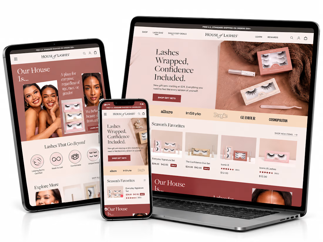
What if finding the perfect lash style was easier than ever? ✨
I’ve been exploring how a beauty eCommerce store can deliver a better shopping experience through thoughtful UI/UX design and conversion-focused strategies.
For this independent redesign concept, I explored a more engaging way to help beauty shoppers discover products, navigate collections, and make confident buying decisions.
A few things I focused on:
1. Clean, premium beauty storefront design.
2. Better product discovery and navigation.
3. Curated product collections.
4. A lash-finder quiz concept to guide shoppers.
5. Clear product presentation and shopping actions.
6. A responsive experience across devices.
My goal with this concept was simple: make the shopping journey feel effortless while keeping the brand visually engaging.
Because a beautiful store is great, but a store that makes shopping easier is even better.
Shopify founders and beauty brand owners: What's more important to you when designing a beauty store — visual experience or product discovery?
#Shopify #ShopifyDesign #ShopifyCRO #EcommerceDesign #UIDesign #UXDesign #ConversionOptimization


This is amazing. I would love to see more of your designs

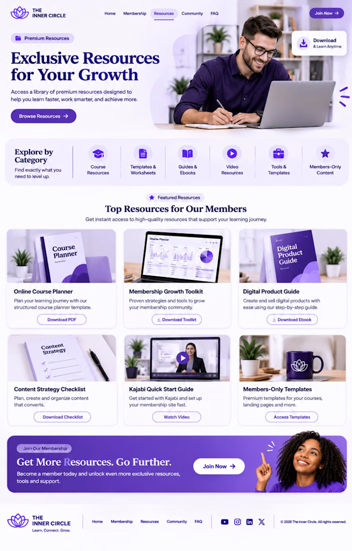
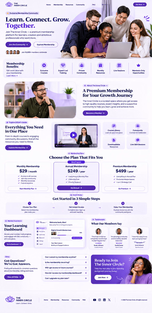
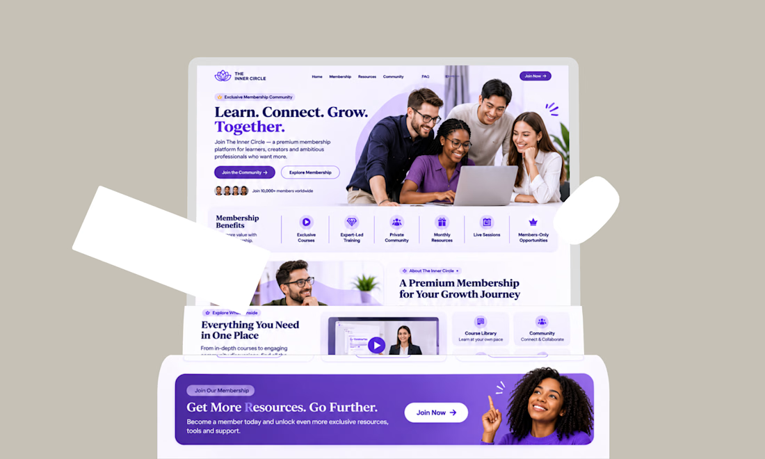
Kajabi Membership Site Setup & Subscription Management



This is looking so professional

🚀 Old vs. New - Which Website Experience Wins?
I'm currently leading the website modernization and booking experience redesign for Niazi Express, transforming a traditional transport website into a modern, user-focused digital platform.
The redesign focuses on:
🎨 Modern UI/UX and stronger visual hierarchy
🚌 Simplified route discovery and a guided booking experience
⚡ Cleaner navigation and more intuitive interactions
💻 Business-focused web development
Now it's your turn! 👇
🅰️ Original Website
🅱️ Redesigned Experience
Which one creates a better first impression, and why?
🚧 Work in progress - your feedback is welcome!
0 voted
0%
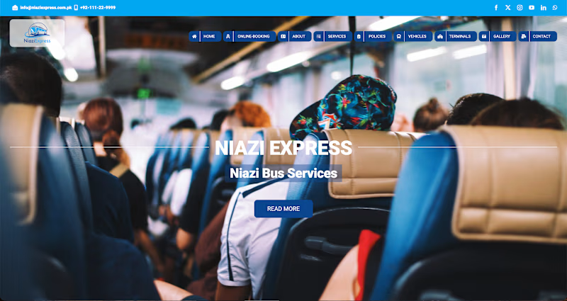
2 voted
100%
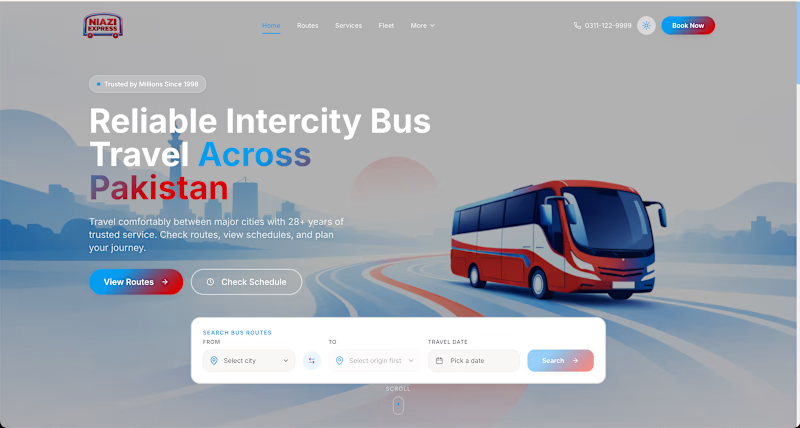
2 votes
Closed

The booking focus makes sense.