The network for creativity
Join 1.25M professional creatives like you
Connect with clients, get discovered, and run your business 100% commission-free
Creatives on Contra have earned over $150M and we are just getting started
Back to feedPost

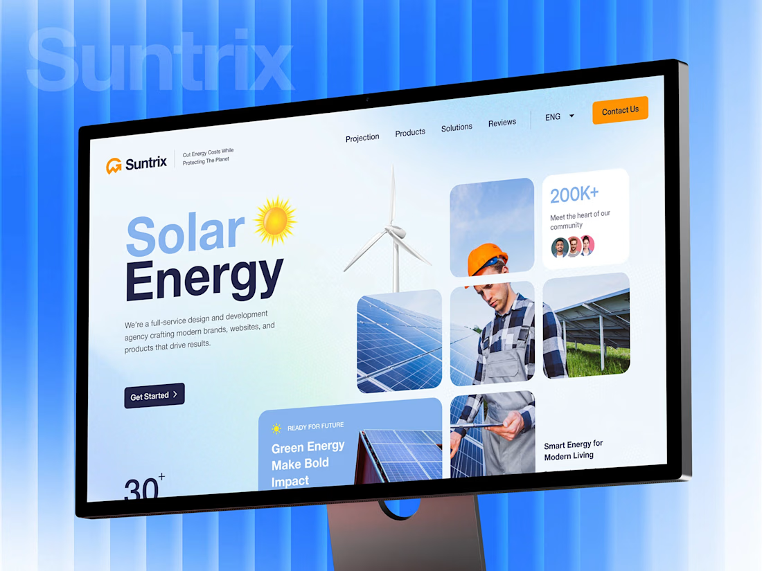
☀️ 𝐌𝐚𝐤𝐢𝐧𝐠 𝐬𝐨𝐥𝐚𝐫 𝐞𝐧𝐞𝐫𝐠𝐲 𝐟𝐞𝐞𝐥 𝐥𝐞𝐬𝐬 𝐩𝐫𝐞𝐝𝐢𝐜𝐭𝐚𝐛𝐥𝐞.
That was the direction behind 𝐒𝐮𝐧𝐭𝐫𝐢𝐱
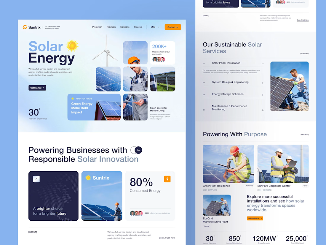
I worked across 𝐝𝐞𝐬𝐢𝐠𝐧 + 𝐝𝐞𝐯𝐞𝐥𝐨𝐩𝐦𝐞𝐧𝐭, shaping the visual direction, responsive layouts, and turning the concept into a working website.
The challenge was keeping services, projects, stats, and testimonials clear without overwhelming the experience.
𝐃𝐞𝐬𝐢𝐠𝐧 → 𝐃𝐞𝐯𝐞𝐥𝐨𝐩𝐦𝐞𝐧𝐭 → 𝐖𝐞𝐛𝐬𝐢𝐭𝐞 ⚡
#fullstack #webdevelopment #webdesign #uidesign #uxdesign #productdesign



Thank you 💯

Keeping services, stats, and testimonials legible without turning it into a wall of text is the hard part of B2B sites like this, the dashboard style stat blocks help a lot.
Exactly, I agree. The dashboard style stat blocks make the key info easy to scan without making the page feel text heavy ✅💯

Good job pro
Thank you 🙌
The network for creativity
Join 1.25M professional creatives like you
Connect with clients, get discovered, and run your business 100% commission-free
Creatives on Contra have earned over $150M and we are just getting started
Related posts

I migrated Pi-lit's site from WordPress to a custom-coded, AI-native website with its own hosting. The result:
-A scalable design system that also supports their ecommerce
-30+ pages with consistent branding throughout
-Animated illustrations of their scenes and products that bring the roadway safety story to life
See Full Case Study


Lovely work


We’re testing two filtering layouts for a template library.
Top Filters
The filters are placed above the content. This option feels lighter, leaves more space for the cards, and works well when there are only a few main categories.
Sidebar Filters
The categories remain visible in the sidebar. This makes the available options easier to scan and works better for more complex filtering, but takes up some of the content space.
Which layout would help you find the right template faster?

24 voted
39%
37 voted
61%
61 votes
Closed

Such a clean presentation. You can tell a lot of thought went into this.


A fresh digital identity, a premium workspace designed for creative professionals.
From an elegant, editorial-style website to a functional mobile app for bookings and studio management, the goal was to make every interaction feel as refined as the space itself.
Clean layouts, timeless typography and a deep green palette bring the whole experience together.


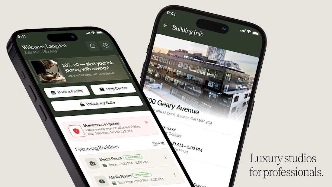
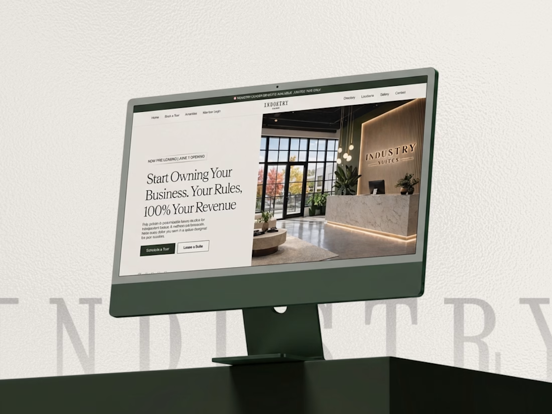

This looks super premium Kabir! Love how you carried the same refined, editorial feel from the website to the mobile app. The clean layouts and booking flow feel exactly like a high-end creative studio should - elegant but functional. The desktop + mobile mockups show the consistency really well. Great execution!


