The network for creativity
Join 1.25M professional creatives like you
Connect with clients, get discovered, and run your business 100% commission-free
Creatives on Contra have earned over $150M and we are just getting started
Back to feedPost

Hello 😉
---
Tired of cluttered editors? I built a minimalist writing workspace where only your current thought matters.
✨ What’s inside:
- Stacked Mode + Focus Blur to keep you in the zone
- Markdown support
- Supabase sync across devices
- And Speedy the Sloth 🦥 — your idle-time companion
Have fun and drop your thoughts below 😉
The network for creativity
Join 1.25M professional creatives like you
Connect with clients, get discovered, and run your business 100% commission-free
Creatives on Contra have earned over $150M and we are just getting started





Related posts

We first heard about Contra through Blahomyr and his posts on LinkedIn. After doing some research, we realized that Contra is a platform that could be a great fit for our studio. Hopefully, we’ll land our first project here very soon!

A huge milestone for me🔥
Still feels a little unreal seeing that.
Along the way my PTS score on Contra went up too, which makes this milestone even more meaningful. It’s not just about the number: it’s all the projects, clients, late nights, ideas, mistakes, and lessons that got...

great one

A horizontal editorial piece built around a conversation about creativity, AI, and why original thinking becomes even more valuable as tools make execution increasingly accessible.
The edit was designed to keep the idea at the center. I worked on structure, pacing, visual rhythm, caption design, sound, color and supporting elements to make a reflective topic feel engaging without overloading it with unnecessary effects.
The goal was to let the argument breathe while still maintaining momentum throughout the video.
Role: Video Editing, Storytelling, Pacing, Caption Design, Sound Design, Color


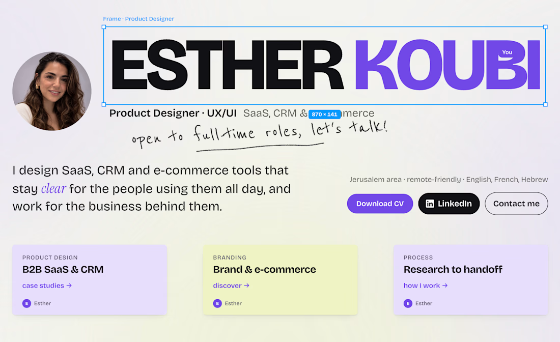
Sooooo… I decided to remake my portfolio.
And I did the exact opposite of my job.
A super nice website, animations everywhere, a little wink to @Figma's design… but barely any explanation of the process behind each project.
Lesson #1: Start with WHY.
(If you know, you know 😅)
So I'm taking it all back from scratch, and I'll share each case study in my next posts.
And to the recruiters passing by: what's the first thing you look at in a portfolio?
Link in the comments if you want to see the crime scene 👀

Looking goooooood 🔥