The network for creativity
Join 1.25M professional creatives like you
Connect with clients, get discovered, and run your business 100% commission-free
Creatives on Contra have earned over $150M and we are just getting started
Back to feedPost

The approved concept is the map, not the finished site.
On Multitech Auto Repair, the client approved a Figma page that scrolled like the real thing. In Framer, one module still had to change: the services table sat under the car, inside a sticky section that can't grow. Moving the table above the car freed the height the chassis needed, and the module reads better on every screen.
That's why I design and build the same site myself. Nothing gets lost in a handoff, and the decisions that only appear in the browser are made by the person who drew the concept.
Figma on the left, Framer on the right.
Case study: https://contra.com/p/gOlcrbqg-multitech-auto-repair-website-in-figma-and-framer
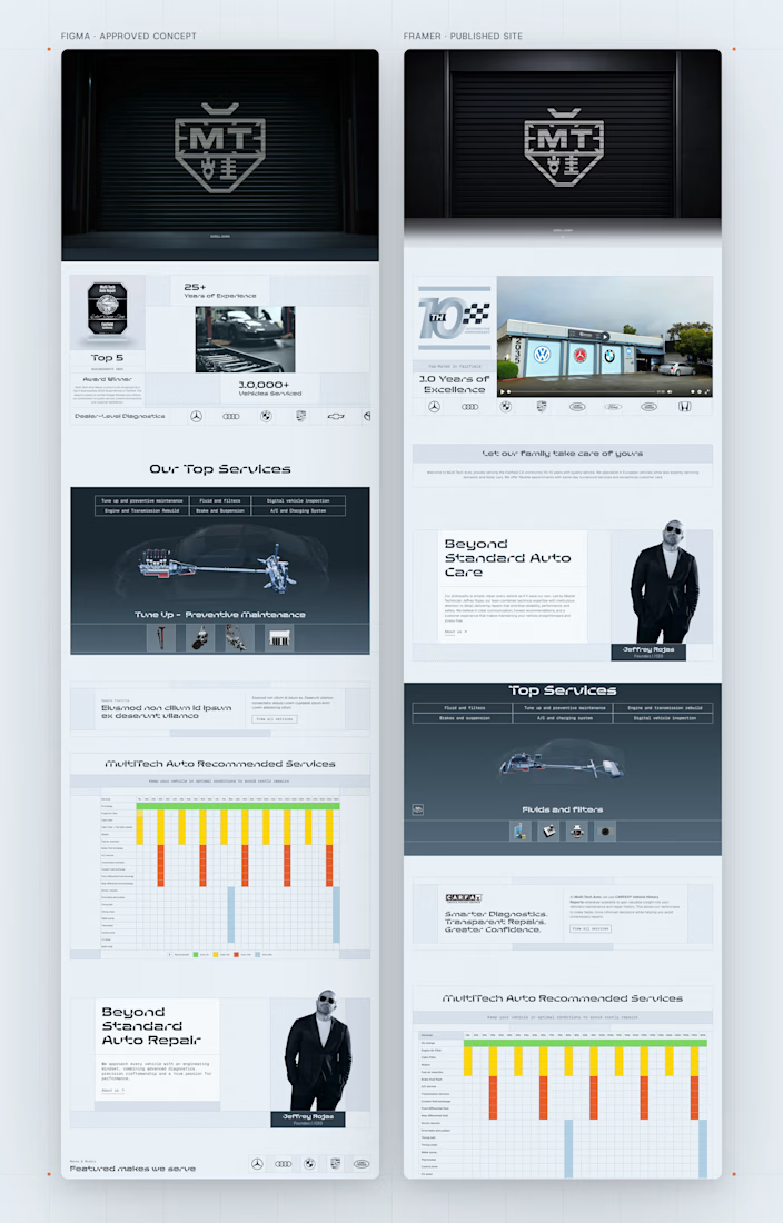

The services table sitting inside a sticky section is a great example of something that only shows up once you build it. Moving it above the car sounds like the right call for every screen size.
Exactly. In Figma the section just grows to fit. In the browser, sticky has rules, and you only meet them when you build it. Thanks for reading it closely, Senad.
The network for creativity
Join 1.25M professional creatives like you
Connect with clients, get discovered, and run your business 100% commission-free
Creatives on Contra have earned over $150M and we are just getting started



Related posts

Infinite Games — A Playful Interactive Experiment
Check it out
Meet my little bioluminescent amoeba!
A playful experiment in character design, motion, and interactive UI.
She floats through space and lights up when you hover over her.


Such a cute and creative concept! The glow and interactive movement give this little character so much personality. ✨

A 16-bit signal has 65,536 steps. No waveform in this brand is allowed to be a curve.
SINE/16: pixel type, a staircase slash, one cyan light per frame, hands on everything.
Full case study ↓

No curves allowed is such a fun rule to build a brand around. The staircase slash is clever.

1 line (headline + body text) or 2 lines? Wider or narrower?
It's easier for me to read 2 lines.
What about you?

5 voted
19%
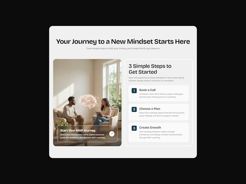
22 voted
81%
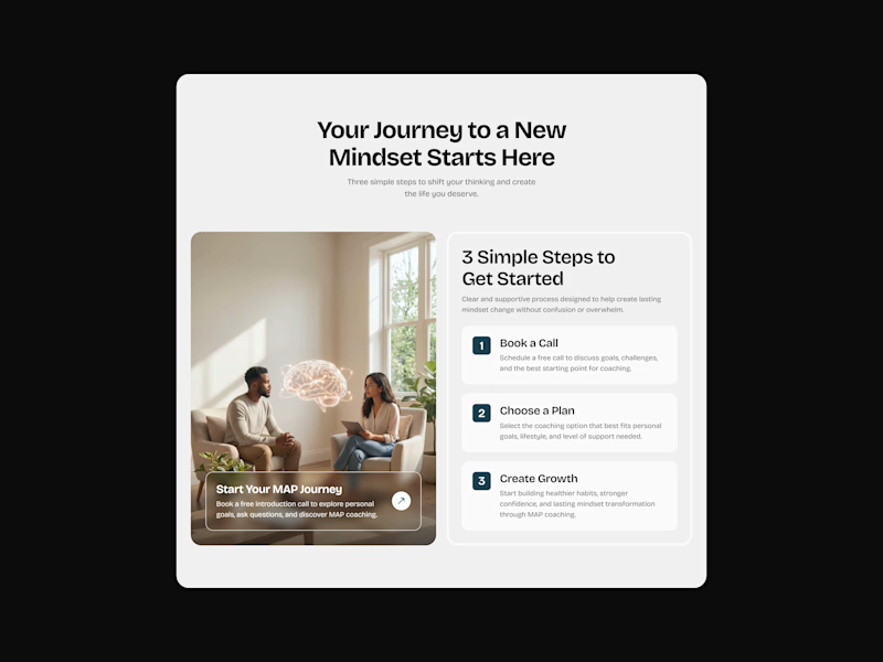
27 votes
Closed

second one


