The network for creativity
Join 1.25M professional creatives like you
Connect with clients, get discovered, and run your business 100% commission-free
Creatives on Contra have earned over $150M and we are just getting started
Back to feedPost
TIME: The Art of Erosion. ⏳
Time doesn't just pass. It leaves a mark.
An exploration of conceptual typography where letters slowly dissolve into sand, transforming an abstract idea into a tangible visual experience.
The concept represents the fragility of time, the inevitability of change, and the beauty of things that never remain the same.
A study in typography, material, and meaning.
#ConceptualTypography #TypographyDesign #VisualMetaphor #GraphicDesign #CreativeDirection #ExperimentalTypography #DesignPortfolio #AIArt


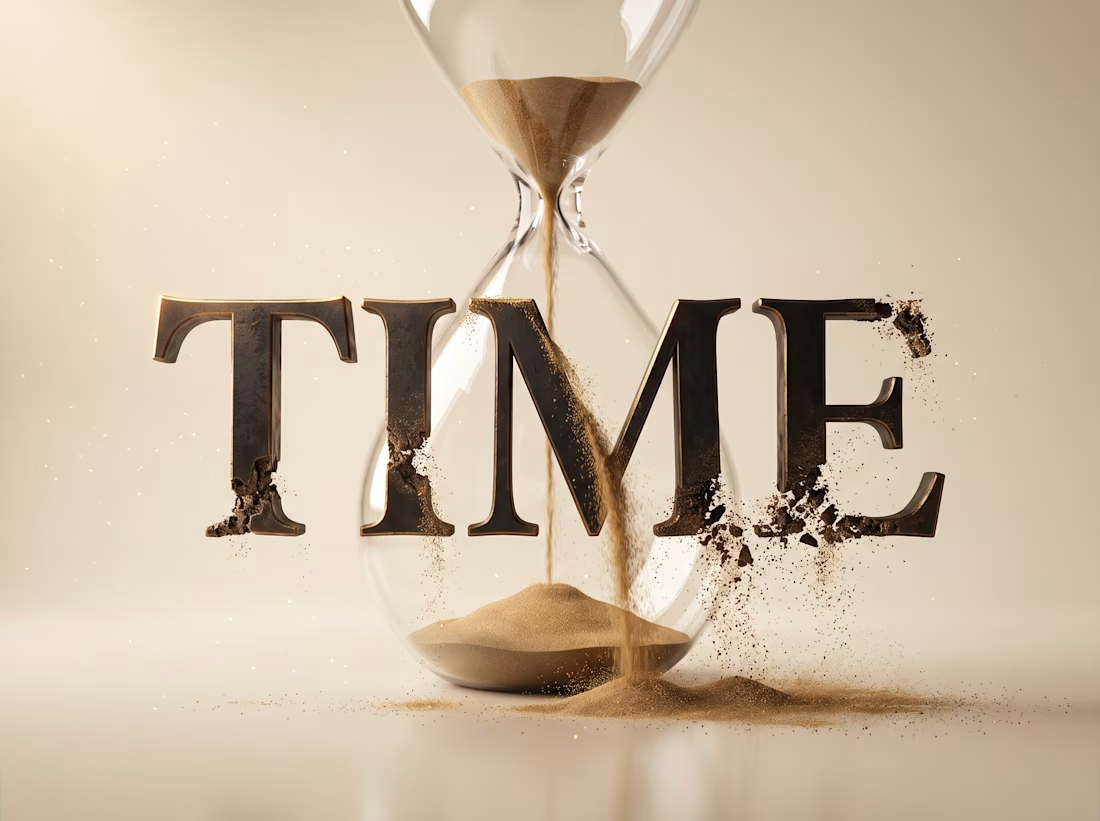

Such a beautiful way to show the passage of time through typography! The concept gives the design a deeper meaning.


Thank you.

Thank you! 🙌 The idea was to show the passage of time through the gradual erosion of the typography, using sand as a visual metaphor for time slipping away. Definitely could have explained the process better in the post!
The network for creativity
Join 1.25M professional creatives like you
Connect with clients, get discovered, and run your business 100% commission-free
Creatives on Contra have earned over $150M and we are just getting started



Related posts

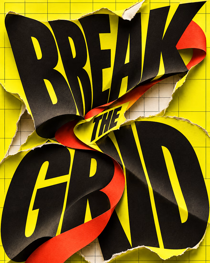
What happens when typography refuses to stay inside the grid?
BREAK THE GRID — an AI-generated visual experiment combining oversized lettering, torn-paper textures and bold colour. The words become the action: bending, tearing and breaking through the layout.
Controlled structure or creative chaos—which draws you in?

Some people think having text on an album cover is tacky.
But I think it really comes down to how the typography is incorporated.
There's a difference between simply placing text on an image and making it an integral part of the artwork.
So I decided to explore this idea by designing a fictional album cover of my own.
For this concept, I used playful colors, handwritten text and hand-drawn elements to capture the album's imaginative and whimsical personality.
Rather than treating the title as a separate element, I wanted it to feel like a natural part of the overall design.
What do you think?
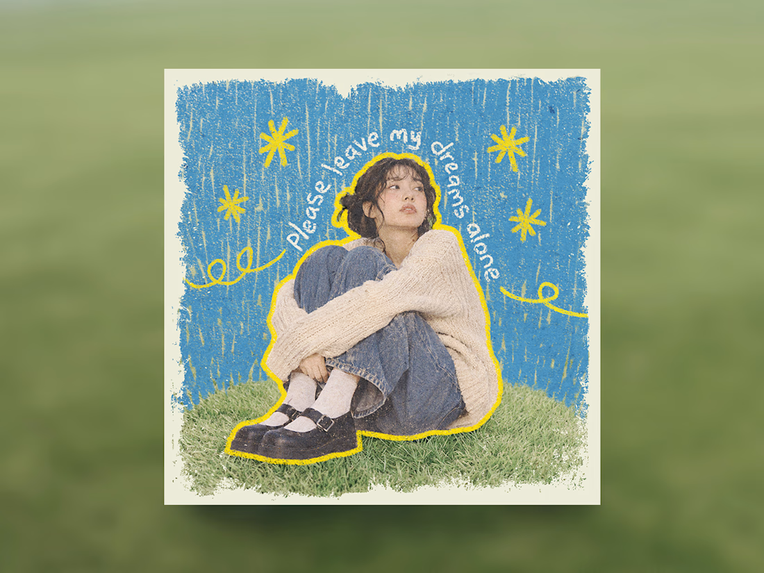

Treating the handwritten title as part of the artwork rather than a label on top is the right call. Email designers fight the same battle with hero images: text baked into the picture looks great until an inbox blocks images. Which came first for you, the lettering or the collage?

AI can generate visuals. But can it create a feeling?
A little cinematic escape to Paris. 🇫🇷
From the lighting and atmosphere to the composition and storytelling, every frame was crafted to capture the feeling of a luxury campaign.
This is the kind of visual storytelling I love creating.
More than just generating. Directing, crafting and bringing a vision to life. 🎬


The pale blue suit against the blue hour Eiffel Tower and warm bokeh lights gives it a real luxury campaign feel. How many generations did the car shot take to stay consistent?