The network for creativity
Join 1.25M professional creatives like you
Connect with clients, get discovered, and run your business 100% commission-free
Creatives on Contra have earned over $150M and we are just getting started
Back to feedPost

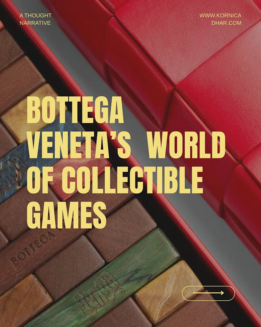
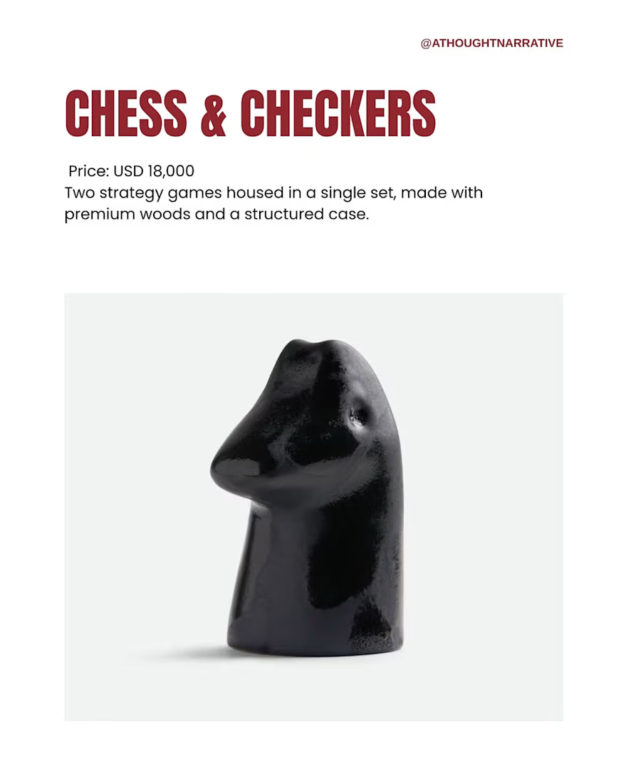
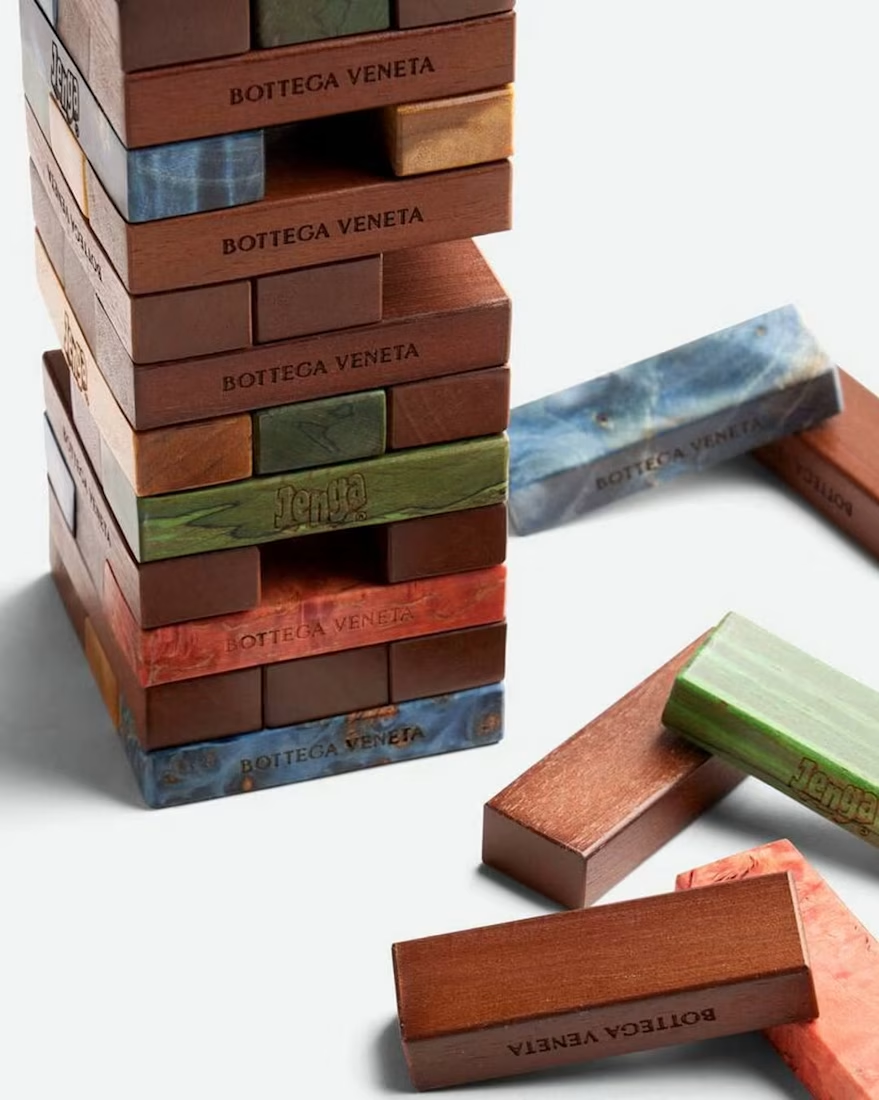
There is a lesser known corner of @bottegaveneta that centres on classic board games, reworked through the brand’s own materials and colour choices.
Swipe to see some of our favourite designs from the collection.
The complete range can be viewed on their website. As someone who still loves board games I love that they are so playful and design first .
Images courtesy of Bottega Veneta.
See the full post as curated by @athoughtnarrative
The network for creativity
Join 1.25M professional creatives like you
Connect with clients, get discovered, and run your business 100% commission-free
Creatives on Contra have earned over $150M and we are just getting started

Challenges
View all


Related posts

Where the ball meets the game 🎾
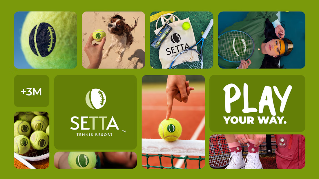
Spent the past week building this one — a full brand identity for SETTA, a tennis resort that didn't want to look like every other sportswear label chasing this season's trend.
The mark lives right on the seam of the ball itself — heritage green, quiet typography, nothing borrowed from anyone else's court. Built to hold up whether it's on a sweatshirt or thirty feet tall on the side of a building. 🌿
Some brands are designed to be loud. This one was designed to last.






Branding me and @Roman Cojuhari have done and won 1st place in competition!


great work

A small iGaming concept inspired by one of my favorite childhood cartoons. Not a real game — just a creative concept.


Fun concept—the nostalgic reference gives it personality.