The network for creativity
Join 1.25M professional creatives like you
Connect with clients, get discovered, and run your business 100% commission-free
Creatives on Contra have earned over $150M and we are just getting started
Back to feedPost

INKY⊕ — A Risograph-Inspired Skin for Video.js v10
Design thinking
Most players try to disappear. INKY⊕ does the opposite: it has a point of view. I wanted the interface to feel like a two-colour riso print: opaque paper-coloured controls, dark ink outlines, offset “shadows” instead of blur, and playful stamped labels. The idea was to prove that a player can have real personality and still stay legible and accessible.
What makes it different
• Tactile Play button & state stamps: The centre Play/Replay button is styled as a bold two-colour overprint with a shifted second-ink layer. As the playback state changes, physical ink stamps slap onto the button—PAUSED / PROOF HOLD when paused and FINAL PRINT / RUN COMPLETE when finished.
• Printer’s registration marks (⊕): Authentic crop and alignment crosshairs frame the viewport and double as the interactive scrubber thumb along the halftone progress bar, reinforcing the print-press metaphor.
• Choose your ink: Pick the ink palette (and a second ink) from the player itself. Every part updates together, including the title, tags, and state stamps. Text colour is tuned per ink so contrast stays high on all of them.
• Voice-over built into the player: A headphones button opens a panel with Off / English / Français / Italiano voice-over, kept in sync with the video, including seeking, pausing, speed changes, and volume. You can also cycle it with the V key, with live screen-reader announcements.
• Controls live inside the player: Headphones, ink, and brightness panels open over the video so the page never jumps, adapting their placement between desktop and phone.
• Brightness control & ink drop: Built right into the control strip for viewing in any lighting condition.
• Printed-paper strip that gets out of the way: Slides down and fades during playback, returns on movement or keyboard use, and stays up while a menu is open.
• Phone-first layout: At narrow widths the strip reorganizes: secondary buttons fold away, labels shorten, touch targets grow, and the volume tank shrinks so it never overflows the player.
• Full menu set: Captions (EN/FR/IT), speed, quality, picture-in-picture, and fullscreen—all styled in the same printed aesthetic.
• Keyboard and gestures: Hotkeys for play, seek, volume, mute, captions, fullscreen, and voice-over, plus touch gestures.
• Accessibility: Visible focus rings, screen-reader labels, live-region announcements, prefers-reduced-motion and forced-colors support, and a light-only colour scheme so the palette is not distorted by forced dark modes.
• Aesthetic poster: A custom riso-style cover so the first frame already feels designed.
Technical & Credits
HTML and CSS only, built on Video.js v10 web components (video-player, media-controls, media-menu, popovers, and tooltip groups). The skin is a single stylesheet using container queries and a single scale unit, adapting to the player's container size rather than just the viewport.
• Live URL: https://playerinky.vercel.app
• Video (Mux Playback ID): 02ABpLdph00KkzwGjGPe28rq700N96S00spSHdxmsL4k0101I
• Licence: Apache 2.0
• Credits: Designed and built with AI assistance (Claude, Genspark, and Gemini) on Video.js v10.
The network for creativity
Join 1.25M professional creatives like you
Connect with clients, get discovered, and run your business 100% commission-free
Creatives on Contra have earned over $150M and we are just getting started




Related posts

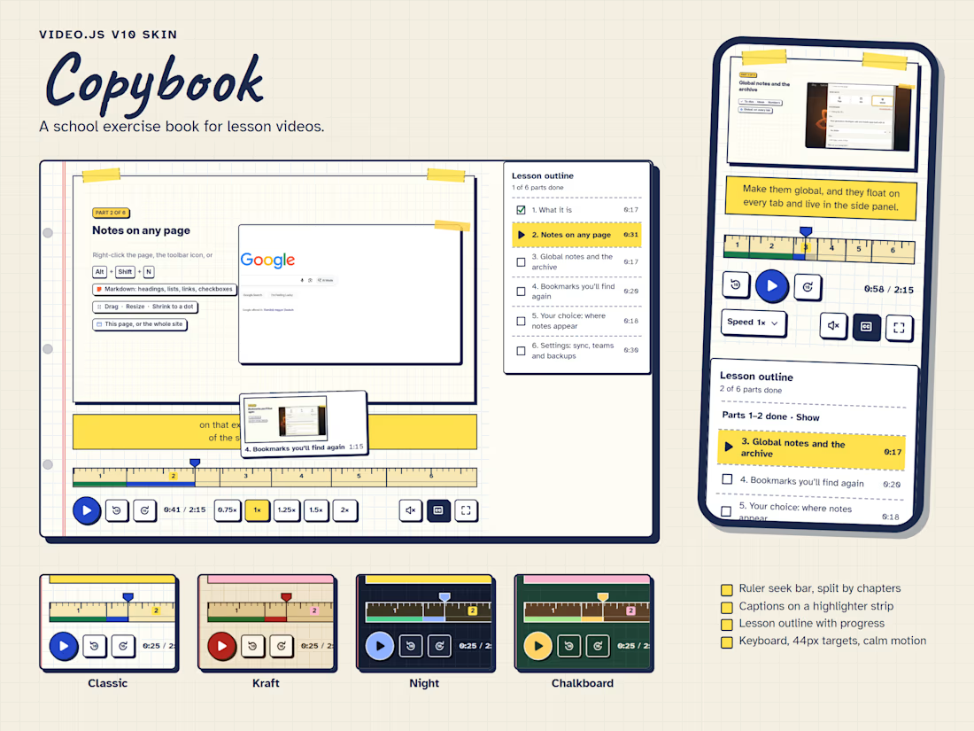
Copybook is a Video.js v10 skin for lesson videos. It treats the player as a page in a school exercise book: the video is taped onto squared paper beside a red margin, the seek bar is a wooden ruler, and captions are written on a highlighter strip under the picture instead of over it.
Every control sits on the paper below the video, so text and icons keep the same contrast over any footage. The ruler is divided by the video's chapters, numbered like centimetres, and finished parts turn green, so the seek bar doubles as lesson progress; hovering it shows a polaroid of that moment. The same chapters build a checklist outline next to the player.
Small details carry the idea through: a ruled title card before the lesson starts, hand-drawn icons, sticky notes that confirm shortcuts and double-taps, and a gold star when the lesson is finished. Buttons are at least 44px, every icon has a tooltip with its shortcut, focus is a thick pen-blue outline, and all motion switches off under reduced motion. Four colour themes (Classic, Kraft, Night and Chalkboard) are switched with one attribute, and each is checked for contrast.
I built it for the video tour of my own browser extension, AI Bookmarks and Notes, where it now runs live.

The wooden ruler and highlighter-strip captions give Copybook such a familiar school-day charm. The gold star is a lovely finishing detail.

Linea, a Video.js 10 skin
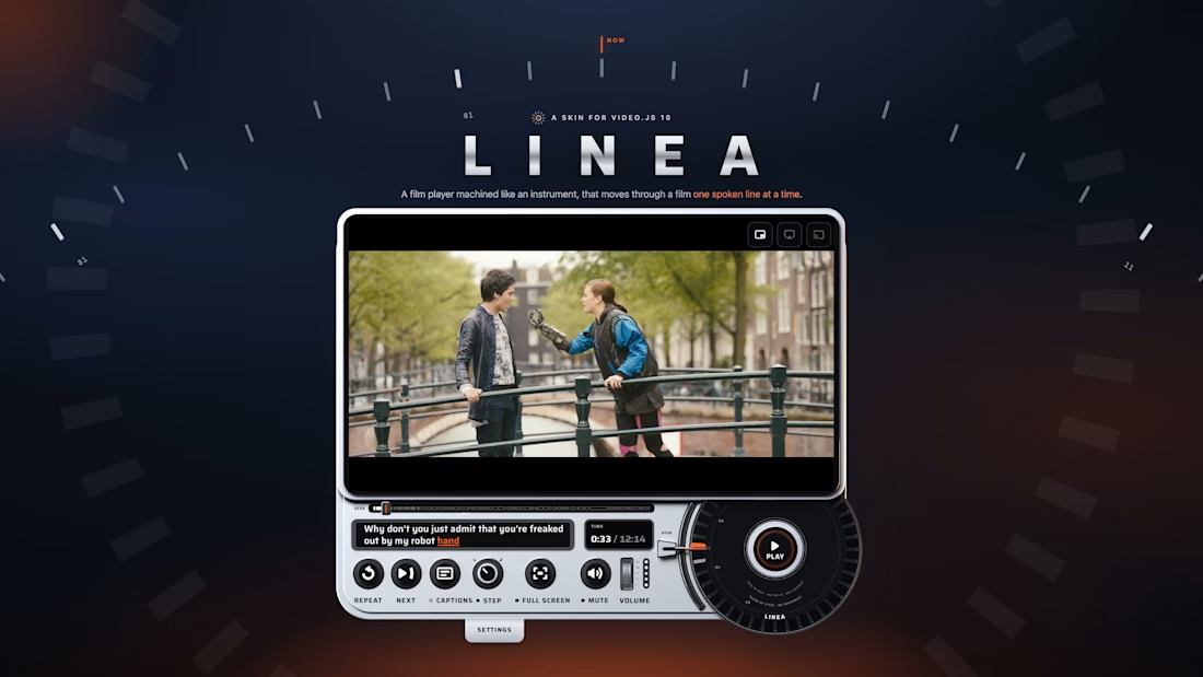
I designed Linea for the moment you miss a line and want it again from the first word. Its seek wheel has one notch for every spoken line, making speech the unit of navigation. Repeat replays the current line, Next starts the following line, and Step pauses after each line until you continue. The caption window highlights the current word, connecting navigation with what you hear and read. I carried the wheel’s mechanical character through black glass, machined aluminium and one ember light, giving the player the form of a physical instrument. Keyboard control, 44 px targets and an upright phone layout support the same actions across inputs and screens.
Film: Tears of Steel (CC BY 3.0, Blender Foundation).

using spoken lines as the unit of navigation is brilliant, linea's seek wheel is such a thoughtful idea

Verbatim: the subtitle became the player.
The sentence you're hearing is the control bar. Words light up as they're spoken. Drag along them to scrub, or click a word to jump to it.
Three things to try:
• Press / and type a word. Every place it's said gets a tick on the seek bar.
• Hit the link button to copy a link to the exact sentence on screen.
• Stop moving, and the bar folds into an ordinary subtitle.
Built on Video.js v10 as an HTML skin, streamed from Mux, and driven by a plain captions file with no word-level timestamps. Every control works from the keyboard, and it respects reduced motion, high contrast and forced colours.
