The network for creativity
Join 1.25M professional creatives like you
Connect with clients, get discovered, and run your business 100% commission-free
Creatives on Contra have earned over $150M and we are just getting started
Back to feedPost

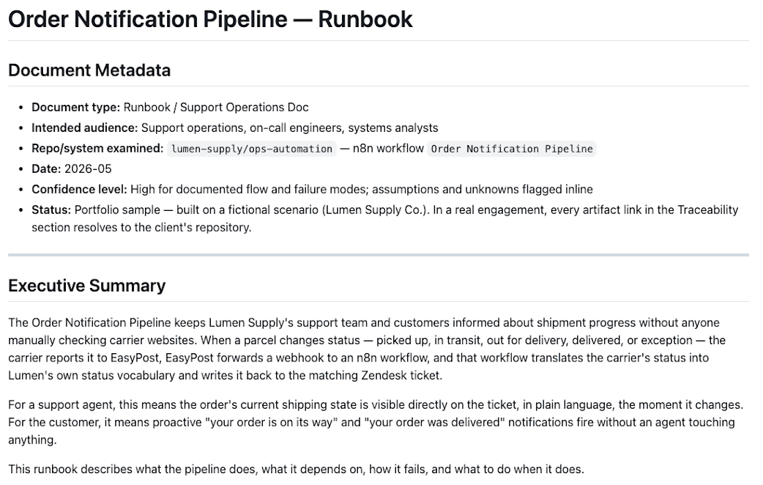
Most integration documentation is written from interviews. Someone explains how the system is supposed to work, a writer transcribes it, and the doc captures the memory, not the system.
I do it the other way. I read the actual workflow exports, configs, and source, then document how the integration behaves in reality. When the doc and the system disagree, the system wins, because that's what I read.
The difference shows up later. Interview-based docs drift the moment a memory is wrong or a config changed after the conversation. Code-first docs match what's running, and every claim traces back to a specific artifact you can open and check 😍
Four full samples here, built on fictional but realistic scenarios: runbooks, a spec, a two-document package, and an architecture decision record, across n8n, Celigo, Salesforce, Zendesk, HubSpot, and NetSuite.
The network for creativity
Join 1.25M professional creatives like you
Connect with clients, get discovered, and run your business 100% commission-free
Creatives on Contra have earned over $150M and we are just getting started





Related posts

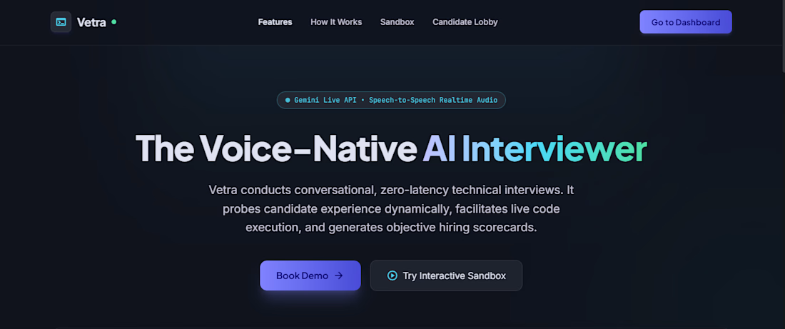
I built Vetra, an AI technical interviewer that makes interviews more structured, adaptive, and realistic.
Vetra conducts real-time voice interviews, explores a candidate’s experience, adapts its questions based on their responses, evaluates performance, and generates structured assessments.
I built the interview orchestration with LangGraph, added real-time voice interaction using Gemini Live, and created a separate evaluation layer for evidence-based scoring.
The goal was to create an AI interview experience that feels more like a real technical conversation than a chatbot.

Jonathan, keeping the evaluation layer separate from the interviewer is a smart choice. When the same model asks and scores, it tends to grade its own questions kindly. How are you handling silence and long pauses on the voice side? That was the hardest part for us on a voice AI build.

Today I have been working on:
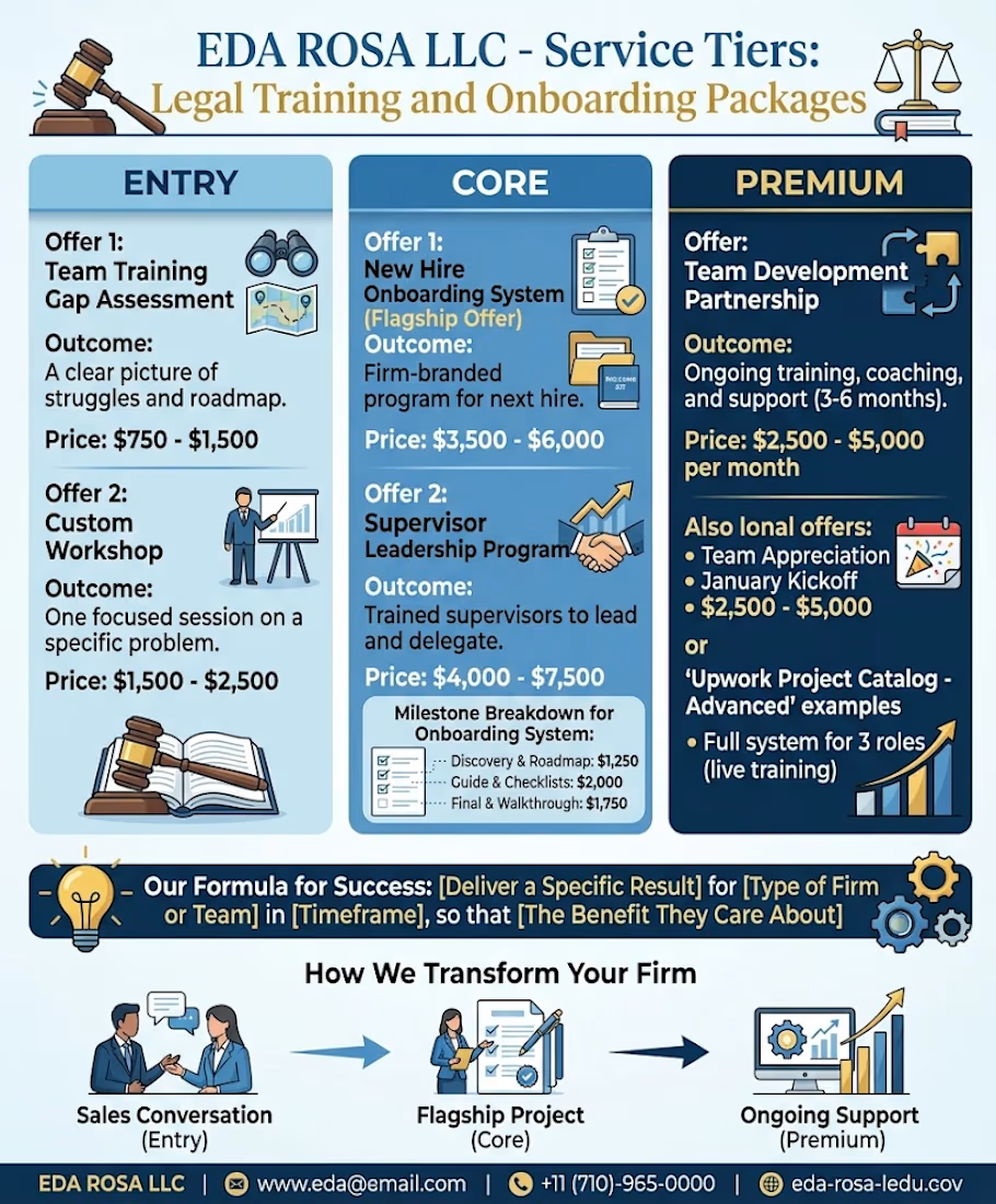
Legal Team Training Workshop: Standard operating procedures, compliance workflows, and team onboarding strategies.
Legal Operations Audit: Reviewing internal legal workflows, tool stacks, and team capacity.
Fractional Legal Operations Lead: Ongoing monthly support for scaling teams.


Good Luck!

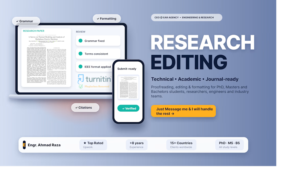
Academic editing and proofreading for theses, dissertations, research papers, journal manuscripts and technical reports. Grammar, clarity, structure, formatting, citations, figures, tables and technical consistency, while preserving the author's original research and meaning.