The network for creativity
Join 1.25M professional creatives like you
Connect with clients, get discovered, and run your business 100% commission-free
Creatives on Contra have earned over $150M and we are just getting started
Back to feedPost

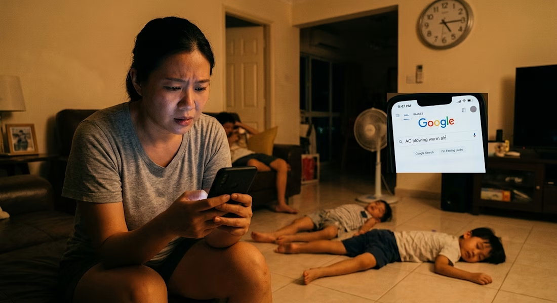
A strategy article for contractors and the agencies that market them. It shows how homeowners search by symptom, not service name, and gives a step-by-step method for turning those phrases into pages that rank and get calls.


The network for creativity
Join 1.25M professional creatives like you
Connect with clients, get discovered, and run your business 100% commission-free
Creatives on Contra have earned over $150M and we are just getting started








Related posts

Which skincare carousel layout would you choose for your brand?


13 voted
50%
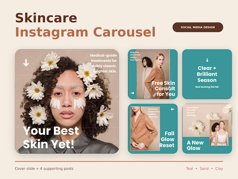
13 voted
50%
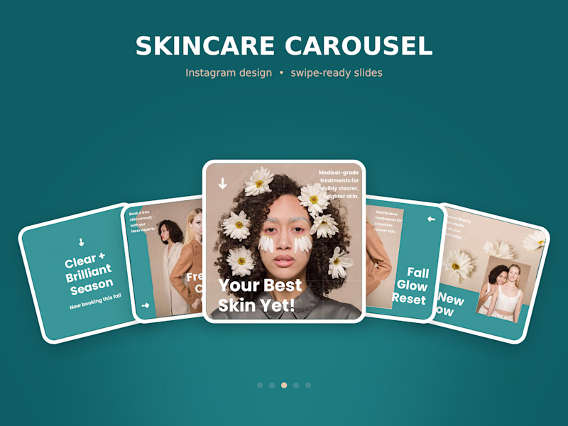
26 votes
Closed


bento grid for me, fan layout gets crowded on a phone screen

A concept feed designed by Business Wifey Agency
The Project
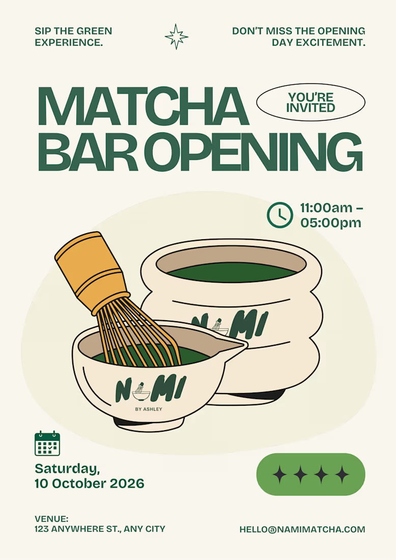
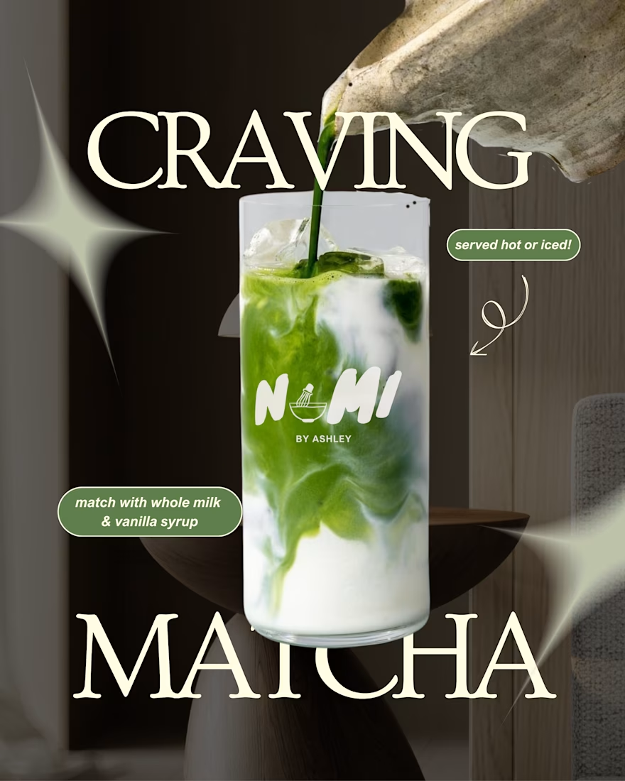
Nami Matcha is a matcha bar brand we fell in love with and couldn't resist designing for. This is not their official branding. This is BWA doing what we do best: taking a vibe, a product, and a personality, and turning it into a full visual identity that makes people stop and stare.
Because honestly - who doesn't love matcha?
What We Created
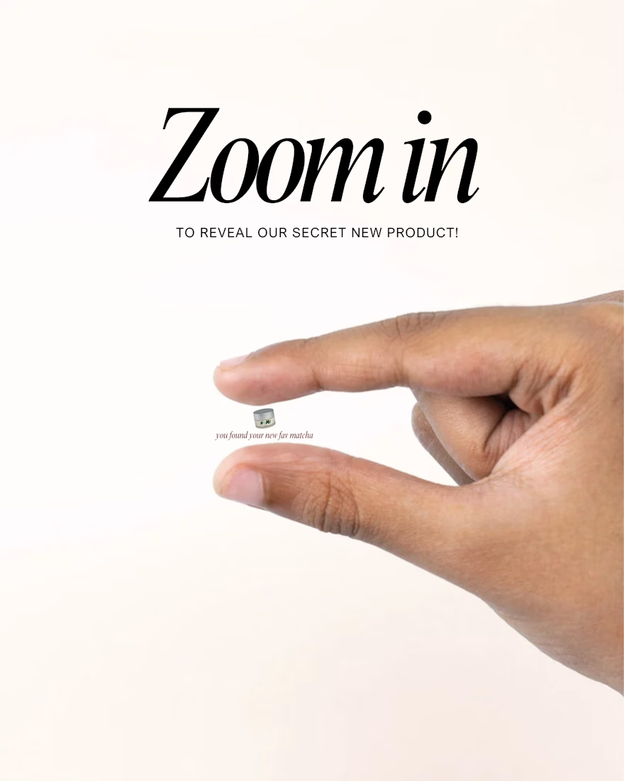
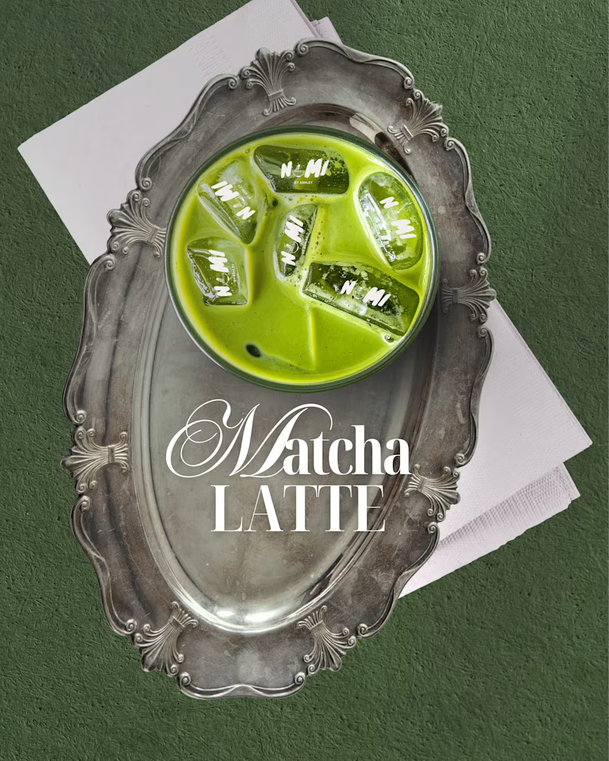
A complete social media design system built around Nami Matcha's playful yet premium aesthetic. Every post was designed to feel like the brand already existed, already had a loyal audience, and already knew exactly who it was talking to.
The feed covers every content pillar a beverage brand actually needs:
Product Content → Editorial-style drink photography posts with bold typography and on-brand copy that makes you want to order immediately.
Event & Launch Design → A full matcha bar opening poster and pop-up event flyer - the kind of content that makes people save the date and show up.
Engagement & Viral Content → "Born to / Forced to," "Take What You Need," "Matcha Mode: ON" - the kind of posts that get shared, saved, and commented on because they feel real, not promotional.
Promotional Posts → Buy 1 Get 1 offers and product deals designed to convert, not just perform.
Brand Storytelling → From the fuel gauge concept to the receipt mockup, every piece tells the Nami Matcha story in a way that feels completely native to the platform.
The Result
A 10-post feed that looks like a fully launched brand - cohesive, confident, and completely scroll-stopping. This is what BWA brings to every client: the ability to make a brand feel real before it even launches.
Note
This is a concept project created independently by Business Wifey Agency to showcase our design capabilities. Nami Matcha is not an official BWA client and this is not their confirmed brand identity - we simply loved the concept and built it out because great design doesn't wait for a brief.
Skills & Tools Used
Brand Design · Social Media Design · Content Strategy · Feed Curation · Typography · Visual Storytelling


Love how the whole feed feels like a real brand launch. The mix of product, promotional, and engagement content works really well.

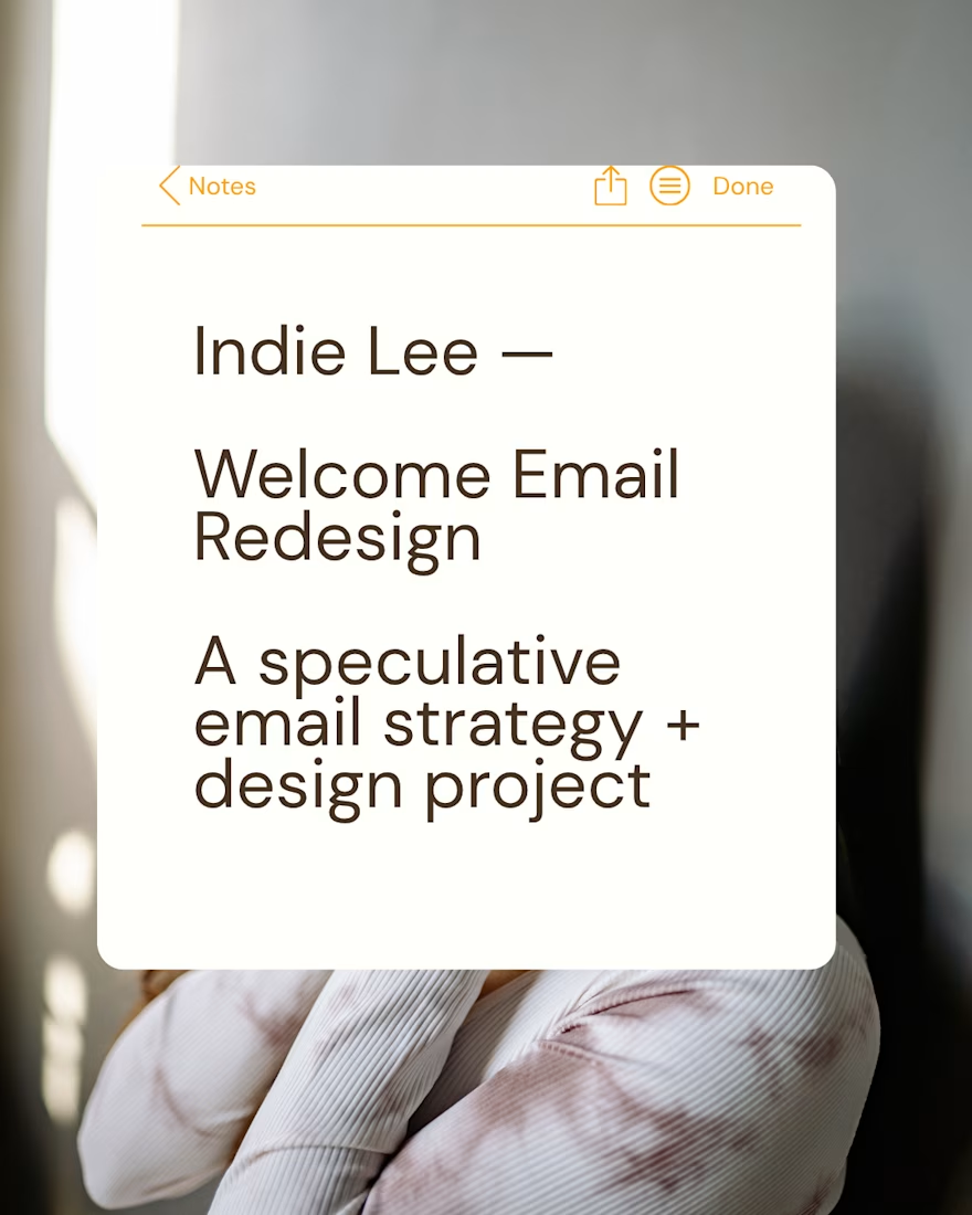
Indie Lee — Welcome Email Strategy & Redesign
Overview
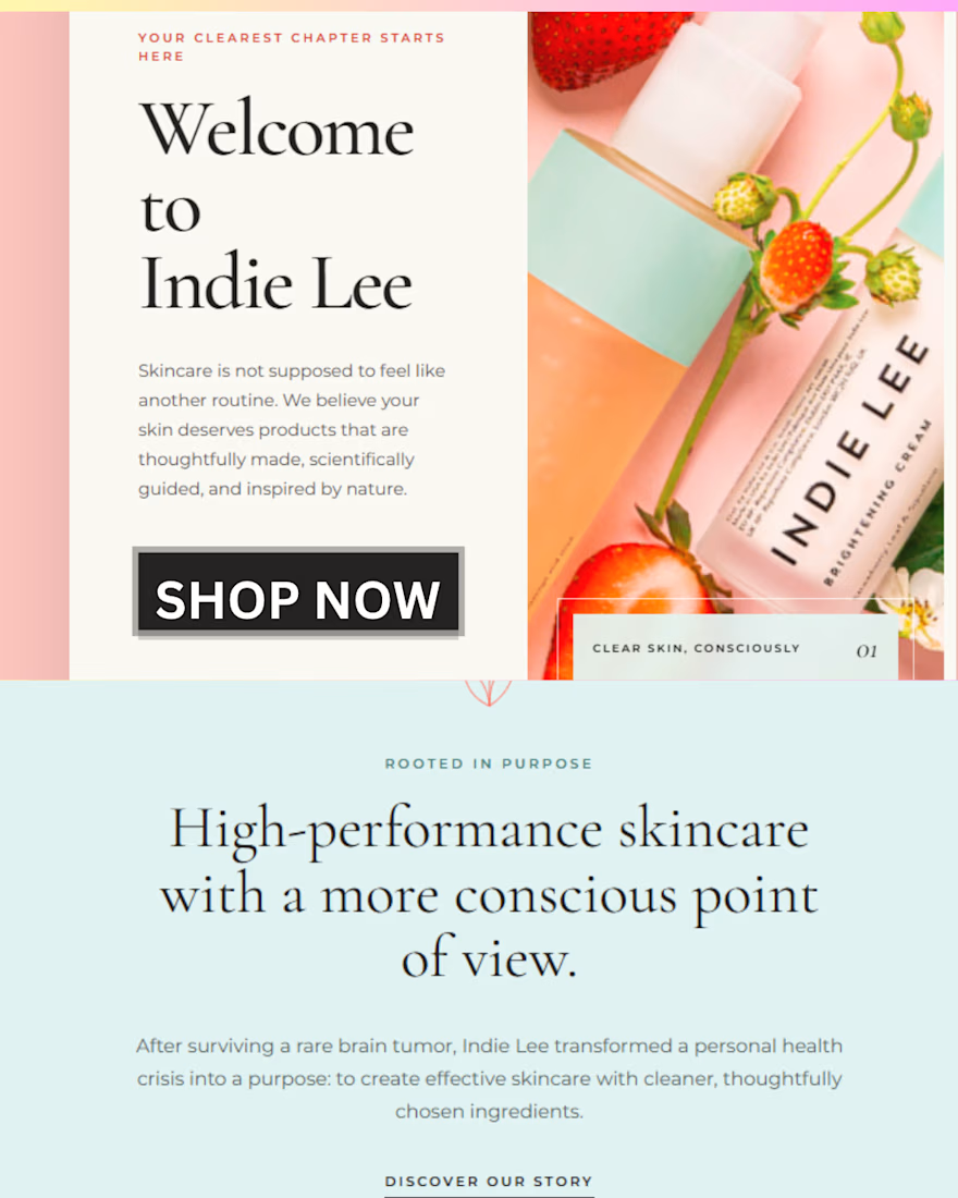
A speculative email strategy and redesign project for Indie Lee, created to practice customer research, email strategy, copywriting, and email design for a beauty/skincare brand.
The Challenge
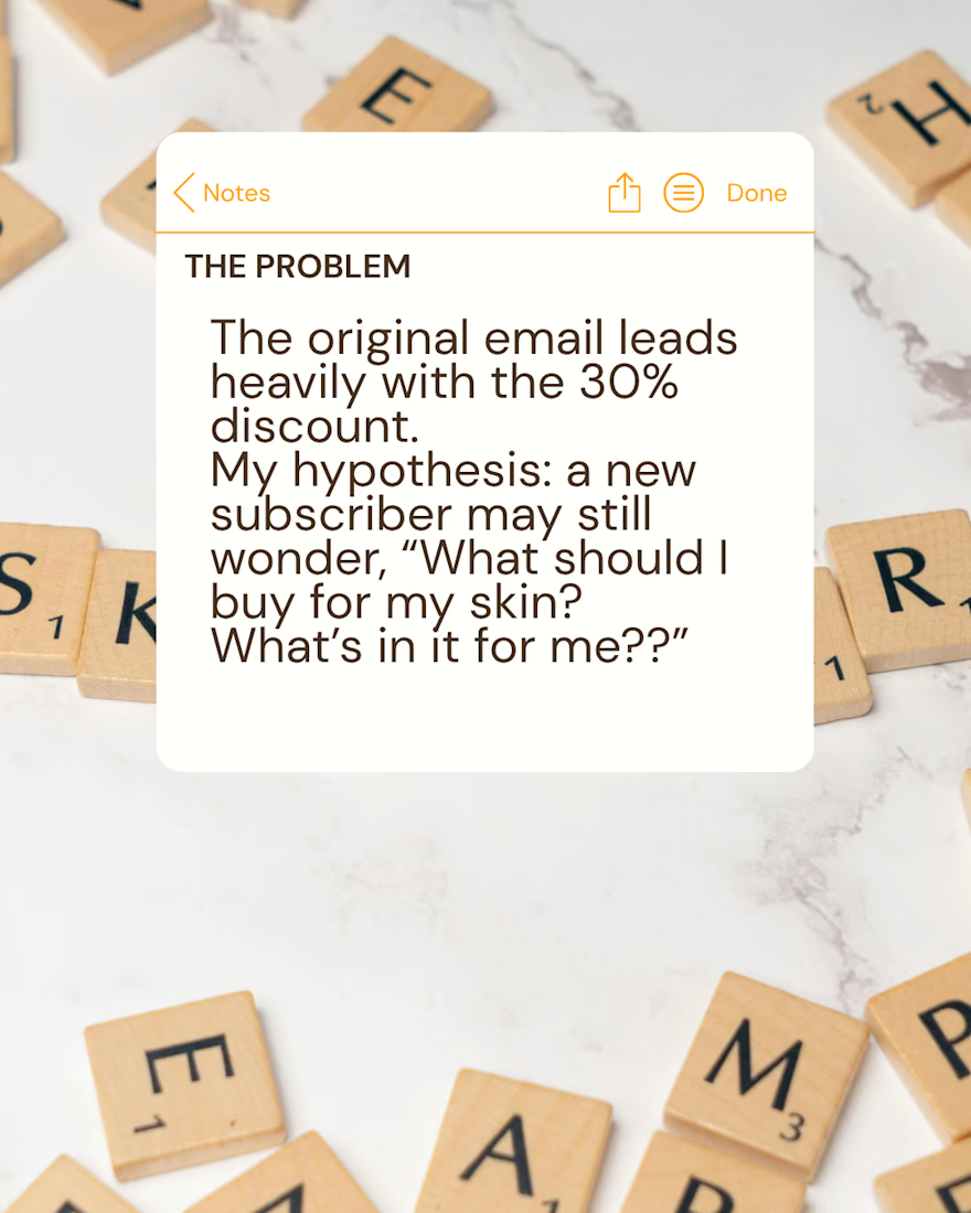
The original welcome email strongly emphasized the first-order discount and encouraged subscribers to shop.
I identified a potential customer barrier:
“What should I buy, and how do I know what's right for my skin?”
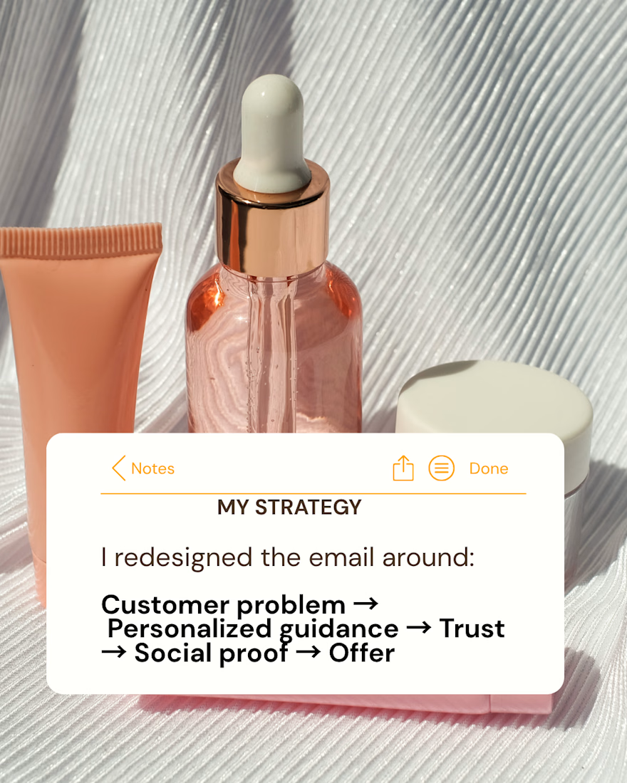
My Strategy
I redesigned the email around a more customer-focused journey:
Customer problem → Personalized guidance → Trust → Social proof → Offer
What I Changed
Added messaging around product-selection uncertainty.
Introduced personalized skincare consultation as a solution.
Strengthened the customer-focused messaging.
Added founder storytelling to build trust.
Added social proof around customer desires such as hydration and glow.
Kept the 30% first-order offer as a conversion incentive.
Reorganized the email to create a clearer path toward purchase.
Speculative concept created for portfolio purposes. Not affiliated with Indie Lee.

Starting from the new subscriber's question is a smart way to frame the welcome email.