The network for creativity
Join 1.25M professional creatives like you
Connect with clients, get discovered, and run your business 100% commission-free
Creatives on Contra have earned over $150M and we are just getting started
Back to feedPost

The network for creativity
Join 1.25M professional creatives like you
Connect with clients, get discovered, and run your business 100% commission-free
Creatives on Contra have earned over $150M and we are just getting started








Related posts

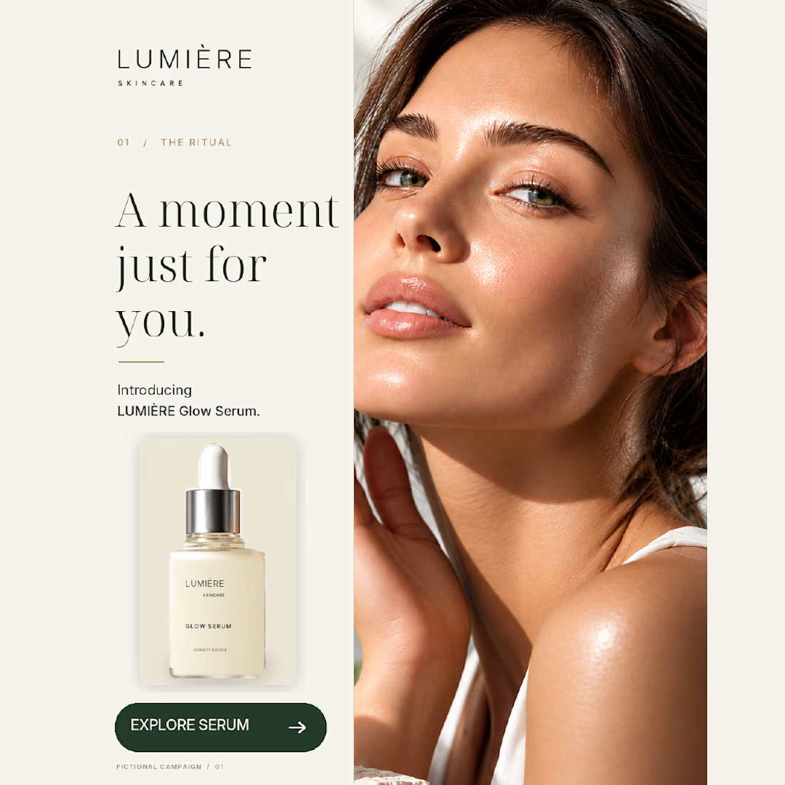
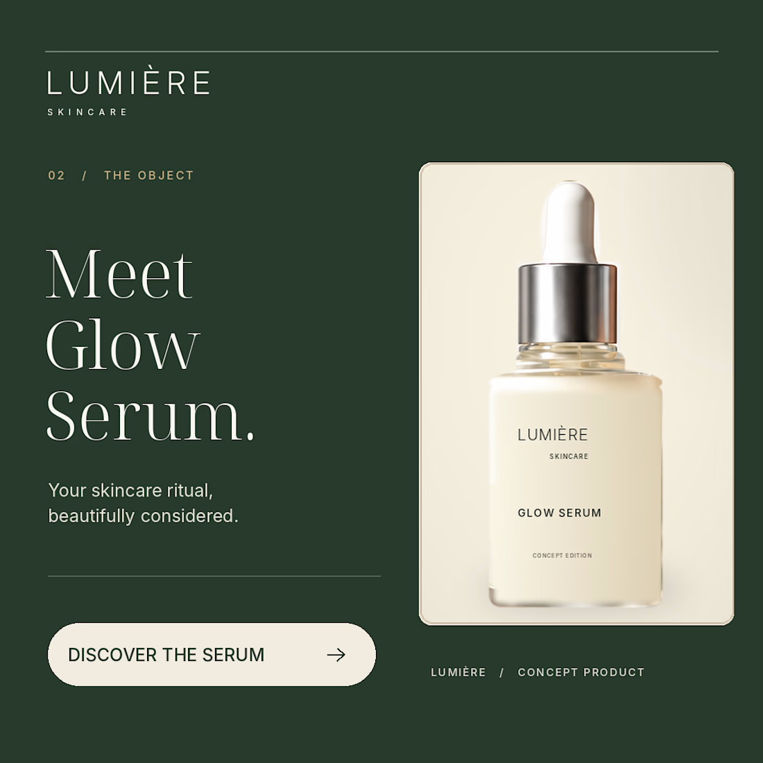
Same skincare brand. Two very different first impressions.
For my latest NeuroDNA project, LUMIÈRE, I explored two creative directions:
01 — the face and the skincare ritual.
02 — the bottle as the main focus.
Warm ivory, deep green and consistent packaging connect both designs. The imagery is AI-assisted, with layout and typography composed separately.
LUMIÈRE is a self-initiated concept for a fictional brand.
For a skincare brand you’ve never heard of, which would make you pause — 01 or 02, and why?

Great job bro 🎉🎉

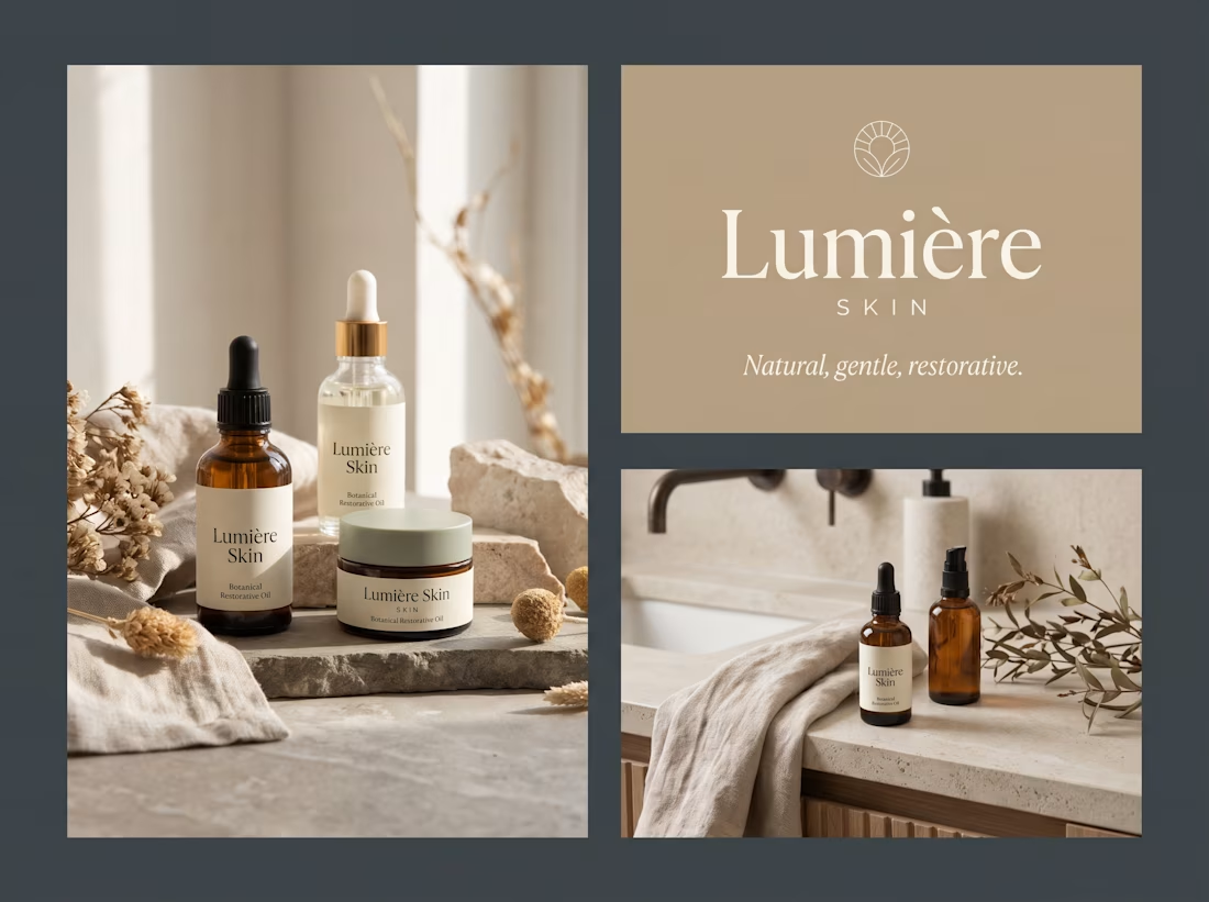
🌿 Lumière Skin — Luxury Botanical Skincare Identity
Super excited to share a brand identity & packaging concept for Lumière Skin, a minimalist, organic skincare brand.
The goal was to evoke serenity, purity, and modern elegance through clean typography, a warm neutral palette, and subtle natural textures.
🎨 Project Highlights:
• Sophisticated Serif Typography & Circular Leaf Icon
• Eco-friendly Glass Packaging (Amber & Clear Dropper Bottles + Cream Jars)
• Earthy & Calm Color Palette (Oatmeal, Muted Sage, Warm Sand & Amber)
• Natural Lifestyle Contexts & Textured Applications
Let me know what you think of this aesthetic! Would you have this on your vanity? ✨
Tools: Adobe Illustrator, Photoshop
Open for new logo, packaging, and brand identity projects! DMs are open 📩
#SkincareBranding #PackagingDesign #BrandIdentity #GraphicDesign #MinimalDesign #CosmeticBranding #VectorArt #LumiereSkin


Great brand design 🔥🔥