The network for creativity
Join 1.25M professional creatives like you
Connect with clients, get discovered, and run your business 100% commission-free
Creatives on Contra have earned over $150M and we are just getting started
Back to feedPost
Taste Test
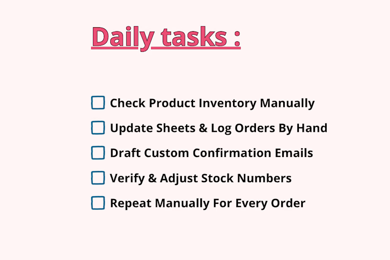
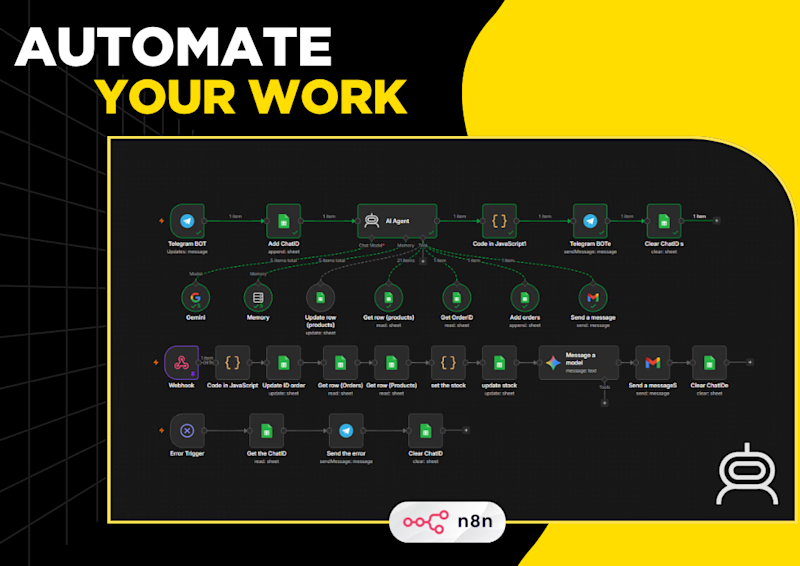
Managing product orders and inventory manually takes hours of tedious, repetitive work. Every time a customer inquires or places an order, you have to manually check stock availability, update Google Sheets line by line, send out custom approval emails, and track down confirmation status.
Which one is faster, saves more time, and prevents mistakes?


1 voted
33%
2 voted
67%
3 votes
Closed

Automated Workflow feels more understandable and practical and I like how the design feels modern minimalistic great job 🎉🎉🔥🔥

Thanks a lot, Really glad you liked the clean design and workflow! 🔥🎉
Pardon❤️
The network for creativity
Join 1.25M professional creatives like you
Connect with clients, get discovered, and run your business 100% commission-free
Creatives on Contra have earned over $150M and we are just getting started











Related posts

Brand identity exploration
Which one do you think it fits better?
36 voted
77%

11 voted
23%

47 votes
Closed
Cobalt is great Gold is unique 🎉🎉🔥🔥


Same brand. Same palette. Two completely different proposals for a real estate developer.
A: An isotype built from blocks. Geometric, precise, the language of construction. It says we build.
B: Custom lettering with movement. Warmer, more editorial. It says we build places you’d want to live in.
36 voted
51%

35 voted
49%

71 votes
Closed

My vote is B, Milagros. Custom lettering with movement has real editorial warmth, which suits a developer selling places people actually want to live in.

Same SAE-REN project. A new way to explore it.
I’ve reworked the case study to make the connections between the identity, packaging, and physical applications clearer.
I think this version finally strikes the balance I was looking for: explaining the design decisions and logic behind the system while making the full page a pleasure to explore.
Old or new, which version would make you keep exploring?

2 voted
15%
11 voted
85%
13 votes
Closed

New♥️