The network for creativity
Join 1.25M professional creatives like you
Connect with clients, get discovered, and run your business 100% commission-free
Creatives on Contra have earned over $150M and we are just getting started
Back to feedPost
Taste Test
Same SAE-REN project. A new way to explore it.
I’ve reworked the case study to make the connections between the identity, packaging, and physical applications clearer.
I think this version finally strikes the balance I was looking for: explaining the design decisions and logic behind the system while making the full page a pleasure to explore.
Old or new, which version would make you keep exploring?

2 voted
15%
11 voted
85%
13 votes
Closed


old one

Thanks, Sahil! Could you please share which part of the Old got your eye to choose it?
I found the old version more engaging visually, and the way the content was presented felt more natural to explore
Thanks for the note, it is appreciated, Sahil!

Voting for New. Explaining the design logic behind the system while keeping the page a pleasure to explore is exactly the balance you want. The clearer identity-to-packaging connections will pay off.
Thanks, Timothy! Sometimes the bigger the project, the harder to explain it in 30 seconds it is.

The New version wins hands down. The original felt like an endless text-heavy audit report.

New feels much clearer. That headline sells the idea fast.
The network for creativity
Join 1.25M professional creatives like you
Connect with clients, get discovered, and run your business 100% commission-free
Creatives on Contra have earned over $150M and we are just getting started




Related posts

Need a second pair of eyes 👀
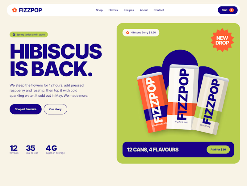
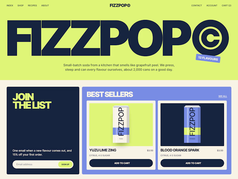
I'm designing the online store for FizzPop, a craft soda brand: all-natural sodas, sparkling waters and botanical tonics.
Flower Fizz(A): eggshell, tiger orange and deep ultramarine, with flower shapes and stacked colour swatches for the flavours
Corner Shop(B): lime, soft blues and navy, editorial layout with a giant wordmark and menu-style flavour tiles
38 voted
44%
48 voted
56%
86 votes
Closed


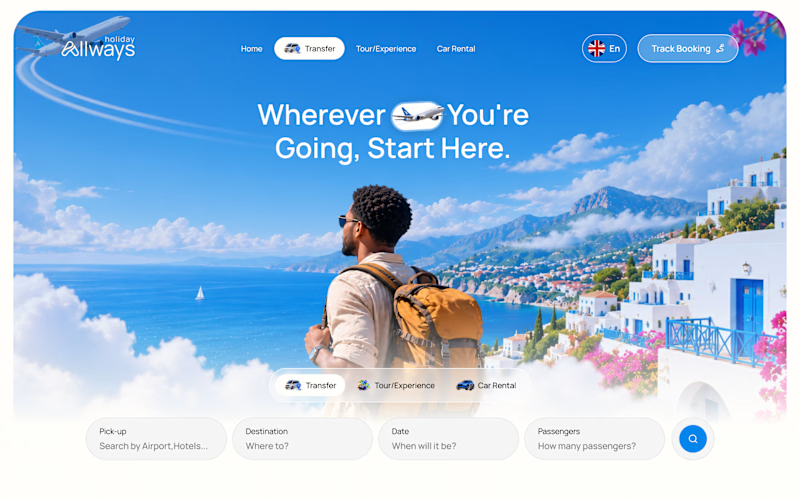
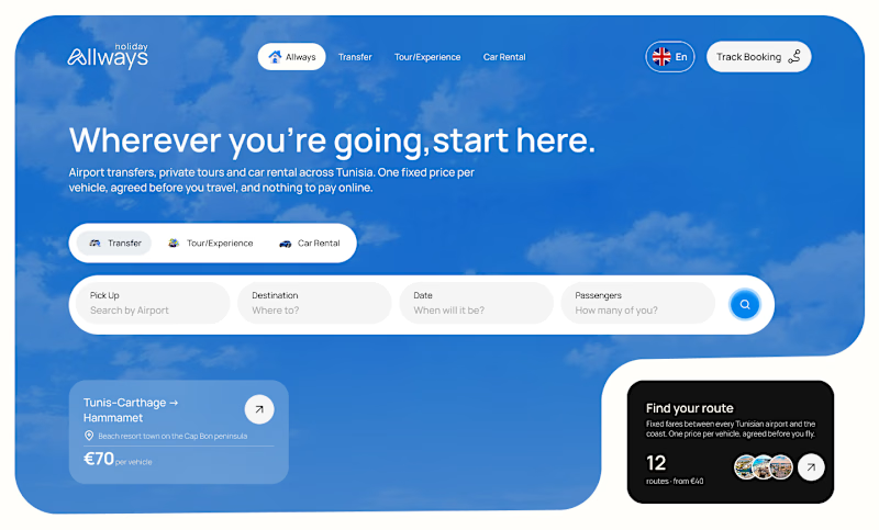
I missed an important detail in th first design direction, and the client rejected it.
After revisiting the feedback, I came up with another directiona nd it got approved
Both designs serve the same product, which one do you think got accepted for a web application?
Direction 1
Direction 2
9 voted
69%
4 voted
31%
13 votes
Closed

Dir 2 for sure!

Working on a Contra project - which one is your go to?
90 voted
52%
82 voted
48%
172 votes
Closed

I will go for A - Spiral