The network for creativity
Join 1.25M professional creatives like you
Connect with clients, get discovered, and run your business 100% commission-free
Creatives on Contra have earned over $150M and we are just getting started
Back to feedPost
Another Detail from Lumen Finance Dashboard
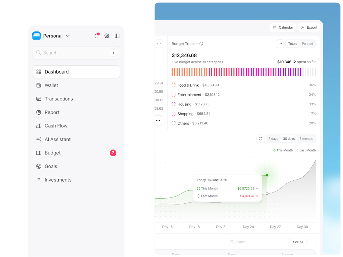
Really clean execution. The budget tracker visualization makes the spending distribution instantly scannable. Did you test different color densities for accessibility?
Thank you! 🙌
Yes, I tested different color densities to keep it clear and accessible, not relying on color alone but also labels and percentages.
However, I did use slightly similar tones for yellow and red, so they can look a bit alike — something I’m considering refining further.
Love that you’re not relying on color alone — labels + percentages make a big difference. For the yellow/red similarity, maybe increasing contrast or slightly shifting saturation could help differentiate them without breaking the visual harmony.
Hahaha thank you ciro!
The network for creativity
Join 1.25M professional creatives like you
Connect with clients, get discovered, and run your business 100% commission-free
Creatives on Contra have earned over $150M and we are just getting started
Related posts
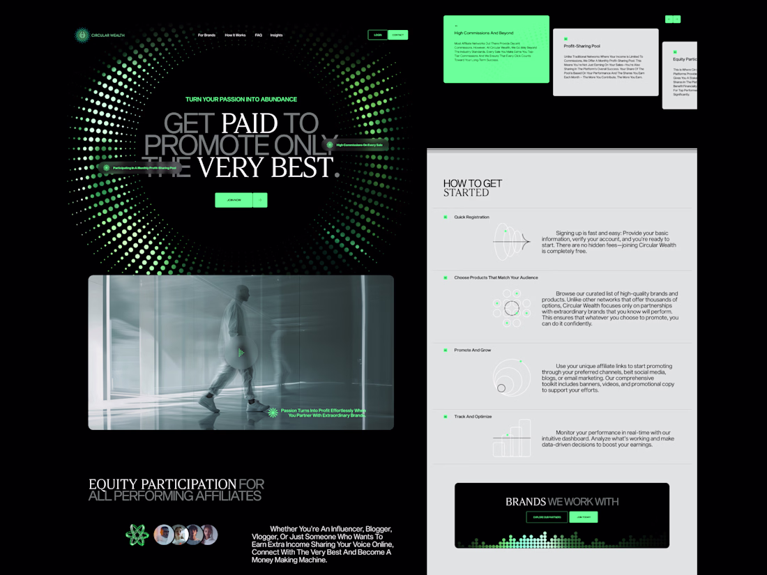
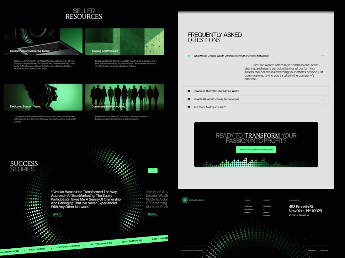
Homepage designed for good folks at Circular Wealth.
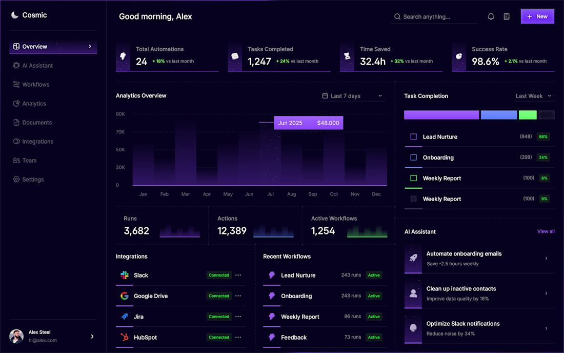
Cosmic - Dashboard
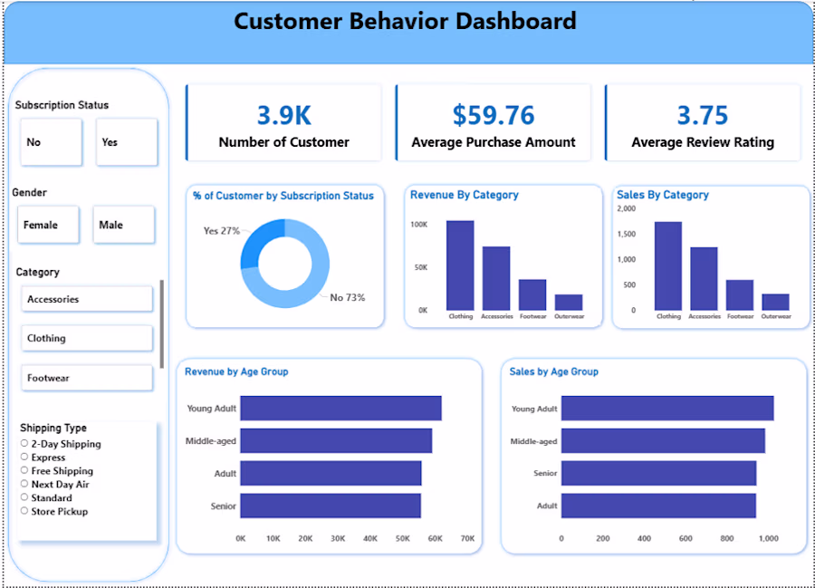
Built a Customer Behavior Dashboard analyzing 3.9K customers, tracking average purchase amount, review ratings, revenue by category, and sales by age group. Created using Power BI with interactive filters for gender, category, and shipping type. This project demonstrates end-to-end data analytics from raw data to business insights.
Challenges
View allTrending
Claude
Claude has entered the design space. How are you using Claude Design?
Contra University
Learn from expert creatives how to earn more using next-gen AI tools.
MagicPath
The canvas is infinite, and exploration is becoming the workflow. How are you using MagicPath?
creativeaiflow
Creative AI workflows are evolving. What tools do you use, and what are their strengths and weaknesses?
freelancerlife
Freelancer life is wins, pivots, and everything in between. What’s yours right now?