The network for creativity
Join 1.25M professional creatives like you
Connect with clients, get discovered, and run your business 100% commission-free
Creatives on Contra have earned over $150M and we are just getting started
Back to feedPost



Thanks! <3


Awesome!


Good job!


Amazing work👏🔥🔥

Sick 🔥

lovely work ,Filip 👍

Stunning!

Awesome work 🎉

This looks so beautiful
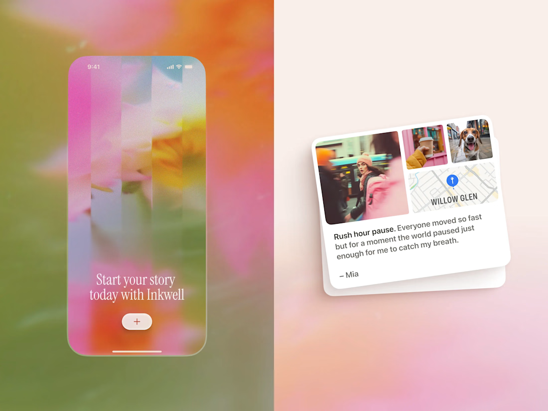
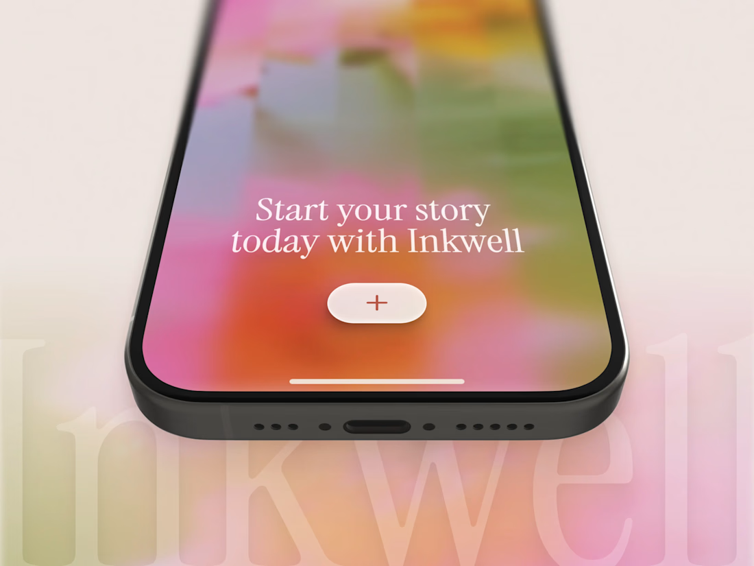
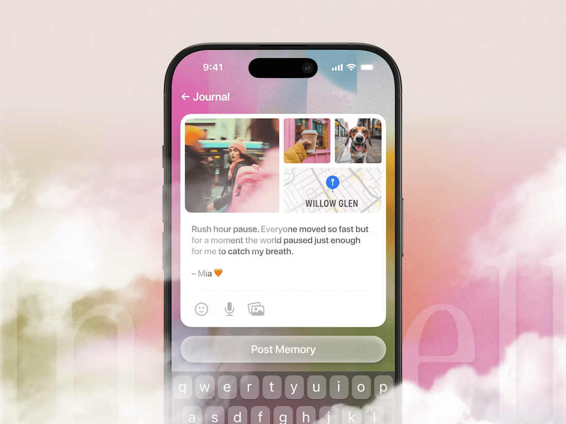
Everything about this design is so perfect. From the mockup to the image the color pallet. I love it!


Vibrant and colorful! That's gives me spring vibes!


I love the colors on this😍

Cool theme..

Good WOrk

Your mindset is your success.


So nice 😍


great work!

Looks awesome

Love the pastel vibe going on


nice work

Good job
THANKSSSS FOR ALL THE SWEET COMMENTS, YOU GUYS ARE THE BEST 🫶

Great design!

Looks amazing

colors are 🌸

Love the concept and colors!

Those onboarding screens look so inviting :🧠

I think colorful look is a great match for this one!

The network for creativity
Join 1.25M professional creatives like you
Connect with clients, get discovered, and run your business 100% commission-free
Creatives on Contra have earned over $150M and we are just getting started
Challenges
View all


Related posts


🎴 TASTY TEST 06/30: Which travel discovery experience would you choose?
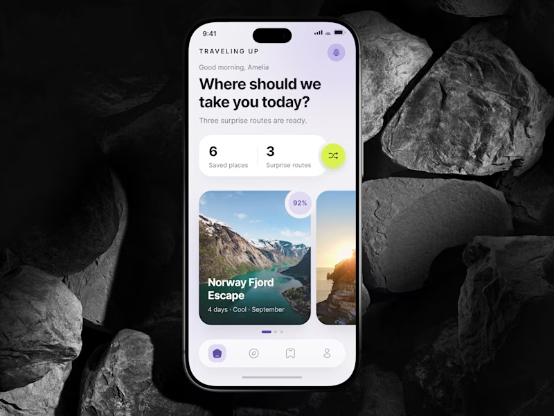
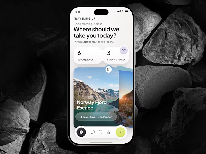
Traveling Up is probably my first mobile concept outside client work in almost three years. It was inspired by a trip where not knowing the destination was part of the fun.
Same app. Same destination. Two ways to discover it.
🤍 A Clean Carousel
Calmer, lighter, more familiar.
💚 B Immersive Deck
Bigger imagery, stronger overlap, more tactile navigation.
Which one makes you want to swipe and see where the app takes you next?
A or B? 👇
#MobileAppDesign #TravelApp #MobileUX #UIDesign #ProductDesign #AsolDesign
23 voted
49%
24 voted
51%
47 votes
Closed


A look at the identity I’ve been working on for Sync, a car rental platform in Greece.
You pick the car you want and a local provider brings it to you. Pretty good starting point.
The goal was to give them a brand that could sit comfortably next to the big rental companies and still feel like people you’d actually want to rent from.
I kept their pink and built the layouts around a shape inspired by a car’s side mirror with real cars and Greek scenery inside it.
Big Greek headlines, plenty of space and a system their team can keep easily.

Impressive work, colors are great in use.

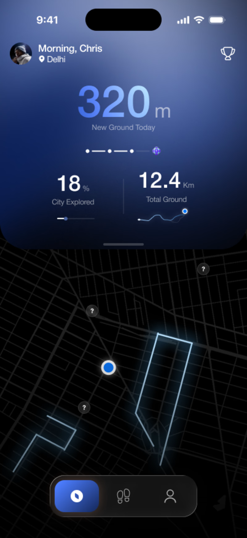
App design for an exploration app. 2 options, because minor decisions make the biggest impact.
7 voted
50%
7 voted
50%
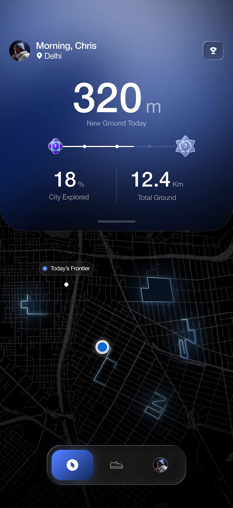
14 votes
Closed