The network for creativity
Join 1.25M professional creatives like you
Connect with clients, get discovered, and run your business 100% commission-free
Creatives on Contra have earned over $150M and we are just getting started
Back to feedPost
Taste Test
Exploring letters “oo” and Infinity concept for a logo
Which one do you like?
2 voted
14%
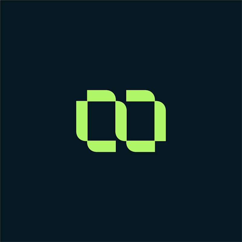
12 voted
86%
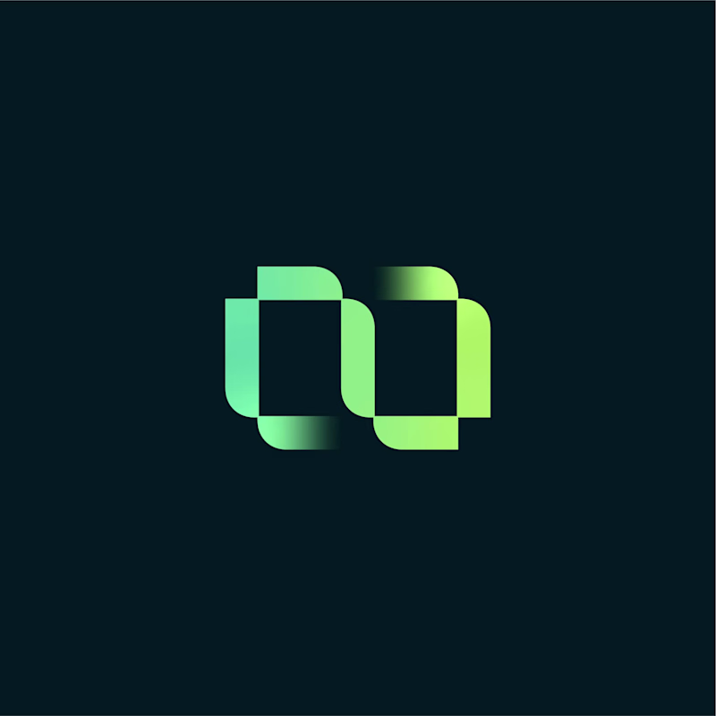
14 votes
Closed
The gradient infinity makes sense alot!
Love this!
Thanks!
Gradient for this one! 👍
Thanks Akin!
The gradient infinity is perhaps giving more character depth to the letter "OO" and I think the gradient infinity concept is more accurate for infinity sign.
Thanks for detailed feedback! I really appreciate it.
You're welcome!
nice
Thanks!
Thank you so much! Glad to hear from you.
The network for creativity
Join 1.25M professional creatives like you
Connect with clients, get discovered, and run your business 100% commission-free
Creatives on Contra have earned over $150M and we are just getting started
Related posts
🙌 Creative Direction for FamilyCall brand
Including Framer website. Check it out 🚀
Great Design
https://www.instagram.com/p/DYhftS9E2iR/
One logo that becomes many. That was the intention behind Warwick Botanical.
The mark is pulled directly from the organic pattern woven throughout the brand. That same shape then splits into color coded sublogos for each area of the park. Tropical House, Fern Grotto, Kids Zone, Rose Garden. Same system, different personality for each space.
When a brand is built right it grows with the place it lives in.
Great!
Logo design is easily my favourite of any brand project. It's also incredibly important. It sets the tone for everything that comes after.
Every project goes through heavy iteration.
Moodboards, layouts, type, web. But the logo stage is where the identity finds its foundation.
Energy Central was a blast.
Perfect!
Trending
Claude
Claude has entered the design space. How are you using Claude Design?
Contra University
Learn from expert creatives how to earn more using next-gen AI tools.
creativeaiflow
Creative AI workflows are evolving. What tools do you use, and what are their strengths and weaknesses?
portfolioreview
The best portfolios tell a story, not just show a grid. Share yours for feedback.
freelancerlife
Freelancer life is wins, pivots, and everything in between. What’s yours right now?