The network for creativity
Join 1.25M professional creatives like you
Connect with clients, get discovered, and run your business 100% commission-free
Creatives on Contra have earned over $150M and we are just getting started
Back to feedPost



The network for creativity
Join 1.25M professional creatives like you
Connect with clients, get discovered, and run your business 100% commission-free
Creatives on Contra have earned over $150M and we are just getting started







Related posts

Recent work on MAE - Visual identity


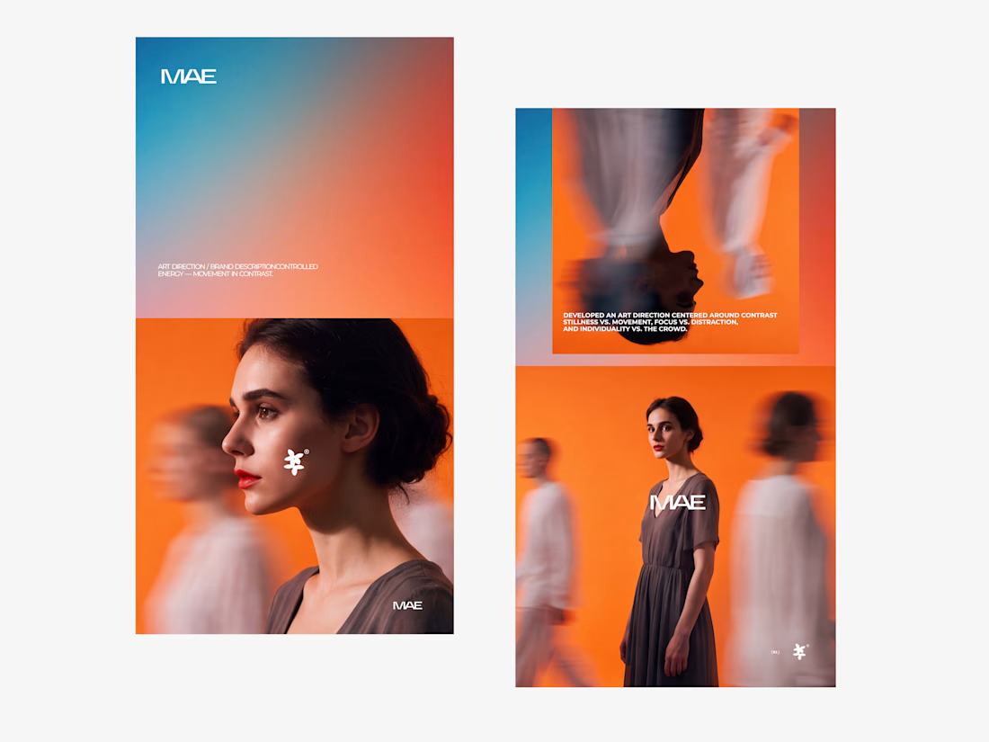

The motion blur on the figures gives the orange-to-blue gradient a reason to be there, and the small star mark stays readable on both the cheek and the shirt. Did the star come first as a standalone mark, or did it grow out of the photography direction?

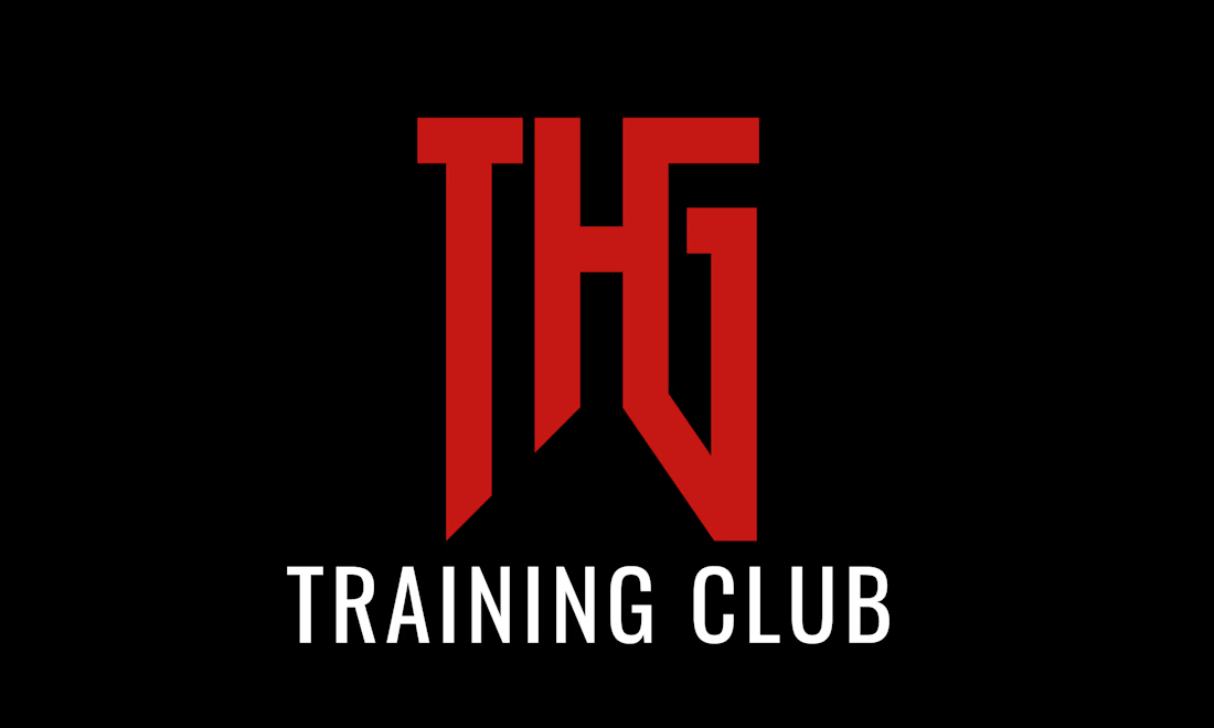
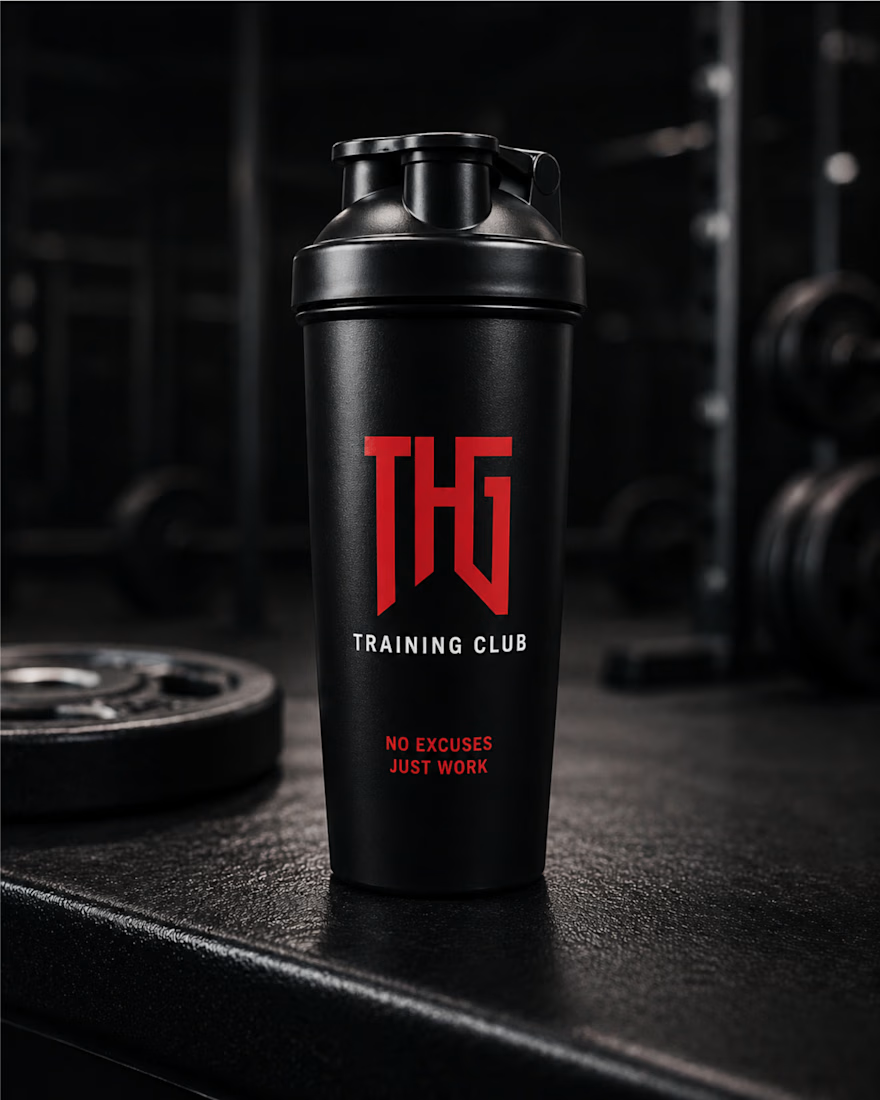
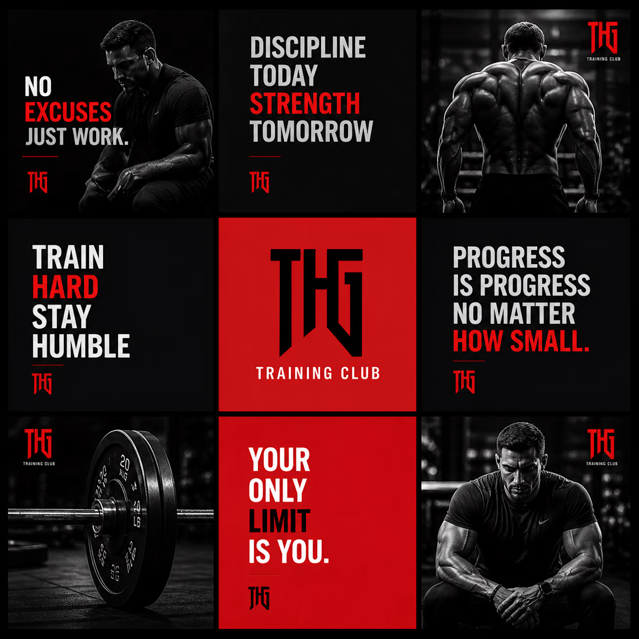
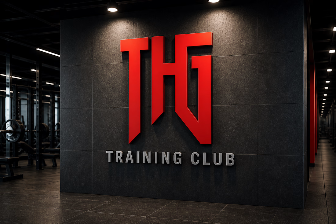
THG Training Club – Fitness Brand Identity & Mockup Design
A bold and modern fitness brand identity design created for THG Training Club. This project focuses on building a strong, powerful visual presence that reflects discipline, strength, and high-performance training culture.
The design revolves around a minimal yet aggressive aesthetic, using a dark theme combined with a striking red logo to create a premium and impactful look. The typography and visual hierarchy are crafted to enhance brand recognition while maintaining clarity across different applications.


whos the target member for THG, serious lifters or more of a general gym crowd

The first 30 seconds can decide whether viewers stay or click away. 🎬
A strong hook, tight pacing, and strategic visuals can help you keep viewers watching longer instead of losing them early.
I edit long-form videos to capture attention, maintain viewer engagement, and help creators get more value from every video they publish.
Your content deserves more than just clean cuts. It deserves editing with a purpose.
Need an editor who understands audience retention? Let’s talk.
#YouTubeEditing #VideoEditing #AudienceRetention #ContentCreators #VideoEditor


The emphasis on the first 30 seconds is critical because analytics often show a steep drop off right after the intro. Tight pacing in that window helps prevent the algorithm from flagging your content as low retention.