The network for creativity
Join 1.25M professional creatives like you
Connect with clients, get discovered, and run your business 100% commission-free
Creatives on Contra have earned over $150M and we are just getting started
Back to feedPost

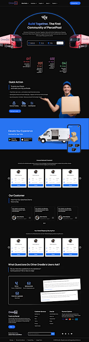
This project is a landing page design for DrexBe, a parcel and shipping platform.
The goal of this website is to help people send parcels easily and safely. Users can search routes, check rates, track parcels, and connect with travelers.
I used a dark theme with blue highlights to give a modern and strong look. I designed clear sections like features, quick actions, customer reviews, and app download.
The design is simple, easy to use, and user-friendly. It helps users understand the service quickly and take action fast.



The blue and black combo works nicely here, Rohit.
The network for creativity
Join 1.25M professional creatives like you
Connect with clients, get discovered, and run your business 100% commission-free
Creatives on Contra have earned over $150M and we are just getting started

Challenges
View all


Related posts

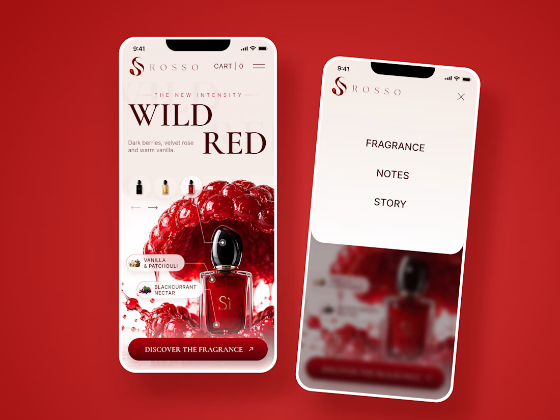
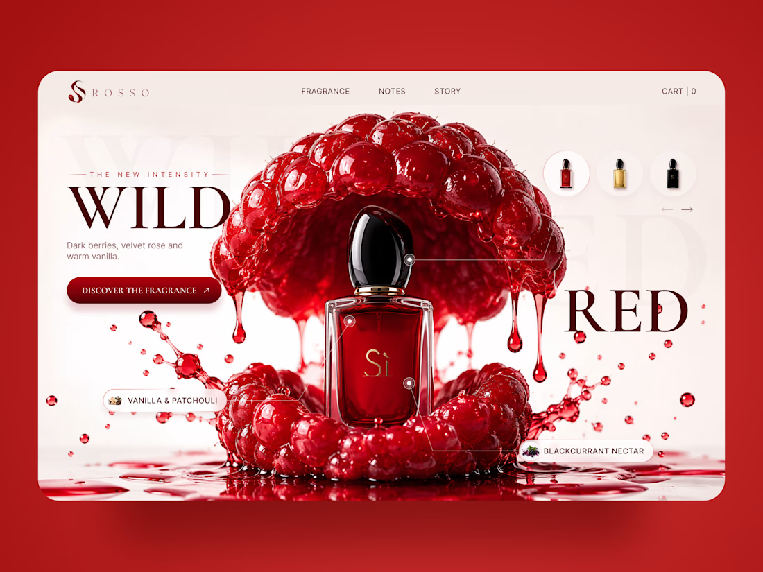
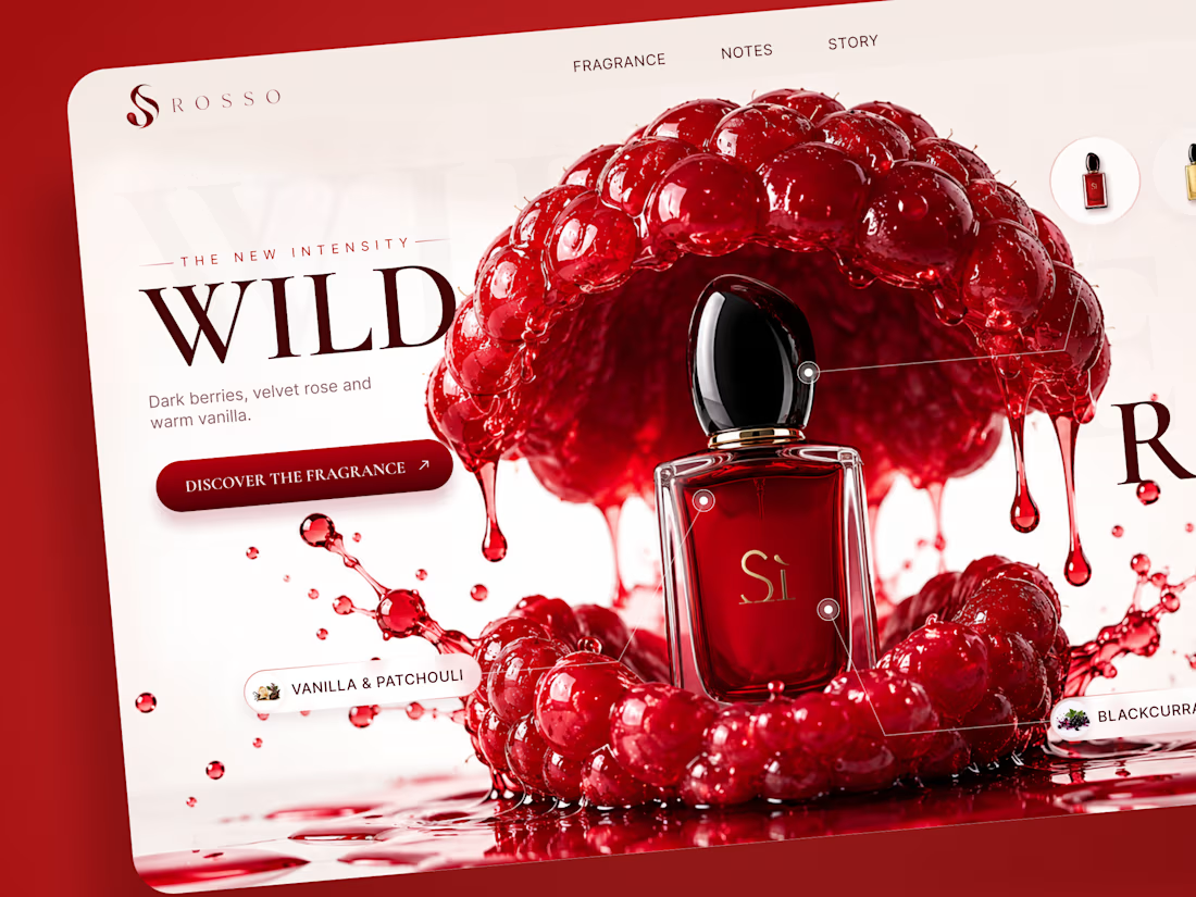
ROSSO — Wild Red Perfume Landing Page 🍒❤️
A bold fragrance landing page concept inspired by rich red berries, sensual notes, and luxury perfume aesthetics
The design combines deep red tones, oversized editorial typography, glossy fruit visuals, and elegant product presentation to create a rich and memorable experience
Special attention was given to:
• Bold product-first composition
• Rich red color palette
• Elegant editorial typography
• Fragrance notes and ingredient highlights
• Product variations and navigation
• Responsive mobile experience
The result is a vibrant, luxurious landing page that brings the fragrance to life through color, texture, and strong visual storytelling ✨
Looking to create a standout website for a beauty, fragrance, or luxury brand? Let’s connect


Another exciting project wrapped up! ✨
This time, we worked on Olympian by Design – a premium one-on-one coaching brand focused on personal transformation and high performance.
Our goal was to create more than just a beautiful website. We wanted the entire client journey to feel connected – from the first landing page visit to purchasing the program and going through the coaching experience.
We designed three custom pages from scratch, built them in Kajabi, created a branded member area, set up the coaching program, and refreshed the app with new onboarding screens.
All wrapped in a bold, dark, luxury-inspired design.
Because great design shouldn't stop at checkout. It should follow the client through the entire experience.

Great project

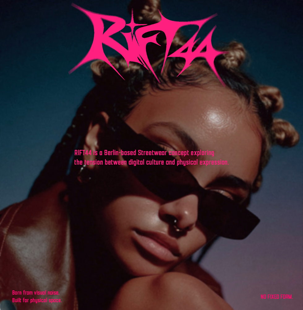
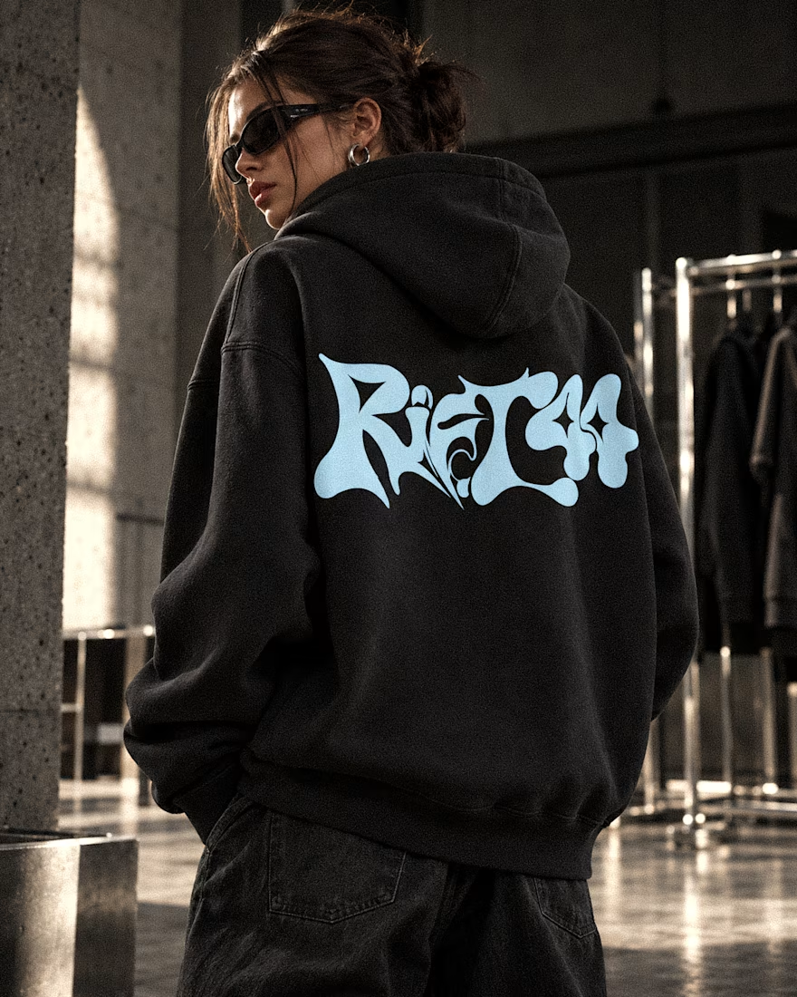
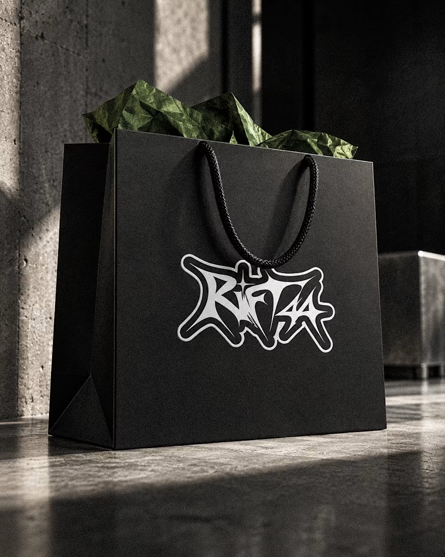
RIFT44 — Streetwear Visual Identity
A self-initiated identity exploring custom lettering, underground fashion culture and bold physical applications.
Visual Identity · Art Direction · Campaign Design



Beautifully done! 🌟🌟

