The network for creativity
Join 1.25M professional creatives like you
Connect with clients, get discovered, and run your business 100% commission-free
Creatives on Contra have earned over $150M and we are just getting started
Back to feedPost
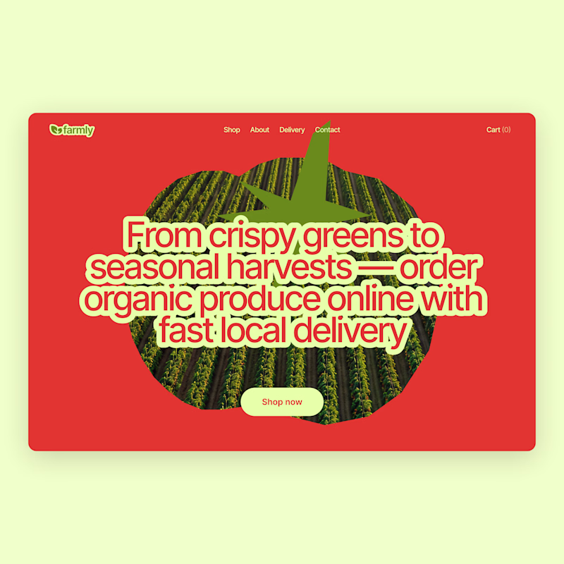
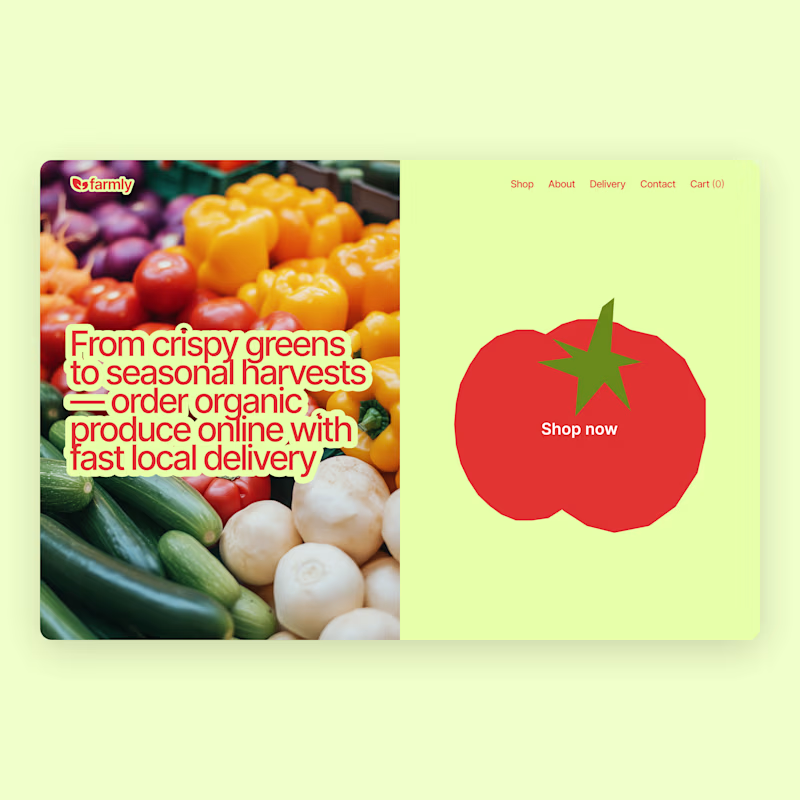
Taste Test


I already shared the first concept a few days ago, but I couldn’t stop exploring 😅
So here’s an alternative direction.
Which one would you pick?
Vote below 👇

52 votes
Ends in 1d

I chose B but A is better for readability

I like design B more, but I think design A gets more clicks on the shop now button

Wow, that's amazing! The overall design looks clean, modern, and very well thought out.

I think Option A works better

Amazing work!

both look good tbh but A has it for me

The use of colors here is so lovely!


Very nice concepts! I personally like option A more, looks sleek

Option A has such a strong character! What made you want to explore the split-screen Option B as an alternative?

Option A is such fun!

Love both! But option 2 looks stronger 👍

I think I like option B

The red version feels way more "act now" urgent for a grocery CTA, but the green one reads fresher and closer to the actual produce. Have you run these past real users yet, or is this still a gut call between the two?



Voted Option A. It's the font size for me.

Oleksa Both are very nice

I like option B better
It's clear

I'd choose the right concept. The bold color contrast instantly grabs attention, while the oversized produce visual creates a stronger focal point. What often gets underestimated is that in eCommerce, a clear visual hierarchy can influence engagement before users even start...

Option A, because main typography and CTA is clear. and color scheme is looking cool too

I would pick the direction that makes the primary action feel the most obvious. In e-commerce, the strongest design is usually the one that removes the most decision friction.

The network for creativity
Join 1.25M professional creatives like you
Connect with clients, get discovered, and run your business 100% commission-free
Creatives on Contra have earned over $150M and we are just getting started
Related posts

moonmoon.digital was built fully in Framer and Spline, and it's still one of my favorite projects from last year. It recently went through a major update, so it's definitely worth visiting. 😊



Amazing 👏

✂️ 𝐈 𝐠𝐚𝐯𝐞 𝐚 𝐥𝐨𝐜𝐚𝐥 𝐬𝐚𝐥𝐨𝐧 𝐰𝐡𝐚𝐭 𝐢𝐭 𝐧𝐞𝐯𝐞𝐫 𝐡𝐚𝐝 — 𝐚 𝐰𝐞𝐛𝐬𝐢𝐭𝐞, 𝐚 𝐛𝐨𝐨𝐤𝐢𝐧𝐠 𝐬𝐲𝐬𝐭𝐞𝐦, 𝐚𝐧𝐝 𝐚 𝐛𝐮𝐬𝐢𝐧𝐞𝐬𝐬 𝐭𝐡𝐚𝐭 𝐫𝐮𝐧𝐬 𝐨𝐧 𝐚𝐮𝐭𝐨𝐩𝐢𝐥𝐨𝐭.
🫡Not a concept. Not a demo. A business, transformed.🫡
🤑A real, unisex family salon in Hanumanthanagar, Bengaluru — previously
running on nothing but a Google Maps listing and a printed price
board — now has a complete, automated business platform.
🎥 Watch the full before/after walkthrough: https://www.loom.com/share/ba397e8d9bf140799f8369b4c84795b4
➡️🔗 Live site: https://blackandwhitesalon.base44.app/
➡️🔐 Admin portal: https://blackandwhitesalon.base44.app/admin/login
Here's everything built in:
👤 CUSTOMER PORTAL
Real-time service booking — pick a package, choose a stylist, select a live time slot.
Auto-filled details for returning customers
Pay online (Card/PayPal/Stripe) or pay at the salon
Digital loyalty stamp card — 10 visits = 1 free service, fully automatic
Referral system — share your link, both sides get an automatic discount
Review your favorite stylist directly from your dashboard
AI chat agent — answers real pricing & availability questions instantly, 24/7
✂️ STAFF PORTAL
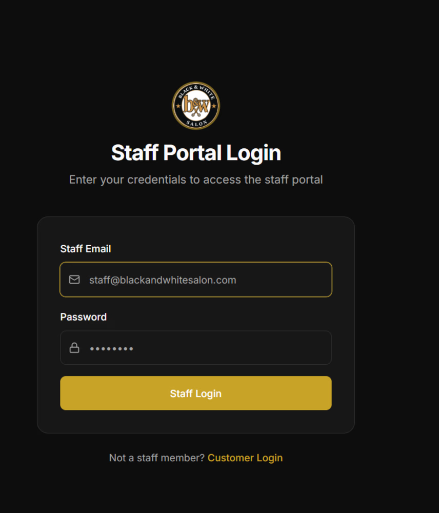
Separate secure staff login — no self-registration, owner-assigned only
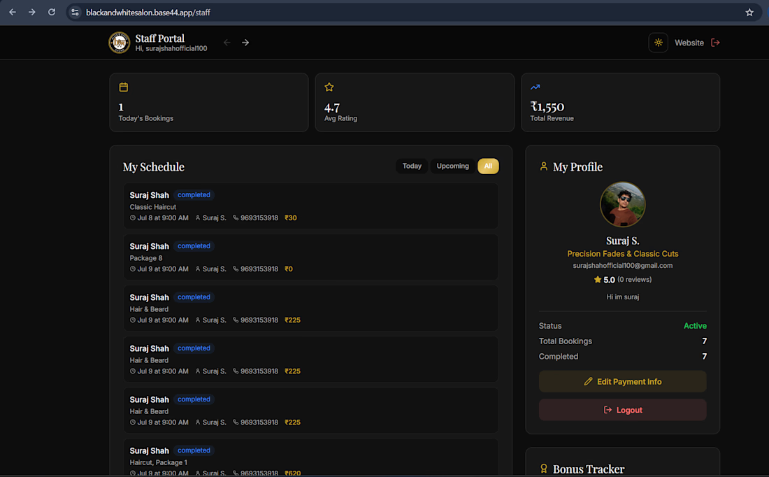
Personal schedule & booking view
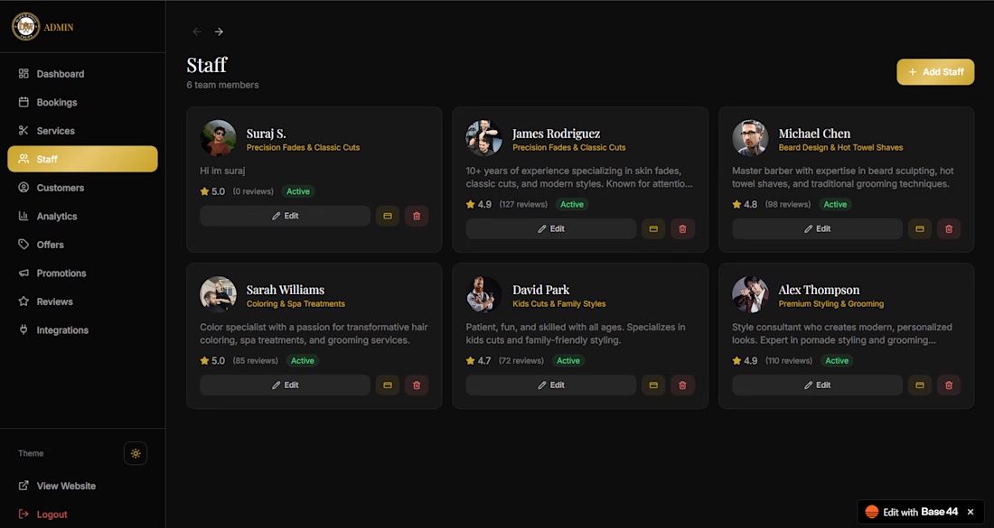
Real performance stats — ratings & reviews from real customers
Bonus tracker tied to performance
Upload bank details / payment QR for seamless payouts
📊 ADMIN DASHBOARD
Real-time business overview — bookings, revenue, customer count
Full booking management across all staff — mark completed → auto-triggers loyalty stamp
Services & pricing control — updates reflect instantly site-wide
Staff management — add staff, assign logins, view payment details
Customer insights — lifetime value, favorite stylist, visit frequency, overdue alerts
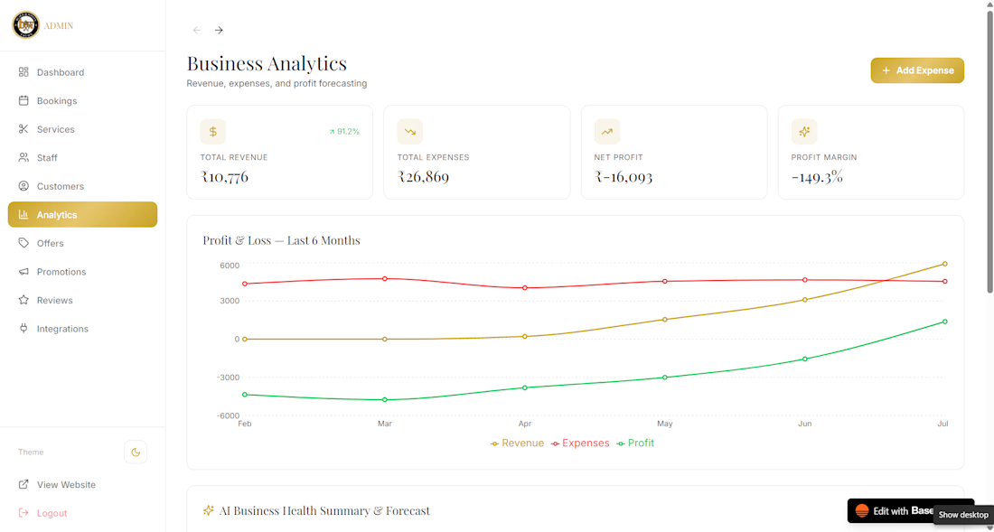
Business analytics — real profit/loss tracking + AI-powered revenue forecasting
Offers & discount engine — manual promos + automatic welcome/referral discounts
Partners page — animated showcase, fully admin-managed
⚙️ THE AUTOMATION
✅ Instant booking confirmation emails
✅ AI Superagent for FAQs & live pricing
✅ Auto-applied loyalty stamps & rewards
✅ Auto-applied referral discounts
✅ Real-time analytics + profit/loss forecasting
From a shop with zero online booking to a fully automated digital
business — built entirely with Base44.
#GiveItAGlow @Base44 #BuildInPublic #AIAutomation #SmallBusiness #LocalBusiness #SalonSoftware #Bengaluru #WebDesign @Contra HQ
AI Automationbase44giveitaglowchallengebase44expertContraBusiness Workflow AutomationWeb DesignBase44


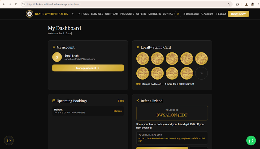
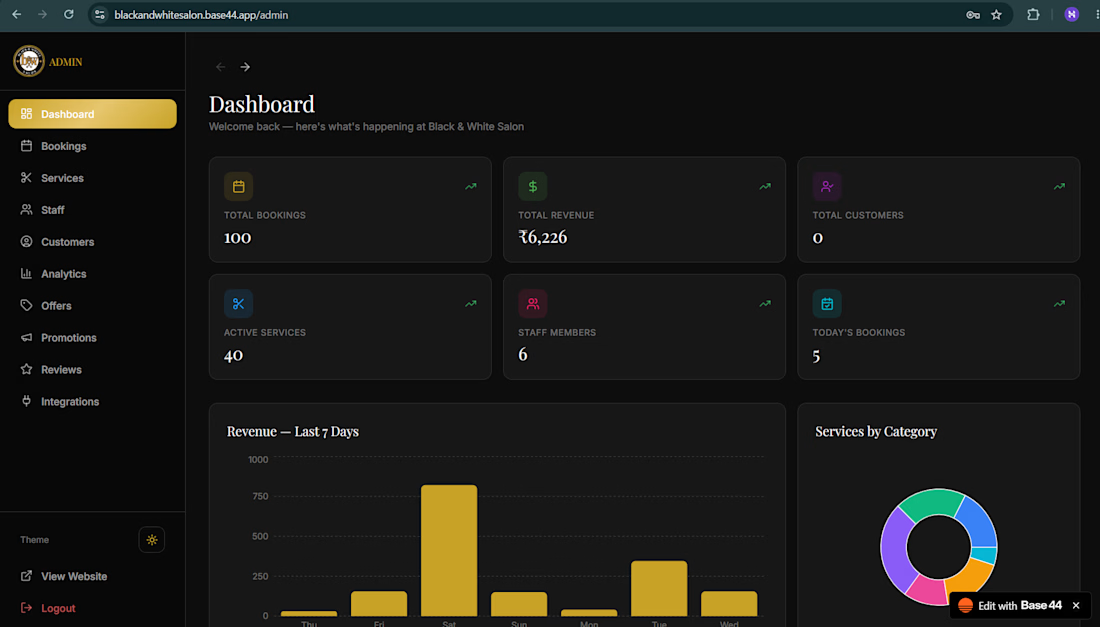
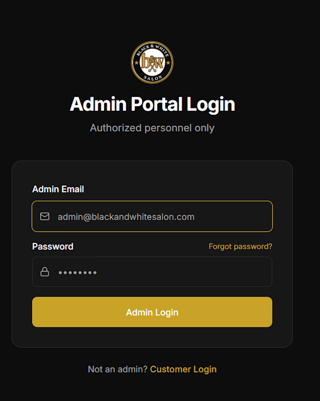
🔐 Secure, role-locked admin access — only the owner can manage the business.

✨ For months, something has been quietly taking shape...
Not just a character.
A companion.
A story waiting to be told.
Shaped by hundreds of tiny creative decisions.
This is just the beginning.
👀 The reveal is closer than you think.
💛 Every story begins with a choice.
❓ Who do you think is waiting behind the curtain?
#envatochallenge

Challenges
View all



Trending

Claude
Claude has entered the design space. How are you using Claude Design?

Contra University
Learn from expert creatives how to earn more using next-gen AI tools.
fifaworldcup2026
The World Cup is here and the whole world's watching. How are you designing for the world stage?
creativeaiflow
Creative AI workflows are evolving. What tools do you use, and what are their strengths and weaknesses?
freelancerlife
Freelancer life is wins, pivots, and everything in between. What’s yours right now?