The network for creativity
Join 1.25M professional creatives like you
Connect with clients, get discovered, and run your business 100% commission-free
Creatives on Contra have earned over $150M and we are just getting started
Back to feedPost
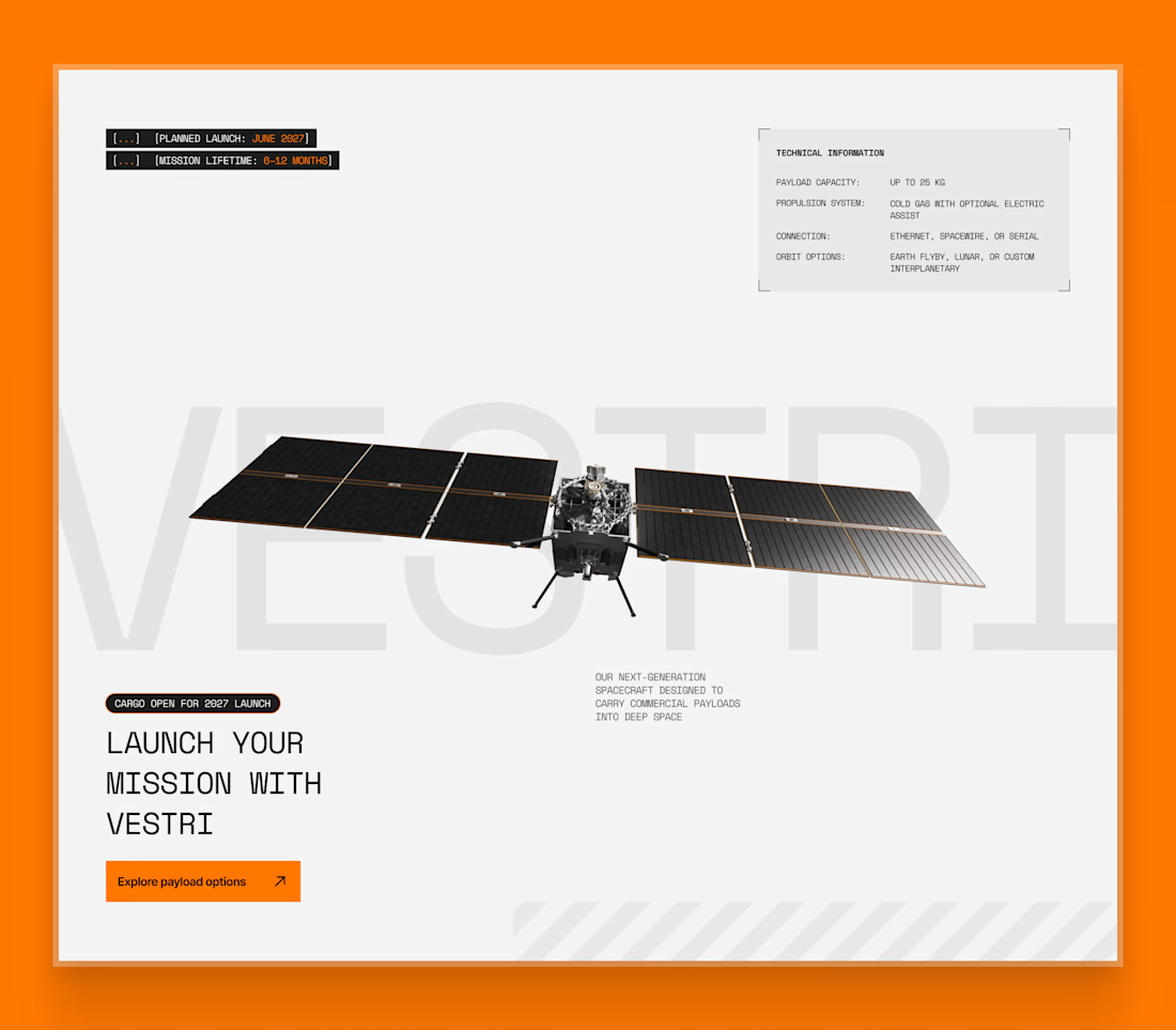
Space systems website visual exploration
This is a visual exploration for a space systems website, focused on how complex offerings are introduced and framed.
A common issue with sites like this is that everything is technically impressive, but it takes too long to understand what’s actually available, who it’s for, and what to do next. In real buying situations, people want to understand relevance quickly before committing time.
This block explores a simpler approach. Set the context, show readiness, surface key constraints, and guide the right visitors toward a clear next step, without overwhelming them with specs upfront.
The goal here was clarity first, with technical depth revealed progressively.
Looks Amazing
Thank you!
The network for creativity
Join 1.25M professional creatives like you
Connect with clients, get discovered, and run your business 100% commission-free
Creatives on Contra have earned over $150M and we are just getting started
Related posts
Can't wait for you to release this
New case study: how we built Marby, a real estate template, with AI agents and human taste. Figma for direction, Framer for the build, external agents for the heavy lifting, AI-driven SEO and AEO before launch.
The full breakdown, motion details and all ↓
Smooth
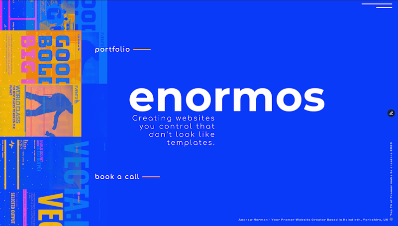
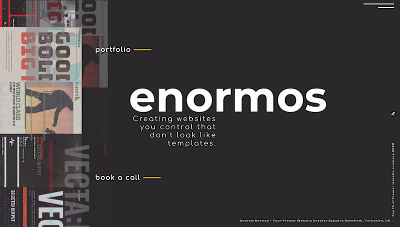
Voted Option 1. The blue makes the enormos wordmark pop way more, the dark version almost blends into itself. Portfolio sites need that first second of impact.
Trending
Claude
Claude has entered the design space. How are you using Claude Design?
Contra University
Learn from expert creatives how to earn more using next-gen AI tools.
fifaworldcup2026
The World Cup is here and the whole world's watching. How are you designing for the world stage?
creativeaiflow
Creative AI workflows are evolving. What tools do you use, and what are their strengths and weaknesses?
freelancerlife
Freelancer life is wins, pivots, and everything in between. What’s yours right now?
