The network for creativity
Join 1.25M professional creatives like you
Connect with clients, get discovered, and run your business 100% commission-free
Creatives on Contra have earned over $150M and we are just getting started


The network for creativity
Join 1.25M professional creatives like you
Connect with clients, get discovered, and run your business 100% commission-free
Creatives on Contra have earned over $150M and we are just getting started








Related posts

Designing a fragrance website with 2 sections that feels as premium as the product.
Built a fragrance experience where the product takes center stage.
I wanted the website to feel as refined as the fragrances themselves minimal layout, strong typography, immersive product visuals, and subtle interactions that make exploring each scent feel premium.
The goal wasn’t to fill the page with elements, but to give every product enough space to create its own presence.
Built with Next.js, with a focus on responsive design, smooth interactions, and a polished browsing experience.


The product imagery is doing most of the work here. Did you use art-directed mobile crops, or keep one image with a different object position? That can preserve label detail without loading the full desktop asset.

The best way to sell a breathwork studio is to let people breathe on the homepage.
SOLACE is a breathwork and sound bath studio. The hard part of selling it is that you can’t explain the feeling. You can only offer a taste of it.
So the design does that:
→ A practice you can try right now. A glowing circle expands and releases while you choose a rhythm: Box, 4-7-8, Coherent, or Wake. Before booking anything, you’ve already had a calm minute.
→ A journey instead of a menu. “Five movements. One return”: Arrive, Breathe, Resonate, Dissolve, Integrate. First-timers can see what a session feels like before they walk in.
→ The unspoken question, answered. The FAQ includes “I am not particularly spiritual. Can I still come?” Naming that doubt does more than any slogan.
→ Low risk to begin. Four experiences from $35, seats left on each session, and free cancellation up to 12 hours before.
The look is quiet: near-black, soft gold, and slow serif type.
When your product is a feeling, don’t describe it. Let people feel a little of it first.
What’s one thing a website could let you try that would make you trust it faster?
#BuildingInPublic #WebDesign #UXDesign #CreativeDirection #WellnessBranding


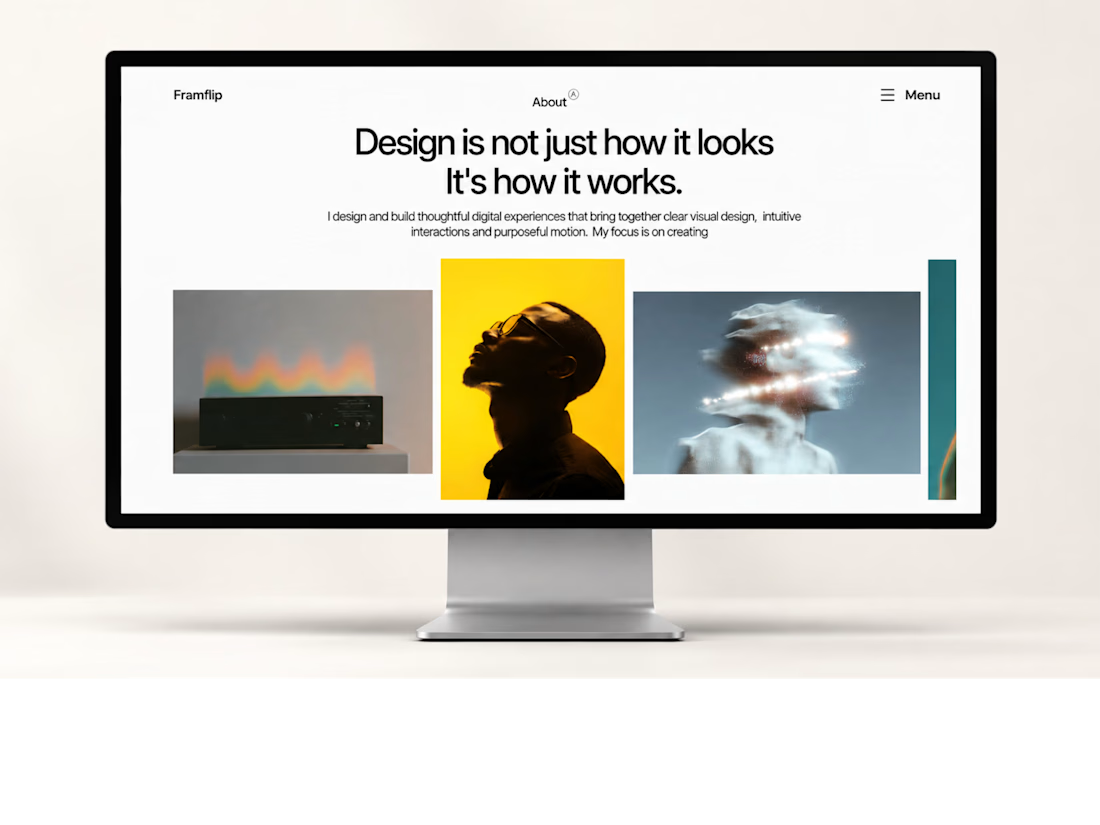
My first Framer template is live!
One step closer to building something great. ✨
#Framer #WebDesign


first templates are always the scariest to ship. curious how you decided what to leave out