
Hasnain Ali ✦
Framer Designer | SEO & AI Search Specialist
Ready for work
Hasnain is ready for their next project!

My New Design
5
70
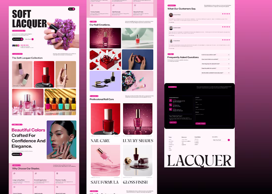
Soft Lacquer is a modern nail polish brand landing page designed to showcase premium nail shades with a clean and elegant user experience.
The goal of this project was to create a visually appealing beauty website that highlights product collections while maintaining a simple and intuitive layout.
Key Sections Included:
• Hero section with strong typography
• Nail polish collection showcase
• Brand storytelling section
• Benefits & product features
• Nail creations gallery
• Customer reviews and testimonials
• Frequently asked questions (FAQ)
• Contact section with form
• Custom 404 error page
Design Approach:
The design focuses on soft color palettes, high-quality product imagery, and balanced spacing to create a premium beauty brand feel.
Tools: Figma
1
0
38
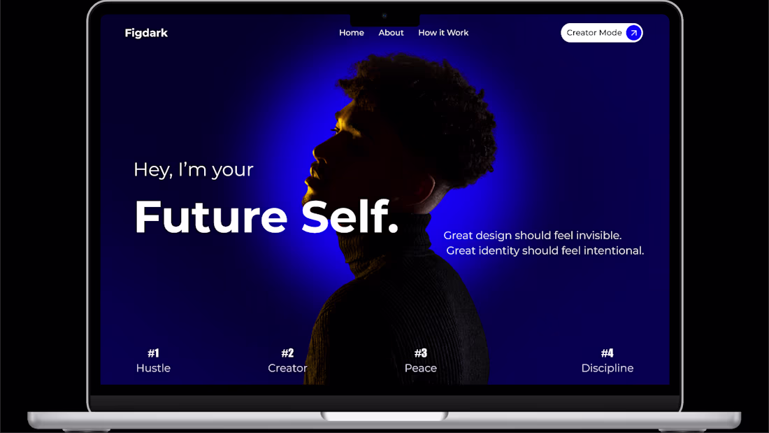
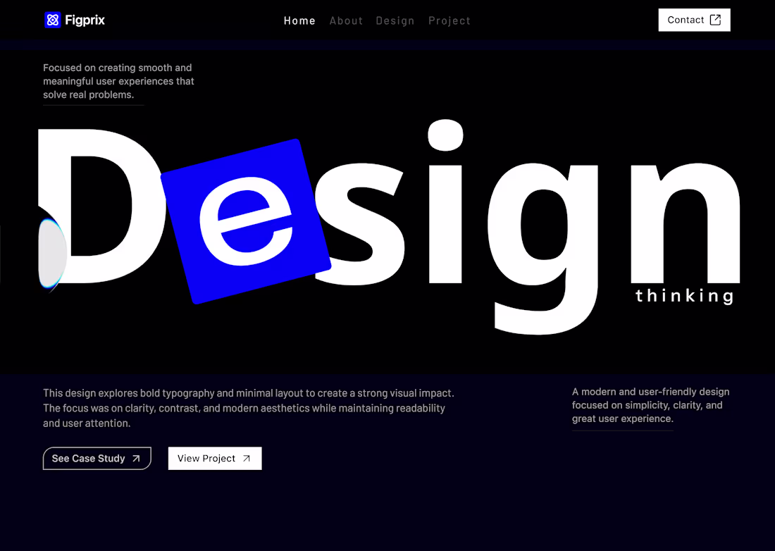
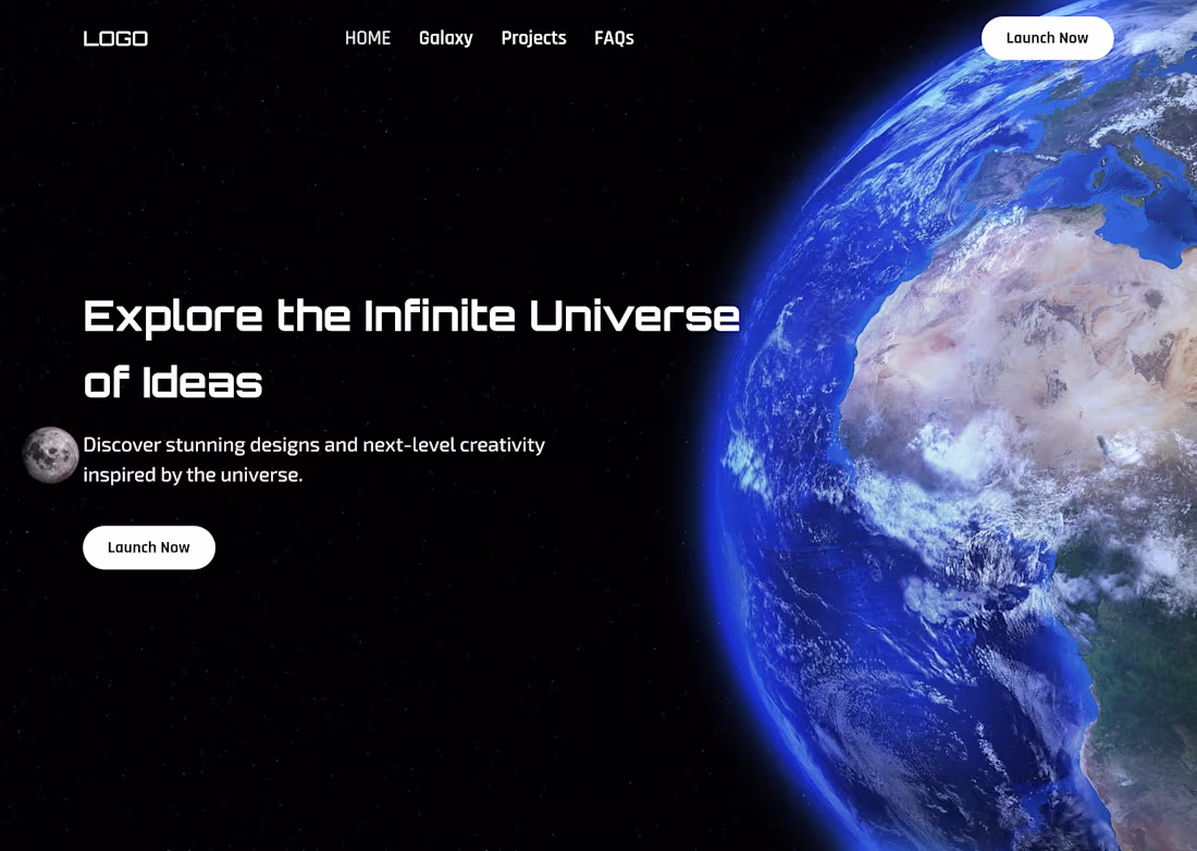
Just designed something new — an aesthetic dark-blue hero section.
Let me know your thoughts in the comments.
1
3
78
Designed this modern, high-conversion landing page for the Figma Makethon
Focused on clean layout, strong typography, and bold CTAs to create real impact.
What rating would you give this design out of 10 ? ⭐
2
2
88

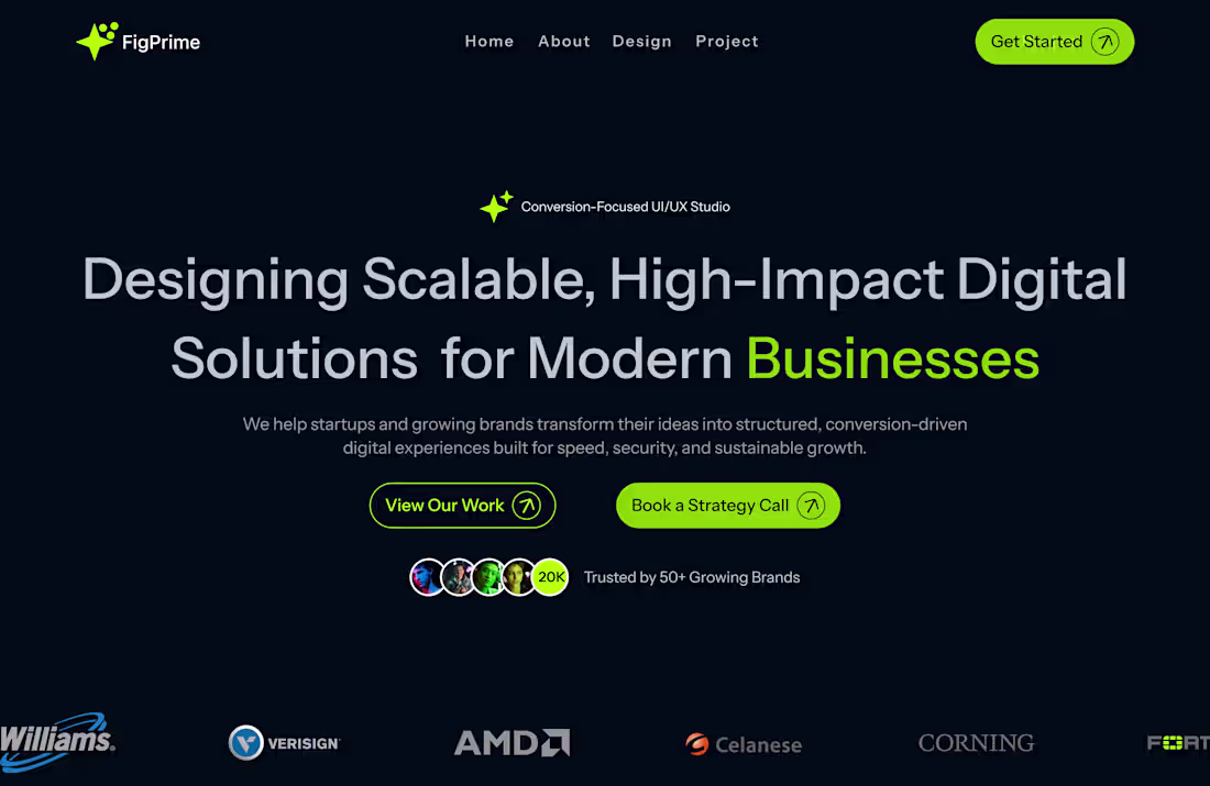
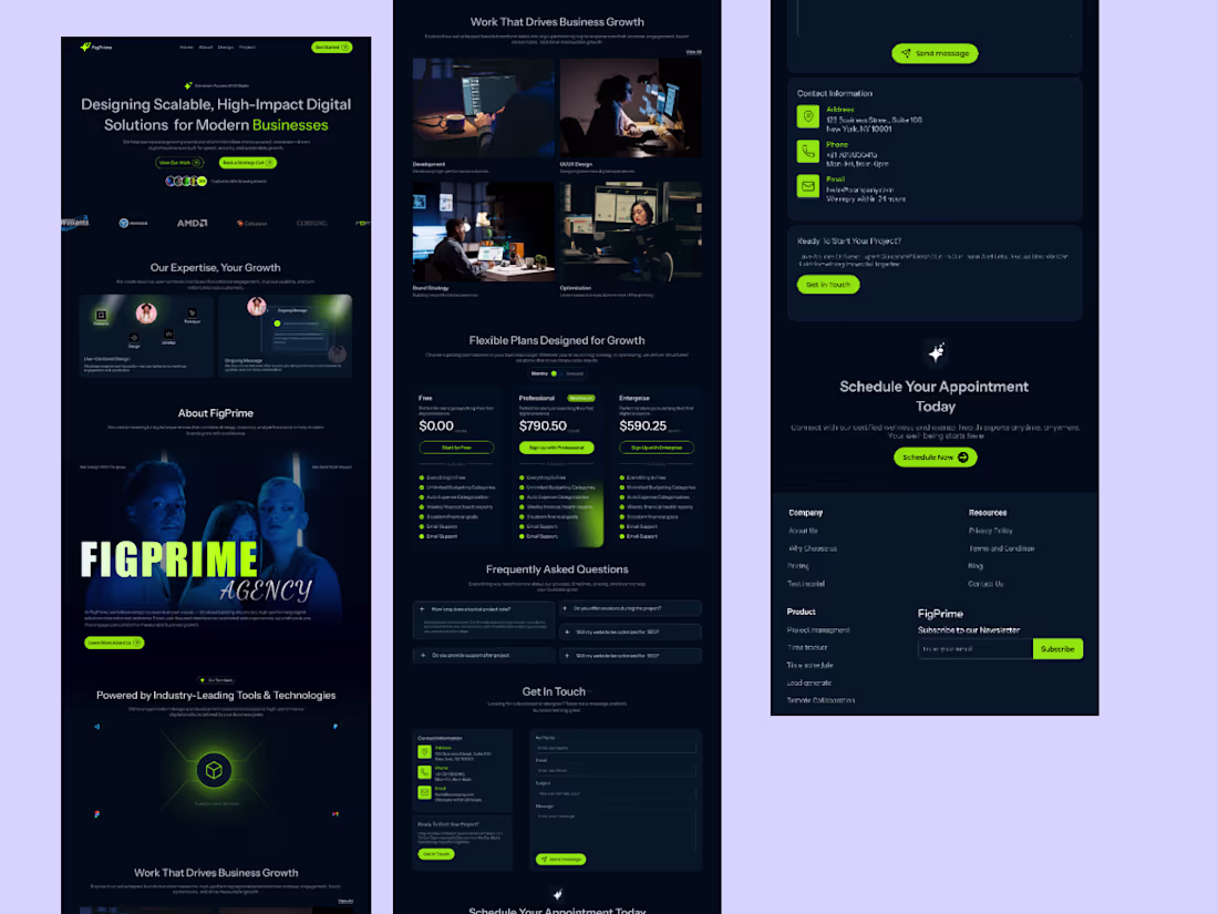
Just completed a full Agency Website UI/UX design built from scratch.
This project focuses on structured layout systems, conversion-driven sections, and modern dark UI aesthetics designed for performance and growth.
What I worked on:
• Hero with strong positioning
• Trust & social proof integration
• Feature storytelling
• Work showcase
• Strategic pricing structure
• FAQ & conversion-focused CTAs
Designed entirely in Figma with attention to hierarchy, spacing, and usability.
Open to feedback and collaboration.
3
6
106
New project completed: Agency Website UI/UX Design 🚀
Built with a focus on structure performance and conversion psychology.
Would love your feedback😊
1
1
73
Excited to submit my design for #figmamakeathon 💙
Let’s build the future of interaction.
2
3
301
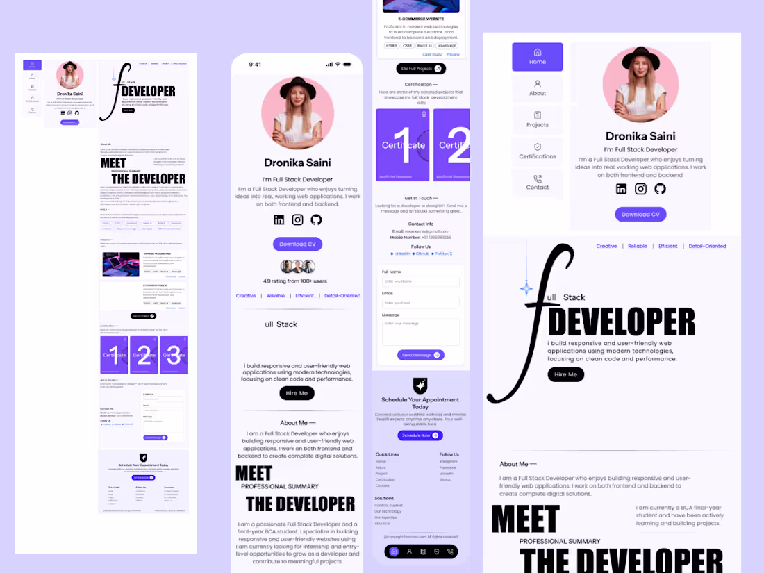
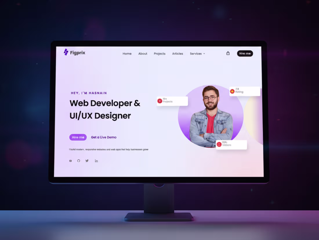
New Case Study 🚀 : I designed a modern and responsive Full Stack Developer Portfolio website focused on clean UI structured layout and professional branding.
This project includes:
• Sidebar based navigation
• Personal profile section with social links
• Download CV button
• Skills and certificates section
• Contact form UI
• Appointment scheduling section
• Clean typography and modern purple theme
• Mobile friendly responsive design
The goal of this project was to create a strong personal brand identity for developers who want a professional online presence.
Tools Used:
1. Figma for UI Design
2. Modern UI principles
3. Responsive Layout System
💯 Open to freelance and collaboration opportunities💯
5
3
92
Is this a 10/10 design? Let me know your rating! 😊
#DesignFeedback #RateMyDesign #CreativeWork #DesignInspiration #UIUXDesign #GraphicDesign #DesignerLife
0
63
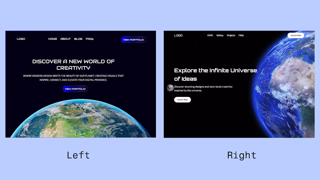
Which one looks better- Left & Right ?
2
2
107
Cosmic Design Experience: Futuristic Landing Page
1
9
Crypto Landing Page Design and Development in Framer
1
1
I will Design a Saas Website
1
4
Dear friend and fellow Contra users
Here are some of my premium design samples.
I want to clarify that I don’t use any scripts or AI tools like ChatGPT for my design posts everything is created by me.
I’m actively improving my skills and I will be sharing new designs daily.
Your support truly means a lot. You can also check out my Contra profile to see more of my work.
Thank you for being here!
2
3
226
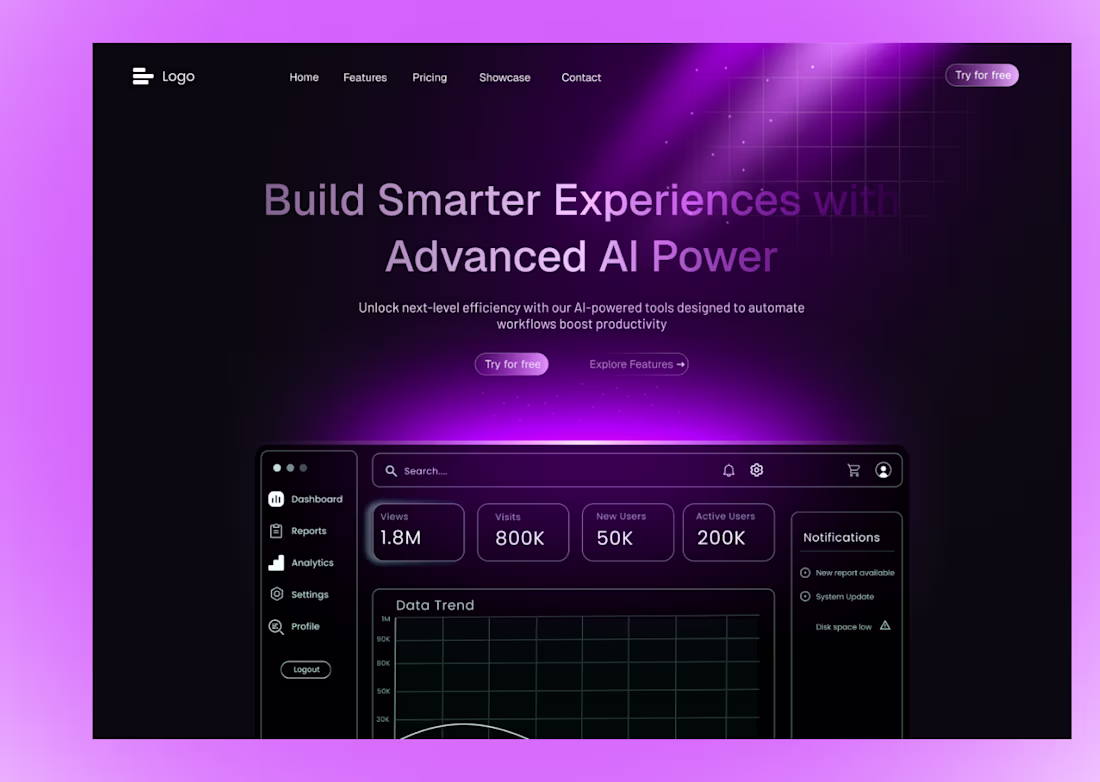
I design clean modern and high-impact UI/UX for websites and landing pages.
:Specialized in AI-themed designs smooth gradients and premium layouts built to convert.
If you want professional fast and visually powerful designs I’m here to deliver.😊 💯
2
3
221
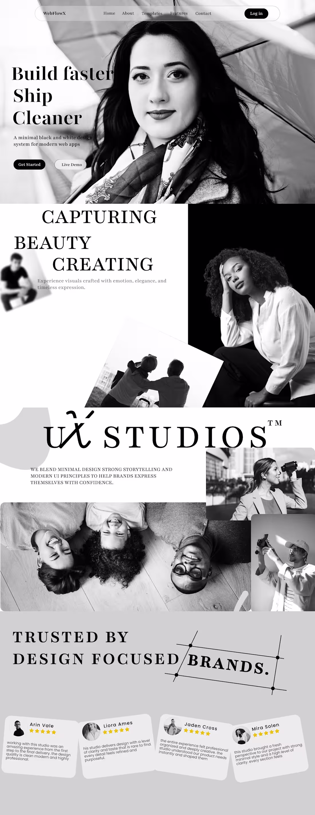
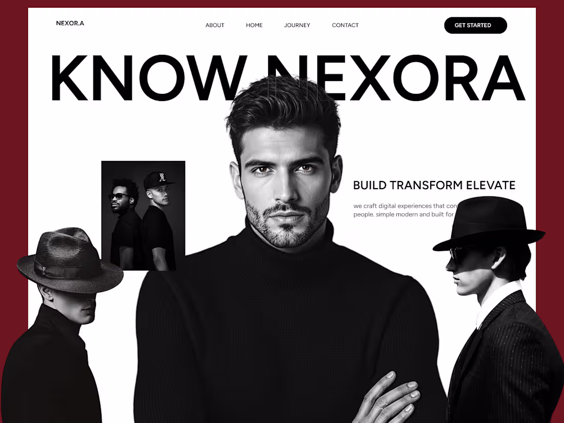
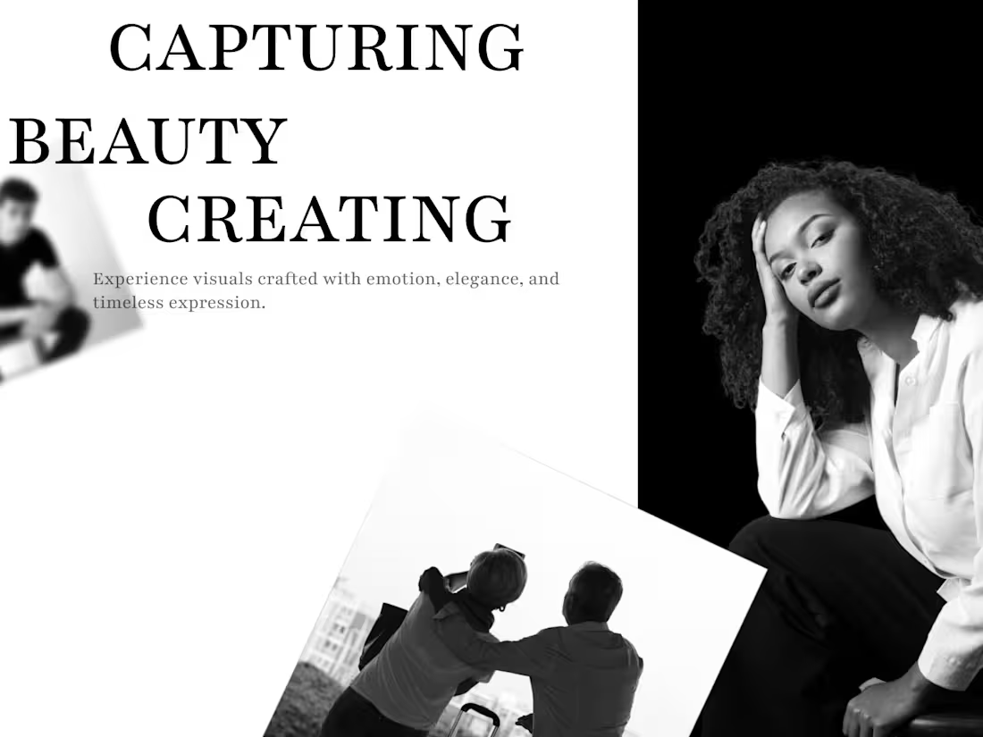
This project explores a modern black and white creative studio landing page. The goal was to create a clean and expressive design that feels bold minimal and timeless. The entire layout uses strong serif typography editorial photography and a simple visual structure that creates clarity and emotional depth.
The design includes a hero section a storytelling block a studio identity section and a trust based testimonial layout. Each part is crafted with intention and balance so the brand can express confidence and simplicity. This structure works perfectly for creative studios photographers and designers who want a premium editorial feel.
If you want a clean and modern landing page for your brand or studio you can reach out anytime. I also create free homepage mockups for new clients.
1
162
Monochrome Creative Studio Landing Page Design
1
3
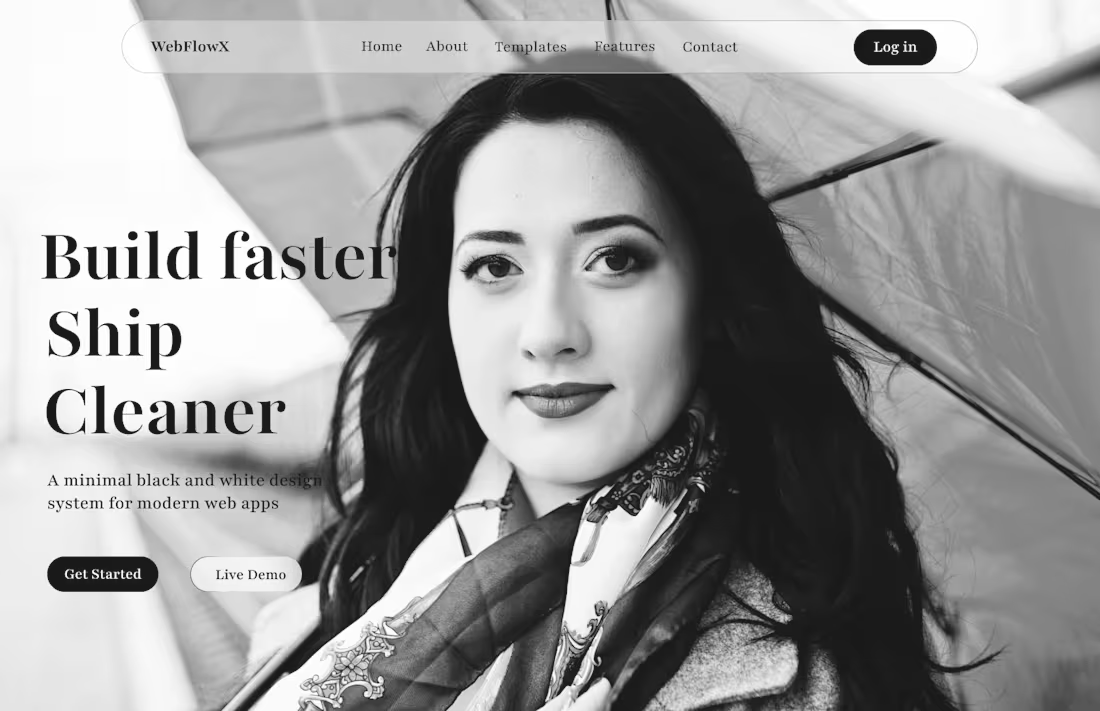
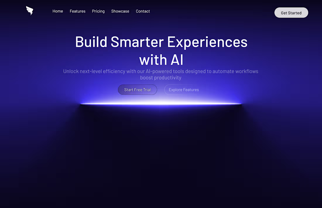
This hero section is crafted with a clean black & white aesthetic strong contrast and premium typography.
The goal was to build a modern focused and high–clarity layout suitable for SaaS portfolios and landing pages.
The design includes:
• Minimal black & white theme
• High-contrast headline
• Premium spacing & layout
• Clean navigation bar
• Modern CTAs (Get Started / Live Demo)
• Full-width hero image with balanced composition.
Perfect for:
• Landing pages
• SaaS platforms
• Agency websites
• Portfolio home screens
Let me know your rating out of 10 and feel free to reach out for custom design work.
1
141
Out of 10, how much rating would you give this design?😍
1
117
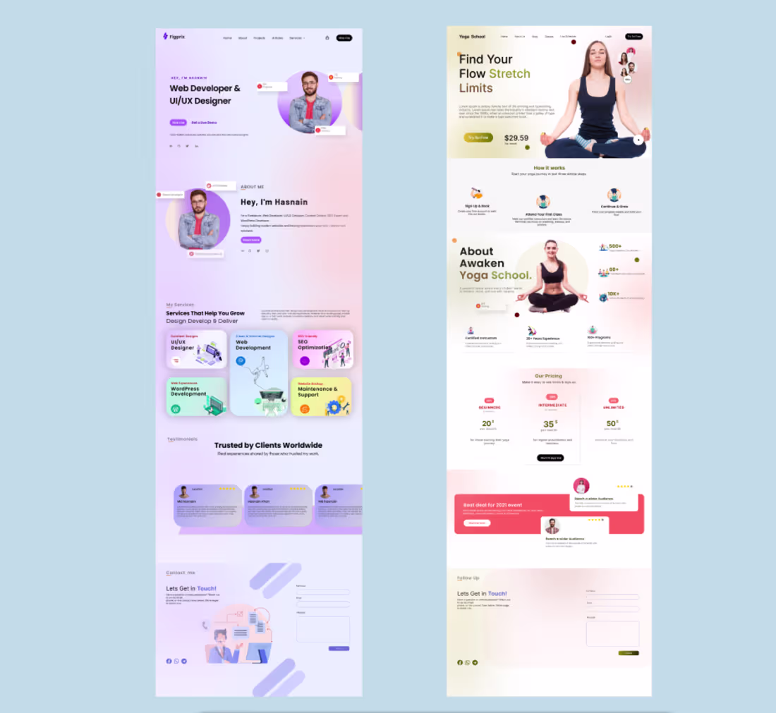
This project features two modern landing pages designed with a strong focus on clean layout visual hierarchy and high quality user experience Each page uses balanced typography premium spacing and a clear call to action to guide users effectively Both designs follow a structured layout that blends powerful visuals with minimal UI elements creating a smooth and professional browsing experience
The goal behind these landing pages was to craft web experiences that feel fast modern and visually appealing while maintaining clarity and usability throughout the entire interface
2
2
145
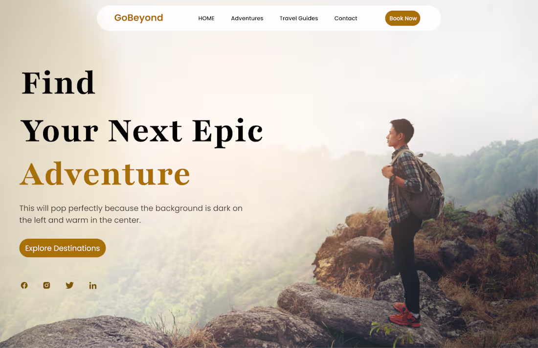
Just finished designing this clean travel adventure hero section in Figma! Tried mixing bold typography, soft gradients, and warm tones for a premium outdoor feel.
Feedback is welcome!
2
123
Personal Portfolio Website Modern Fast & Fully Responsive:
This is my Day #10 @Framer personal portfolio where I am leveling up my design and frontend skills through clean layouts smooth interactions and a modern performance focused structure I built this website to show my work my growth and my creative identity while making it super easy for clients to explore my services projects and contact options This project reflects my dedication to getting better every day and delivering high quality work that builds trust and strong professional impact😍.
💯 Building daily to get better and deliver better💯
2
130
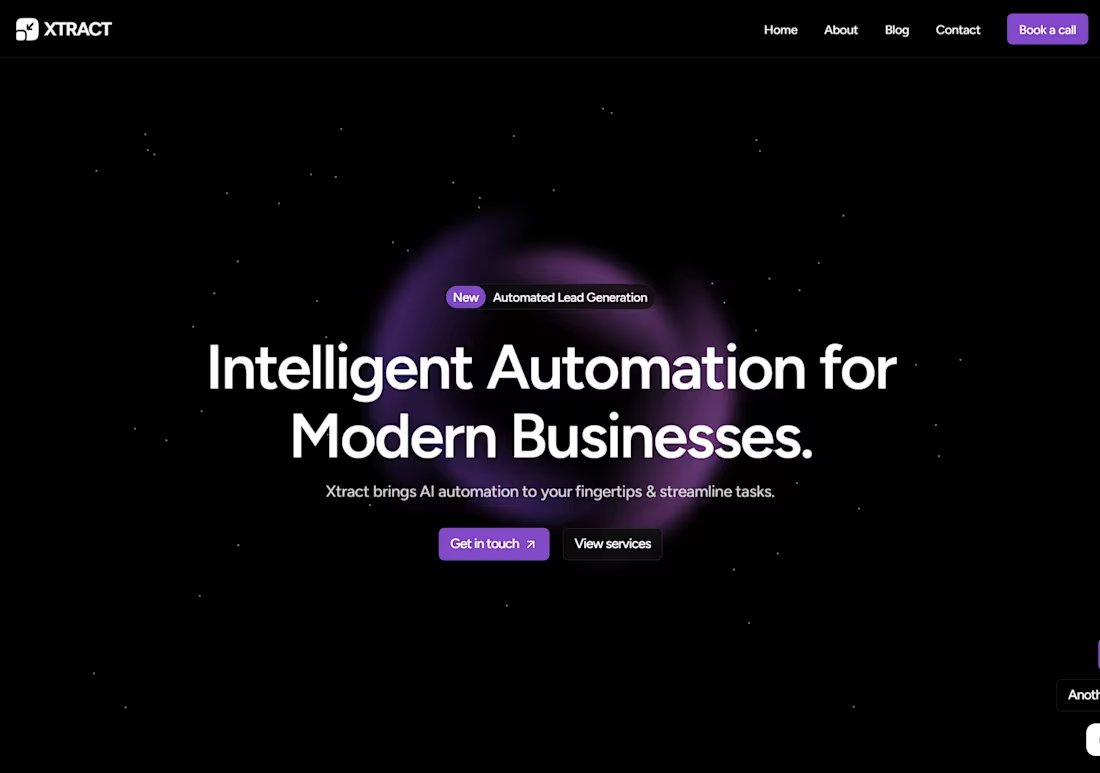
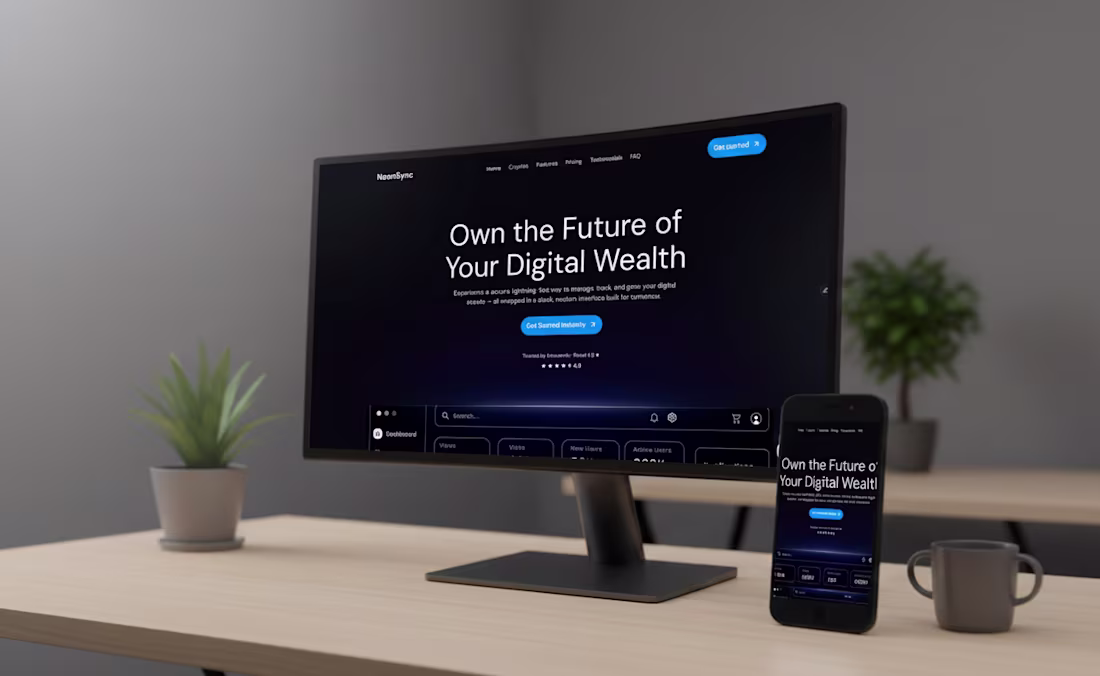
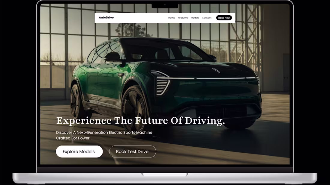
Futuristic Hero Section Design for Xtract
1
1
Modern Website Template (UI/UX Design)
1
5
Modern Portfolio Website UI – Designed in Figma
2
139
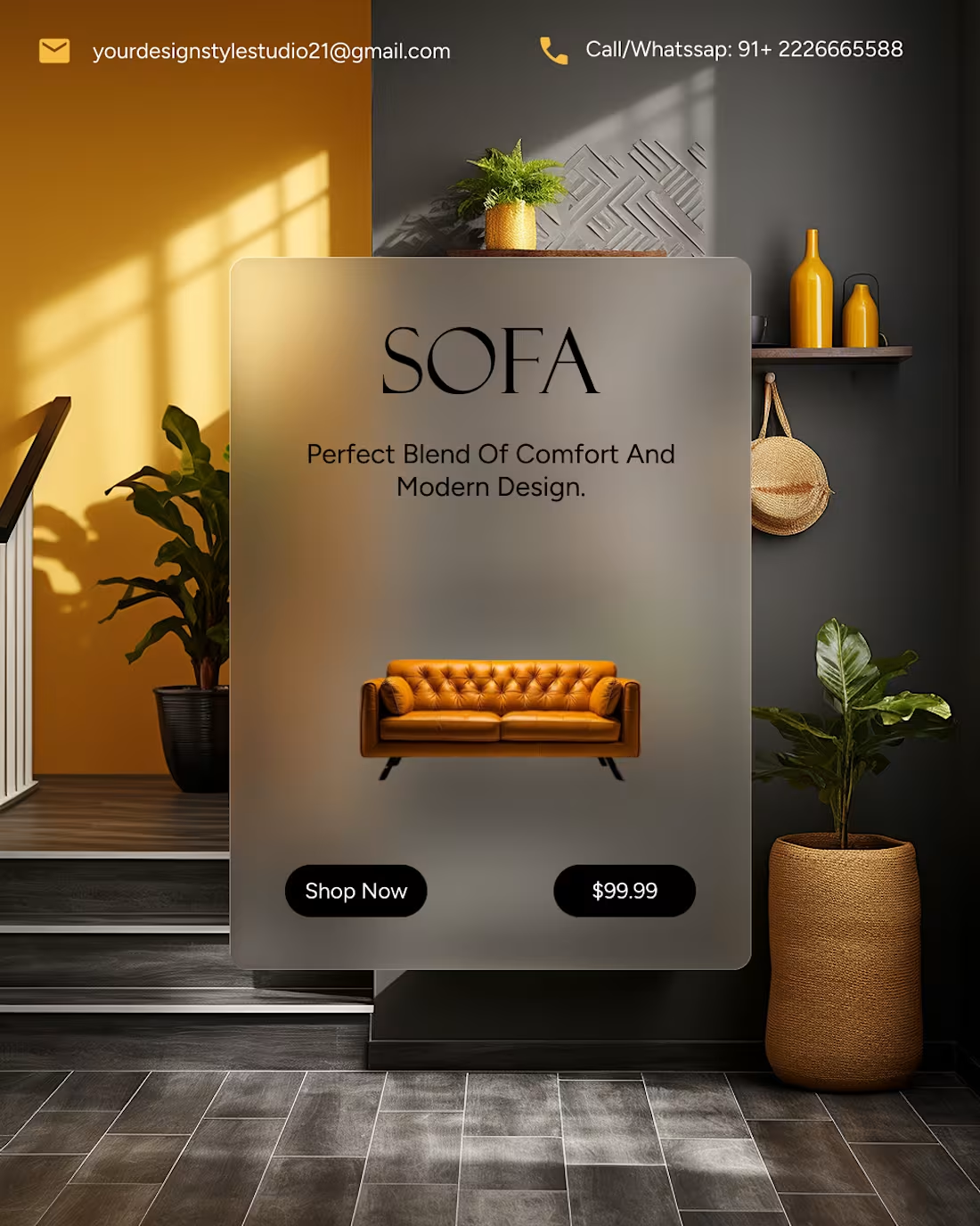
Enter yourDesigned in Figma focusing on minimal, calm, and wellness-based colors. Task / Goal: To design a modern and minimal section for an event or corporate website that promotes special offers and customer reach. The goal was to combine promotional content (“Best deal for 2021 event”) with user feedback cards creating both credibility and engagement. The final design is a modern, vibrant, and trustworthy section that effectively combines marketing and social proof. It can be used for event websites marketing landing pages or coworking platforms.The interface feels professional yet friendly — ideal for brands promoting corporate or wellness events.
0
121
Modern Portfolio Website UI – Designed in Figma
0
124
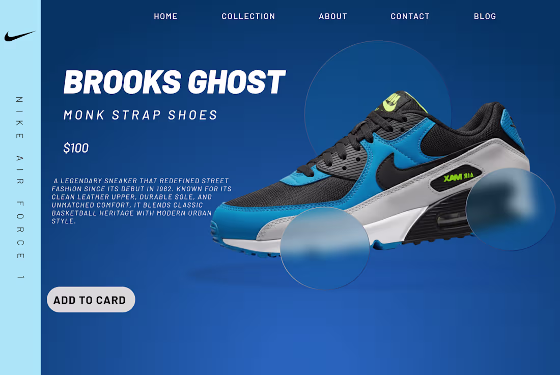
Nike PUMA Cali — Modern Product Landing Page:
0
109
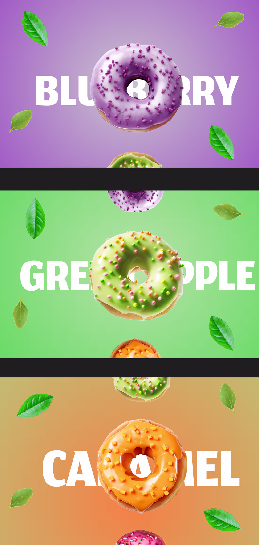
Sweet Donut Poster Series – 3D Flavor Visuals
0
103
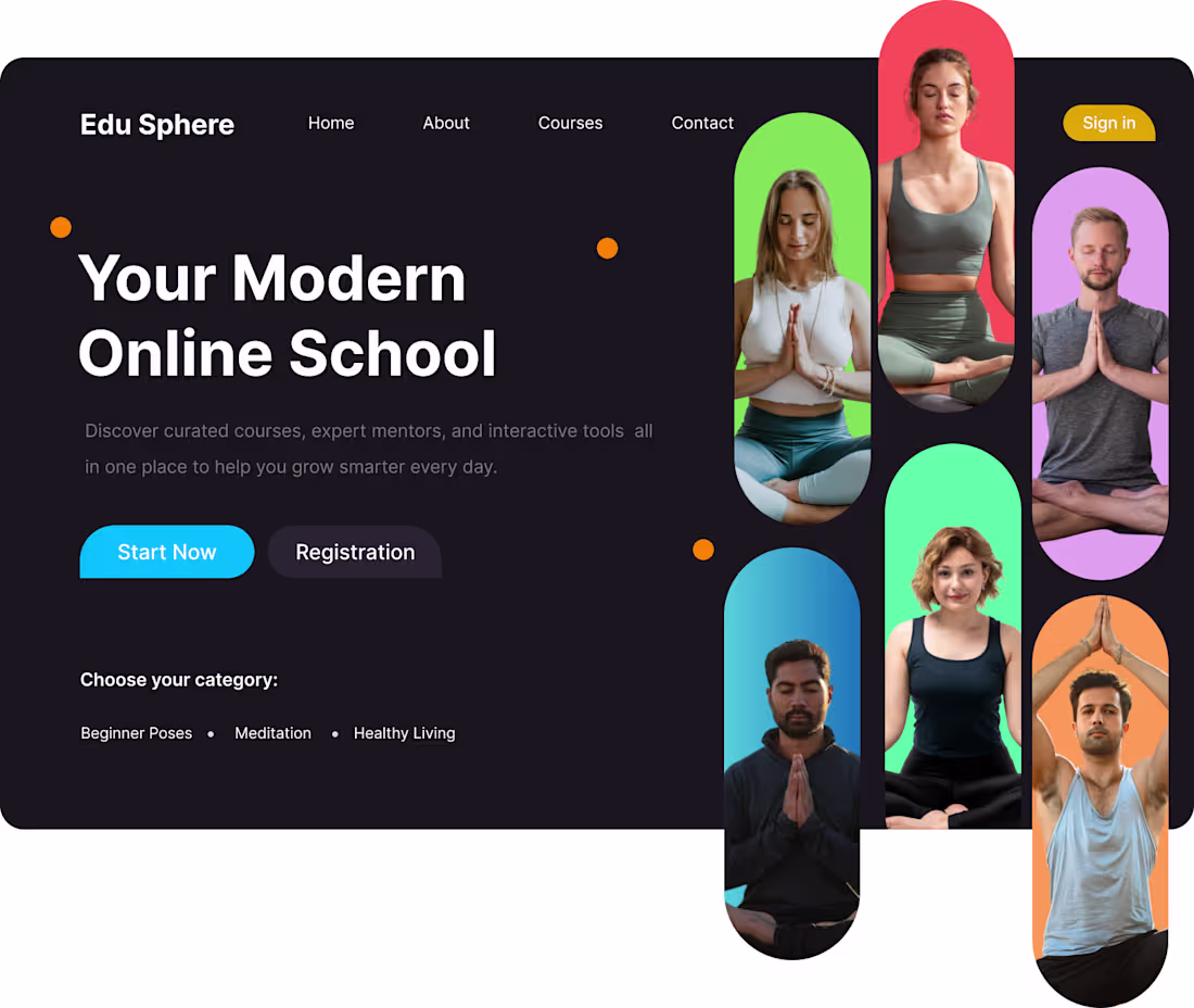
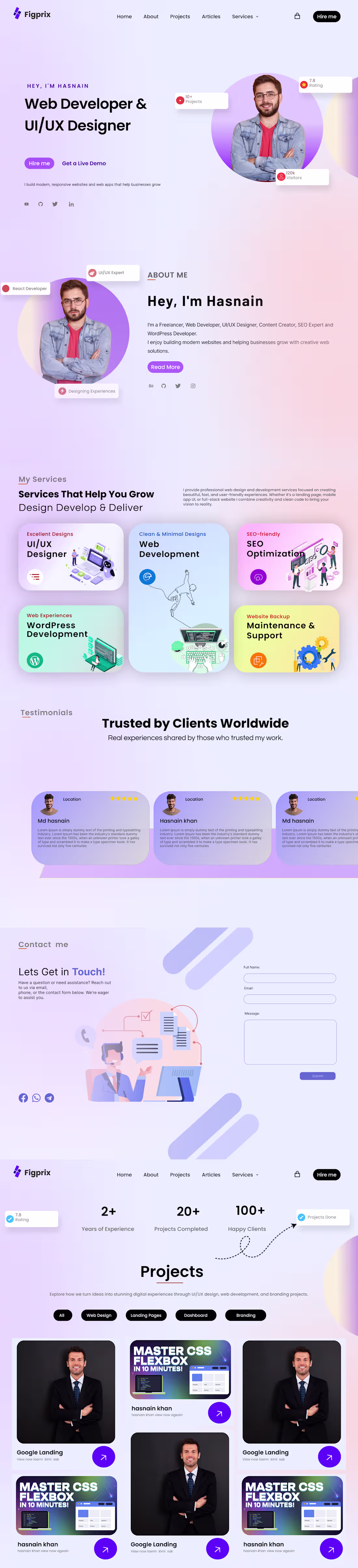
Yoga & Wellness Educational Website Calm Clean & Mindful UI D
0
96