The network for creativity
Join 1.25M professional creatives like you
Connect with clients, get discovered, and run your business 100% commission-free
Creatives on Contra have earned over $150M and we are just getting started
Back to feedPost

PERFECT IS NOT THE POINT.
For the Human by Design challenge, I created a dark high-fashion jewelry campaign around a sculptural silver ring.
The first AI-generated directions were polished, balanced and technically impressive — but they felt too safe. The more “perfect” the images became, the more they lost the asymmetry, texture and tension that made the ring distinctive.
My Human by Design moment was choosing not to correct those irregularities.
I changed the direction from sterile product perfection to a darker editorial campaign built around real skin texture, sculptural movement, hard directional light and the handmade character of the metal.
AI generated the options.
Human judgment shaped the campaign.
Created using Envato stock assets, typography, music and sound, with AI-assisted image and video workflows and final human art direction.
@envato
#envatochallenge


This is clean ngl


Hey @Uliana Suliatytska make sure to include a video showing how you actually used Envato to be a valid submisison
The network for creativity
Join 1.25M professional creatives like you
Connect with clients, get discovered, and run your business 100% commission-free
Creatives on Contra have earned over $150M and we are just getting started
Challenges
View all


Related posts


New cover, new visual taste test.
As a visual director, the hardest choice is choosing between your own creations.
Two covers. Two directions. One choice.
Which one gets your vote?


34 voted
79%
9 voted
21%
43 votes
Closed


the blue background makes the orange shapes pop

What's your one-rule brand? Tell me.
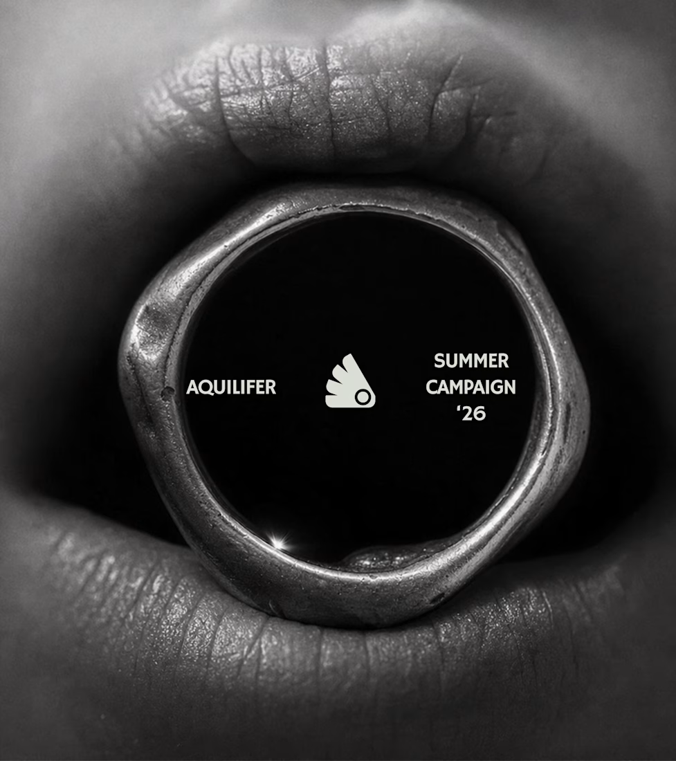
Most jewelry brands photograph the object. This one photographs the grip.
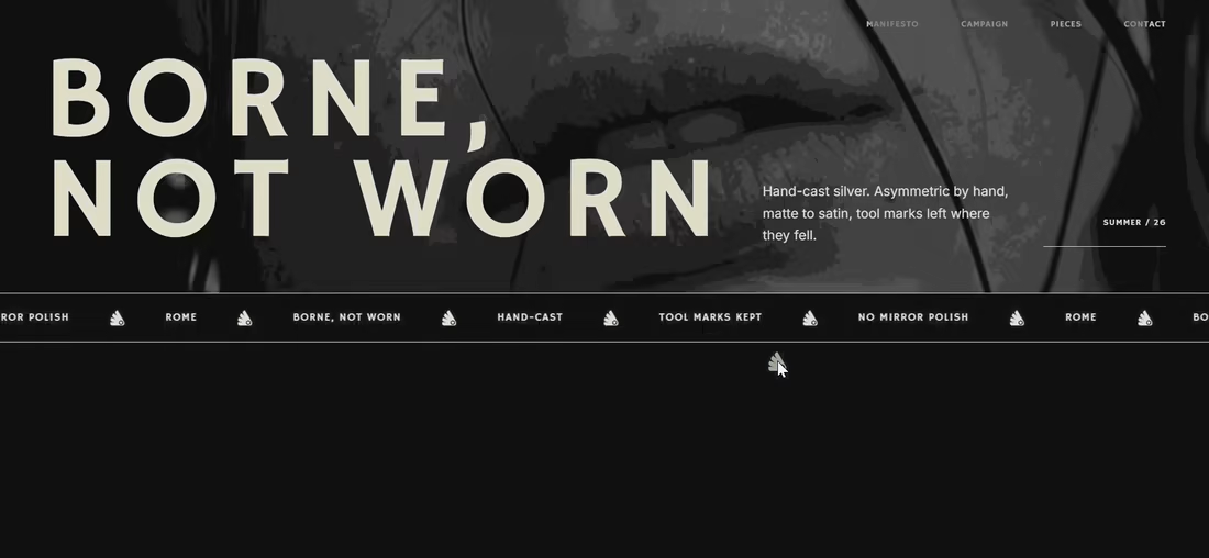
AQUILIFER — a brand I built around one idea: jewelry as something carried, not worn.
Case study + full site now live.
The name comes from Roman military rank. The aquilifer carried the standard — the one thing the legion couldn't afford to drop.
That single word killed my first direction before I'd finished it.
No polish. No faceted stones.
Hand-cast, asymmetric pieces, tool marks left visible.
Photography went extreme macro, unretouched skin, hands gripping the face instead of posing near it.
Color system: two darks instead of one dark + accent.
#1E1E1E and #27331A let the brand shift register — campaign world to product world — without ever going light.
#D9DED4 stays structural only. Never a fill.
Motion rule on the site: diagonal masks only. No rotation, anywhere.
A spinning object reads as being shown off. This brand is about weight, not display.
Same angle, same easing, top to bottom.
One idea, held all the way through — name, object, photography, palette, motion.
That's the whole pitch for how I work.

Absolutely love your works!

Everyone wants their brand to look "premium" but almost nobody can define what that actually means.
In crowded industries like digital marketing, premium is the absence of noise. Every unnecessary element is removed until what's left earns trust on sight and can be immediately recognized.
Designing Nyxora meant understanding that trade-off and building for legacy.
The identity needed to feel current enough to compete with the top agencies out there, but grounded enough that a client would hand over a real budget without hesitation.
The result is an identity built on purpose, one designed to earn trust before it earns attention.
Case study: https://rb.gy/hy6hs1




Nice