The network for creativity
Join 1.25M professional creatives like you
Connect with clients, get discovered, and run your business 100% commission-free
Creatives on Contra have earned over $150M and we are just getting started
Back to feedPost

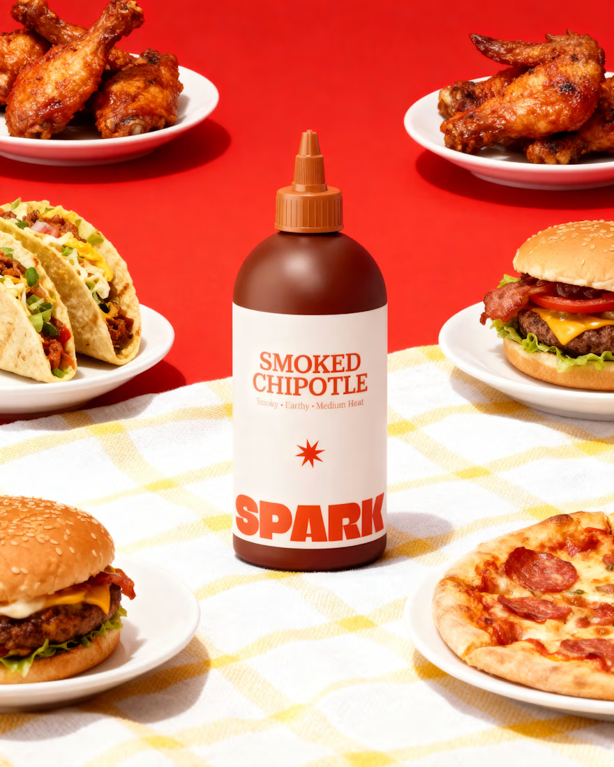
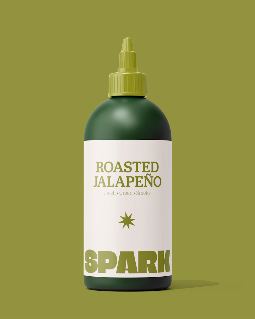
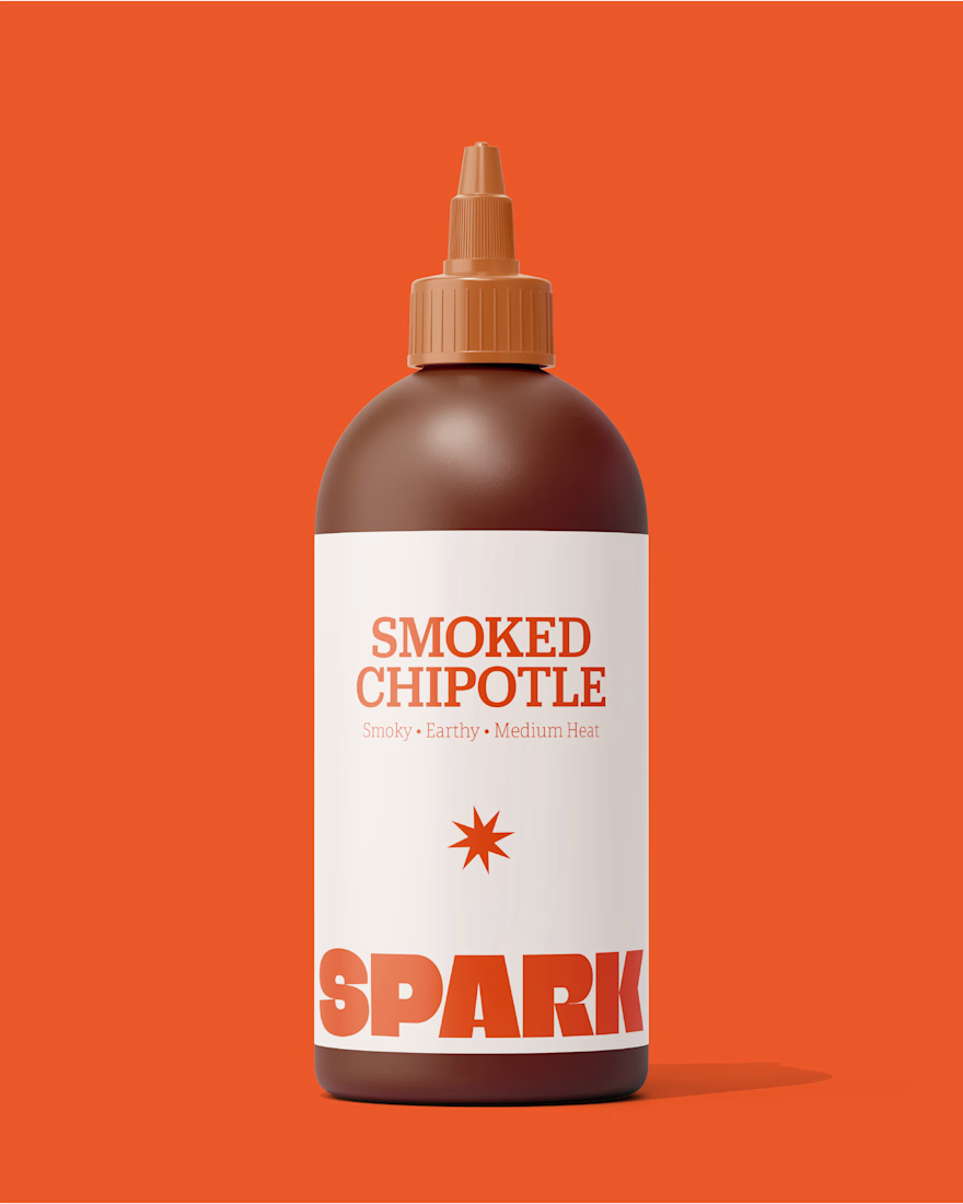
SPARK Building a Bold Packaging Identity
A great hot sauce deserves an identity that brings the heat before the first taste.
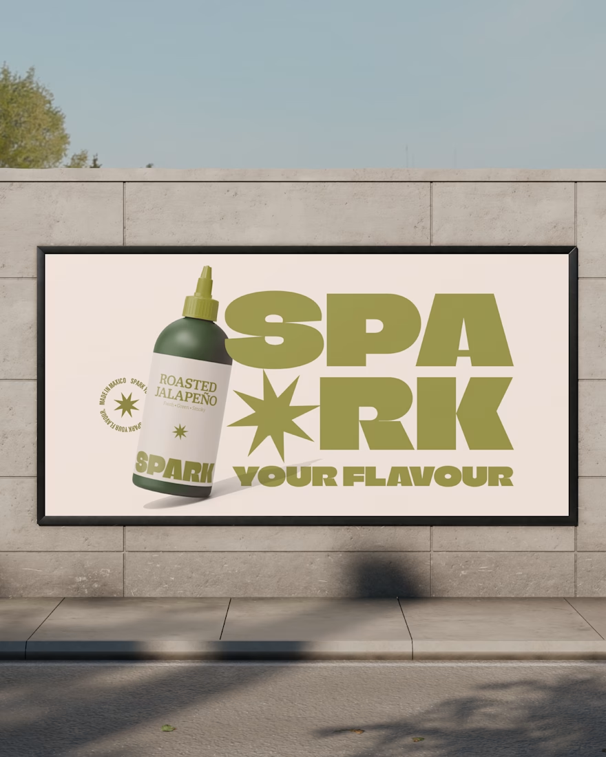
For SPARK, I created a bold and energetic visual identity built around custom typography, a distinctive spark motif, and a vibrant colour system for each flavour Original, Smoked Chipotle, and Roasted Jalapeño.
The goal was to create packaging that feels loud on the shelf, memorable in the hand, and consistent across every touchpoint from labels and packaging to billboards and menus.
Bold. Fiery. Memorable. Designed to stand out.
Brand Identity · Label Design · Packaging · Typography


The network for creativity
Join 1.25M professional creatives like you
Connect with clients, get discovered, and run your business 100% commission-free
Creatives on Contra have earned over $150M and we are just getting started





Related posts

Winder is a bold brand identity built around a geometric W-inspired symbol, combining sharp angles and forward movement to represent progress, speed, and direction.
The identity uses a striking red and deep burgundy palette, supported by clean typography and a consistent visual system across brand guidelines, digital applications, and product mockups.
Progress in Motion.




Great logo it feels it really has an identity 🎉🎉

Still waiting to hear back from @Contra HQ
So I did what any designer would do: I made the card myself 😂
Brushed metal. Laser-engraved logo. Holographic Mastercard rings. Full 360° spin. I'm going to keep polishing this until the real one shows up in my mailbox. Your move, Contra 👀
(Concept / fan design, not an official Contra product..Yet 🙌 )


“Okay, this looks WAY too good 🔥 Contra needs to make this real 👀”

Brand identity work for WesoftAI
