The network for creativity
Join 1.25M professional creatives like you
Connect with clients, get discovered, and run your business 100% commission-free
Creatives on Contra have earned over $150M and we are just getting started
Back to feedPost


The network for creativity
Join 1.25M professional creatives like you
Connect with clients, get discovered, and run your business 100% commission-free
Creatives on Contra have earned over $150M and we are just getting started






Related posts

One family, different needs
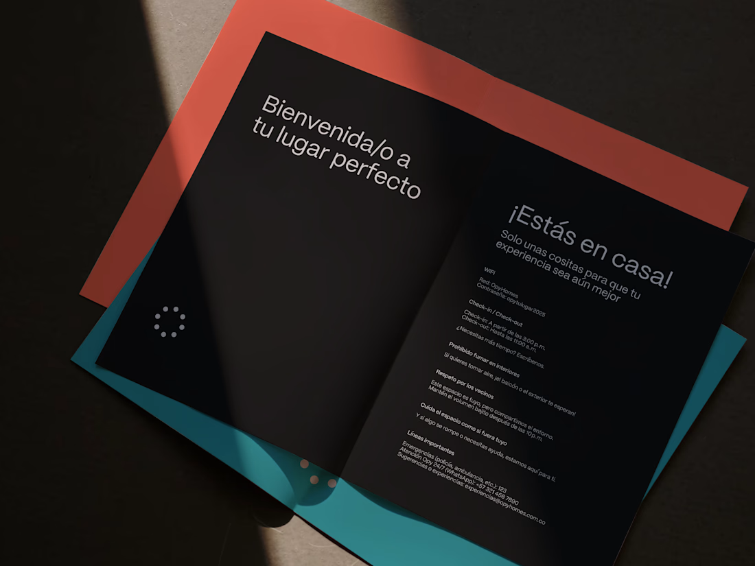
Brand identity for Opy, connecting stays and arrivals through a warm visual system.
The design challenge was to carry the same personality across two different contexts. Homes needed to communicate comfort and hospitality. Parking needed to communicate access, direction and reassurance.


Nice!

Created a SaaS product explainer for LotIQ, showcasing its land analysis platform through engaging UI animation, voiceover, and motion graphics.


Looks great!!

A sushi roll with a life of its own.
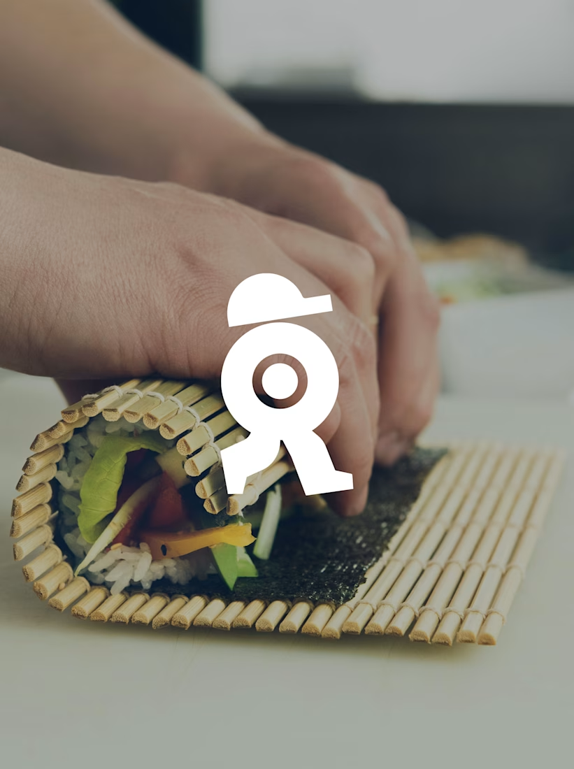
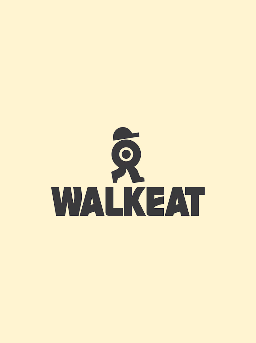
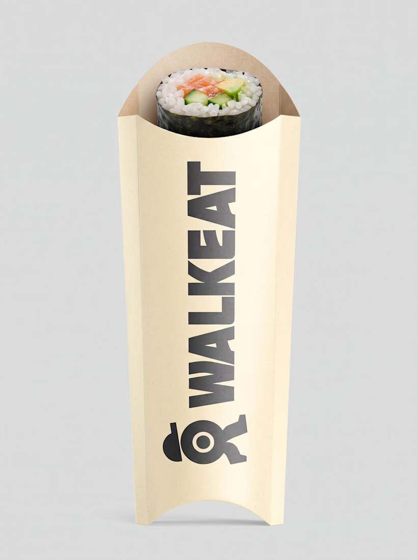
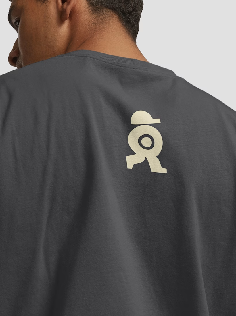
The WALKEAT identity transforms the shape of a sushi roll into a walking character. Its circular center references the cross-section of the roll, while the cap and legs bring movement and personality to the figure.
The custom-designed wordmark reinforces this concept through subtle modifications to the W, A, and E, creating a visual connection between typography and symbol.
A simple, playful and contemporary identity that communicates the product without relying on literal Japanese imagery or an overly cartoonish character.
Great work!!