The network for creativity
Join 1.25M professional creatives like you
Connect with clients, get discovered, and run your business 100% commission-free
Creatives on Contra have earned over $150M and we are just getting started
Back to feedPost


Congrats Dimitar!!

Thanks Isabel!

Let's goo 🔥
Congrats Dimitar!
Thankss Mohammed!!

Congratulations 🔥

Congratulations! Onward


Awesome, congrats @Dimitar Dimitrov

congrats !!

Congrats Dimitar!


congratulations Dimitar. This marks the beginning of a lot more success

Congratulations!

Congrats!

Congratulations 🎊

congrats @Dimitar Dimitrov
The network for creativity
Join 1.25M professional creatives like you
Connect with clients, get discovered, and run your business 100% commission-free
Creatives on Contra have earned over $150M and we are just getting started





Related posts

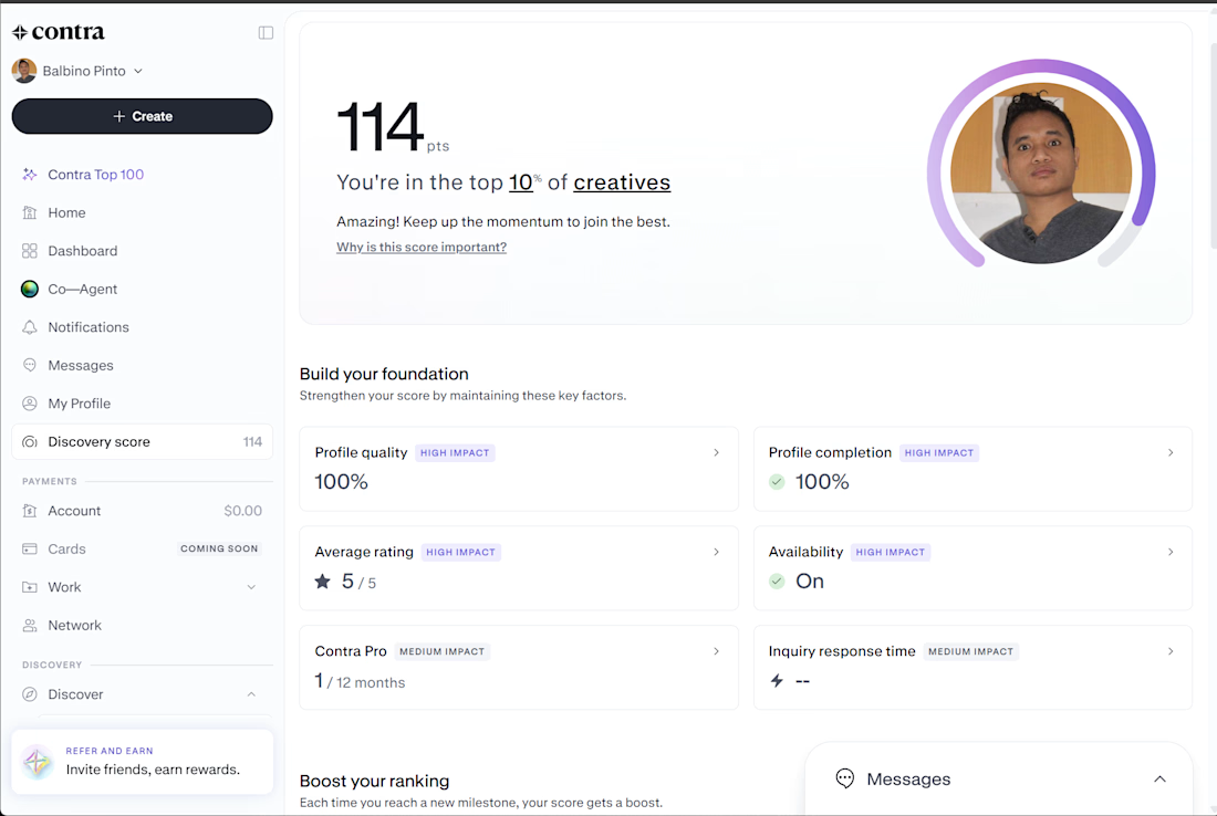
My Contra Discovery Score has reached 114 points, placing me in the top 10% of creatives on the platform. My profile quality and profile completion are both at 100%, with a 5/5 average rating and availability turned on.
As a software engineer specializing in React, .NET, API development, and SAP Business One, I'm continuing to strengthen my Contra presence, showcase my portfolio, and connect with potential clients for new freelance opportunities.



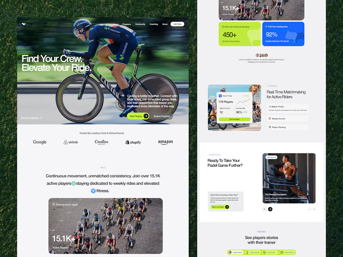
🚴♂️ Framer Landing Page Design for Cycling Community
Transformed group ride discovery and rider matchmaking into a high-energy, community-driven Framer web experience designed to boost member sign-ups.
Explore the full case study on Contra: https://contra.com/p/Y3MsYMb6-framer-landing-page-design-for-cycling-community?r=airzon_agency


I used to freelance on Upwork back in 2019–2020, and recently found Contra.
Joined today and got some of my work together in one place.
Love seeing so many talented people here.
Here's me and my Mom lol
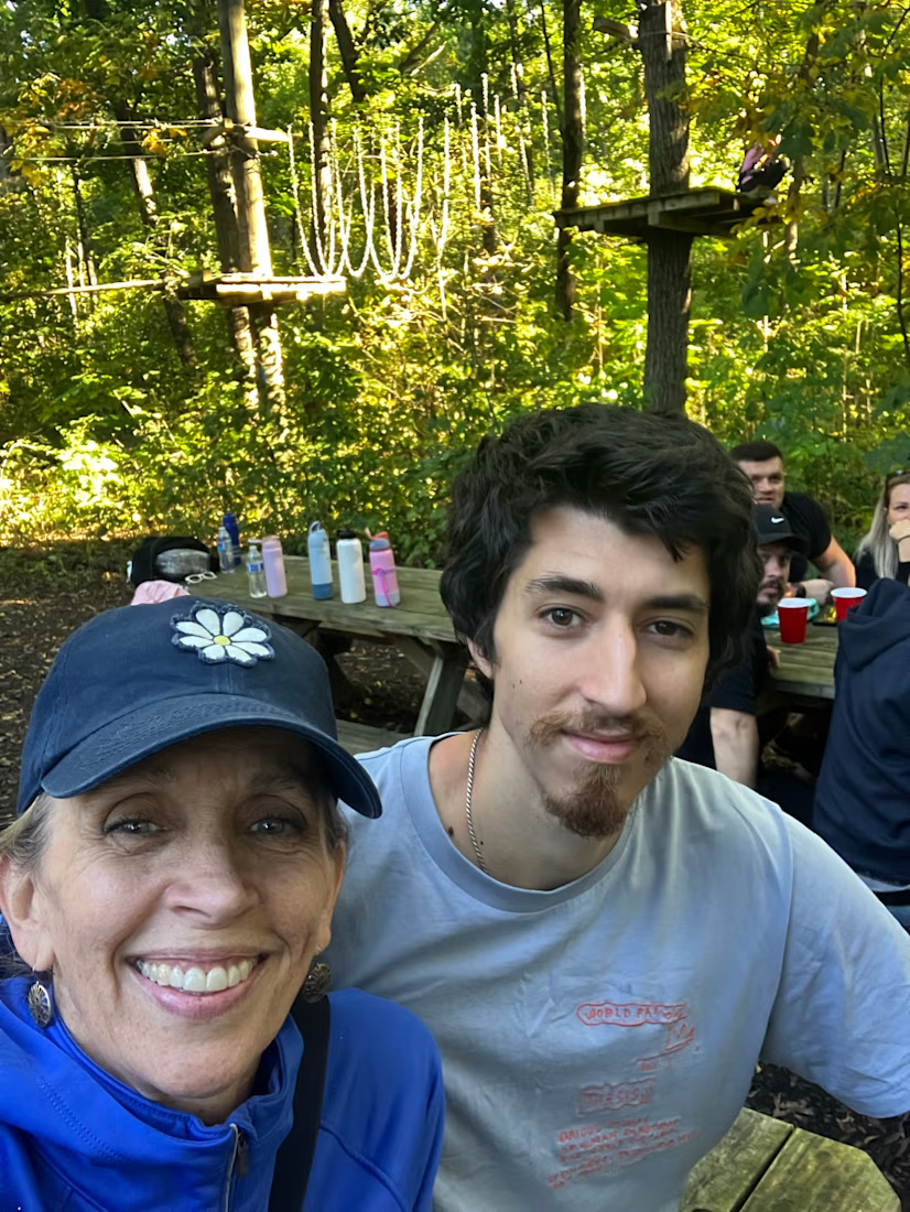

welcome to Contra! love the photo with your mom haha