The network for creativity
Join 1.25M professional creatives like you
Connect with clients, get discovered, and run your business 100% commission-free
Creatives on Contra have earned over $150M and we are just getting started
Back to feedPost

Some more experimental futuristic typography story design for Bar LOQA.


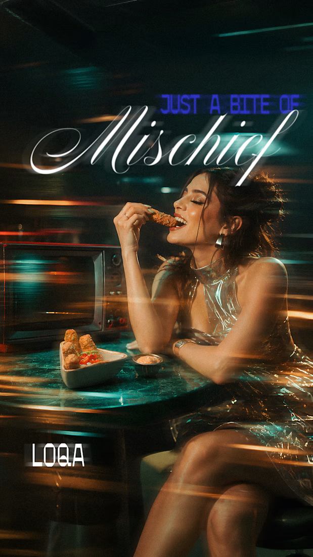
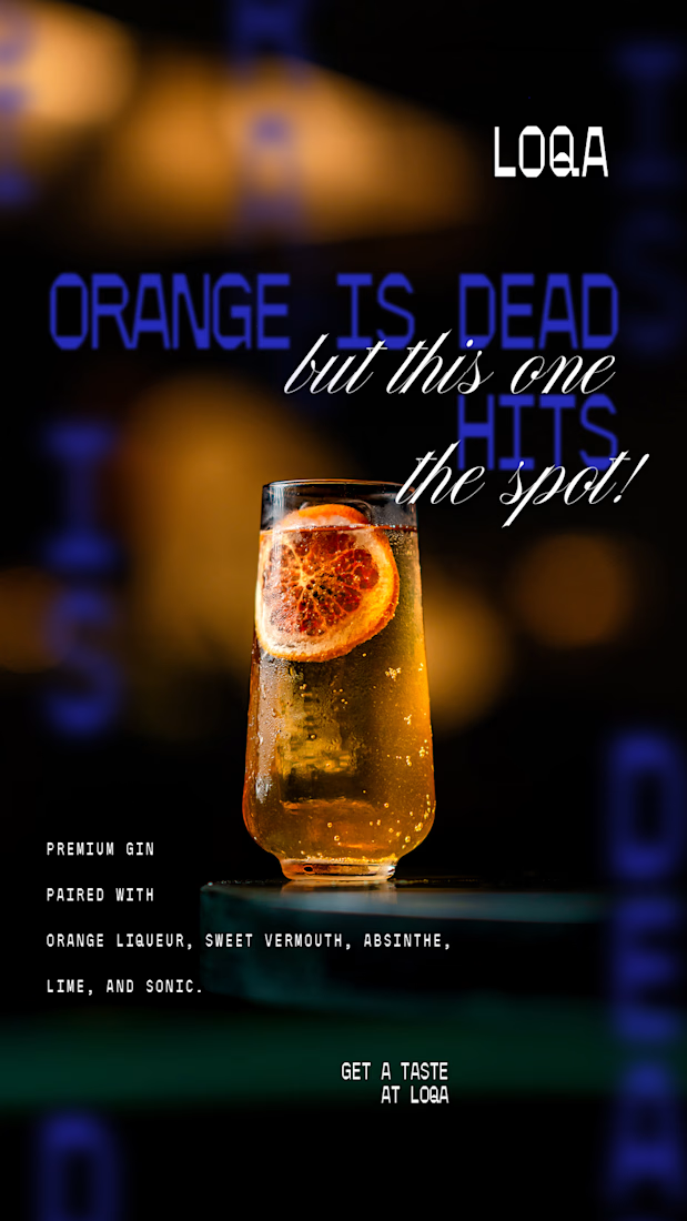
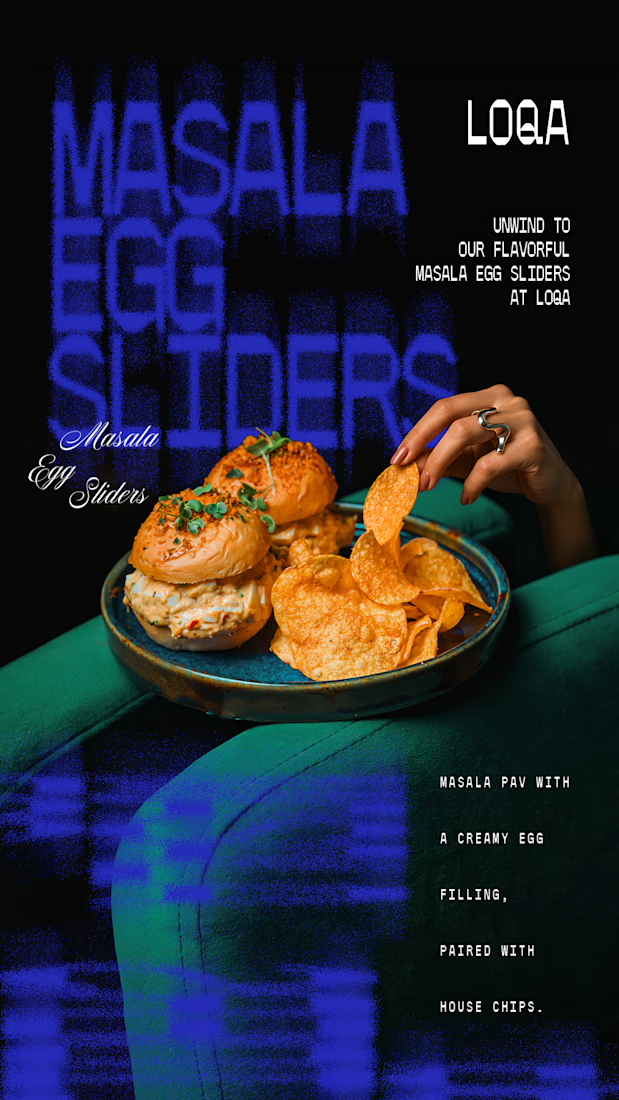
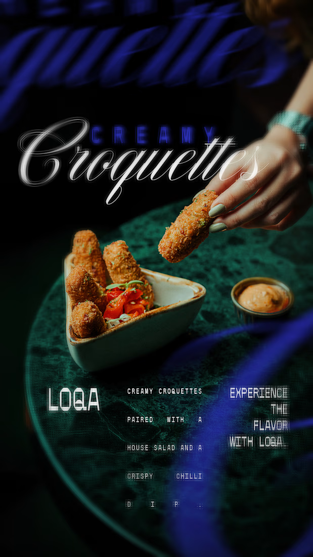

The script lettering over the cocktail sits in the glow without fighting the photo, while the sliders frame gets a much lighter touch. Do you place the type first and crop the image around it, or the other way round?
Hi Artur,
I place the image first then see how the type will look around it.
Image first makes sense for a nightlife piece, since the glow sets the mood and the script can borrow its colour from the photo.

The decision on whether to crop the image around the text or the other way around matters most for keeping the cocktail in the focal point. If you place the type first, you risk awkward cropping that cuts off the drink or the background glow.

The glowing orange spritz with the script the spot over it is the best frame, because the type finds its place in the blur. Contrarian note: four moody food photos with neon blue is a very familiar nightlife look. The Masala Egg Sliders tile is the only one with a personality of...
The network for creativity
Join 1.25M professional creatives like you
Connect with clients, get discovered, and run your business 100% commission-free
Creatives on Contra have earned over $150M and we are just getting started






Related posts

New Day - New Case Study
Developed a visual identity for SuperMatics, a Berkeley-based technology company combining physics and AI to discover new superconducting materials.

Amazing work!!


Very juicy. Didn't you feel like having some berries while working?


The color palette works so well here 🪙