The network for creativity
Join 1.25M professional creatives like you
Connect with clients, get discovered, and run your business 100% commission-free
Creatives on Contra have earned over $150M and we are just getting started
Back to feedPost
Taste Test


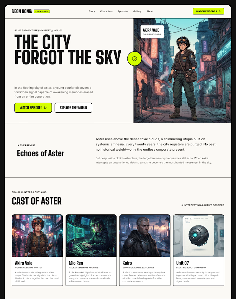
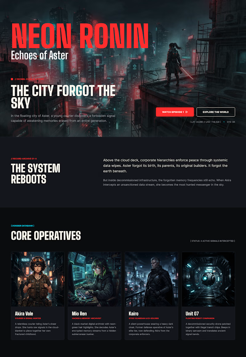

The dark cinematic direction feels perfectly matched to an anime series, and the red accent gives the page a strong focal point. I’m especially into how the character cards carry the world-building beyond the hero.
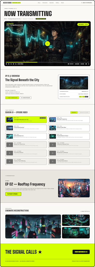
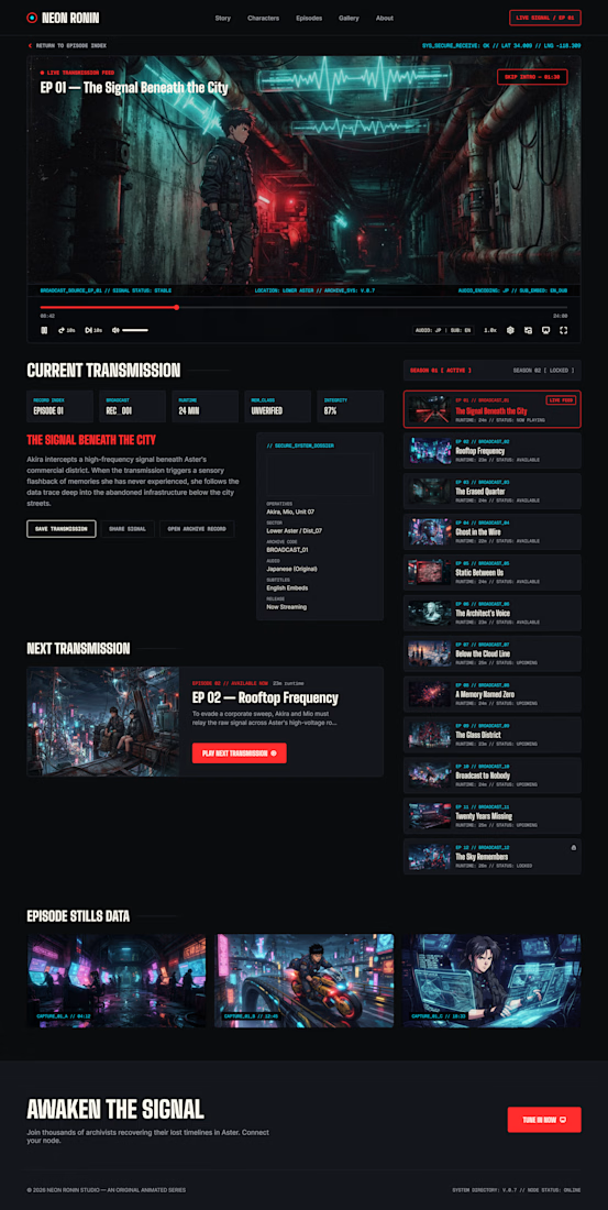

A for me. "Neon Ronin" as a title needs actual darkness for the neon accents to read as neon, on the light version that red just becomes a regular brand color and loses the genre signal.

For me I go with the second give the animation a good and interesting back story that will pull in people
The network for creativity
Join 1.25M professional creatives like you
Connect with clients, get discovered, and run your business 100% commission-free
Creatives on Contra have earned over $150M and we are just getting started











Related posts

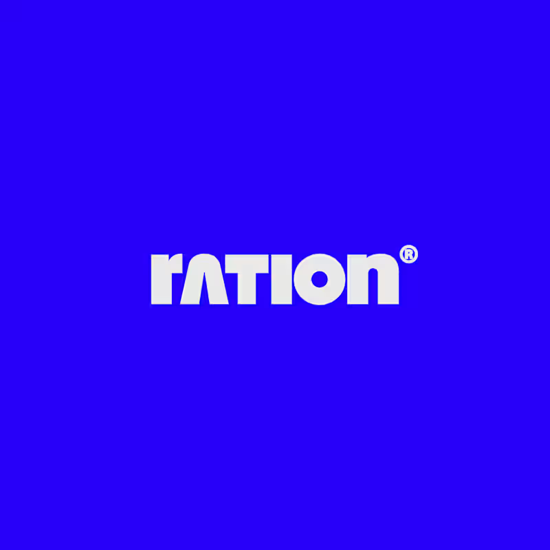
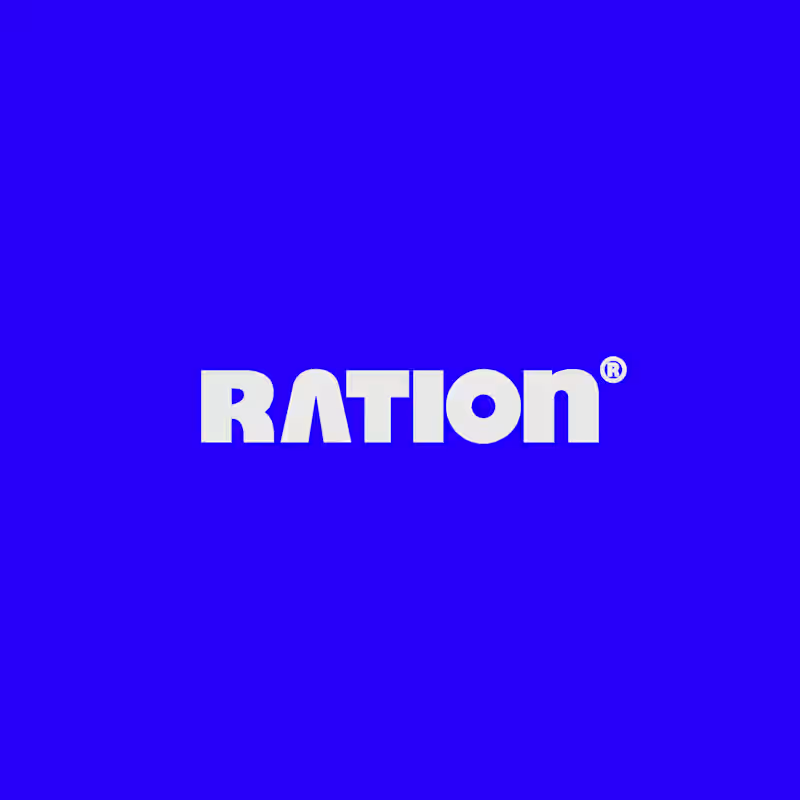
I’ve been working on a bold, modern-retro logotype and can’t decide between these two options.
🆘 Which one feels more aesthetically pleasing to you?

11 voted
26%
31 voted
74%
42 votes
Closed

CAPITAL is great but SMALL is unique great job Nawras 🔥🔥


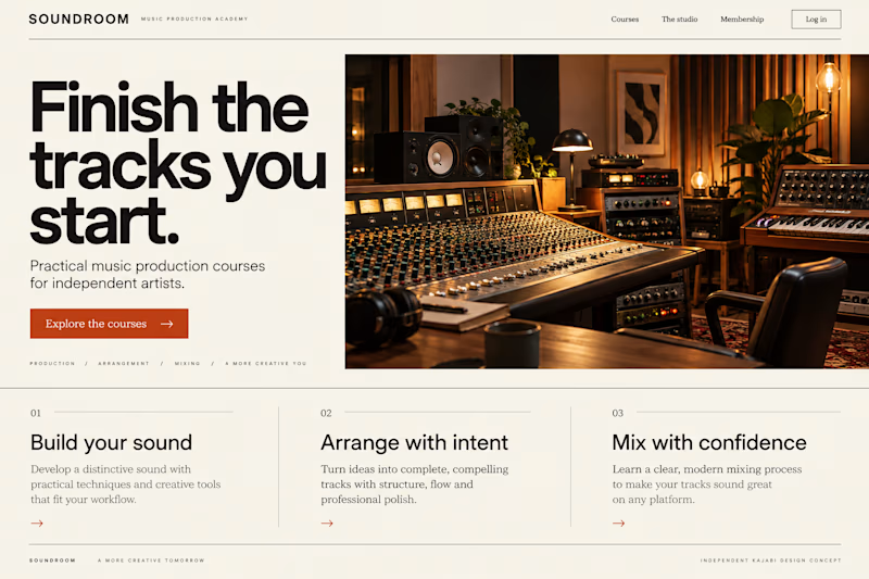
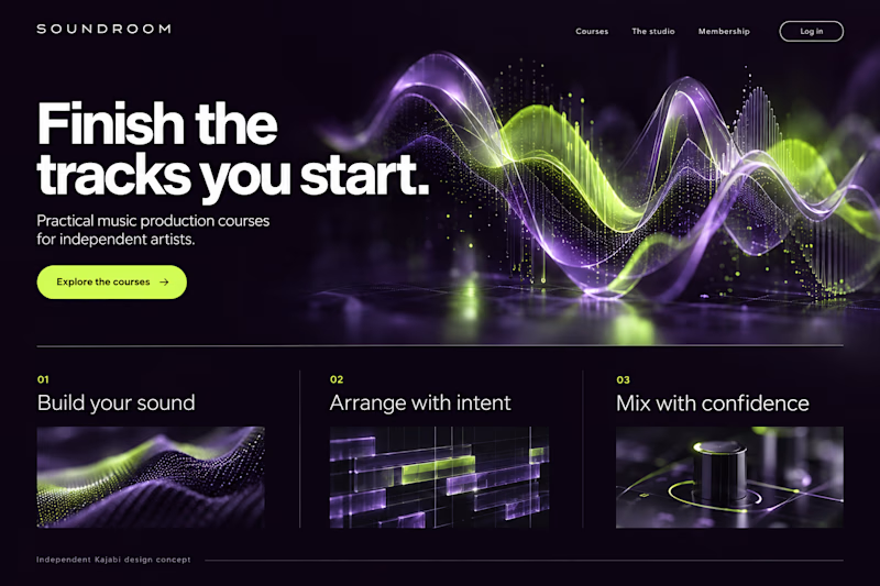
Which Kajabi music-course design makes you want to hit play?
Two original AI-generated website concepts for Soundroom, a fictional music-production academy. Analog Studio pairs warm recording-room imagery with cream and burnt orange. Digital Rhythm brings luminous waveforms, midnight plum and acid lime. Same course, two different first impressions.
Which direction would you choose?

13 voted
41%
19 voted
59%
32 votes
Closed

AI can build the UI in minutes.
Bringing it up to a good standard, still needs a designer. Agree or disagree?
I see some of your work and honestly your work is really premium 🎉🎉
Great job Alex🎉🎉🔥🔥