The network for creativity
Join 1.25M professional creatives like you
Connect with clients, get discovered, and run your business 100% commission-free
Creatives on Contra have earned over $150M and we are just getting started
Back to feedPost

Brochure Design. Built to Be Picked Up and Read.
Clean layouts. Sharp hierarchy. Every fold and typeface chosen with purpose. Built across real estate, education, hospitality, wellness, and professional services.
The standout: an architecture firm brochure with a die-cut infinity loop formed from interlocking buildings — revealing silhouette structures beneath the first page. A cover that doesn't just represent the client's work. It is the work.
Print-ready. Bleed-correct. Built to convert.
Designed for businesses that want collateral worth keeping.


The network for creativity
Join 1.25M professional creatives like you
Connect with clients, get discovered, and run your business 100% commission-free
Creatives on Contra have earned over $150M and we are just getting started



Related posts

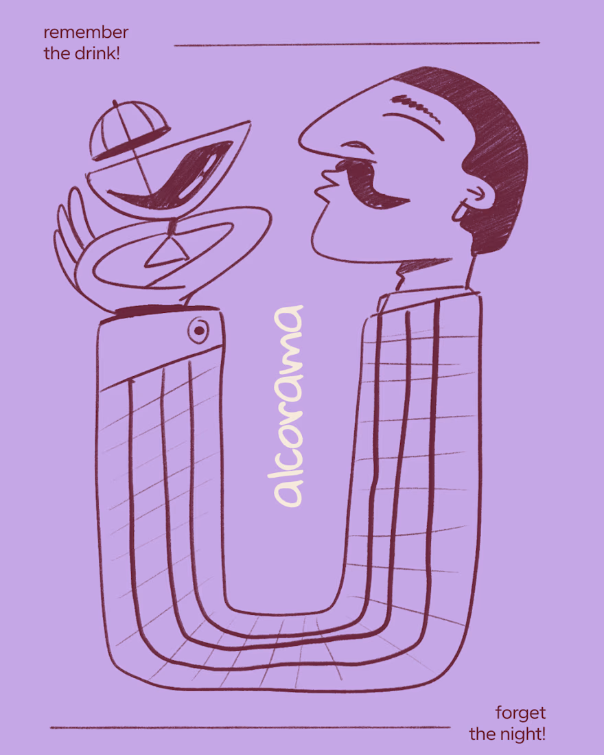
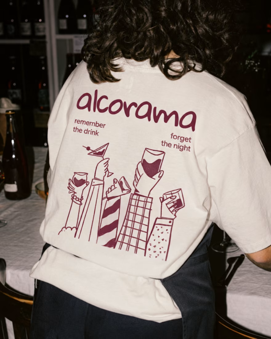
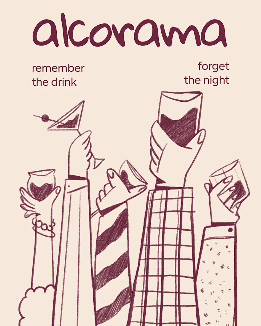
Final direction picked! I love when brands use custom illustration as the main way to communicate with their audience.
Direction discovery should not take more than one week and it should be full of personality! Ready to upgrade your brand?


Amazing work!

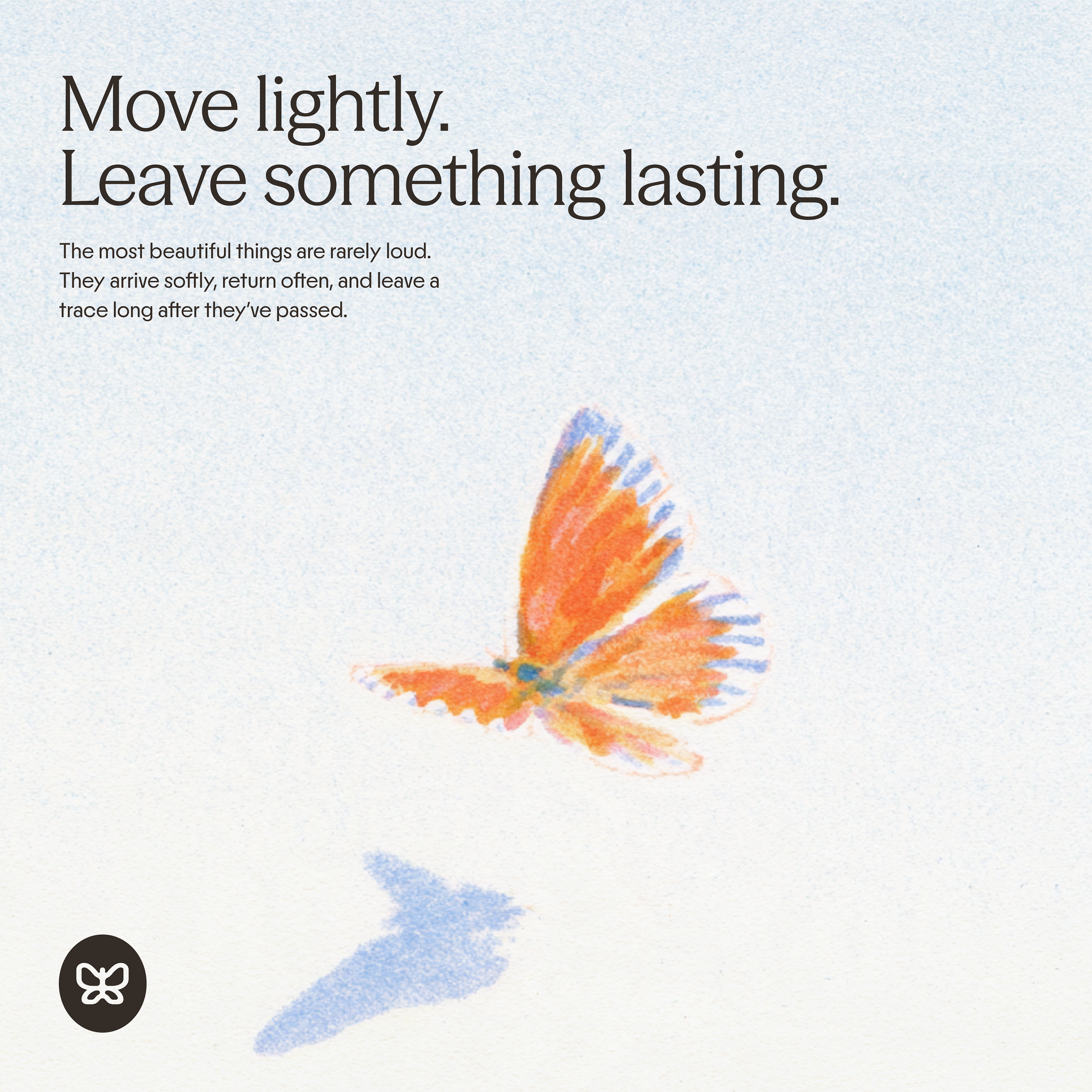
generated these little fellas for a concept and now i want to build a whole brand around them.
if you're making something that helps people dream and aspire, they're looking for a home:)



adorable!🥹

Two ad designs, same offer, very different vibes. Which one would make you stop scrolling and tap “Start Today”?
Drop your pick below and tell me why. I’m collecting honest feedback on layout, colors, and what feels most clickable.
Option A: bold, dark gradient with a glowing neon feel.
Option B: clean, bright, and playful with a white background.
5 voted
38%
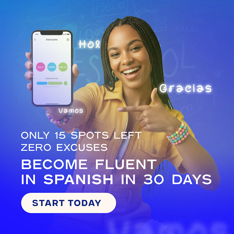
8 voted
62%

13 votes
Closed

Option A for me. The dark neon version pops harder in a busy feed and the headline reads faster. B feels friendlier but blends in a bit more.