The network for creativity
Join 1.25M professional creatives like you
Connect with clients, get discovered, and run your business 100% commission-free
Creatives on Contra have earned over $150M and we are just getting started
Back to feedPost

💳 Your Money, Your Way.
Managing digital assets should feel simple, clear, and comfortable.
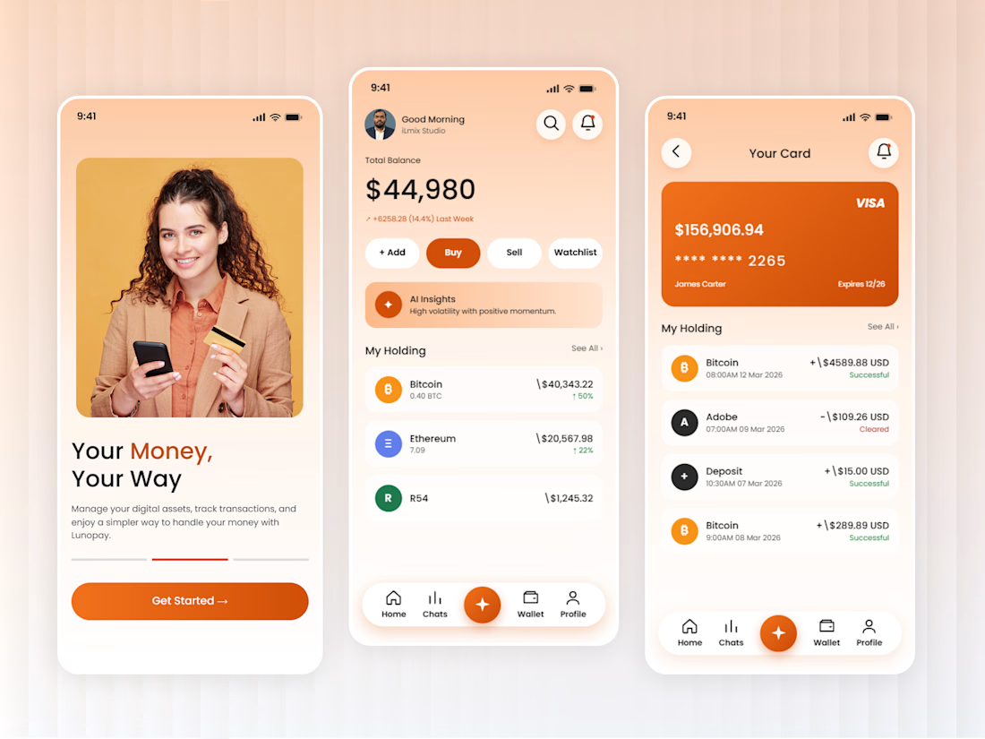
I recently worked on this crypto wallet mobile app UI concept, focusing on making everyday financial activities easier to understand and navigate.
The idea was to keep things clean while giving users quick access to the information they need.
A few details I focused on:
👍 A welcoming and easy-to-follow onboarding screen
👍 Clear balance and portfolio overview
👍 Quick actions for buying, selling, and managing assets
👍 Simple transaction history
👍 A clean wallet and card management experience
I went with a warm orange color palette to give the interface a friendly and approachable feel.
Always enjoy exploring how thoughtful UI/UX can make complex digital products feel simpler.
What do you think about this direction? Would you prefer a warm color palette for a finance app or something more minimal?
#MobileAppDesign #UIUXDesign #CryptoWallet #FintechDesign #ProductDesign #OrdainIT

The network for creativity
Join 1.25M professional creatives like you
Connect with clients, get discovered, and run your business 100% commission-free
Creatives on Contra have earned over $150M and we are just getting started
Related posts

New on Contra, not new to design.
I draw logos by hand, then build everything around them: the brand, the website, the store. Lately I also make product films and ads with AI.
Recent work: an RY monogram and site for a Koreatown law firm, a winged W for a defense firm, and my family's golf eyewear brand, from the mascot to Shopify.
Starting a brand, or have one that doesn't feel like you yet? Show me what you're building.

The logo-led system reads tight because the wordmark sits clean in the negative space instead of fighting the emblem — when a brand has that kind of restraint, the Shopify store usually carries the same hierarchy into the product grid and checkout without inventing new rules....


smooth animation , love it , looking at it, thinking of how the components will look like and also the prototype , i really love this animation