The network for creativity
Join 1.25M professional creatives like you
Connect with clients, get discovered, and run your business 100% commission-free
Creatives on Contra have earned over $150M and we are just getting started
Back to feedPost

Brutalist Brand Identity for an Architectural Practice
This project is a complete brand identity design for an architectural practice, built around the honest, raw, and structural language of Brutalist architecture. The goal was to create an identity that feels as solid, confident, and timeless as the buildings the practice designs.
The Challenge
Architecture firms compete on trust, clarity and a strong point of view. Many look alike, with thin logos, generic fonts and soft colour palettes. This practice needed a visual identity that communicates strength, precision and craft at first glance, and that works equally well on a business card, a website, a drawing set and a construction hoarding.
The Approach
I started by studying Brutalist architecture: exposed concrete, bold geometry, heavy forms, strict grids and the play of light and shadow. These ideas shaped every decision in the identity:
A strong, geometric logo and monogram with a solid, architectural feel
A restrained palette inspired by raw concrete and stone, with sharp contrast
Bold, grid-based typography with clear hierarchy
A flexible layout system that mirrors architectural drawings and floor plans
Consistent spacing, alignment and proportion across all applications
What's Included
Primary logo, monogram and logo variations
Colour palette and typography system
Brand guidelines with usage rules
Stationery and business collateral
Brand specimen pages and presentation layouts
The Result
A confident, modern and highly consistent brand identity that helps the practice stand out, look professional in front of clients, and keep its visual language clear across print and digital.
Looking for a brand identity, logo design, or visual identity system for your architecture, interior design, or construction business? I'd be happy to help. Message me on Contra to discuss your project.
brandidentitydesignbrutalistdesignarchitecturedesignLogo DesignBrand Audit DesignGraphic DesignAdobe PhotoshopFigma MakeGoogle AI Studio


The network for creativity
Join 1.25M professional creatives like you
Connect with clients, get discovered, and run your business 100% commission-free
Creatives on Contra have earned over $150M and we are just getting started



Related posts

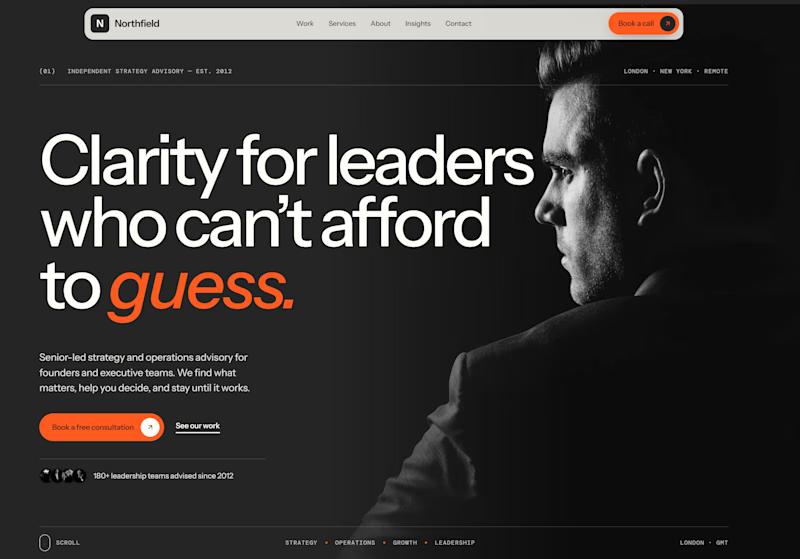
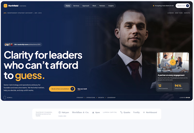
Exploring two different hero directions for a new project.
Same message, two completely different visual approaches.
Which one makes a stronger first impression?
A or B? Curious to hear your thoughts!

36 voted
90%
4 voted
10%
40 votes
Closed

Both are strong. I lean towards the dark version, because the orange accent on the italic "guess." pops and the profile portrait gives it a more editorial, confident feel. The navy one reads a bit more corporate, which could suit a more conservative audience. Nice exploration!

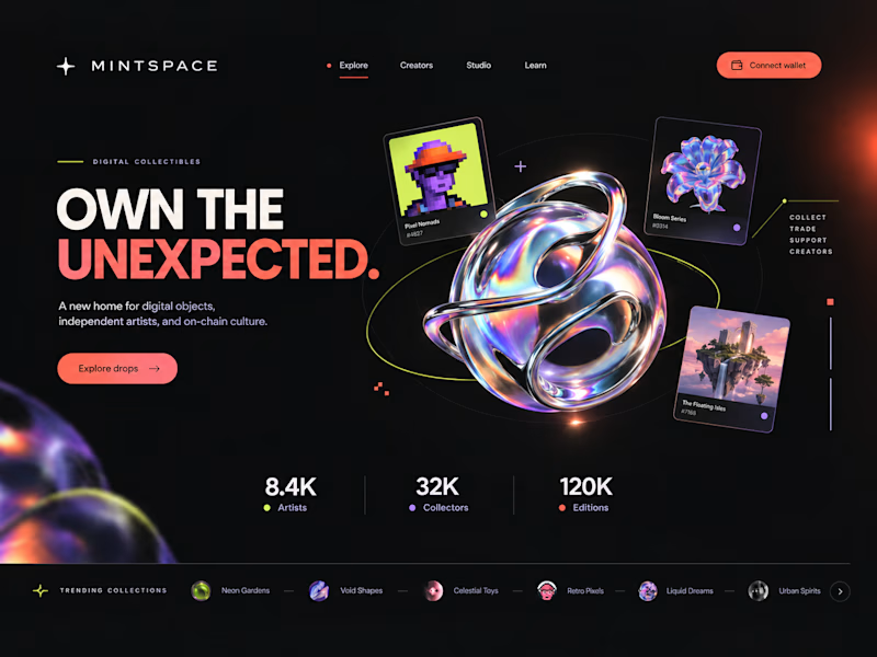
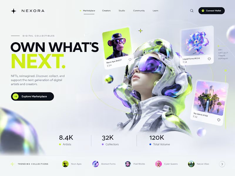
Two directions. One NFT marketplace.
Which visual direction would you choose?
🖤 A — Dark & Futuristic
🤍 B — Bright & Minimal
Both explore the future of Web3, but with completely different visual identities.
Drop your vote in the comments: A or B?
#UIUXDesign #WebDesign #NFT #Web3 #ProductDesign

10 voted
29%
25 voted
71%
35 votes
Closed

Strong design, well done

Every brand has a story to tell.
From logo marks to full visual systems, we design identities that hold up on screens, merch, and apps alike.
Watch the showcase and tell us which one is your favorite.
#BrandIdentity #LogoDesign #GraphicDesign #VisualIdentity


Great work