The network for creativity
Join 1.25M professional creatives like you
Connect with clients, get discovered, and run your business 100% commission-free
Creatives on Contra have earned over $150M and we are just getting started
Back to feedPost

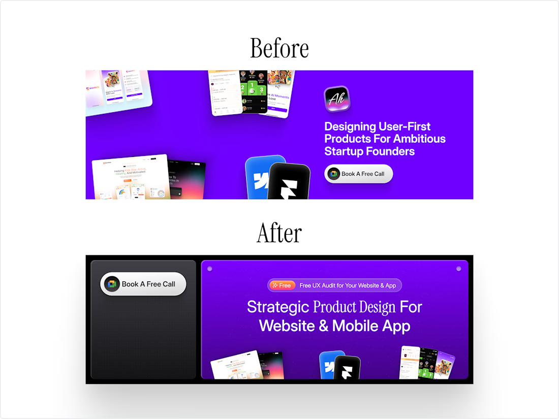
Updated my X banner finally
Small change, but messaging feels way cleaner now.
Open for feedback let me know what you think!
Designers, how often do you update yours?
The network for creativity
Join 1.25M professional creatives like you
Connect with clients, get discovered, and run your business 100% commission-free
Creatives on Contra have earned over $150M and we are just getting started

Challenges
View all


Related posts

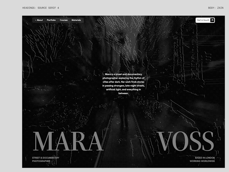
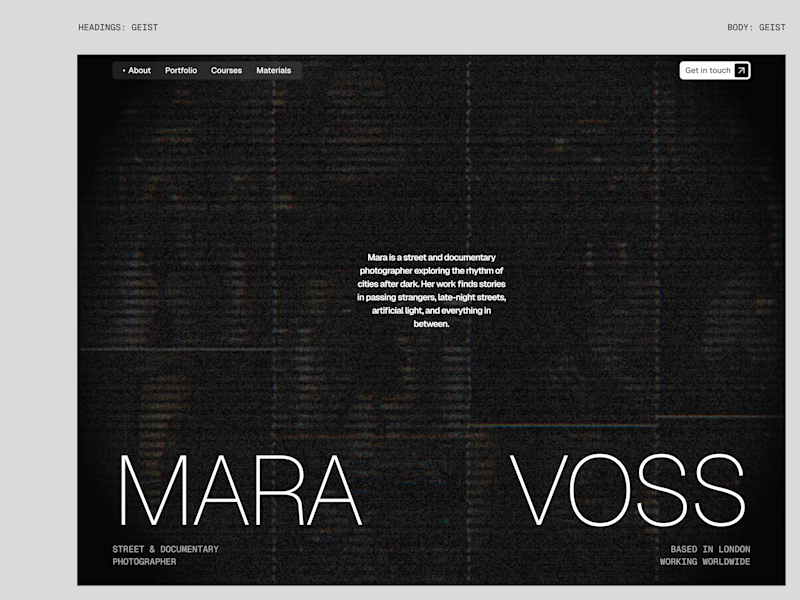
I tried experimenting a little with my previous design. I changed the fonts and background a bit. Which version do you like better?

22 voted
73%
8 voted
27%
30 votes
Closed

New design for sure. The distressed texture in the type makes it feel like actual street photography lives inside the letters. The previous version is clean but this one has grit.

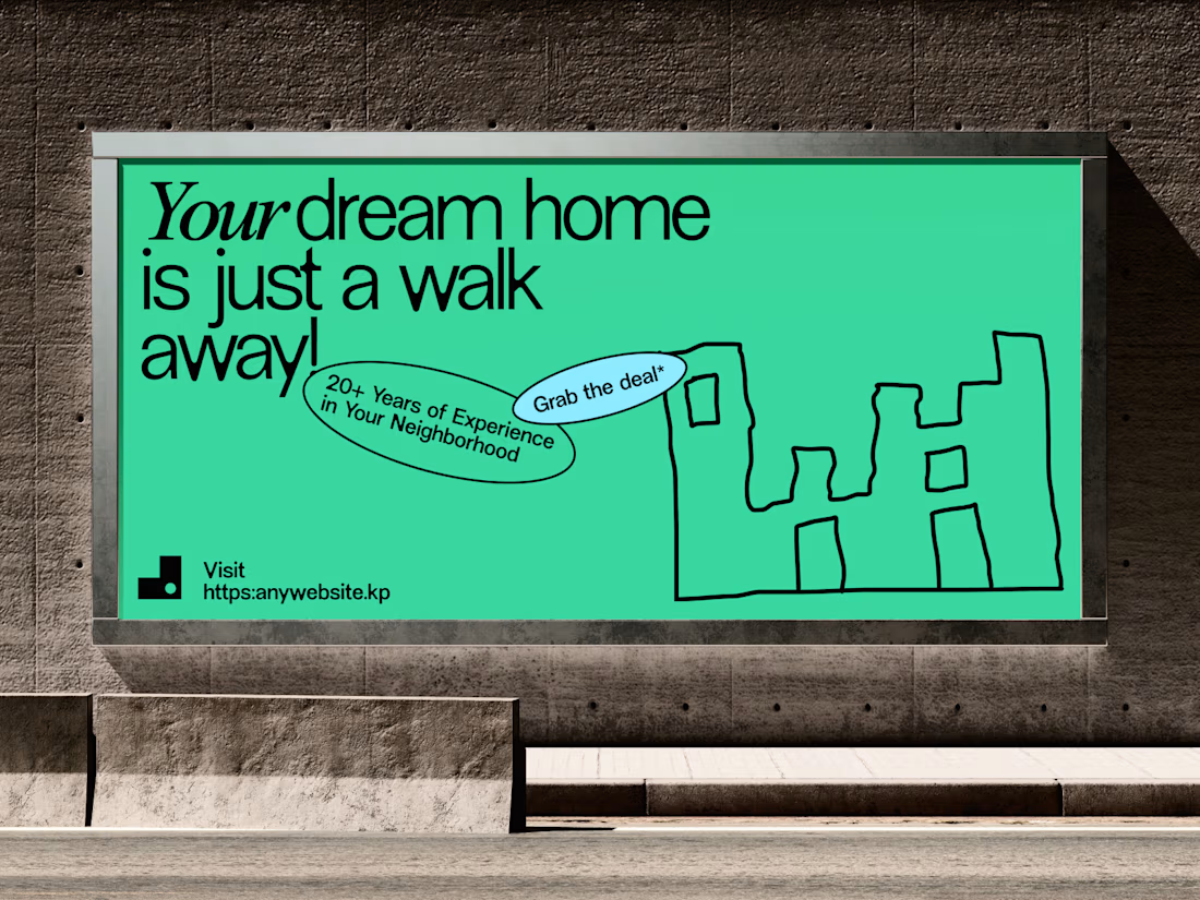
Aesthetic Real Estate Banner
Real estate advertising has one immediate challenge: get attention without taking attention away from the property.
For this banner concept, we built the composition around the property image and used typography, spacing and supporting details to create a more refined visual hierarchy.
The design keeps the message clear while giving the property enough space to make the first impression.
The result is an aesthetic real estate banner that can work across property promotions, digital campaigns and social media advertising.
Focus: Real Estate Banner Design · Property Marketing · Real Estate Advertising · Graphic Design · Brand Identity
Designed by WaxyWeb.
For real estate brands looking for a stronger visual direction:
realestatebannerrealestatebrandingrealestatedesignBrand DesignGraphic DesignVisual DesignAdobe SuiteFigma


Well Played

Working on a website redesign for one of the biggest crypto data providers.
Lots still under wraps, but these cards are my fav so far.
More soon ... 👀

The restraint in these dark cards is doing a lot of work—the tiny pixel details feel intentional, not decorative. The progression across the set makes the crypto product direction feel especially cohesive.