The network for creativity
Join 1.25M professional creatives like you
Connect with clients, get discovered, and run your business 100% commission-free
Creatives on Contra have earned over $150M and we are just getting started
Back to feedPost
Taste Test

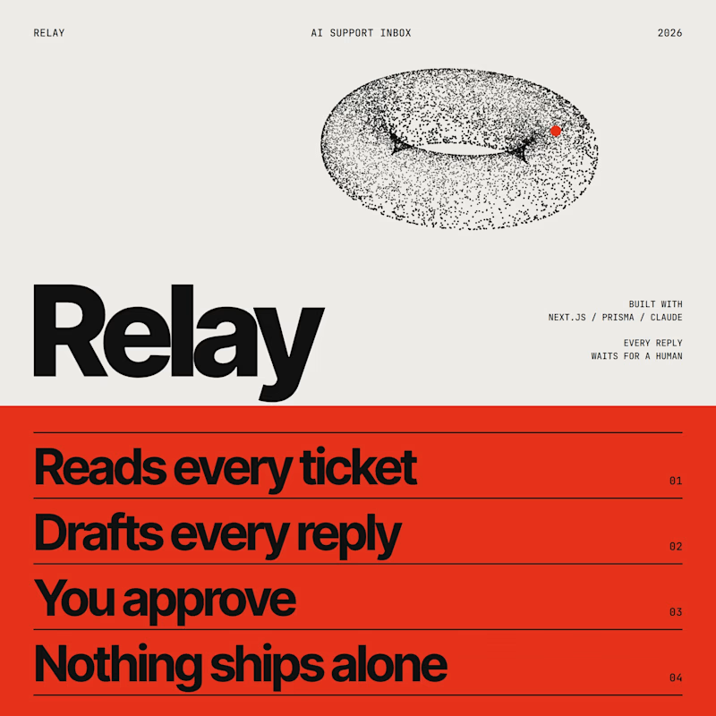
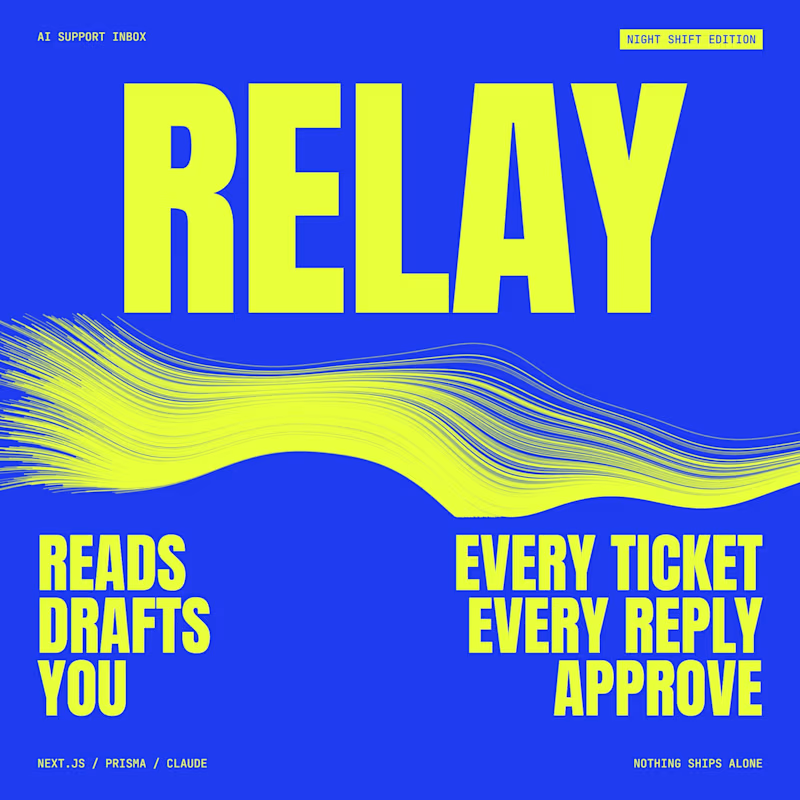
Relay, the AI support inbox I built, needs a launch poster.
Swiss grid in red and black, or Night shift in blue and acid yellow.
Which one would make you stop scrolling, and why?
1 vote
Ends in 1d

Night shift would stop my scroll: the acid yellow wave gives it motion before a single word is read, while Swiss grid reads more like a spec sheet. Curious who the launch is aimed at though, since support leads might respond better to the calmer red and black.
The network for creativity
Join 1.25M professional creatives like you
Connect with clients, get discovered, and run your business 100% commission-free
Creatives on Contra have earned over $150M and we are just getting started



Related posts

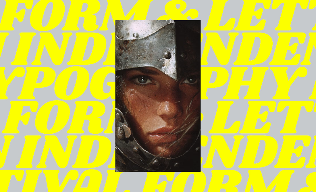
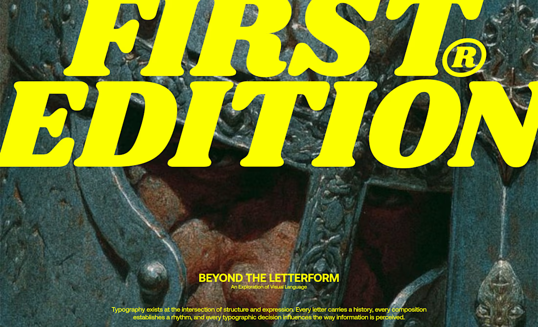
I designed a series of editorial-inspired layouts for a fictional typography event and workshop focused on the history of type.
↳ Master typography & layout - The foundation of timeless web design. Join 350+ designers inside my 13-hour online course https://typomonday.com/course

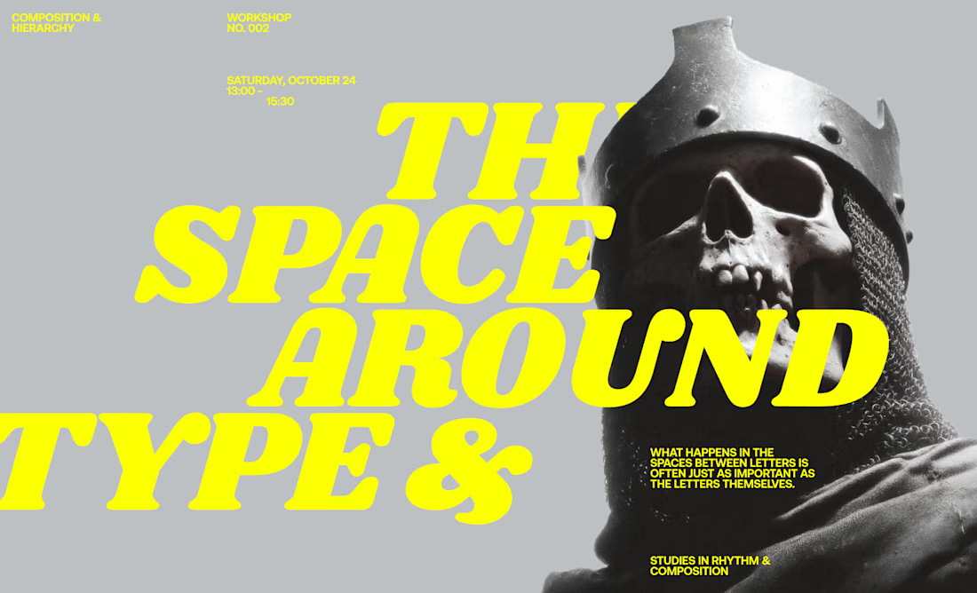
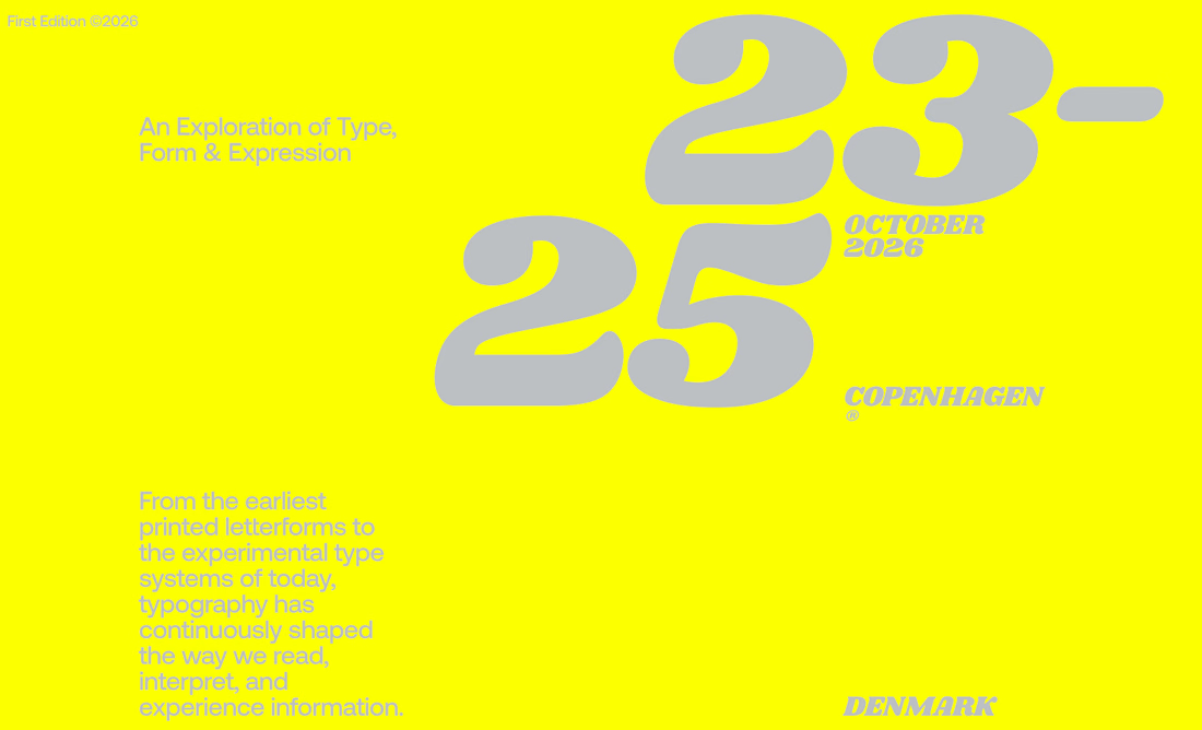

i love your compositions, always so inspiring:))

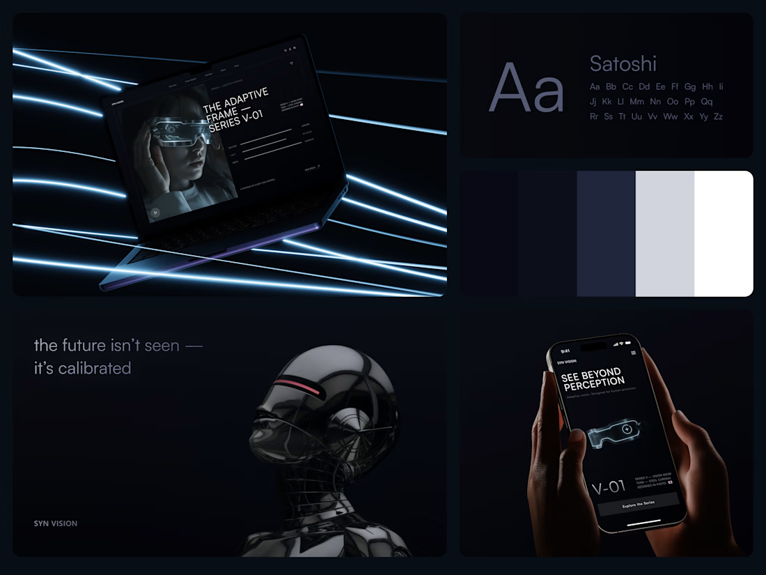
Smart Glasses Landing Page
"See beyond perception." Three words on the phone, and the whole page had to earn them.
On desktop, the headline starts over the edge of a tall portrait of the glasses being worn, so the product name and the product in use read as one image. Next to it, reaction, light and depth sit as three thin gauge lines, each with a one-word reading. Specs, without a spec table.
On mobile, a 3D render of the frame sits between the headline and a single Explore the Series button. One image, one next step.
The palette stays in deep navy and soft gray, so the cool light on the frame stands out on every screen.
Designed by the Hue & Machine team.
#WebDesign #LandingPage #ProductDesign #WearableTech #DarkUI #UIDesign #TechProduct #ResponsiveDesign #UXDesign #FigmaDesign



Good work

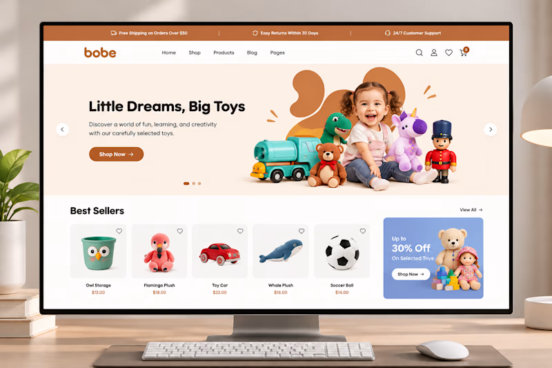
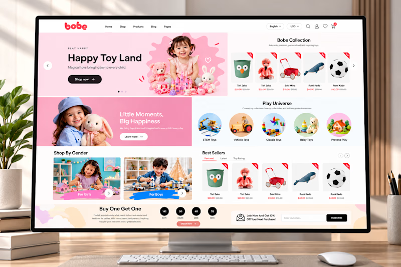
🎨 Which section makes the biggest impact on an eCommerce homepage?
I designed this playful toy store experience with a focus on product discovery, engaging visuals, and a seamless shopping journey.
But I'm curious about your opinion!
👇 If you were shopping on this website, which section would catch your attention first?
A. Hero Banner
B. Shop by Category
C. Best Sellers
D. Promotional Offers
Let's hear your thoughts! 👀
#ShopifyDesign #EcommerceDesign #UIUX #WebDesign
3 voted
60%
2 voted
40%
5 votes
Closed


Option 1 for me 💯