The network for creativity
Join 1.25M professional creatives like you
Connect with clients, get discovered, and run your business 100% commission-free
Creatives on Contra have earned over $150M and we are just getting started
Back to feedPost



The network for creativity
Join 1.25M professional creatives like you
Connect with clients, get discovered, and run your business 100% commission-free
Creatives on Contra have earned over $150M and we are just getting started

Challenges
View all


Related posts

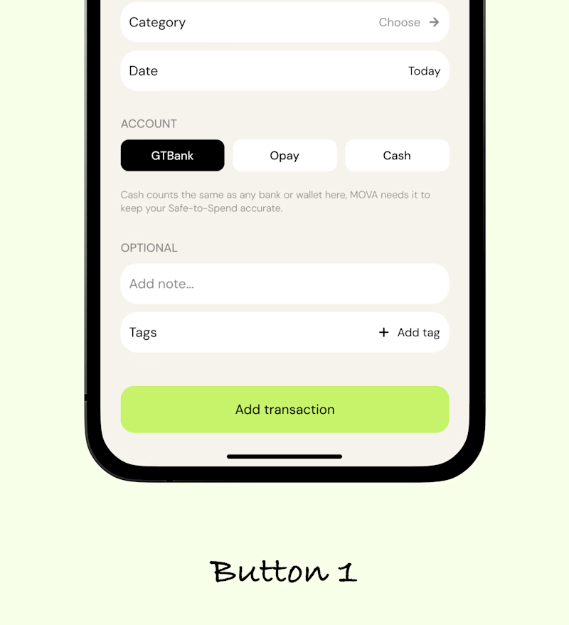
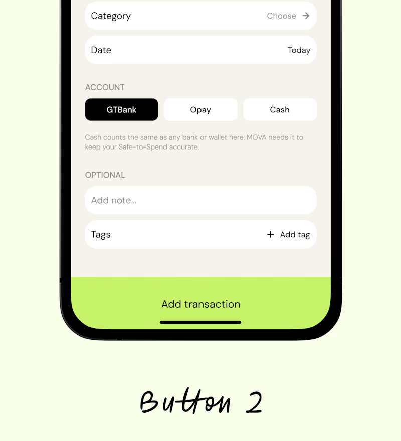

Button 1 does the work


I’ve been razzmatazzing and flibbertigibbeting with Claude Code and somehow ended up with a new yels.dev.
It finally feels like me: simple on the surface, slightly complicated underneath, and very much alive.
You can see who I am, what I do, the work behind Herodot, RaptorLabs, CyberLink Security and Solmint, plus a selection of projects I’ve built across AI, cybersecurity, Web3, product systems, education, archives, and experimental digital spaces.
Built to be explored


The simple-on-the-surface, layered-underneath idea comes through so clearly in the presentation. I especially like how the project archive turns the site into something to explore rather than just a résumé of links.


A brand can look beautiful and still feel forgettable.
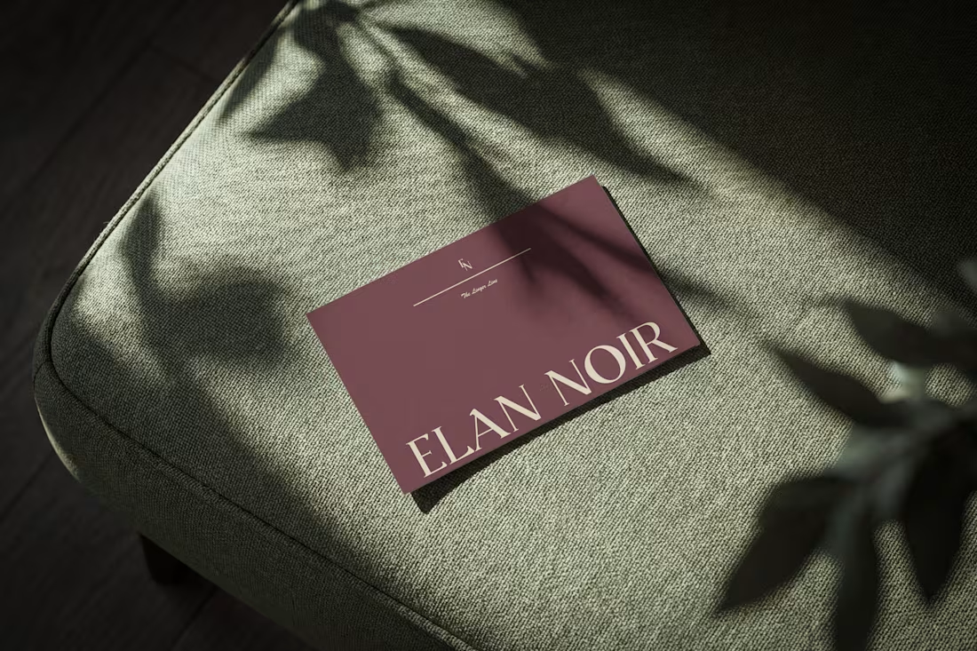
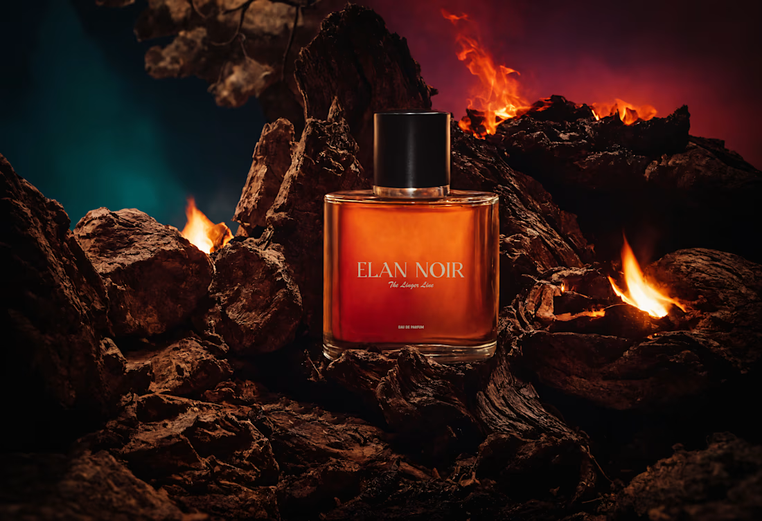
For ÉLAN NOIR, I wanted the identity to communicate something more specific: elegance, mystery, and quiet confidence.
That meant looking beyond the logo and thinking about how the typography, color, layout, packaging and overall visual language could create one consistent feeling.
That’s how I approach brand identity and packaging design.
Not just making individual pieces look good, but building a visual system that gives a brand something recognizable to grow with. I’m currently open to working with founders and brands in:
→ CPG → Food & Beverage → Wellness → Lifestyle → DTC → Consumer products
Whether you're building a new brand, launching a product, expanding your SKUs, or refreshing an existing identity, I'd love to hear what you're working on.
What makes a brand instantly recognizable to you?
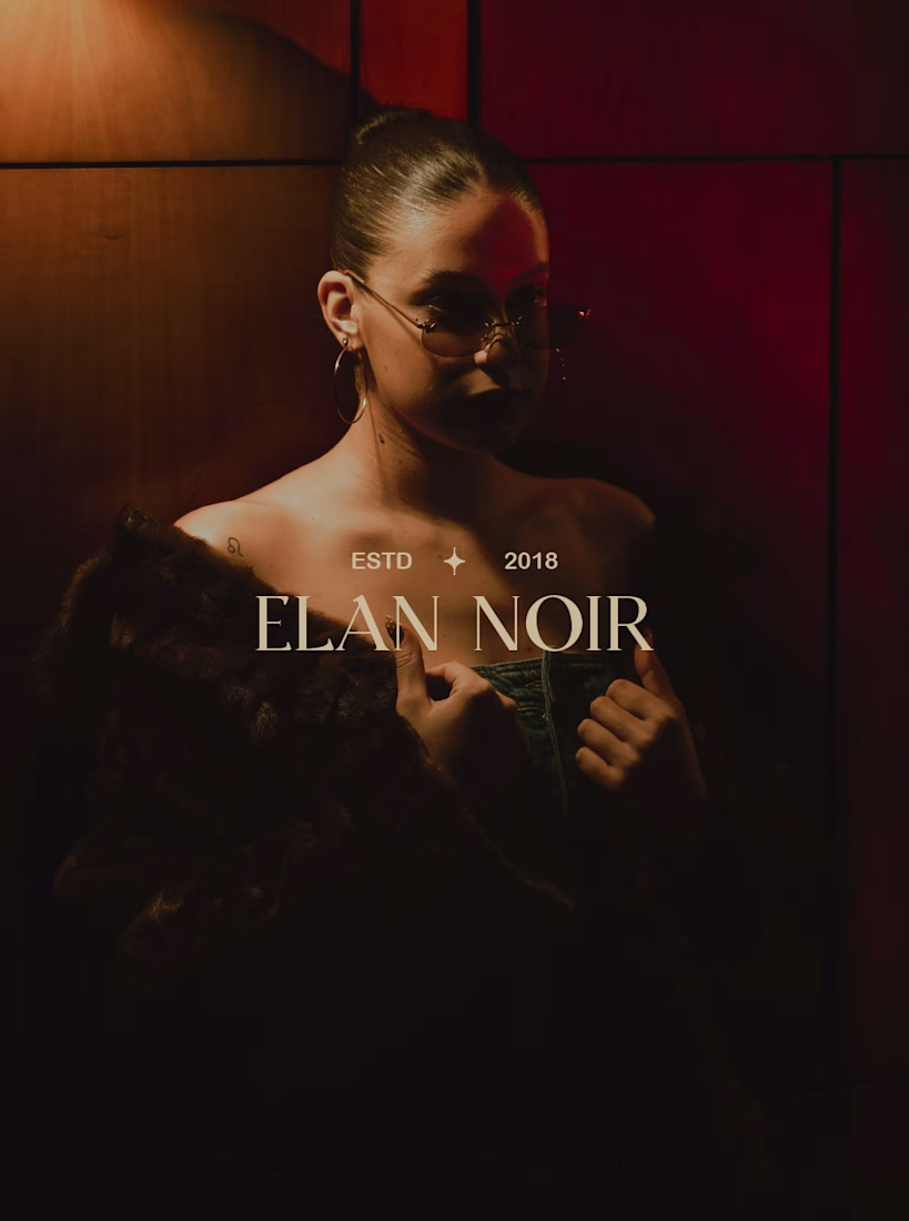
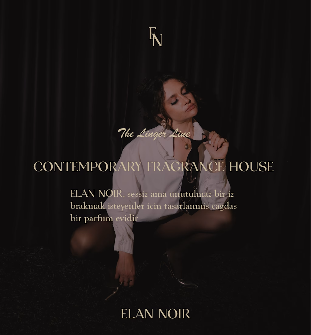

For me it's repetition of one non-logo asset — a crop, a paper stock, a specific shade — showing up often enough that people recognise it before they read anything. The low-key lighting is doing that job here; does it survive a retailer shooting the bottle on plain white?