The network for creativity
Join 1.25M professional creatives like you
Connect with clients, get discovered, and run your business 100% commission-free
Creatives on Contra have earned over $150M and we are just getting started
Back to feedPost

It’s interesting how logo design has changed. A hundred years ago, you could sketch something on a napkin in five minutes and that became a brand, not because it lacked quality, but because the visual world was just beginning.
Today everything is different. Making a vector is easy, but creating something truly original is the hard part. Anyone who says it’s simple has probably never gone through the real process.
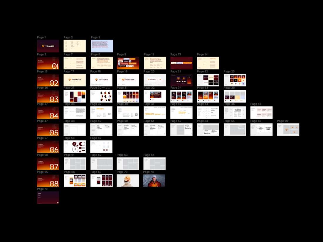
This screenshot shows only a small part of my digital sketches, not even counting the ones that start on paper before becoming something more solid.

The network for creativity
Join 1.25M professional creatives like you
Connect with clients, get discovered, and run your business 100% commission-free
Creatives on Contra have earned over $150M and we are just getting started











Related posts


Mastering Claude + Figma MCP has been a process, but it’s already made iterating on brand assets significantly faster


Same here, once it clicks the iteration speed is wild. Would be cool to see how you set up your workflow.

Little did I know this logo I designed would be seen billions of times.
And that kids would walk on the street rocking the logo on their chest 🤯
Seeing kids wear your logo on the street must be such a surreal feeling. Amazing work Tim!

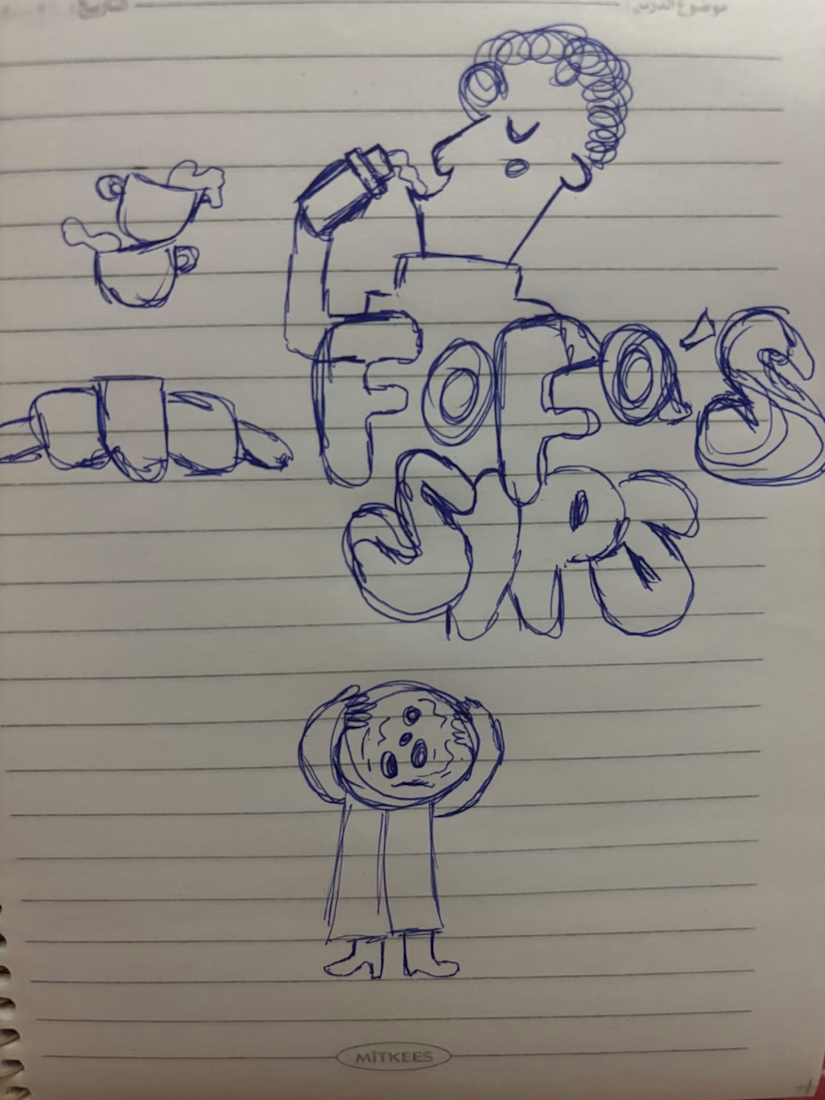
I turned one of my notebook doodles into a whole brand identity. And honestly this was way more fun than I expected I usually work on UI/UX and digital products so I wanted to take a step back from screens and explore something completely different: illustration-led branding.
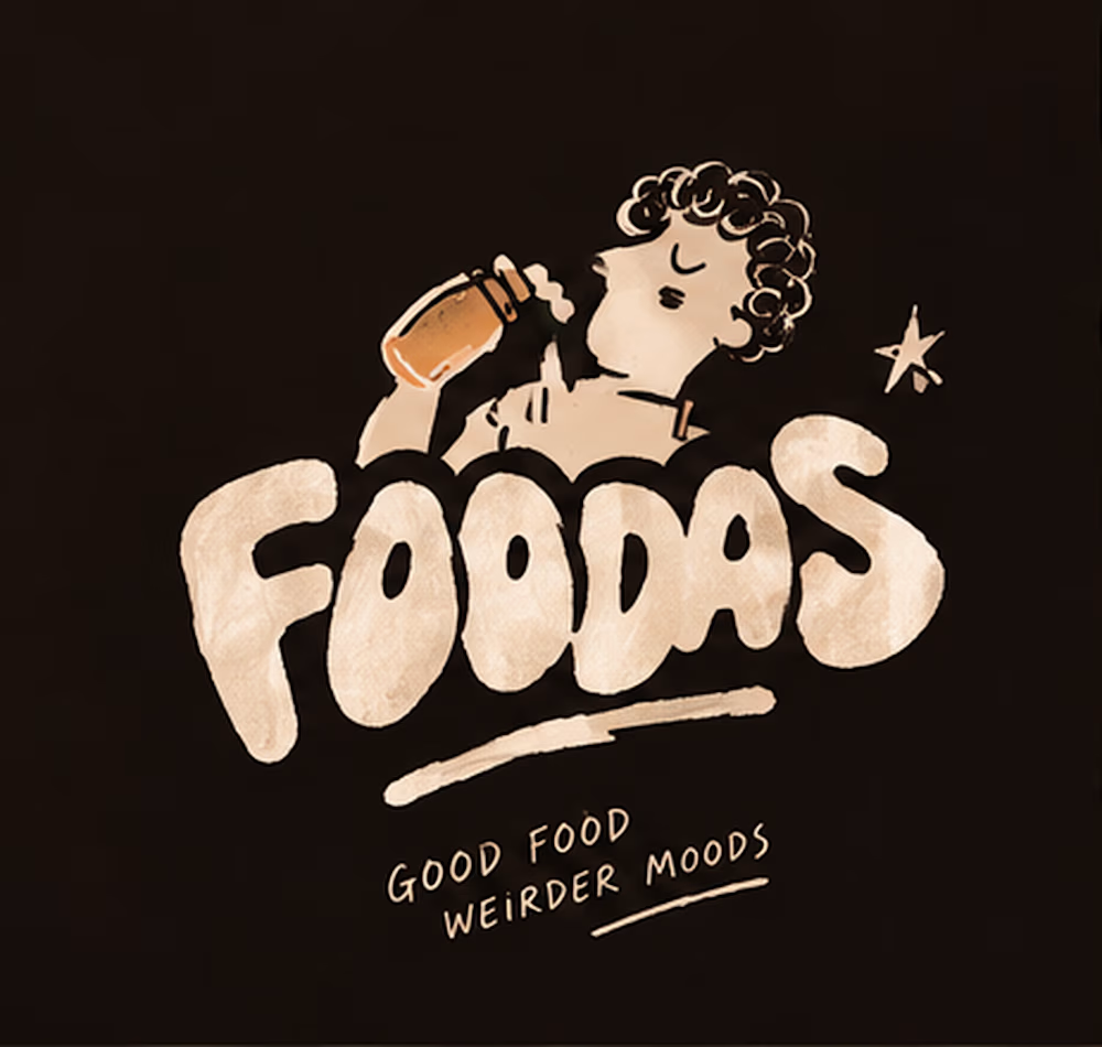
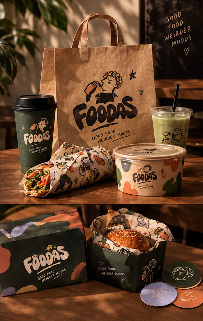
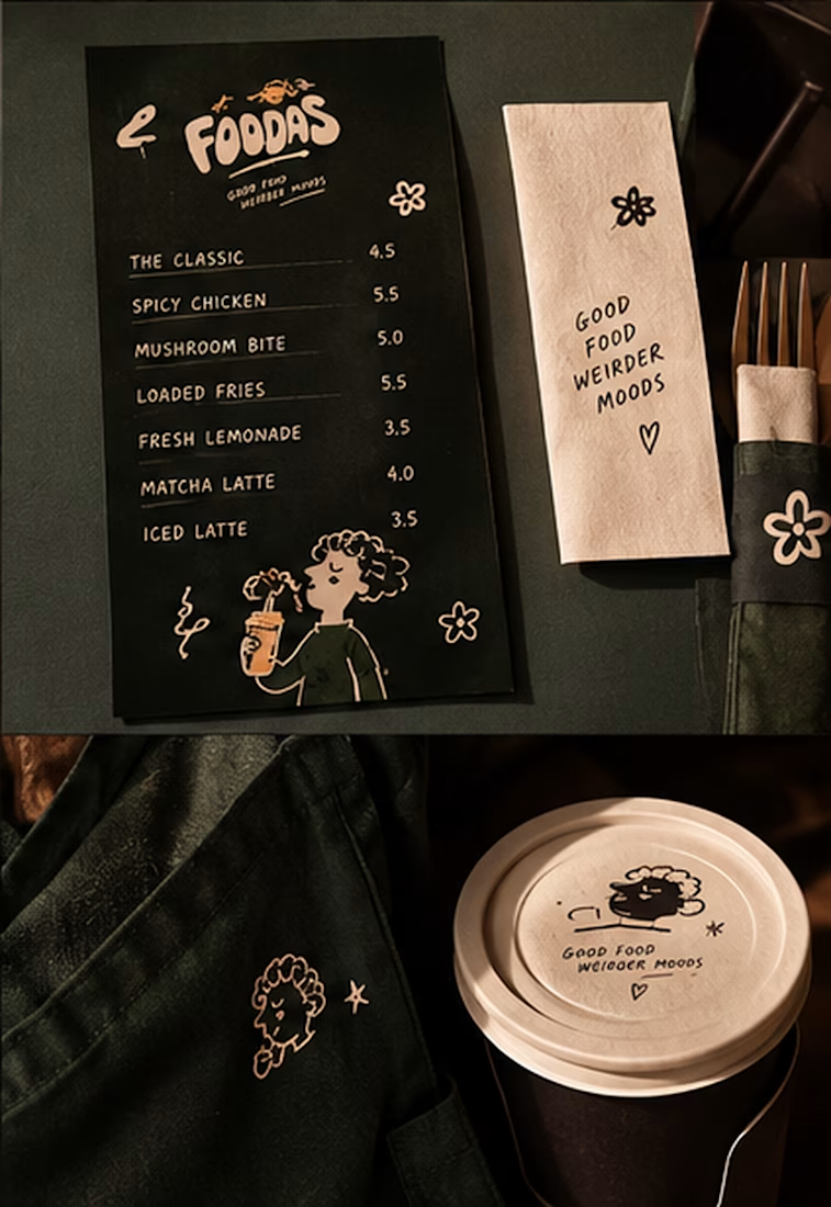
I took my original FOODAS sketch and built an entire visual world around it from the logo and mascot illustrations to the color palette packaging, cups, and menus
The goal wasn't to make it look perfectly polished and predictable I wanted it to feel playful, a little weird, and still premium.
Now I'm curious about one thing:
Can playful, imperfect illustrations make a brand feel more premium or do you think premium branding needs to be more minimal?
I have a feeling designers will disagree on this one