The network for creativity
Join 1.25M professional creatives like you
Connect with clients, get discovered, and run your business 100% commission-free
Creatives on Contra have earned over $150M and we are just getting started
Back to feedPost
Taste Test


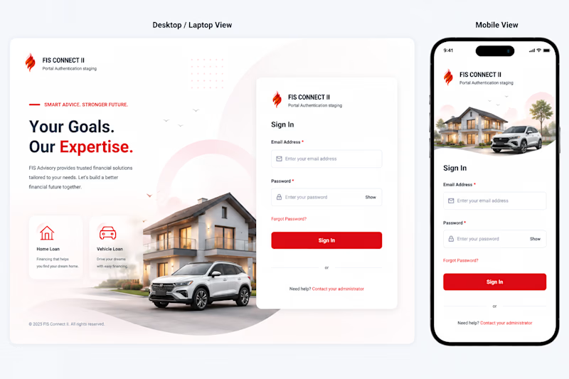
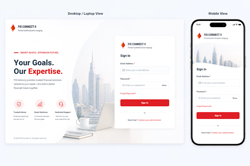
Working on the login screen for the project and I have come down to these 2 options to select from. I would love to hear your choices and any feedback or improvements that I can make to these.
Do let me know in the comments!
10 voted
63%
6 voted
37%
16 votes
Closed

login A looks more elegant...
It does! Thank you

Yes, red has been the firm's primary color since its inception, but yeah, it does pop, for good reasons and I personally like Login A more.

Leaning towards B. In Option A the car and house visuals feel slightly heavy and fight the login card for visual hierarchy. B keeps it calm and trustworthy.
Point noted. The car and the house are deliberately places their as the firm provides car and home loan advisory as their services but I definitely agree that B feels more calm.
Thank you for your feedback, really appreciate it!

I lean toward Login B for this particular screen: the quieter city backdrop keeps the form in focus, especially on mobile. A has stronger lifestyle storytelling, which could work well earlier in the journey. I’d also check the small field labels and recovery link at actual phone size.
Yes, and since the client provides car and home loan advisory services, place the car and the house becomes almost a storytelling choice, and agreed, I will definitely check on the field labels and recovery link at various phone sizes to make sure it is responsive!
Thank you for your feedback, really appreciate it!

Went with A. The house and car photo does more to sell the lifestyle promise in "Your Goals, Our Expertise" than the city skyline does, feels warmer for a first touchpoint like login.
Couldn't agree more, thanks for your feedback🙌
The network for creativity
Join 1.25M professional creatives like you
Connect with clients, get discovered, and run your business 100% commission-free
Creatives on Contra have earned over $150M and we are just getting started





Related posts

Same prompt. Two builders.
One site made with Lovable, one with Google AI Studio. A Flemish still-life snack brand, gilt frames, GSAP scroll, the works.
Which one is better?
33 voted
67%

16 voted
33%

49 votes
Closed

Light or dark, which one wins? ☀️🌙
Same site, two moods. Warm stone and lacquer red, or the same build after dark.
Both are hand-built with a 3D paper crumple, real physics, a stick-figure film drawn in code, and a receipt that gets a bicycle kick. 🔊 Sound on.
Tell me which you'd ship: light or dark? 👇
26 voted
59%
18 voted
41%
44 votes
Closed

I really like how the light version looks, but it has some legibility issues. Since readability is more important for users than visual appeal, I think the dark version is the better option.
BTW, I initially voted for the light version, but after analyzing both options more closely, I changed my mind 😄

Minimal vs Detailed - Which coin design feels more premium for a fintech brand?
9 voted
27%
24 voted
73%
33 votes
Closed

I like the premium gold version