The network for creativity
Join 1.25M professional creatives like you
Connect with clients, get discovered, and run your business 100% commission-free
Creatives on Contra have earned over $150M and we are just getting started
Back to feedPost
Designing a developer portfolio that doesn't look like a template
The brief
Build a developer portfolio in Next.js and Tailwind. No generic AI-looking hero. Dribbble-level polish.
The starting point
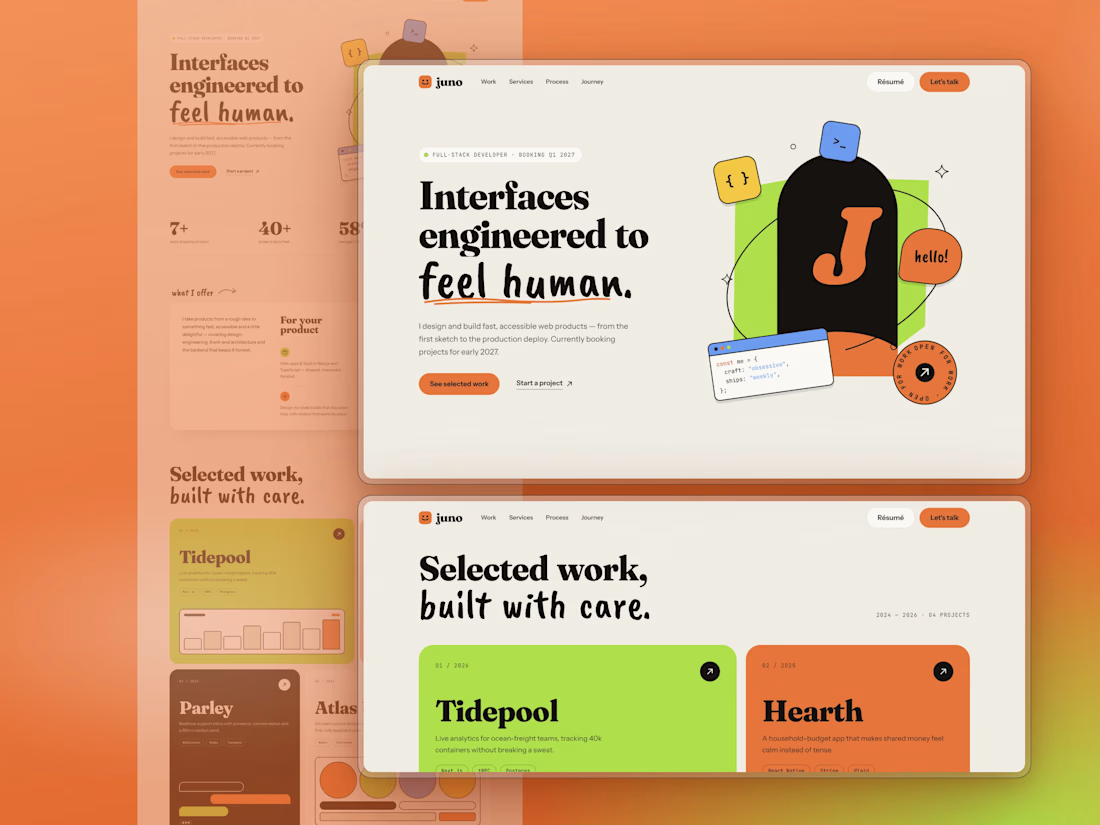
I took a reference site with a warm cream background, a chunky serif, a handwritten accent and a photo cutout over a lime shape. The rule was to take inspiration, not copy: borrow the mood, the type pairing and how elements are placed, then make it a different page.
Decision 1: replace the photo with a composition
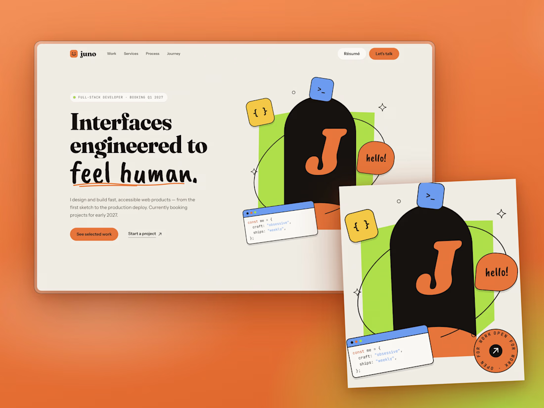
A portfolio template can't ship someone's face, so I built the hero from code instead. A lime slab, an ink arch holding your initial, an orbit line that passes behind the arch and in front of it, and floating stickers: a code window, a "hello!" bubble, a spinning "open for work" badge. They sit on separate depth layers and shift with the cursor. If you drop a transparent PNG into public/, the hero swaps your photo in automatically.
Decision 2: type that does the talking
Fraunces at heavy weight for headlines, a brush script for one phrase per section, Instrument Sans for reading, JetBrains Mono for labels. The script is kept rare on purpose. Overuse makes it a gimmick.
Decision 3: contrast before aesthetics
The reference uses white text on orange. At body size, white on that orange fails WCAG AA, so my buttons use ink text instead. It also reads more editorial.
Decision 4: single-column storytelling
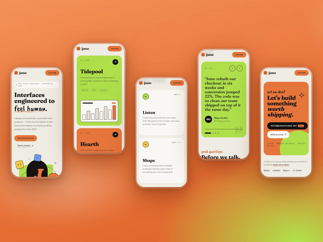
My first journey section used two columns and felt sparse on the right. I moved it to one column with a vertical timeline, full-width roles and stack tags.
A mistake worth sharing
My first testimonials section was a horizontal scroller. On a wide monitor the cards sat flush against the left edge, because I'd written an invalid calc() for the padding and the browser silently dropped it. The staggered offsets made it look worse. I replaced it with one featured quote at a time: arrows, dots and a panel that changes colour per person. Simpler, and it reads better.
What I'd do next
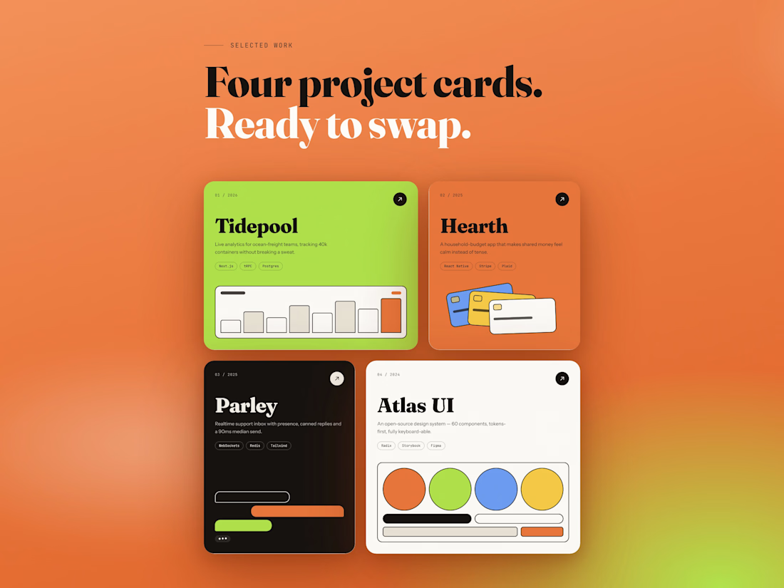
Real project screenshots instead of CSS mock-ups, and a case-study page template for each project.
Built with Next.js 16, React 19, Tailwind v4 and TypeScript. No image files, all SVG and CSS.



Beautiful work

Ok I like the design concept, its quite nice

"No generic AI-looking hero" is a good brief to set yourself. The warm cream base already makes it feel more personal than most dev portfolios.

This is a fantastic breakdown. Building the hero from code instead of shipping a photo is such a smart constraint, and the depth layers shifting with the cursor sound like they give the page a real sense of play. Honestly, the mistake sharing is my favorite part. The calc()...

Thanks! The hero composition changed the feel the most. It set the tone for everything below it. Honestly, the calc() bug taught me more, though. A silently dropped declaration is such a sneaky failure.

Love that you shared the testimonials mistake. The orange and green palette is bold.
The network for creativity
Join 1.25M professional creatives like you
Connect with clients, get discovered, and run your business 100% commission-free
Creatives on Contra have earned over $150M and we are just getting started











Related posts

FOCUS — Creative Portfolio & Digital Art Website 🌸✨
A visually expressive website concept for a creative portfolio, built around digital art, bold imagery, and visual storytelling
The design combines vibrant pink tones, soft gradients, experimental typography, and immersive photography to create a distinctive editorial experience
Special attention was given to:
• Bold editorial hero composition
• Vibrant pink and dark color palette
• Experimental typography and visual details
• Immersive photography and digital artwork
• Creative project gallery and navigation
• Responsive mobile experience
• Clean layouts with a strong visual identity
The result is an expressive digital experience that puts creativity, emotion, and visual storytelling at the center of every screen 💗
Looking to create a standout portfolio or website for a creative brand? Let’s connect 🚀


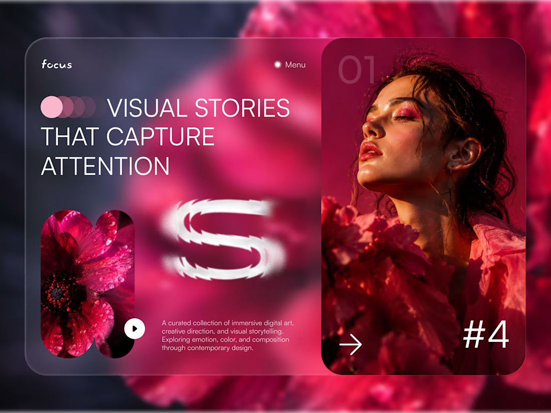
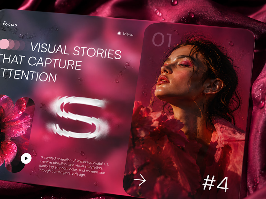
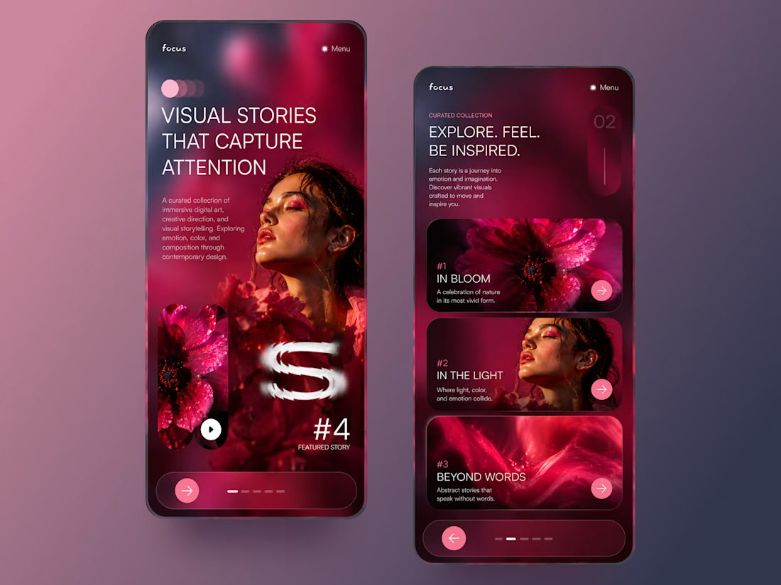
The vibrant pink against the dark palette gives this such a bold editorial feel. The experimental typography is the star here.

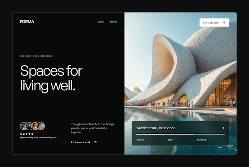
Design Exploration: Hero Section of Architecture Website. Which one do you think much better?


12 voted
43%
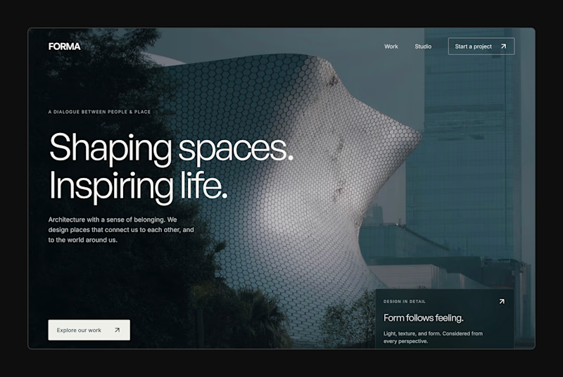
16 voted
57%
28 votes
Closed


An interaction study for Mare’s collection feed, exploring how to make groups legible within a dense, mixed-format archive.
The layout preserves image proportions and integrates collection labels into the packing system. On hover, image-derived gradients establish the collection boundary, while subtle displacement creates space around the active group without changing its position or scale.
The motion studies isolate assembly, packing, colour and proximity, using real collection content to examine timing, spatial continuity and hover behaviour.
