The network for creativity
Join 1.25M professional creatives like you
Connect with clients, get discovered, and run your business 100% commission-free
Creatives on Contra have earned over $150M and we are just getting started
Back to feedPost


the PLAY TIME screen is so fun. did you make all the icons?
Thanks! Naw, i found some old icons from different stuff that I had used from different Spline projects awhile back lol

Nice Creativity


the toys landing in front of the type instead of around it is a nice call

I love it

Well done! 🚀

Love the playful interaction

The collision of playful icons with the oversized type makes the hero feel instantly alive. The restrained black-and-white frame gives the motion plenty of room to breathe.

Haha that is fun man, good job!! 🎉


love a hero you can actually poke at

I think the users of this product will never be bored.
The network for creativity
Join 1.25M professional creatives like you
Connect with clients, get discovered, and run your business 100% commission-free
Creatives on Contra have earned over $150M and we are just getting started



Related posts

Built this free SaaS portfolio template in Framer a few months ago, and it’s been amazing to see the momentum it’s gaining! 🚀
It’s now ranked #18 in Framer’s Marketing category, bringing in more visibility, views, and commissions.
I’ve shared the full case study here, covering the project and how it came together.
Take a look if you’re curious! 🙌


This is amazing Fawaz! 🚀 Ranked #18 in Framer's Marketing category is huge! Love how you turned a free SaaS template into visibility + commissions. That's smart product thinking. Can't wait to read the full case study, congrats on the momentum!


Which hero background works better?
9 voted
75%
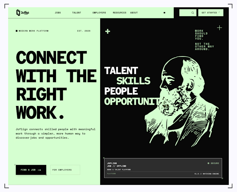
3 voted
25%
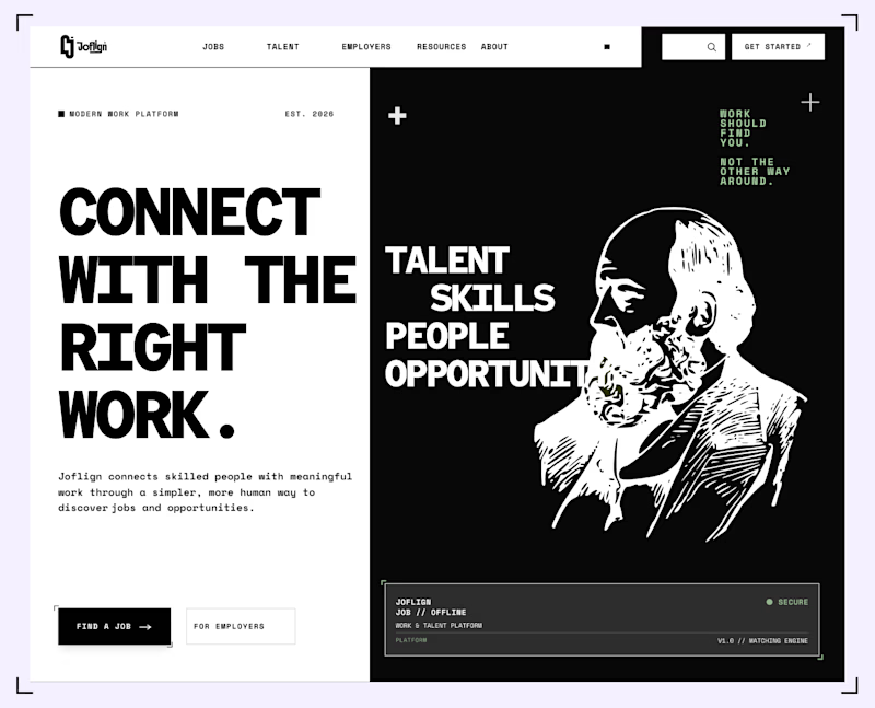
12 votes
Closed

I lean light green because it carries through both the copy panel and the illustration, making the two halves feel connected. I’d keep “Find a job” clearly stronger than “For employers” if jobseekers are the main audience. That hierarchy matters more than the background preference alone.


