The network for creativity
Join 1.25M professional creatives like you
Connect with clients, get discovered, and run your business 100% commission-free
Creatives on Contra have earned over $150M and we are just getting started
Back to feedPost

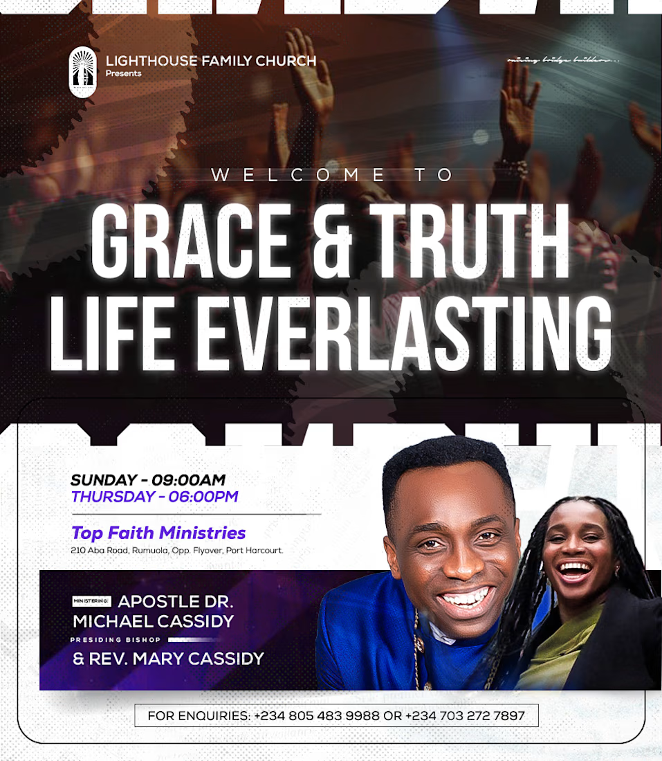
added a halftone texture to a flyer just to see what would happen.
I wasn't expecting much.
But the moment it hit ,the whole design changed.
Suddenly it had depth. Character. That premium editorial feel you can't fake with flat design alone.
A technique from the 1800s just made my 2025 work better.
Moral of the story ,never stop experimenting. The oldest tools sometimes unlock the best results. 🎨
Frederick | Fredarts Studios
The network for creativity
Join 1.25M professional creatives like you
Connect with clients, get discovered, and run your business 100% commission-free
Creatives on Contra have earned over $150M and we are just getting started








Related posts

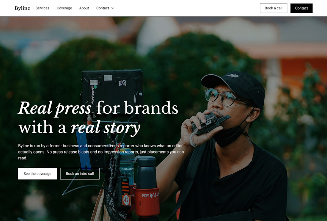
Built this in Framer as a concept project. Goal was to make it feel run by ex-journalists. Choices: editorial serif (Libre Baskerville), a dark photo with one color accent, and copy that positions against blast-style PR.
Where I’m unsure: text legibility over the photo and whether the two CTAs compete. What would you change?



That's great design it feels professional I like how the background mixed with interface ❤️❤️
Great job Cheree🎉🎉

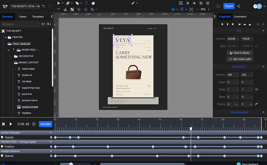
THE RECEIPT turns a simple thermal receipt into an editorial fashion launch announcement.
Built with Codex and SVGator MCP, the template lets creators swap brand identities, product imagery, and copy while keeping the same animation, making it ideal for product drops, collection launches, and promotional campaigns.


this is amazing!

When I create templates, the most important thing for me is that they actually work for businesses, not just exist as beautiful animations for the sake of animation. Showing results is one of the simplest and most effective visual marketing techniques. A good before-and-after comparison can often say more than a whole paragraph of copy.
That idea is what shaped Before/After Reveal — a 9-second animated ad template for businesses where the result is the main message. It can work for skincare, dentistry, car repair, and many other industries.
The concept is simple: reveal the transformation, highlight the result, and end with a clear call to action.
I also wanted to make the template genuinely reusable. You can swap two photos, change the logo and copy, and quickly turn it into a new campaign. All elements are properly named, and the text remains editable.
I built the entire animation using Claude through SVGator MCP, from the before-and-after reveal to the masking effects and keyframes.