The network for creativity
Join 1.25M professional creatives like you
Connect with clients, get discovered, and run your business 100% commission-free
Creatives on Contra have earned over $150M and we are just getting started
Back to feedPost

Graphic Design | Social Media & Branding | Sample Project


The network for creativity
Join 1.25M professional creatives like you
Connect with clients, get discovered, and run your business 100% commission-free
Creatives on Contra have earned over $150M and we are just getting started











Related posts

The team is cooking
Motion design for the logo we are making for Nation e-commerce


Wou

Finally a Contra Top Independent!
Been part of this community for a few years now, sharing my work, joining challenges, meeting some great people, and even picking up a few wins along the way.
I've genuinely enjoyed being part of Contra and seeing how much the platform has grown.
This one means a lot. Big thanks to the Contra team for the recognition!
More to come!


Second Serve Club — Exploring Visual Identity Through AI & Design.
For this branding challenge, I created a series of original logo marks in Adobe Illustrator, inspired by vintage tennis culture.
I then explored how these designs could come to life by combining my own typography, monograms and colour identity with AI-generated visuals using ChatGPT.
From the texture of a clay court to embroidered details on tennis balls, the goal was to bring the brand identity into a more tangible, realistic setting.
An exploration of how traditional graphic design and AI can work together to create a cohesive visual world.
Designed by me. Visualised with AI. 🎾
Full brand identity case study coming soon.
#BrandIdentity #VisualIdentity #GraphicDesign #AIDesign #ChatGPT

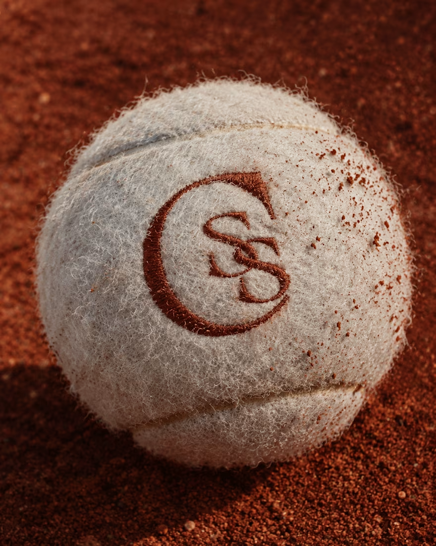
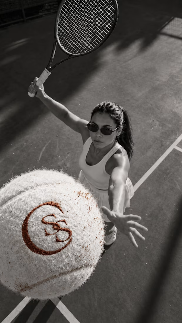
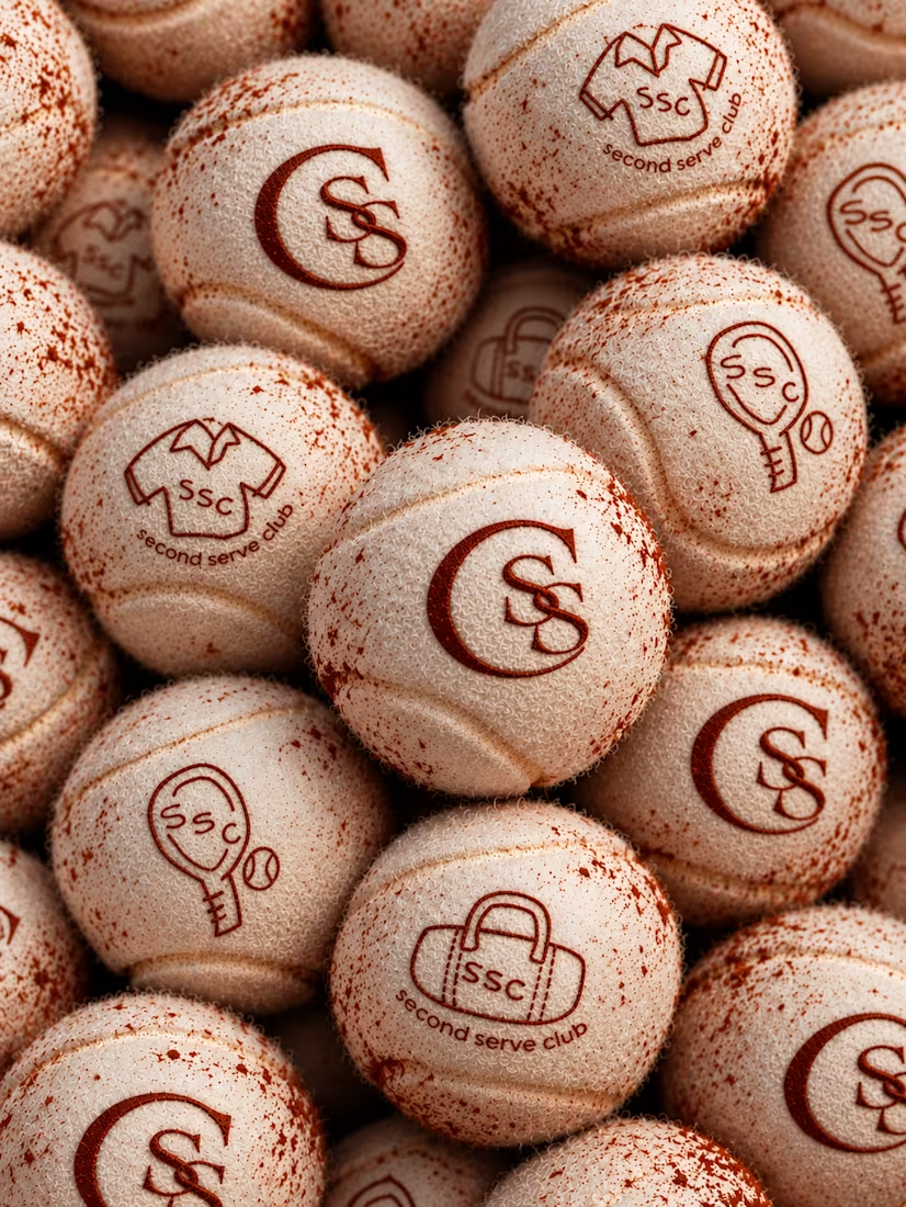

The SS mark stamped into the tennis ball felt is a great detail. Looks very real on the clay court.