The network for creativity
Join 1.25M professional creatives like you
Connect with clients, get discovered, and run your business 100% commission-free
Creatives on Contra have earned over $150M and we are just getting started
Back to feedPost

fitness, gym and e.t.c...

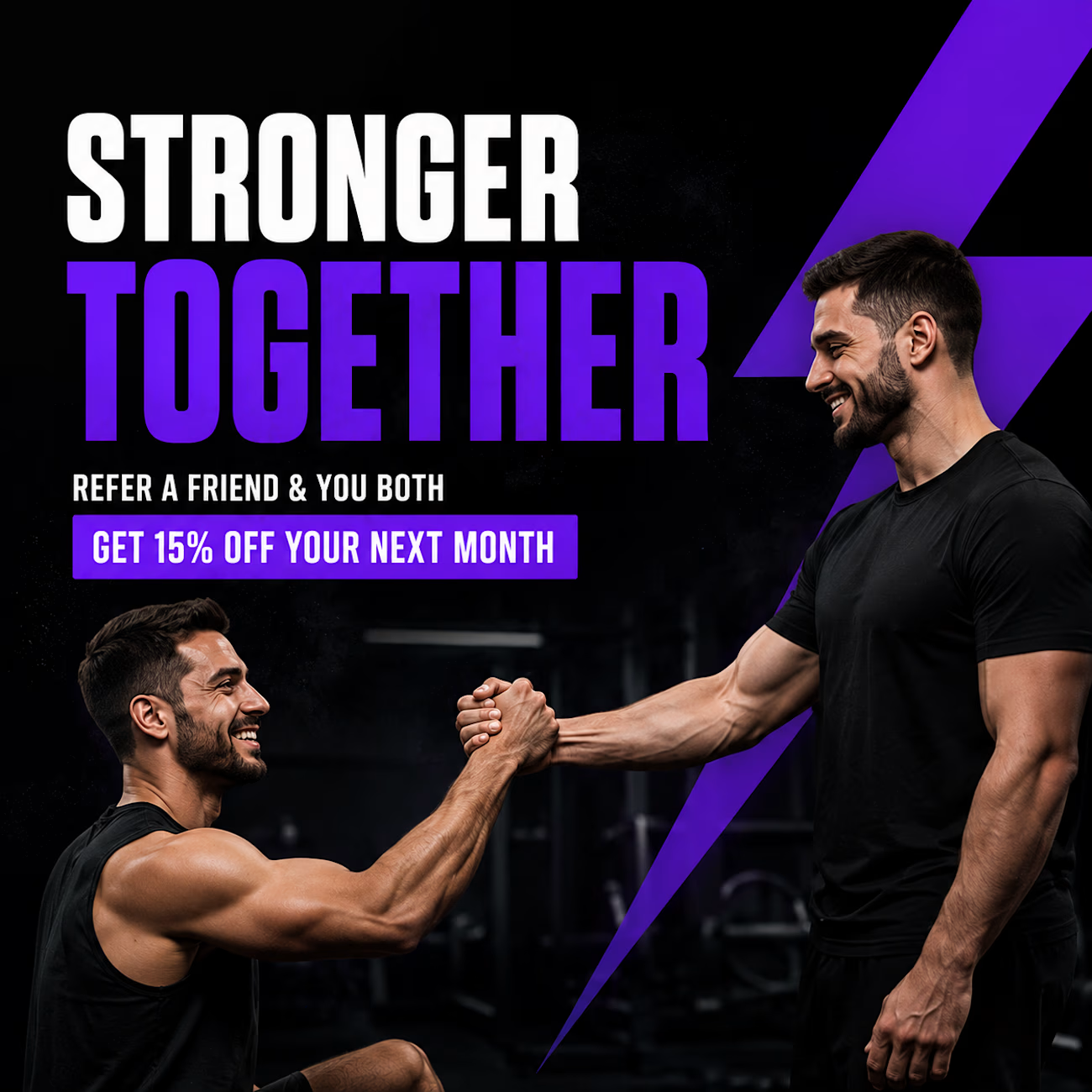
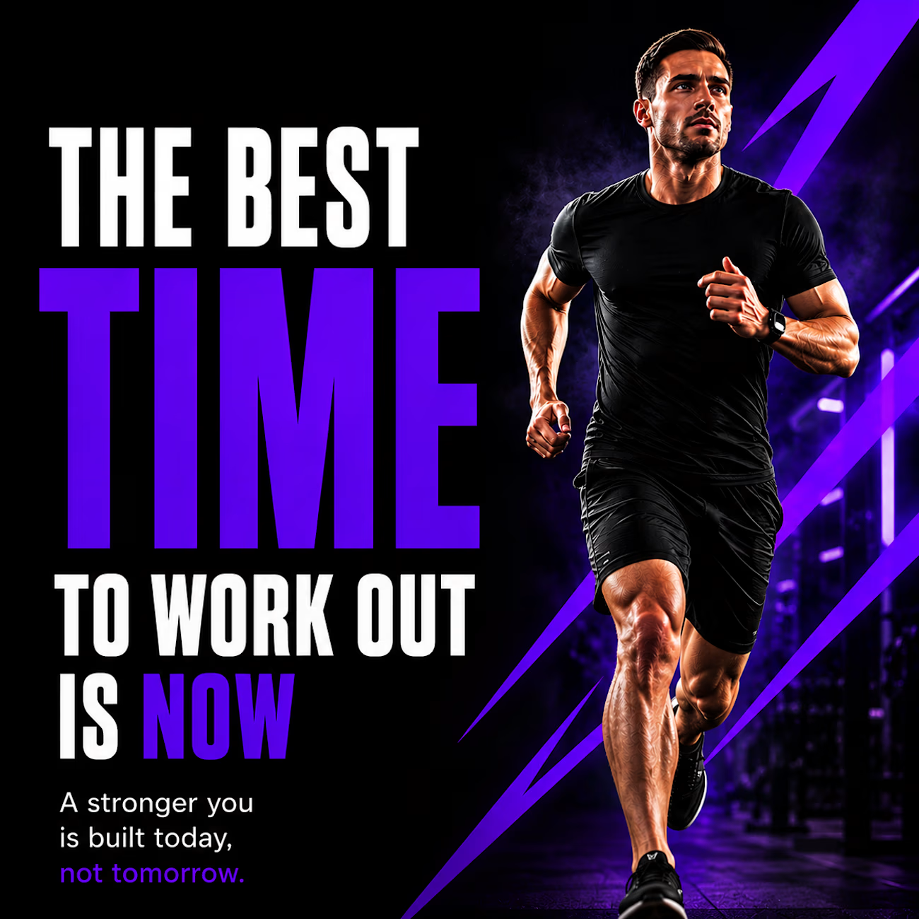
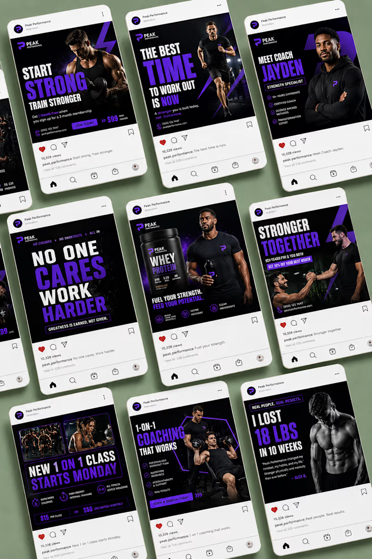
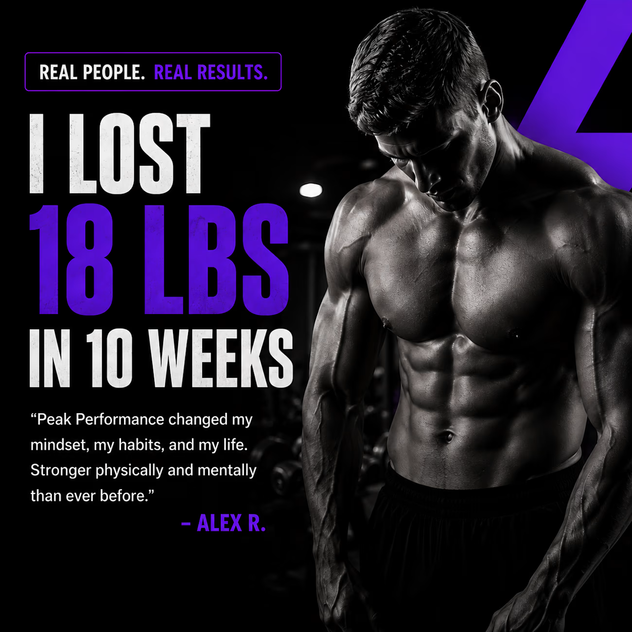
PEAK PERFORMANCE | Fitness Social Media Campaign
A bold fitness campaign designed to make every post feel powerful, energetic, and performance driven. I combined strong typography, high contrast visuals, electric purple accents, and motivational messaging to create a cohesive...
The network for creativity
Join 1.25M professional creatives like you
Connect with clients, get discovered, and run your business 100% commission-free
Creatives on Contra have earned over $150M and we are just getting started

Challenges
View all


Related posts

Branding & Packaging Design for Glowy


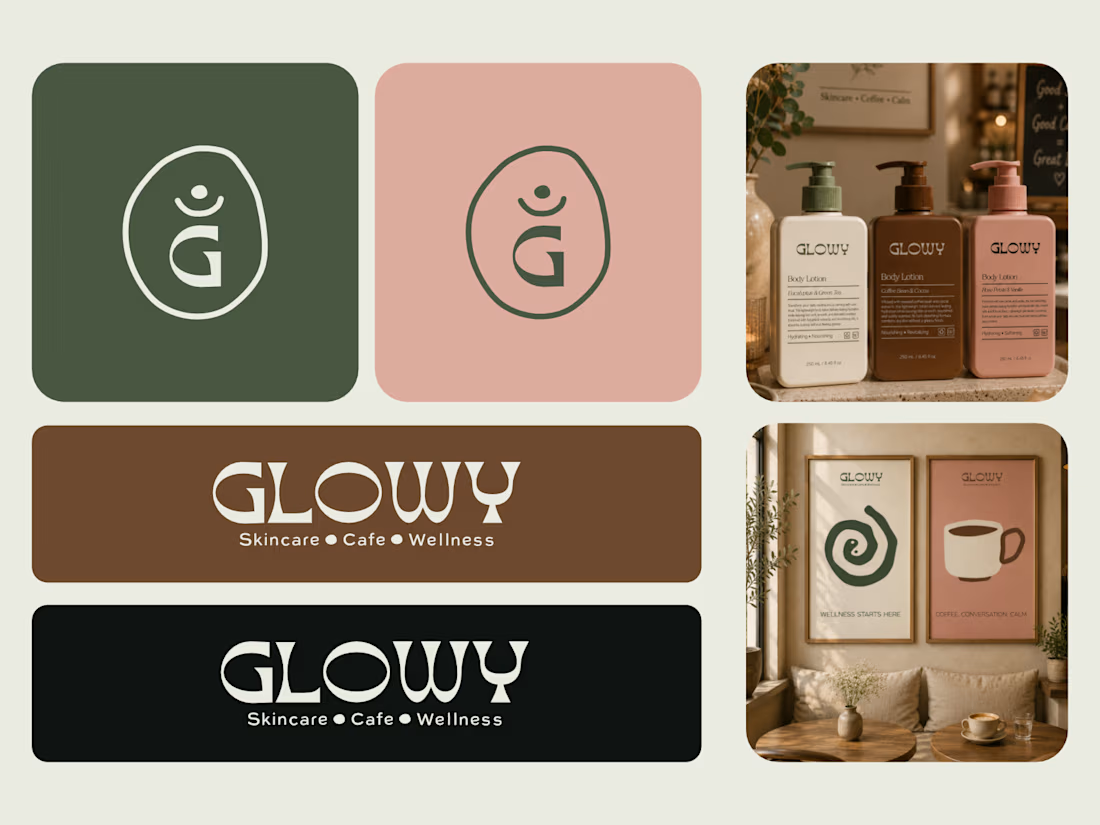

This is great! Something about it makes it have an African vibe

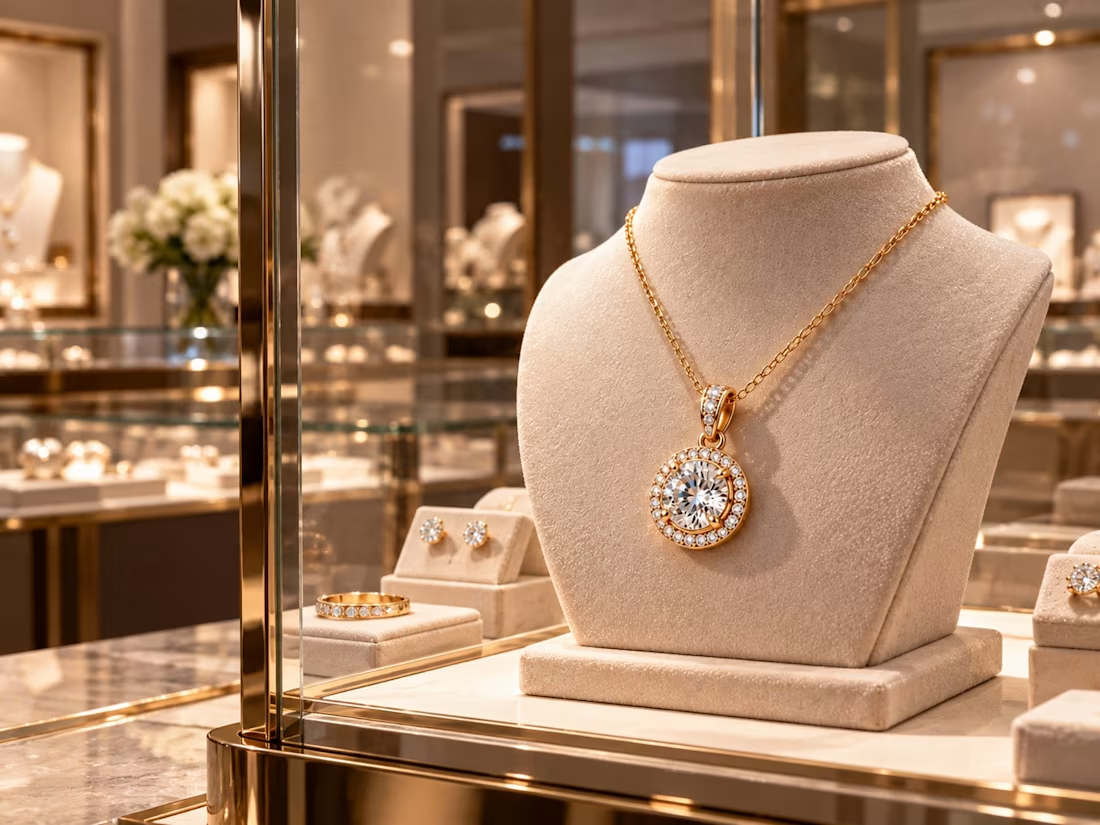

Superb

NDR - Brand Identity
Check out my new project on Behance:
https://www.behance.net/gallery/256750195/NADRA-CREATIVE-HUB-BRANDING
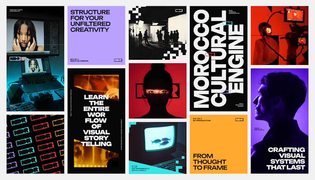

That's stunning incredible job 🔥🔥🔥🔥