The network for creativity
Join 1.25M professional creatives like you
Connect with clients, get discovered, and run your business 100% commission-free
Creatives on Contra have earned over $150M and we are just getting started
Back to feedPost

Content that resonates: no formulas, no clickbait, clear point of view.

The network for creativity
Join 1.25M professional creatives like you
Connect with clients, get discovered, and run your business 100% commission-free
Creatives on Contra have earned over $150M and we are just getting started





Related posts

Brand Identity & Packaging Design
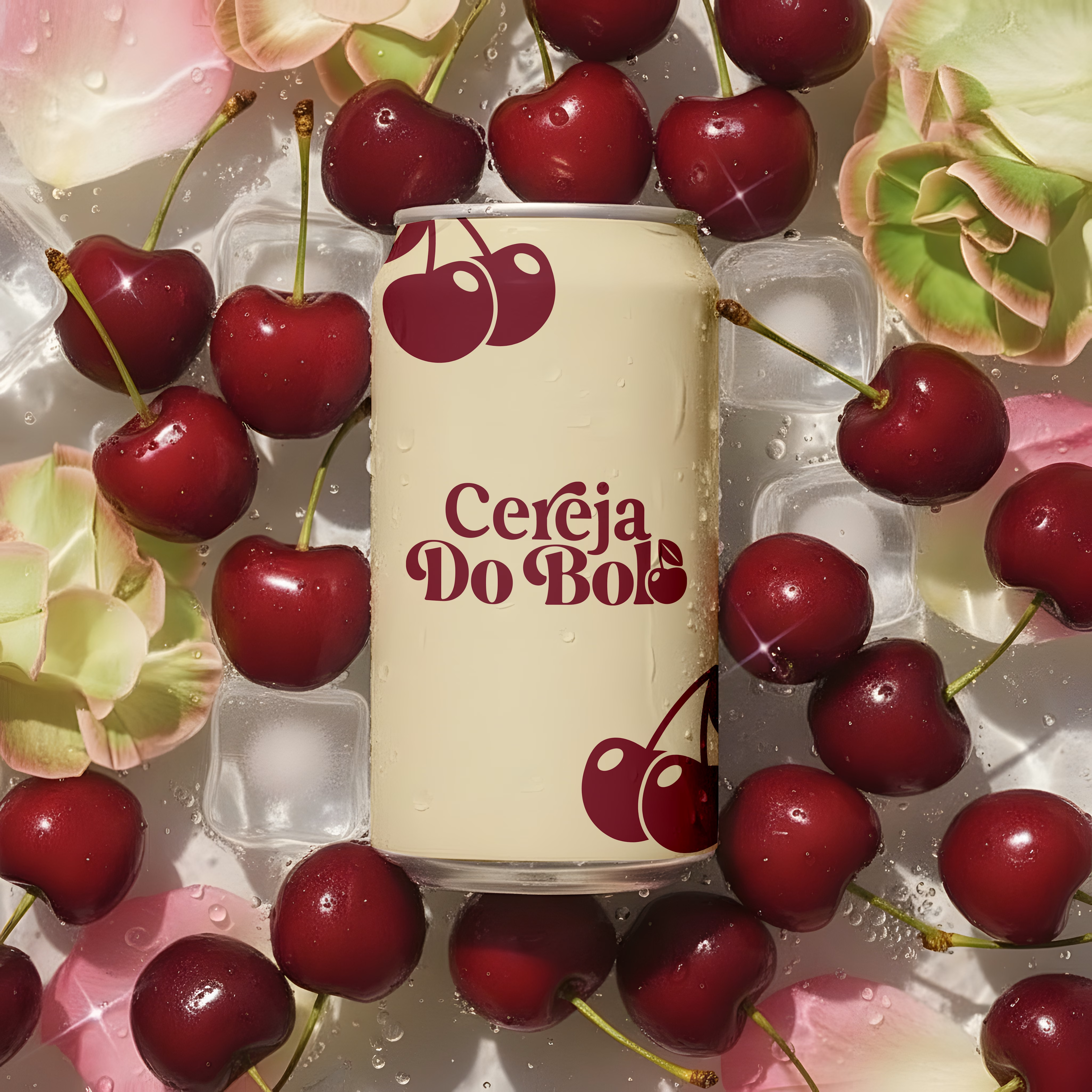
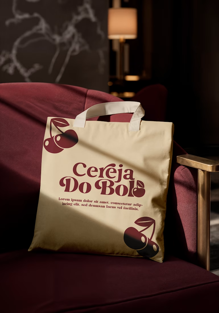
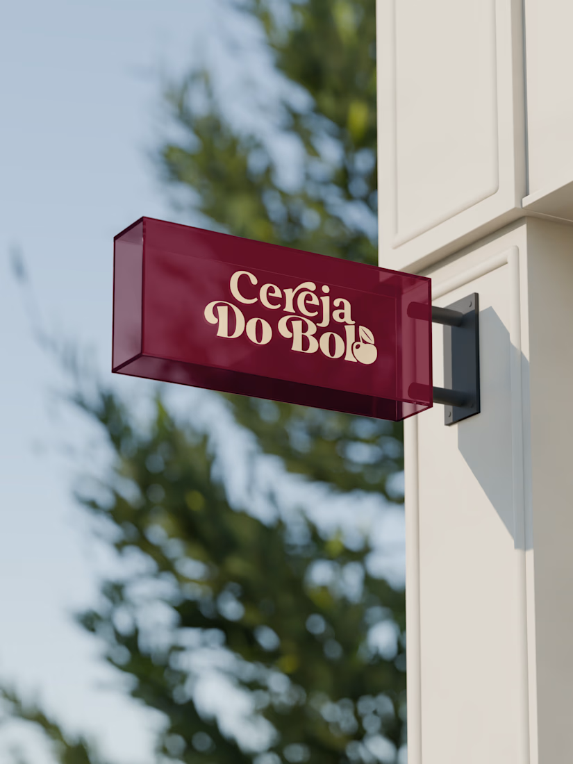
A complete visual identity and packaging concept for Cerveja do Bolo, including branded packaging, merchandise, and outdoor signage. I developed the visual direction and applied the brand consistently across multiple touchpoints to create a cohesive and recognizable identity.




Wow, love it

XNOMAD — Brand Identity Design!
XNOMAD is a premium modular camper brand based in Scandinavia, offering both rental experiences and ownership of off-road pickup campers.
The goal was to create an identity that could sit naturally between two worlds:
Scandinavian minimalism + rugged outdoor capability.
Rather than following the typical loud adventure aesthetic, we kept the system clean, modern, and confident, reflecting XNOMAD's idea of quiet luxury and freedom.
The identity was built around a distinctive X, supported by a minimal wordmark, bold blue palette, typography, graphic patterns, and applications across digital and physical touchpoints.
Wake Up Anywhere.
One of those projects where simplicity did most of the talking.


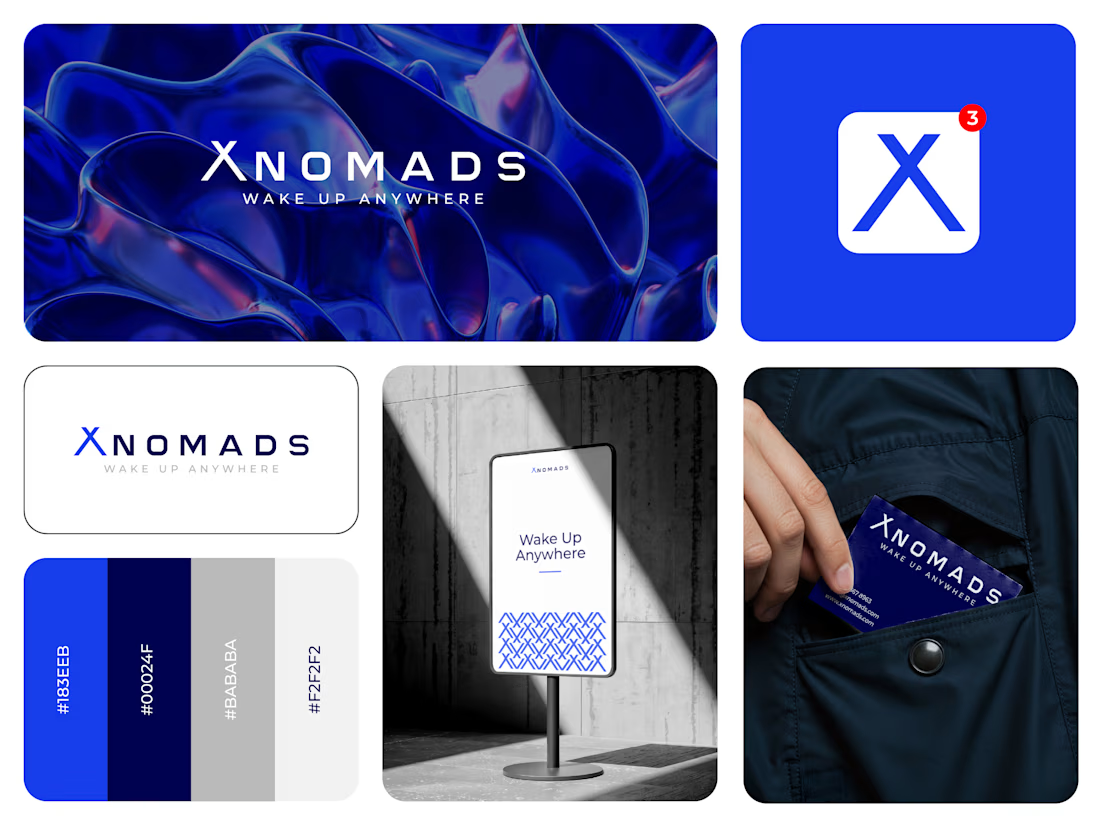

The blue visual system and mockup presentation work so well together.

no-code.supply is open.
I've been quietly building landing page templates. Six are out today, each with its own brand, its own type pairing and one interaction it's built around:
→ Aurel: a skincare brand with a WebGL serum drop that bulges toward your cursor
→ Ferro Type: a type foundry where the hero word bends its weight and width under the pointer
→ Meridian Expeditions: contour maps that redraw themselves as you switch routes
→ Oda: an architecture studio whose timber cabin draws itself, with a live sun study
→ Relay: a dev tool where the editor types a workflow and the run graph executes it live
→ Signal: a mission-control SaaS with a live infrastructure graph that contains threats as they flare
Built to be edited with AI. Every template ships with a README, a DESIGN.md and an AGENTS.md, so Claude, Cursor or whatever assistant you use changes it the way it was built, not the way it guesses.
Pricing, per template:
• HTML: $29
• React: $59
• Bundle (HTML + React): $79
Or get All-Access for $169: all six templates, both editions, plus every future drop. Nine more are on the way, at no extra cost.
No page builder, no lock-in, no third-party requests.
If you build sites for clients, I'd love to hear which one you'd use first.


Ferro Type is the one I would open first. Bending a variable font under the pointer re-lays out the text every frame, which is a much bigger bill than it looks, and stepping the weight in a few fixed increments is usually what keeps it smooth on a laptop that is not plugged in....