The network for creativity
Join 1.25M professional creatives like you
Connect with clients, get discovered, and run your business 100% commission-free
Creatives on Contra have earned over $150M and we are just getting started
Back to feedPost

VELO — Eyewear Brand Website
A concept eyewear brand website built for a premium, direct-to-consumer eyewear experience — clean, dark aesthetic with a complete storefront layout.
What's included:
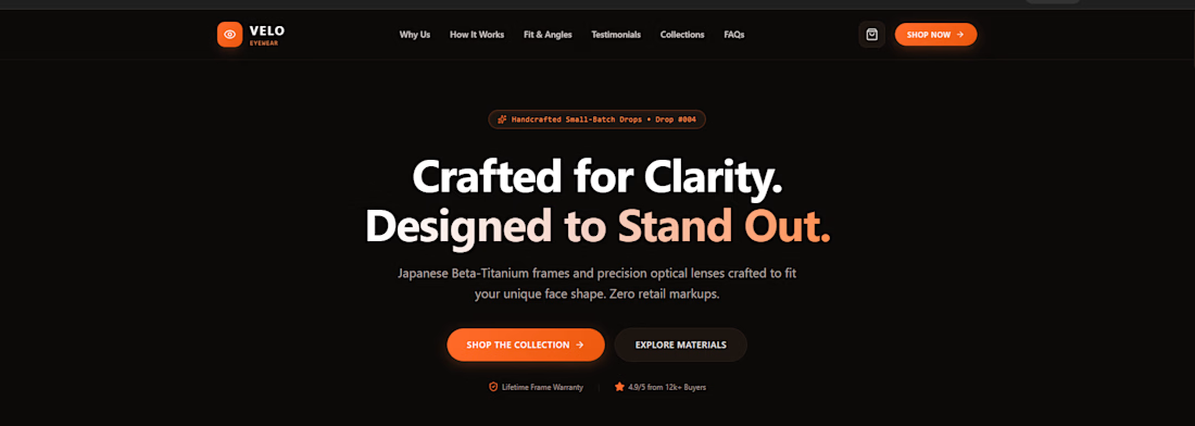
Hero section with brand messaging and clear calls-to-action
Interactive frame customizer — 4 colorways (Obsidian, Amber, Brushed, Midnight) with live product photo switching and lens technology selection
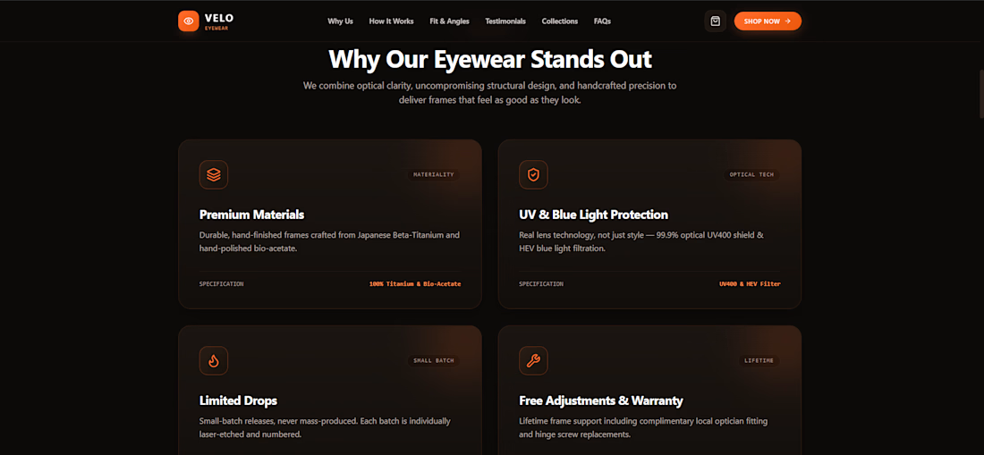
"Why Us" feature grid highlighting materials, UV/lens tech, limited drops, and warranty
How-it-works process section
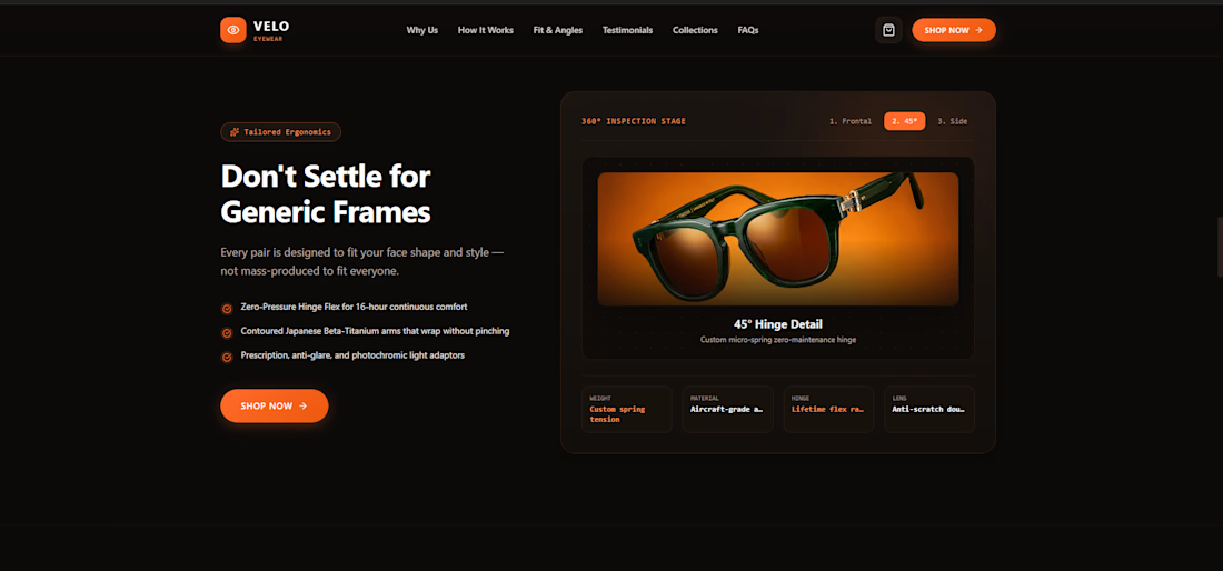
360° product inspection stage with real angle photography (frontal, 45°, side views)
Customer testimonials carousel
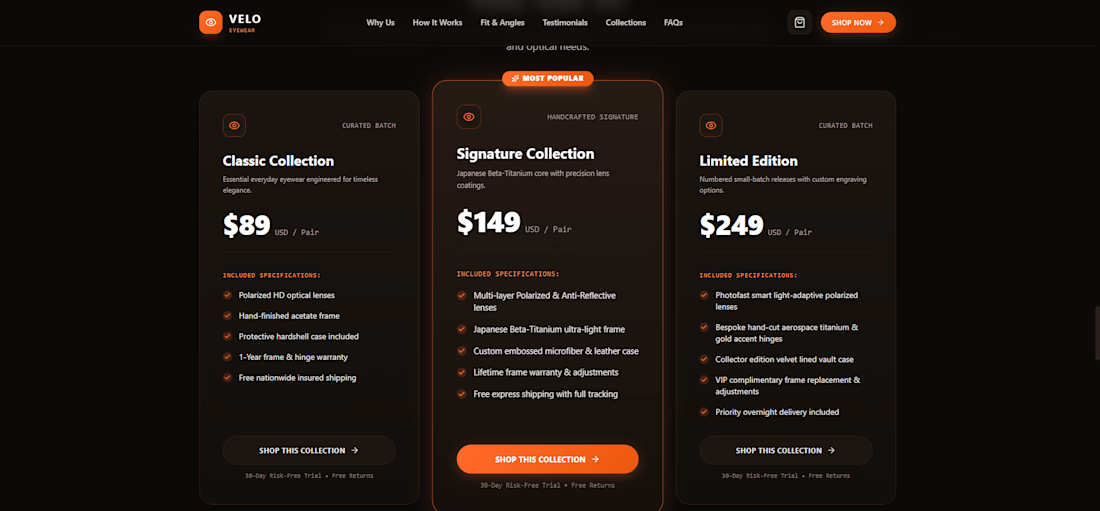
3-tier pricing/collections section (Classic, Signature, Limited Edition)
FAQ accordion and full footer
AI-generated model and product photography, styled consistently throughout
Dark, premium aesthetic with warm orange-glow accents and custom typography
Tools used: AI-assisted design & development, AI-generated product photography
Like this style? I build custom brand websites like this for fashion, eyewear, and product businesses — from concept and product photography to a fully functional storefront. Message me to discuss your project.
The network for creativity
Join 1.25M professional creatives like you
Connect with clients, get discovered, and run your business 100% commission-free
Creatives on Contra have earned over $150M and we are just getting started

Challenges
View all


Related posts


Love this concept 🧡

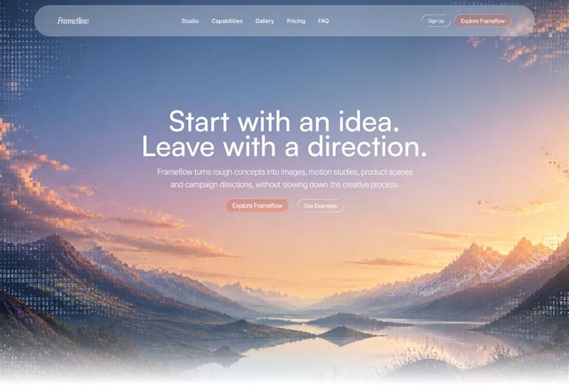
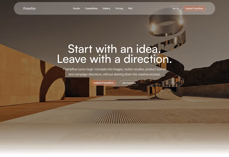
Explored two different visual directions for the same SaaS landing page.
The structure stays consistent, while the imagery, mood and art direction shift the overall brand feel.
Interested to know which direction feels stronger.
11 voted
73%
4 voted
27%
15 votes
Closed

Woww... What a precious design priyansh bro.😍 💯 🔥 🎉

I'm working on a store concept mixing art supplies, gifts and tech. I presented two moodboards: one inspired by traditional art supply stores, and another cleaner, modern direction inspired by Japanese gift and tech stores. They chose option 2.
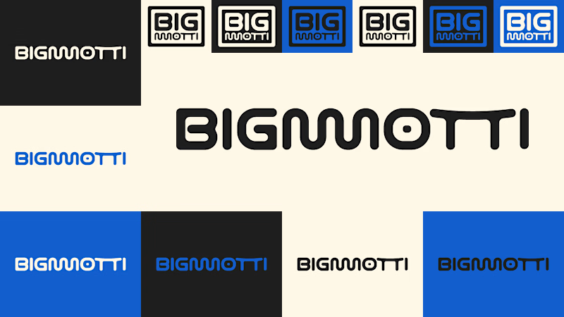
I presented four logo ideas. These two are my favorites and the ones the client liked most.
1_ Based on the second moodboard, with a more neutral and slightly futuristic feel. My favorite detail is the boxed version: its vertical weight balances with the I and O, making it feel tidy and visually appealing.
2_ Inspired by traditional art supply stores, but with a modern, clean style. Handwritten lettering adds a human touch and keeps it timeless.
Which one is your favorite and why?
Which one do you think the client chose?
1 voted
14%
6 voted
86%
7 votes
Closed

The second moodboard feels like the stronger direction for this mix of categories—it gives the products room to feel curated rather than crowded. I’m especially into the restrained palette paired with the more expressive wordmark options.