The network for creativity
Join 1.25M professional creatives like you
Connect with clients, get discovered, and run your business 100% commission-free
Creatives on Contra have earned over $150M and we are just getting started
Back to feedPost
Taste Test
Select your most like option
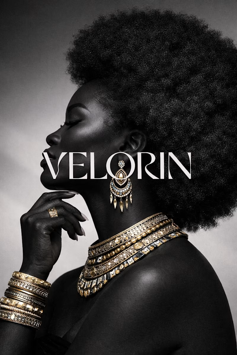
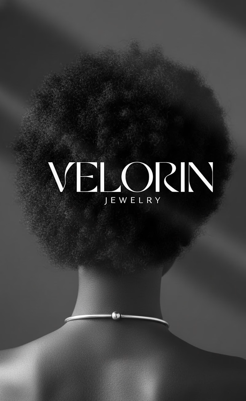
A logo design for Velorin, a jewelry brand
1 voted
50%
1 voted
50%
2 votes
Closed

I'd go with Option A. The bold front-facing composition with the jewelry front and center just feels more confident and editorial. Option B is clean but the back view feels a bit passive for a jewelry brand that wants to show off the pieces. Option A makes you want to look closer.

Hi, thank you for your feedback☺️, totally agree with you
The network for creativity
Join 1.25M professional creatives like you
Connect with clients, get discovered, and run your business 100% commission-free
Creatives on Contra have earned over $150M and we are just getting started





Related posts

Fillerkosm Brand Identity
Fillerkosm is a brand identity project built at the intersection of science, beauty and precision.
The creative process started from the meaning behind the name itself: Fillerkosm combines the world of aesthetic medicine with kosmos, the Greek idea of order and harmony. From there, I explored visual references connected to chemistry, space and refined beauty, with the goal of creating an identity that could feel technical, authoritative and premium without becoming cold or overly clinical.
The logo was developed as a direct extension of this concept. Two elliptical forms move through the wordmark like planetary orbits, while the circular elements at their extremities also suggest a molecular structure. The result creates a deliberate duality between the scientific precision of aesthetic medicine and the broader idea of harmony, balance and universal beauty.
Rather than designing a logo in isolation, the objective was to build a coherent visual language capable of expressing reliability, innovation and elegance across every brand touchpoint.

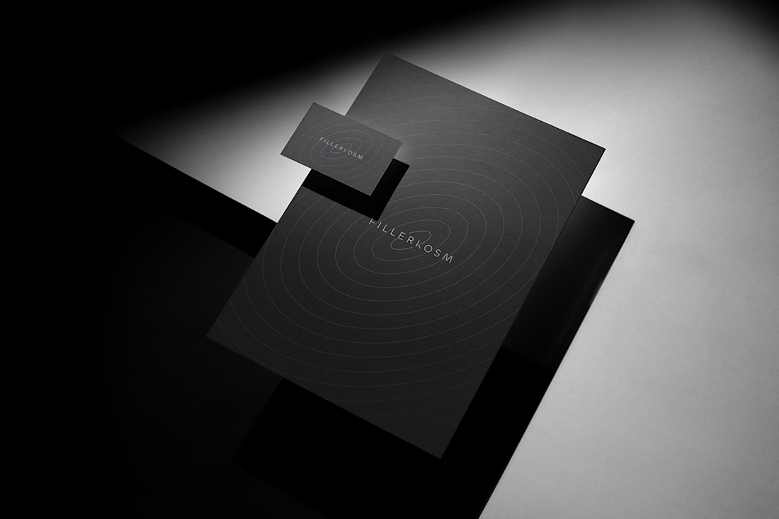
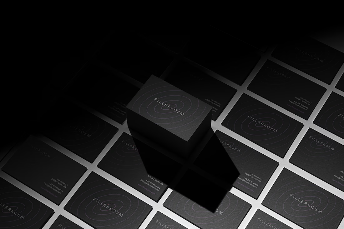
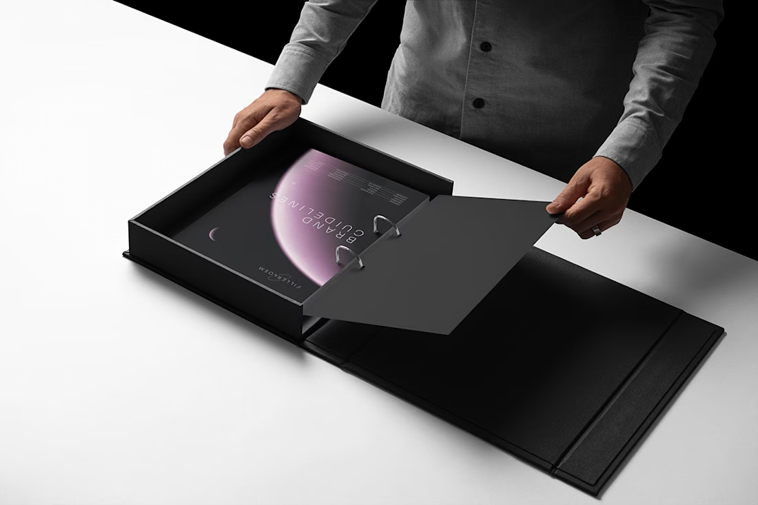

Monochrome with that one soft pink moment in the last shot. Really restrained.

A logo is just the front door, not the entire house.
Too many founders invest in a clean logo mark and wonder why their brand still feels disjointed. Real recognition happens when every single piece of your identity works together as one unified system.
Here is what actually makes up a complete brand system:
• Typography: Custom font pairings that establish your tone and bring consistency.
• Color: A tailored palette that evokes the right emotion and sticks in memory.
• Imagery: Photography and graphics that tell your story with personality.
• Layout: Balanced spacing and structure that guide the eye and build trust.
• Voice: The exact words and messaging style that shape how people feel about you.
• Applications: Clean execution across web screens, product packaging, and merch.
Stop thinking about just the mark. Build the complete system, and the credibility will follow.
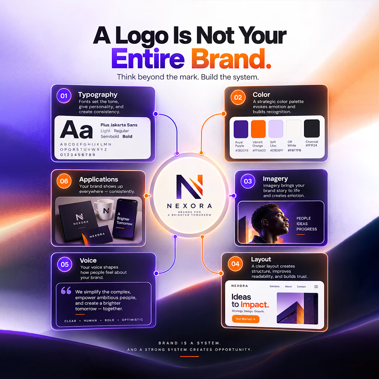

Great branding kit it's so vibrant and attractive 🎉🎉🔥🔥

Logo Design & Brand Identity created for Auraflint Atelier — a scent & fragrance brand.
©2025
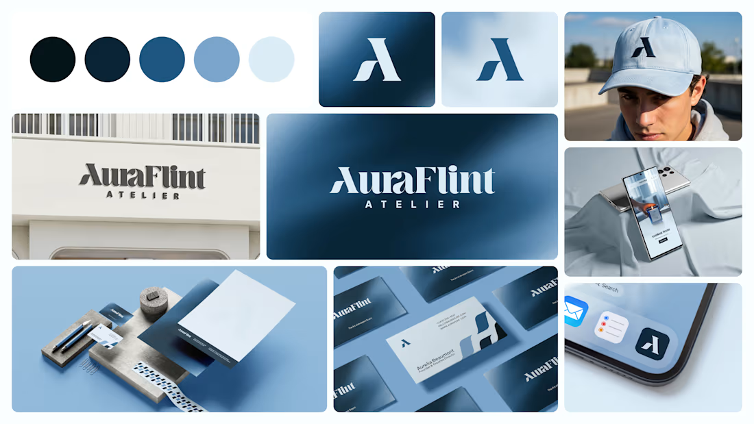

I liked colour palette.