The network for creativity
Join 1.25M professional creatives like you
Connect with clients, get discovered, and run your business 100% commission-free
Creatives on Contra have earned over $150M and we are just getting started
Back to feedPost

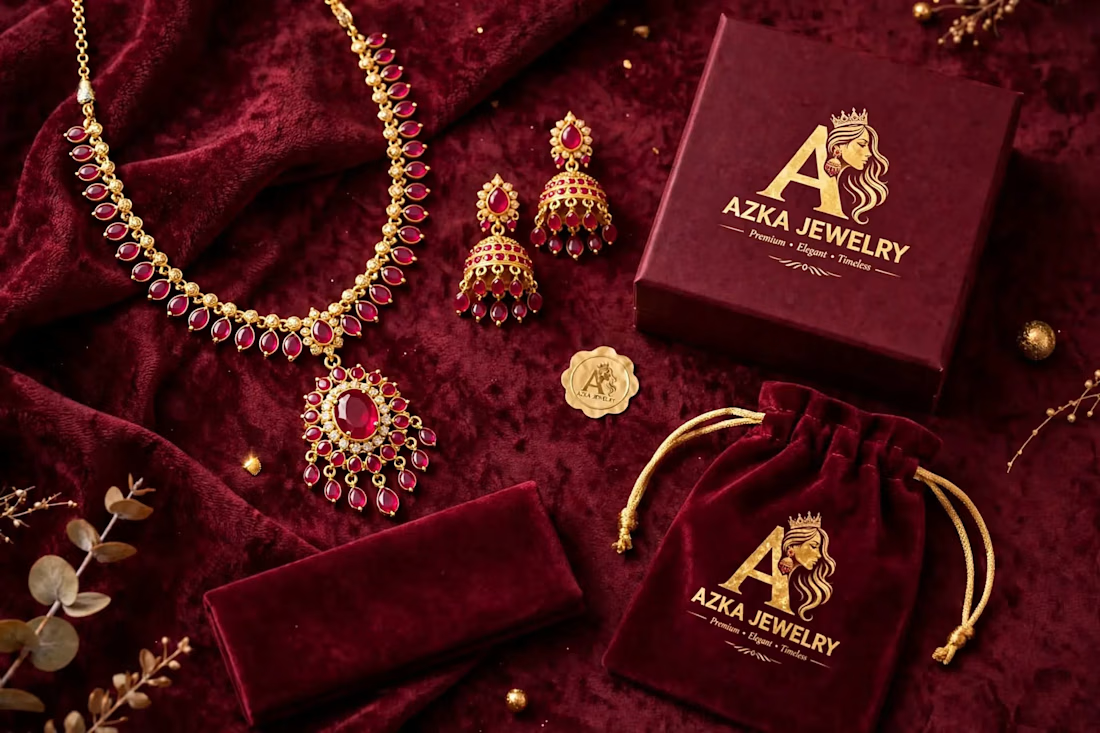
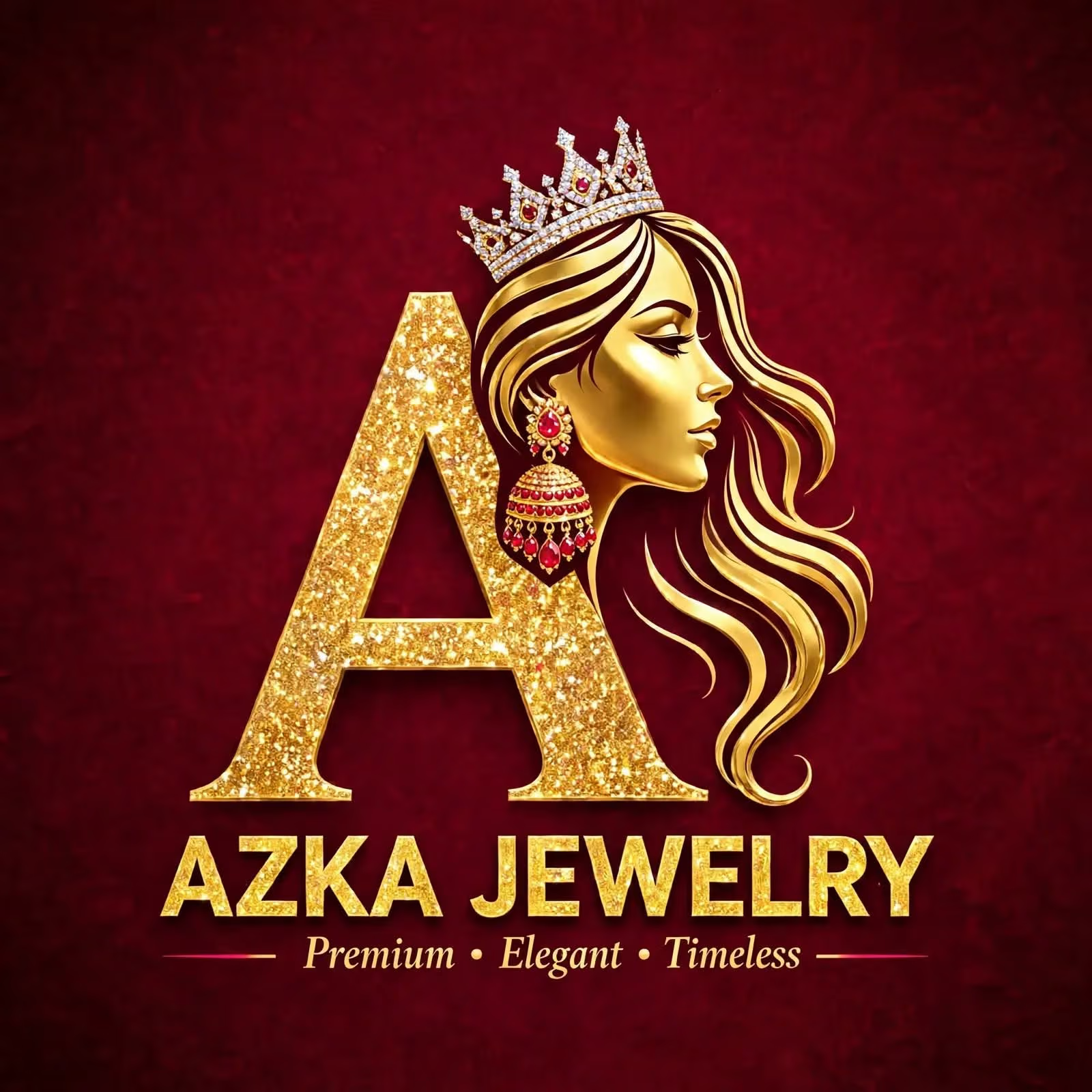
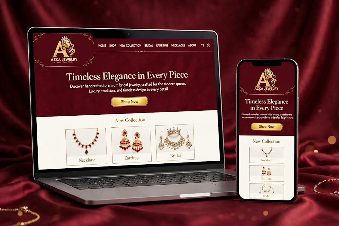
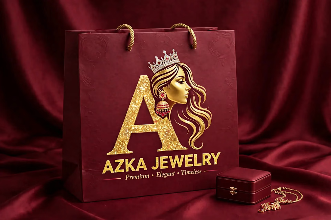
AZKA JEWELRY - Luxury Jewelry Logo + Branding
Luxury Jewelry Brand Logo & Complete Branding Design for AZKA JEWELRY
Designed by AZKA DESIGNS
Logo • Packaging • Branding • Social Media Kit
DM for your custom Jewelry Logo!
Logo Design, Jewelry Branding, Luxury Logo, Branding
The network for creativity
Join 1.25M professional creatives like you
Connect with clients, get discovered, and run your business 100% commission-free
Creatives on Contra have earned over $150M and we are just getting started





Related posts

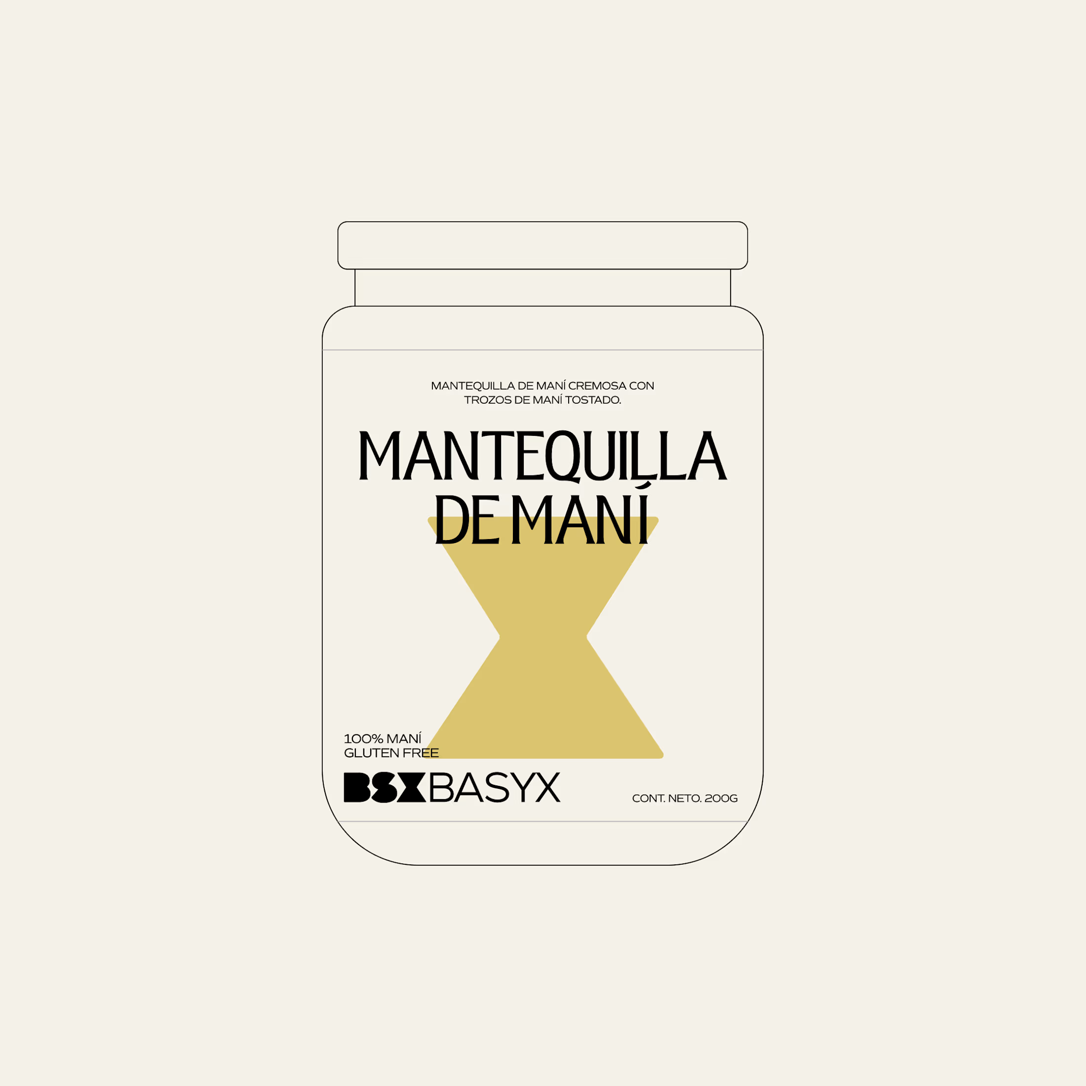
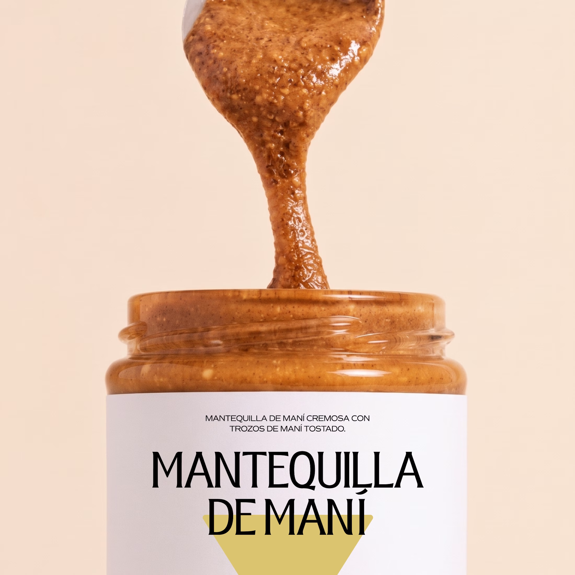
Minimal packaging is not less work. It’s MORE decisions 🤍
On a recent project, I spent a whole day on one thing: the spacing between two phrases in a label. Nobody will ever notice it. But everyone will feel it.
When there is nothing else on the label, every small adjustment has to carry the brand.
Do you also lose hours on details no client will ever mention? 😅

So true. A whole day on the spacing between two phrases sounds about right, and it's exactly why good packaging just feels right.

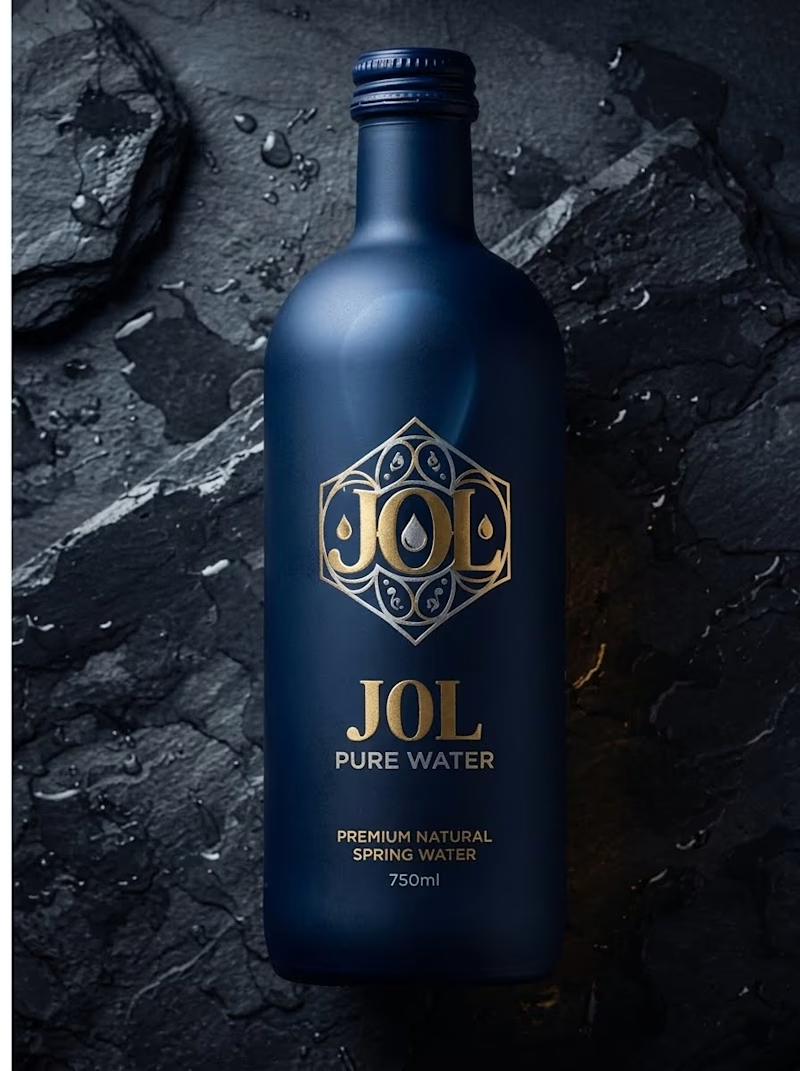
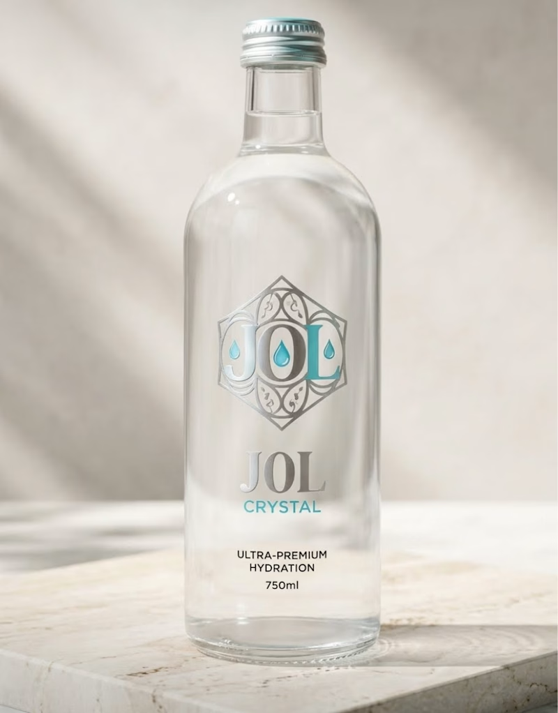
Which J0l bottle design stands out more to you?
I am testing two packaging directions for J0l, a luxury water concept I designed.
On one side, I created a bold, matte midnight blue bottle with gold accents. On the other, I designed a clean, crystal clear glass bottle with silver and teal details.
Which look grabs your attention first? Let me know in the poll below!
0 voted
0%
1 voted
100%
1 vote
Closed

Love how clean and well-balanced this is.

Trust is built into the identity.
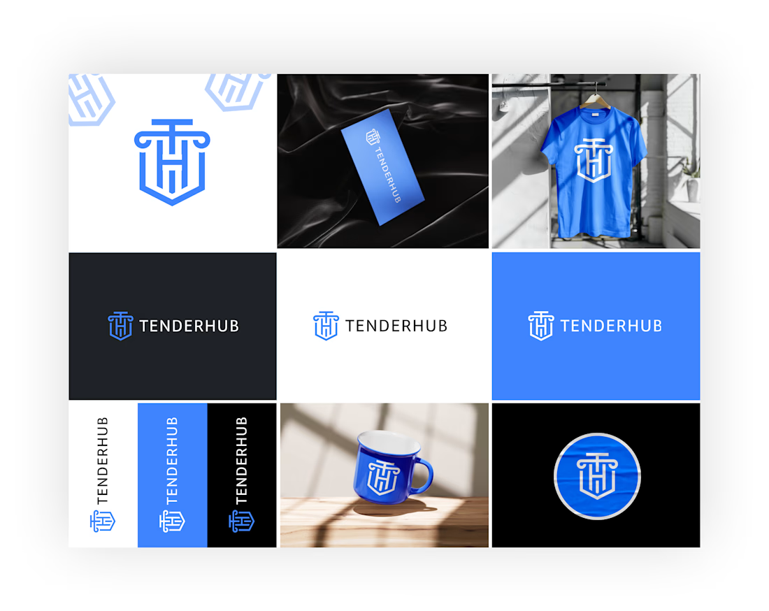
For Tenderhub, we wanted to create a visual identity that feels confident, credible and distinctive — something that reflects the authority of the legal industry without looking outdated.
From a custom-designed monogram and wordmark to a cohesive brand guideline, every element was built to create a consistent brand presence.
What we worked on:
Logo & Brand Identity
Custom Brandmark
Typography & Colour System
Brand Guidelines
Brand Applications & Mockups
A brand should be recognisable long before someone reads its name.
Designed by SYNQVO.
#BrandIdentity #LogoDesign #BrandGuidelines #VisualIdentity #SYNQVO