The network for creativity
Join 1.25M professional creatives like you
Connect with clients, get discovered, and run your business 100% commission-free
Creatives on Contra have earned over $150M and we are just getting started
Back to feedPost

which one?

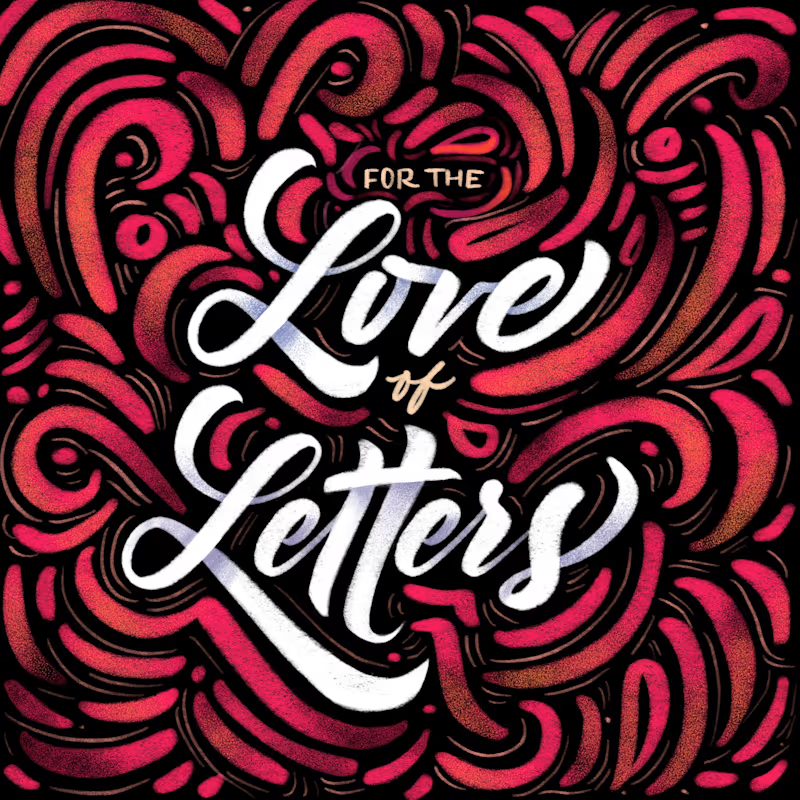
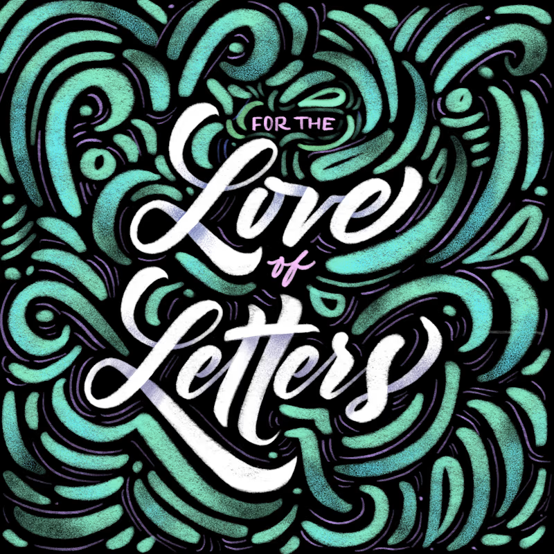
Same lettering, two color directions. Which one would you pick?
I got nostalgic this week looking at this lettering design. About 8 years ago I was deep into it and drew every day. Little by little I lost that rhythm, and now I only do it once in a while for gifts and small...
37 voted
61%
24 voted
39%
61 votes
Closed
The network for creativity
Join 1.25M professional creatives like you
Connect with clients, get discovered, and run your business 100% commission-free
Creatives on Contra have earned over $150M and we are just getting started






Related posts

Same four pasta dishes, two ways to meet them.
Would you rather watch the chef finish your plate or find it waiting at a sunlit table?
Vote A or B.
8 voted
44%
10 voted
56%
18 votes
Closed

Nice work!

Same 18 seconds, two middles. One pulls you through a tunnel of banners, one lays them out. 1 or 2.
23 voted
55%
19 voted
45%
42 votes
Closed

2 — the laid-out banners read clearer.

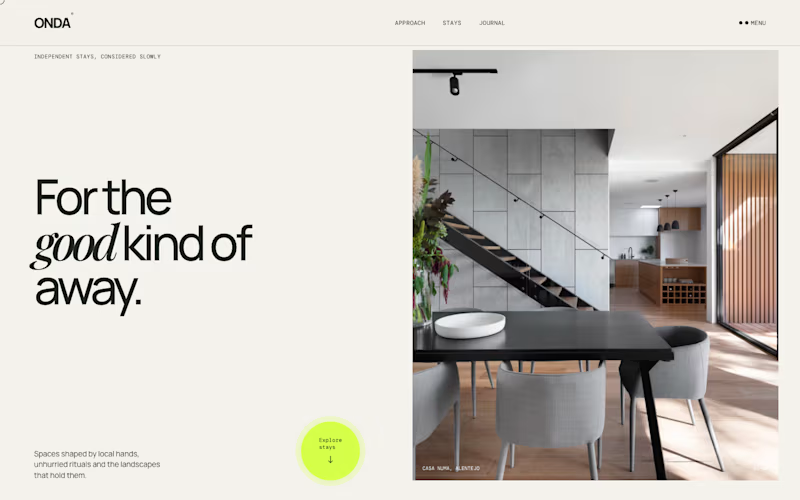
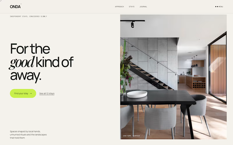
Same homepage, two approaches.
One keeps it calm with a single round button at the bottom. The other puts the action right under the headline, with a second option.
Which one would get your click?
1 voted
13%
7 voted
87%
8 votes
Closed

Action up front gets my click. The round button in the corner reads more like a badge than a button, so a first-time visitor could scroll right past it. Would love to see which one wins on real traffic.