The network for creativity
Join 1.25M professional creatives like you
Connect with clients, get discovered, and run your business 100% commission-free
Creatives on Contra have earned over $150M and we are just getting started
Back to feedPost

Overview:
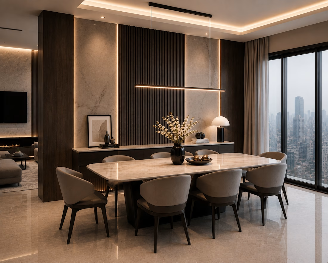
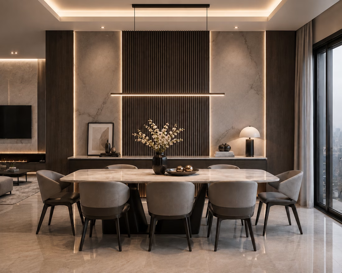
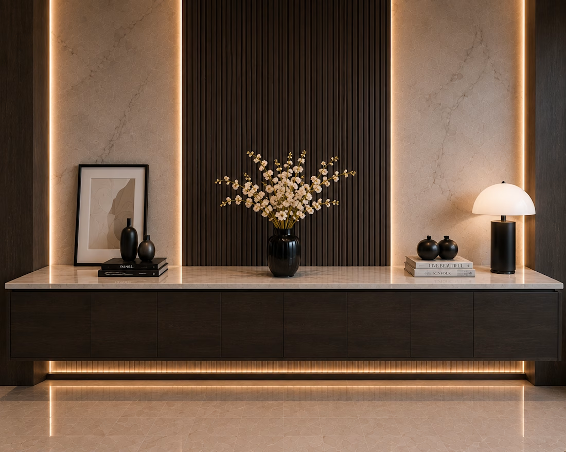
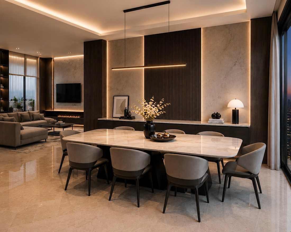
Minimal luxury dining with marble top, walnut details & city view.
I visualized this penthouse to feel warm, timeless and premium.
Work: 3D Modeling + Lighting + 4K Rendering
Tools: Blender
Available for interior visualization projects.
📩 zaini3dstudio@gmail.com

The network for creativity
Join 1.25M professional creatives like you
Connect with clients, get discovered, and run your business 100% commission-free
Creatives on Contra have earned over $150M and we are just getting started











Related posts

Building a Modern Restaurant Management Dashboard with Lovable (Light ☀️ vs. Dark 🌙)
I’ve been working on the dashboard interface for ReserveTable (Eat Pro Japan), focusing on giving restaurant managers and users a clean, modern, and intuitive interface to manage bookings, tables, and analytics.
Using Lovable, I was able to rapidly prototype and construct a modern UI system complete with smooth component transitions and native theme switching.
✨ Key Design & Tech Highlights:
⚡ Built with Lovable: Leveraged AI-powered design-to-code workflows to assemble clean component hierarchies, responsive search/filter bars, and sleek cards rapidly.
🌗 Seamless Light & Dark Mode: Designed a flexible color system using modern CSS variables / Tailwind tokens so the entire interface gracefully shifts between an elegant light aesthetic and a moody, dark dining ambience.
🎯 Contextual UI Elements: Styled input controls, select menus, and primary CTA buttons to maintain legibility and contrast across both light and dark themes.


For reservation and table states, the same semantic color tokens need to stay clear in light and dark mode. Did you define status tokens once and map both themes to them, or tune those colors per component?

🎬 DEBUT
A launch-day ad that rolls out the red carpet for your product.
Friday, October 20. Premiere night.
A limo glides up to the carpet.
A perfume takes the spotlight.
"Who are you wearing?"
It was wearing the night.
Saturday, a skateboard walked the same carpet.
"Can you do it again?"
It landed it.
Sunday, a soda can cracked open in front of the press.
"What's the flavour?"
Nobody would say.
None of them were real.
All of them got a premiere.
🎟️ Every launch deserves a red carpet.
Most of them get a story post.
So I built the whole premiere.
The marquee. The press pen. The fans. The limo.
A rooftop across the street to watch it all from.
I had way too much fun with this one.
Built the street in Blender, then rolled the cameras in SVGator with the MCP.
Six premieres.
One template.
Zero redraws.
Swap the logo and the product.
Every marquee, wall and shot follows.
Retype the headline, the date and what the press shouts.
Every word is live text. Every layer has a name.
The cameras never change.
So who's walking the carpet next?
The flashes never stop. ✨
🛠️ Built in SVGator with the MCP, staged in Blender. 1,429 named layers, 3,917 keyframes.
Use the template 👇
DEBUT · Red-carpet launch ad


the motion looks so fine-
🎁 SPECIAL DELIVERY — the holiday ad where your product is the gift
To: every small brand that wrapped its own orders this December
From: the last stop on Santa's route
You know the feeling. The big brands get snow, music and a film people wait for all year. Everyone else gets a card in the feed and hopes someone stops scrolling.
This one is for everyone else.
It's the night before Christmas. Snow falls on a sleeping town. A sleigh crosses the moon. Santa checks the Nice List twice and finds your customer's name on it. One box drops down one chimney and lands by the fire. The lid lifts, the room fills with light, and inside is the thing you make: your product, your logo, your words.
That's the moment every Christmas ad is chasing. The second before a gift is opened. Now your brand gets it too.
In the video, the same box opens four times: a bottle of perfume, a pair of running shoes, a tin of hot cocoa, an instant camera. Four very different brands. One night they all share.
📦 What's in the box
• A 24-second film in ten shots, from the moonlit town to the living room
• EDIT ME layers for everything you'd change: product-image, logo, headline, CTA, sign-off
• Live text on the gift tag, the Nice List and the end card, so it can speak to your own customer
• One accent colour, picked once
• Four ways for your product to arrive: rise, spin, bounce or turn
🔧 Making it yours takes minutes: swap two images, retype a few lines, choose a reveal. No keyframes to touch, no camera to rebuild.
🛠️ Staged in Blender and animated in SVGator with the MCP
Somebody out there is waiting to unwrap what you make. 👇
SPECIAL DELIVERY
Have to say @SVGator is easy to use as well as a good tool for us.


the idea behind this impresses me.