The network for creativity
Join 1.25M professional creatives like you
Connect with clients, get discovered, and run your business 100% commission-free
Creatives on Contra have earned over $150M and we are just getting started
Back to feedPost

Restaurant Menu Design & Brand Collateral for Coconut Lunch Home
Short Description
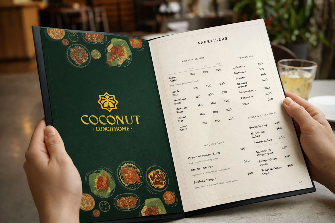
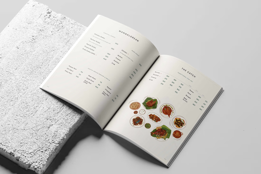
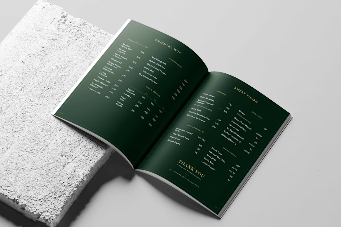
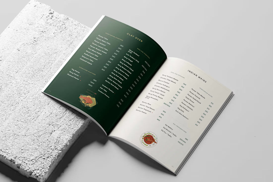
Designed a clean, modern menu system for Coconut Lunch Home that enhances the dining experience through thoughtful typography, intuitive layout, and strong visual hierarchy while staying true to the restaurant's authentic identity.
Overview
Coconut Lunch Home wanted a menu that felt as inviting as the food they serve. The objective was to create a menu that not only showcased the restaurant's offerings clearly but also reflected its warm and authentic brand personality.
The focus was on improving readability, creating a clear information hierarchy, and designing a layout that makes browsing effortless for customers. Every design decision—from typography and spacing to section organization—was carefully considered to ensure a seamless user experience while maintaining a clean and premium visual aesthetic.
Rather than overwhelming customers with information, the final menu balances functionality and visual appeal, making it easy to explore dishes while reinforcing the restaurant's identity.
The Challenge
The existing menu lacked a clear visual hierarchy and consistent layout, making it difficult for customers to quickly navigate through categories and offerings. The challenge was to simplify the experience without compromising the restaurant's personality.
The Solution
I developed a structured menu system with clean typography, consistent spacing, and an organized layout that improves readability and enhances the overall dining experience. The design prioritizes clarity while maintaining a warm, approachable visual language that complements the Coconut Lunch Home brand.
My Role
Menu Design
Brand Collateral Design
Layout Design
Typography
Print Design
Visual Communication
Deliverables
Restaurant Menu Design
Print-Ready Artwork
Menu Layout System
Typography Hierarchy
Brand Collateral
Production Files
Tools Used
Adobe Illustrator
Adobe Photoshop
Adobe InDesign
Industry
Food & Beverage • Restaurant • Hospitality
Skills
Brand Identity
Branding
Graphic Design
Menu Design
Print Design
Restaurant Branding
Editorial Design
Typography
Layout Design
Visual Identity
Brand Collateral
Adobe Illustrator
Adobe Photoshop
Adobe InDesign
Art Direction



Looking Nice
The network for creativity
Join 1.25M professional creatives like you
Connect with clients, get discovered, and run your business 100% commission-free
Creatives on Contra have earned over $150M and we are just getting started





Related posts

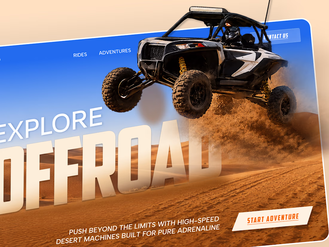
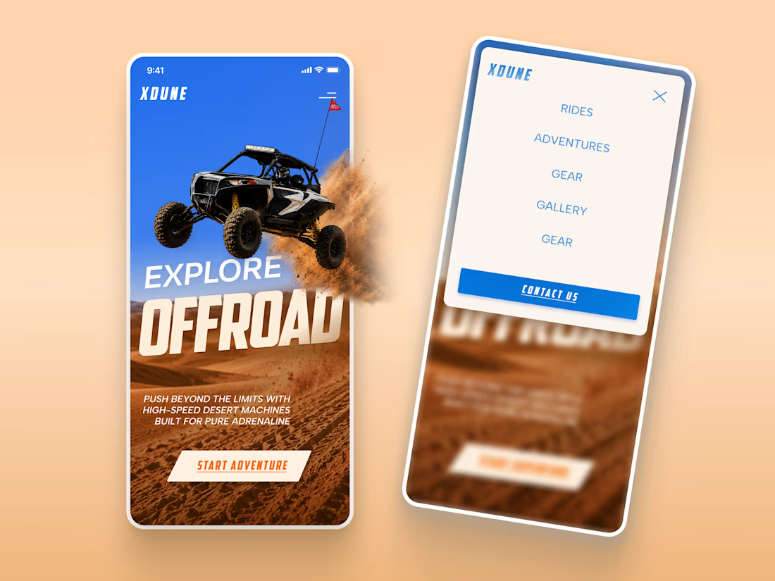
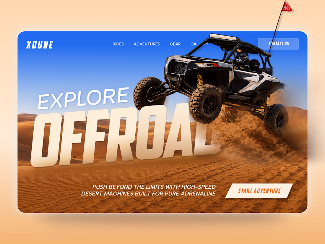
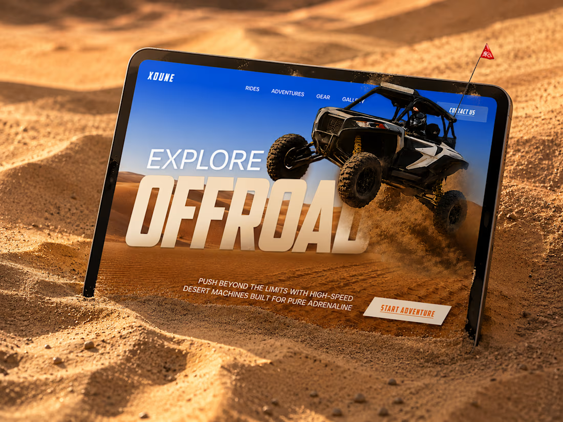
XDUNE — Off-Road Adventure Landing Page
A bold landing page concept built around speed, freedom, and off-road adventure 🔥
The visual direction combines desert landscapes, oversized typography, and a dynamic vehicle composition to make the experience feel energetic from the first screen
Special attention was given to:
• Strong action-focused hero composition
• Bold typography and clear hierarchy
• Desert-inspired visual atmosphere
• Adventure-focused CTA
• Responsive mobile experience
• Simple and clean navigation
The result is a high-energy landing page that feels fast, adventurous, and made for people who want to get off the road
Looking to create a bold website for an automotive, outdoor, or adventure brand? Let’s connect 🚀


love the vibe


New Brand Identity project alert! 🚨
GATE108 is a forward-thinking ecosystem bringing together people, ideas, experiences and new ways of living, working and connecting.
We’ve been their long-term design partner, shaping and continuously evolving a flexible visual ecosystem across visual strategy, brand identity, creative direction, digital experiences, event assets, 3D motion and social media.
Inspired by the idea of GATE108 as a gateway into a multidimensional world of people, ideas and possibilities, we’ve built a brand system designed to move, adapt and grow across physical and digital spaces.
As the brand evolves, we continue to create new expressions while keeping the wider ecosystem cohesive, recognisable and ready for what’s next.


a lot of what gives a brand character lives in the little details.
some favourites from Yield