The network for creativity
Join 1.25M professional creatives like you
Connect with clients, get discovered, and run your business 100% commission-free
Creatives on Contra have earned over $150M and we are just getting started
Back to feedPost

Good finance UI reduces support tickets.
This summary is designed to answer the 3 questions users always ask:
“How much did I use?”
“What’s left?”
“What can I do next?”

The network for creativity
Join 1.25M professional creatives like you
Connect with clients, get discovered, and run your business 100% commission-free
Creatives on Contra have earned over $150M and we are just getting started











Related posts

FinFlow — A Modern Personal Finance Dashboard 🚀
FinFlow is a self-initiated finance dashboard UI concept designed to present financial information through a clean, structured, and intuitive interface.
Created in Figma, the design brings together financial overviews, transaction data, expense tracking, and savings goals in a cohesive dashboard experience.
The focus was on clear information hierarchy, consistent visual design, and making key financial information easier to scan and understand.:


Financial management and utility flow for Quickpay, covering spending activity analytics, multi-method wallet top-ups, map-based ATM discovery, and user profile management.
Looking for a custom UI/UX design for your Fintech platform or SaaS product? Let's collaborate!
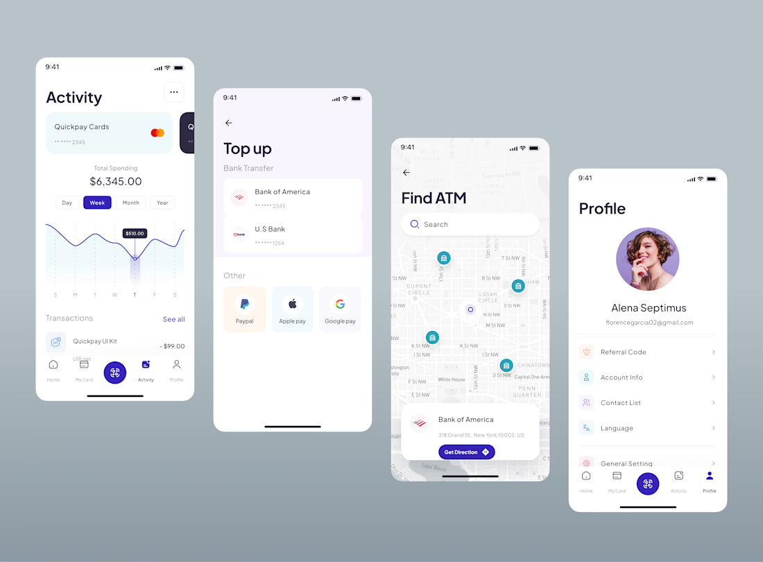

Bringing spending insights and everyday wallet tools together makes financial management so much more convenient!


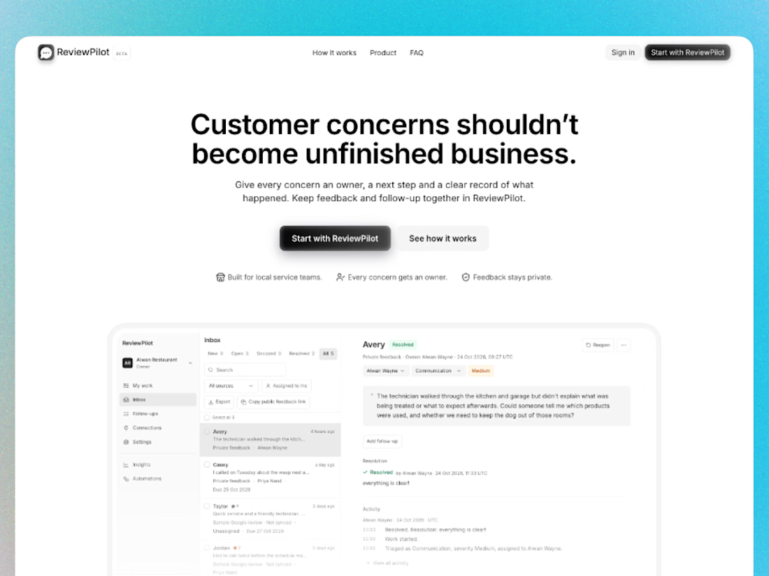
I built ReviewPilot with @Base44 to help small businesses keep track of what happens after a customer leaves feedback.
Using a restaurant demo, the app brings private feedback, assigned follow-ups, due dates, response approval, and resolution history into one workspace. In-app notifications let the person responsible know when follow-up work is assigned.
A big part of the process was simplifying the experience: reducing competing buttons, making ownership clearer, and refining typography, spacing, and mobile layouts.
The goal was practical—help a team understand the concern, identify the next step, and record how it was handled.
Here’s a one-minute walkthrough using fictional sample data. 👇