The network for creativity
Join 1.25M professional creatives like you
Connect with clients, get discovered, and run your business 100% commission-free
Creatives on Contra have earned over $150M and we are just getting started
Back to feedPost

BOB: The Unbothered Bear https://www.recraft.ai/project/6e747f46-bdb1-430a-805c-8034b2bcf6d2
Seems like the teddy from our childhood has grown up to become Bob, with his own character arc.
The Yin Yang in Bob represents his dual nature: outside, he's fully involved with the world around him, and inside, he's totally unbothered by the world outside.
Bright green is Bob's aura - infused in him by the fireflies from his childhood - guiding him from within, so nothing outside bothers him. Bob does what he wants, and yet he stays unbothered by people's opinions or judgements. He loves to mind his own business without letting anyone intervene.
The world of Bob has its own fashion, merch, food, and culture which he presents with a deadpan, unbothered expression.
Bob welcomes everyone to be a part of his circle and experience a community where everyone celebrates life together - but the only condition for members is: 'Stay UNBOTHERED'.


The network for creativity
Join 1.25M professional creatives like you
Connect with clients, get discovered, and run your business 100% commission-free
Creatives on Contra have earned over $150M and we are just getting started



Related posts

From an error screen to a character with personality. That's a pretty good glow-up.
Love the creativity behind this!


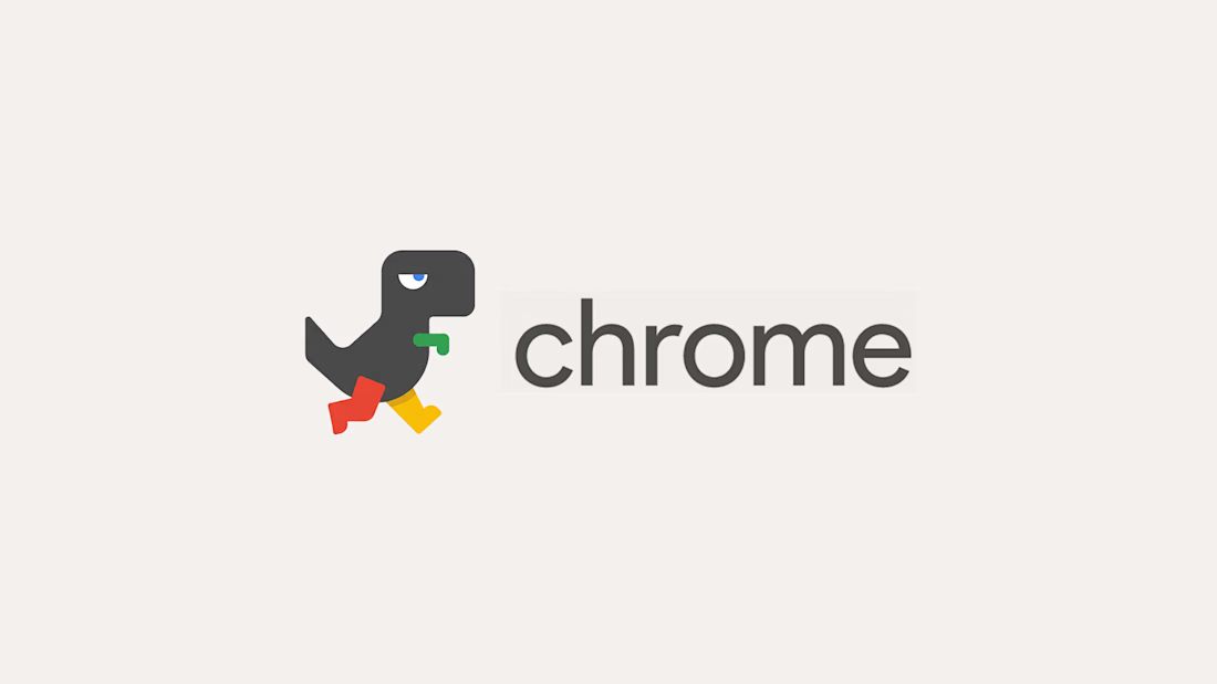
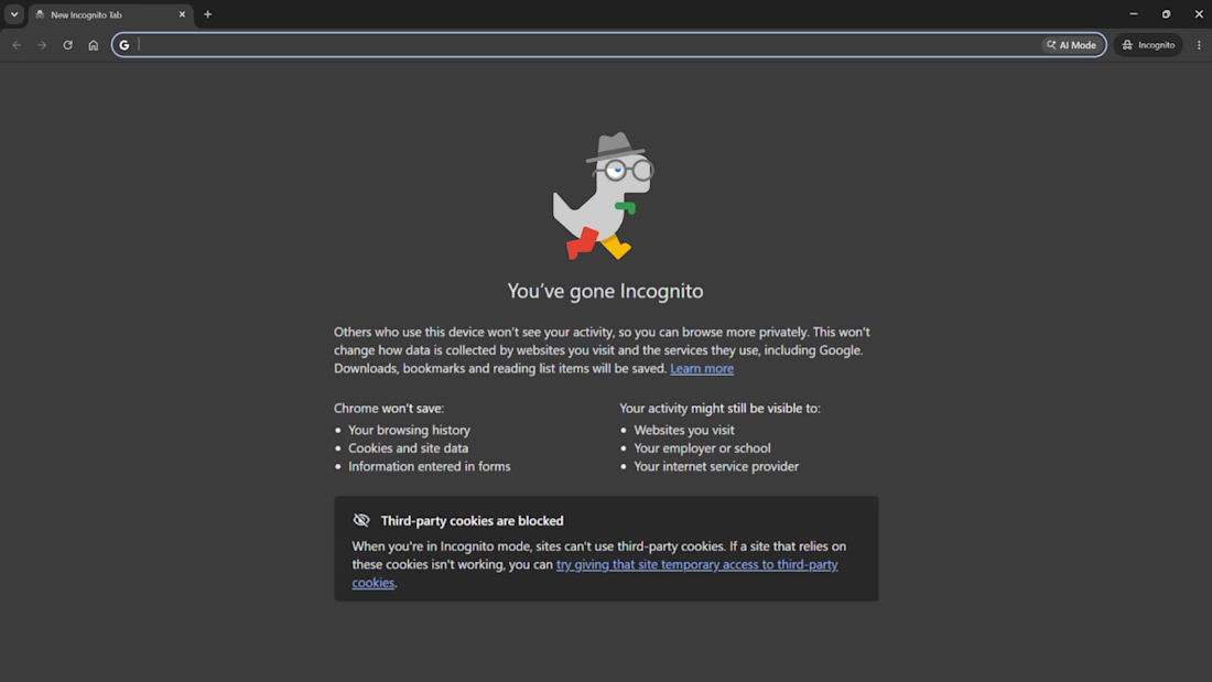
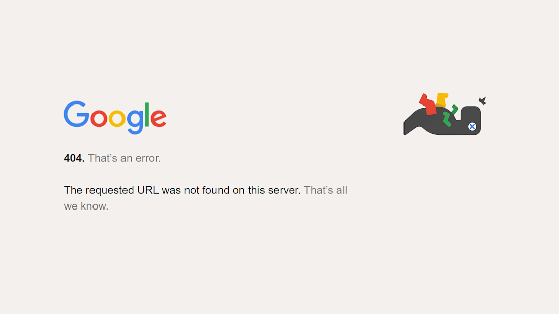
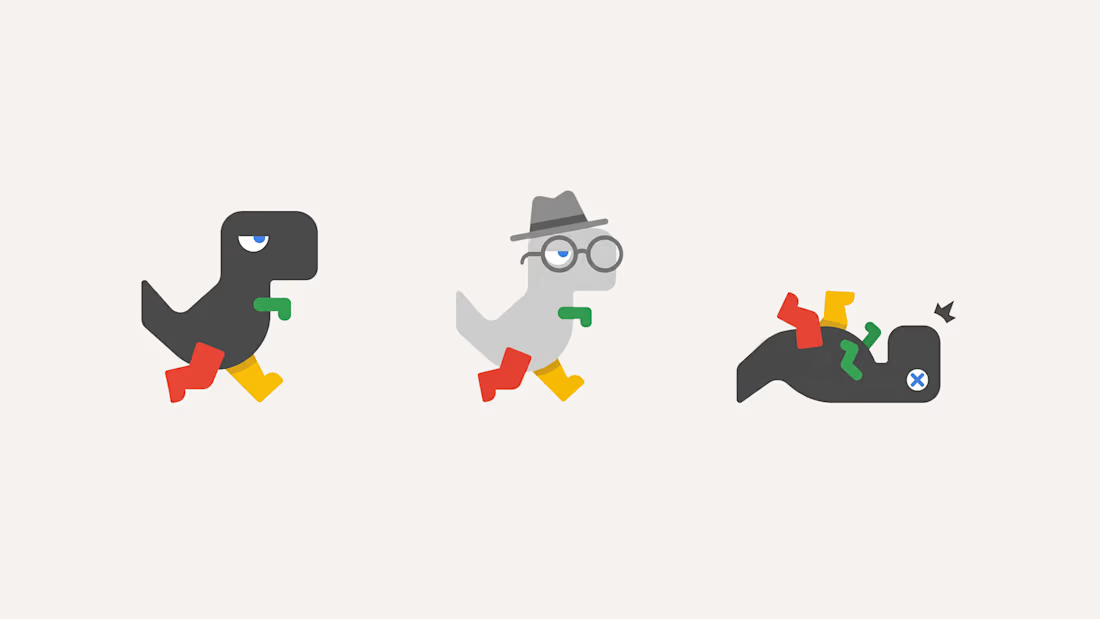
Firefox has a fox, so why doesn’t Chrome have a mascot? 🦊
Well…it kinda does. The offline dino, the one that only shows up when everything is broken (who didn't rage on the game too lol)
So I gave it the glow up it deserves: flat Google shapes, Chrome colors on the legs and arm,...

thank you for reposting!!!


How far can you take a logo beyond the first draft?
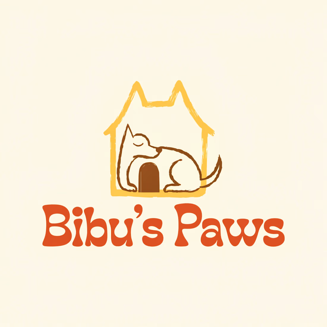
I started with Recraft's Logo Maker and a fictional idea: Bibu's Paws, a cosy little dog rescue and adoption shelter.
I wanted the identity to feel warm, homely and full of character, so I explored a few logo directions before settling on the little dog tucked inside a house.
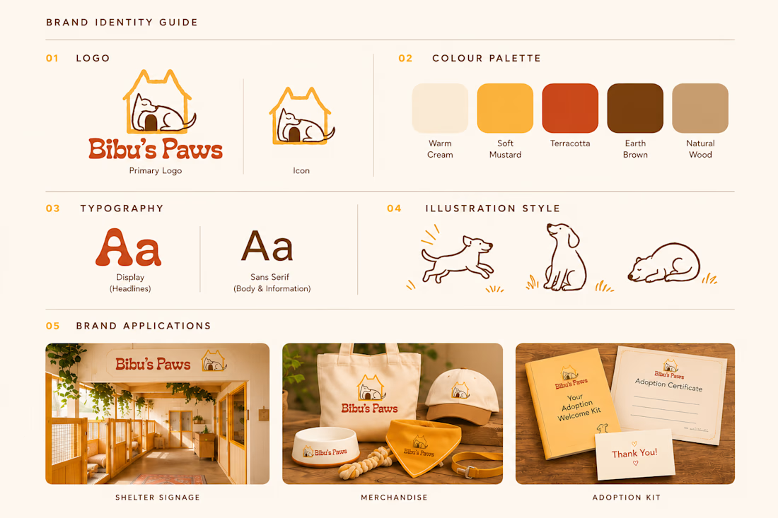
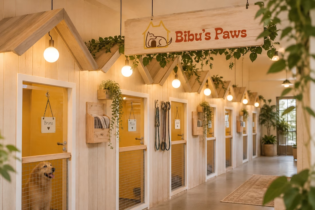
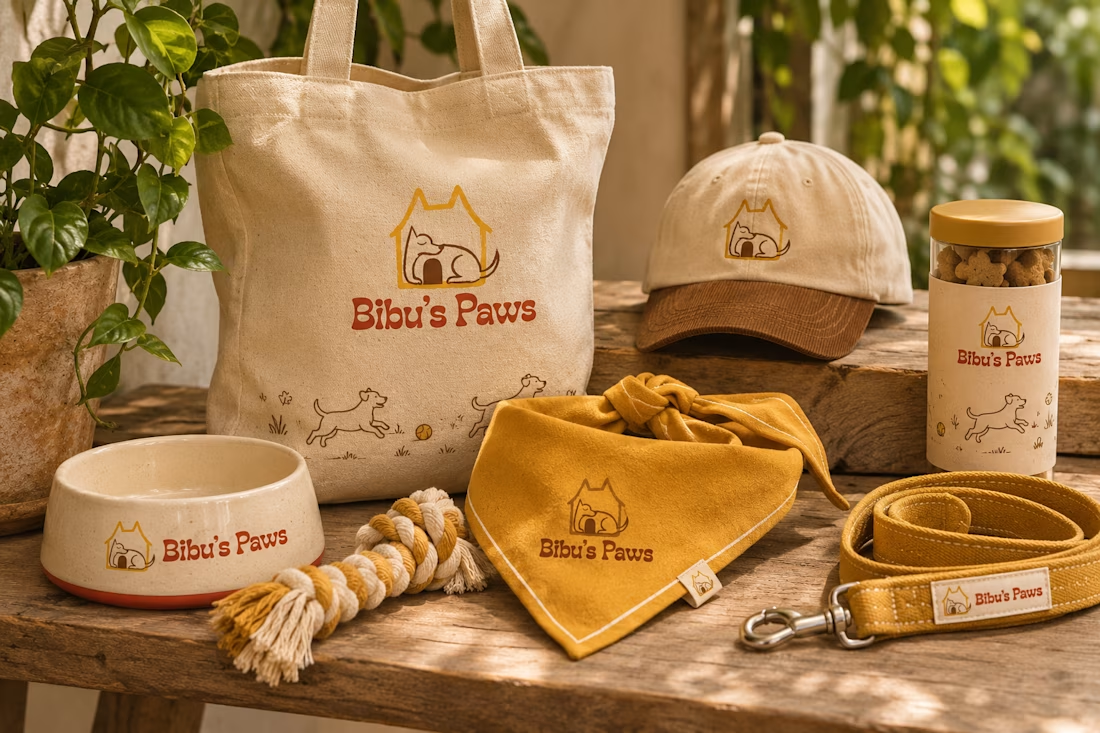
From there, I took the idea further, building out the visual identity with an earthy colour palette, typography, illustrations and a few real-world applications: the shelter space, dog merchandise and an adoption welcome kit.
I enjoyed seeing how a small starting point could grow into a brand with its own personality and world.
Now I'm curious: if you were building a brand around this logo, what would you create next?


This is my submission for the Video.js Skins Design Challenge!🚀
Nubi is a playful, animated video player designed for kids and family content.
Why this niche: children's video is one of the most-watched categories online today and one of the most valuable for creators and platforms.
☁️ What makes it special:
• Interactive googly eyes peek over the frame
• Day and night mode: a bright pastel sky with fluffy clouds, or a calm starry night where the eyes get sleepy.
• A friendly, easy-to-use look
• On phones it becomes a vertical 9:16 video with thumb-friendly controls.
Built with Video.js 10, fully keyboard accessible, legible over any footage, and calm with reduced motion.
(Film: "WING IT!" by Blender Studio, CC BY 4.0.)
#videojsskinschallenge

Designing for kids first is a smart niche, and the sleepy eyes in night mode turn a theme switch into a bedtime moment. Big friendly controls in 9:16 make total sense for how kids actually watch.