The network for creativity
Join 1.25M professional creatives like you
Connect with clients, get discovered, and run your business 100% commission-free
Creatives on Contra have earned over $150M and we are just getting started
Back to feedPost
Hello Contra Community.
Here is my second video for #EndTheCageAge.
The project involved a delicate balance between stylisation, and realism.
The client asked me to design the animals so that they look accurate and somewhat realistic, but to simplify the form and detail. The goal was to keep
it as uncartoony as possible.
I referred closely to filmed footage of the animals expressing their natural behaviours to try to replicate the movement accurately. As an animator who’s
used to conveying emotion in faces, it felt unusual to me to avoid that for this project!
The cage the animals are in takes design elements from the End The Cage Age logo, and is supposed to be more symbolic of confinement than a representation of how the animals are kept. The client was specific about how large the cage should be in reference to each animal, because they wanted that part to be realistic.
I drew the animation in Photoshop and put it all together with shapes and textures in After Effects. The animation itself is a combination of hand drawn
elements and animated shapes – the approach I took for each shot depended on the animation involved. If you’re curious to understand this better, throw me your questions!
When I tell you that the animal in the final animation is considered especially
intelligent, I bet you can guess...


Beautiful work! I love the realistic proportions on the bunny and how the colors brighten up.

Thank you, Kamilla! Hoping there are brighter days ahead for bunnies 😊
The network for creativity
Join 1.25M professional creatives like you
Connect with clients, get discovered, and run your business 100% commission-free
Creatives on Contra have earned over $150M and we are just getting started





Related posts


New Brand Identity project alert! 🚨
GATE108 is a forward-thinking ecosystem bringing together people, ideas, experiences and new ways of living, working and connecting.
We’ve been their long-term design partner, shaping and continuously evolving a flexible visual ecosystem across visual strategy, brand identity, creative direction, digital experiences, event assets, 3D motion and social media.
Inspired by the idea of GATE108 as a gateway into a multidimensional world of people, ideas and possibilities, we’ve built a brand system designed to move, adapt and grow across physical and digital spaces.
As the brand evolves, we continue to create new expressions while keeping the wider ecosystem cohesive, recognisable and ready for what’s next.


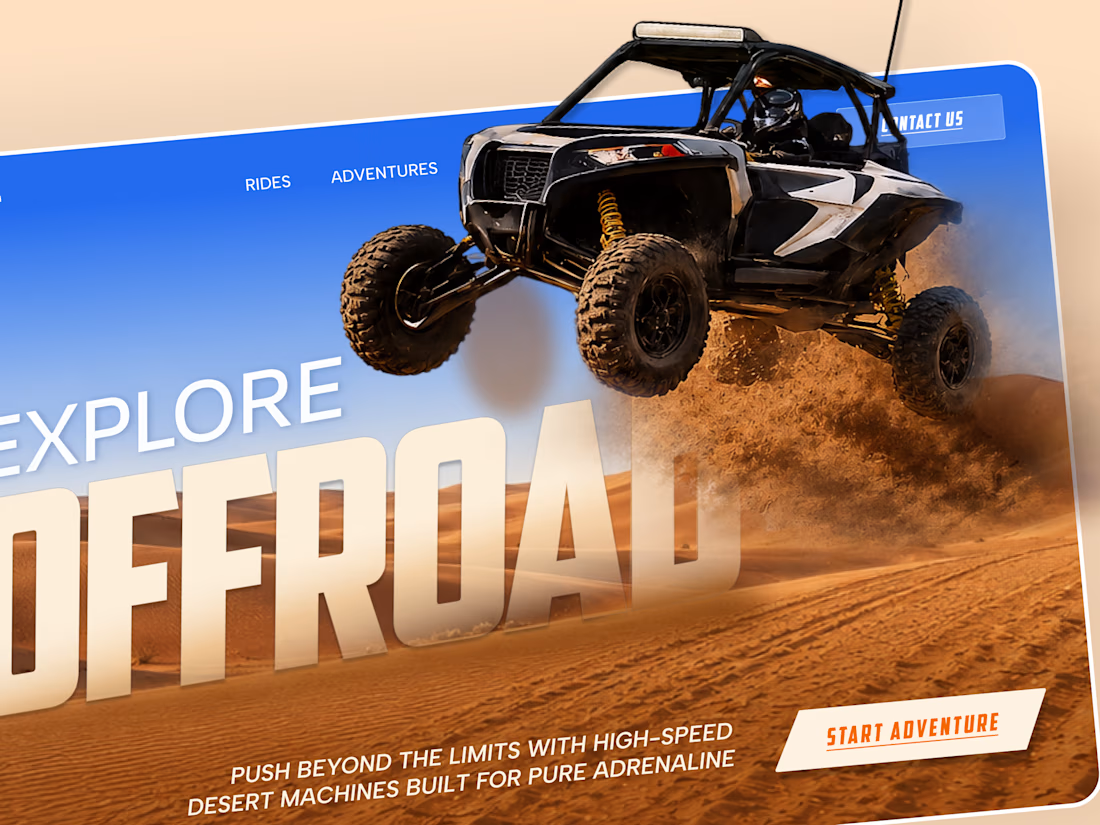
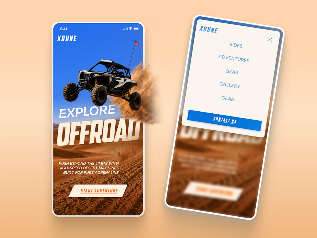
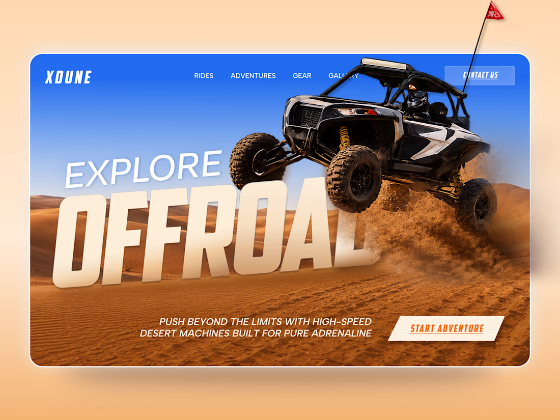
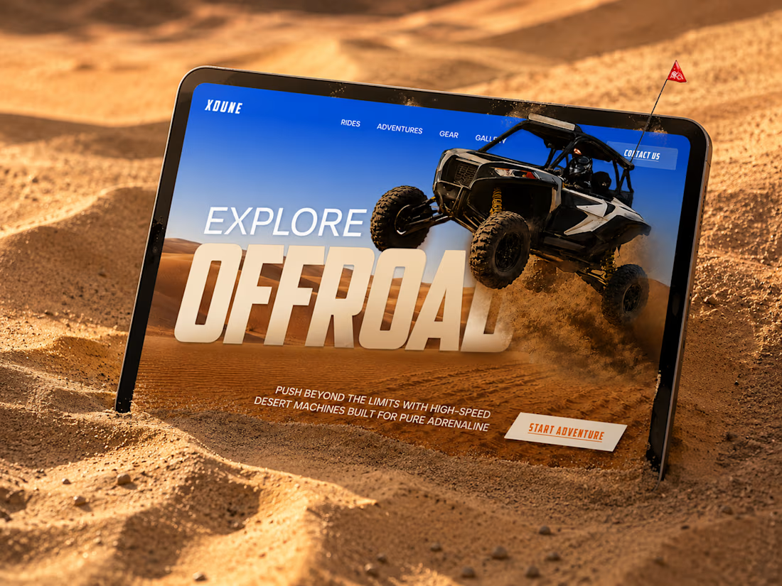
XDUNE — Off-Road Adventure Landing Page
A bold landing page concept built around speed, freedom, and off-road adventure 🔥
The visual direction combines desert landscapes, oversized typography, and a dynamic vehicle composition to make the experience feel energetic from the first screen
Special attention was given to:
• Strong action-focused hero composition
• Bold typography and clear hierarchy
• Desert-inspired visual atmosphere
• Adventure-focused CTA
• Responsive mobile experience
• Simple and clean navigation
The result is a high-energy landing page that feels fast, adventurous, and made for people who want to get off the road
Looking to create a bold website for an automotive, outdoor, or adventure brand? Let’s connect 🚀

love the vibe


Bringing 200+ integrations, workflows and AI agents together in one clean, animated experience. We'd love to hear your thoughts!


